Heritage Woodworking Blog Landing Page Template
Craftwork is a heritage-styled woodworking landing page built for DIY bloggers and maker communities. It pairs a cinematic half-page hero with a masonry project grid, a handwriting-style founder's letter, and a single-field email capture. Warm parchment tones, serif typography, and scroll-linked reveals give it the honest, unhurried feel of a real workshop.
by Rocket studio
Quick summary
Craftwork is a single-page landing page template designed for woodworking and maker blogs. It opens with a split-screen hero, flows into a personal founder's story, and expands into a masonry grid of project cards. The layout earns reader trust before it ever asks for an email address.
Who this template is for
This template is built for makers who want a content hub that feels as honest as their process. It suits bloggers who document real builds, not polished product shots, and who want readers to subscribe because the content earned it.
- Weekend woodworkers and garage hobbyists sharing tutorials and build logs
- Retired craftspeople or engineers launching a personal project blog
- Young makers upcycling furniture who want a warm, story-first online presence
What problem this template solves
Most blog templates force a hard pitch before the visitor has seen a single reason to trust you. Craftwork flips that order. It lets the work speak first and places every call to action only after the reader has already received something useful.
- Generic blog layouts bury the maker's voice under stock-photo headers and impersonal grids
- Subscription prompts that appear too early drive visitors away before they form a connection
- Skill-level filtering is rarely built in, leaving beginners and advanced readers equally lost
What you get with this template
You get a fully structured, single-page layout with every section already designed and sequenced. The visual system, typography, card layout, and call-to-action placement are all defined so you can focus on your content instead of your layout.
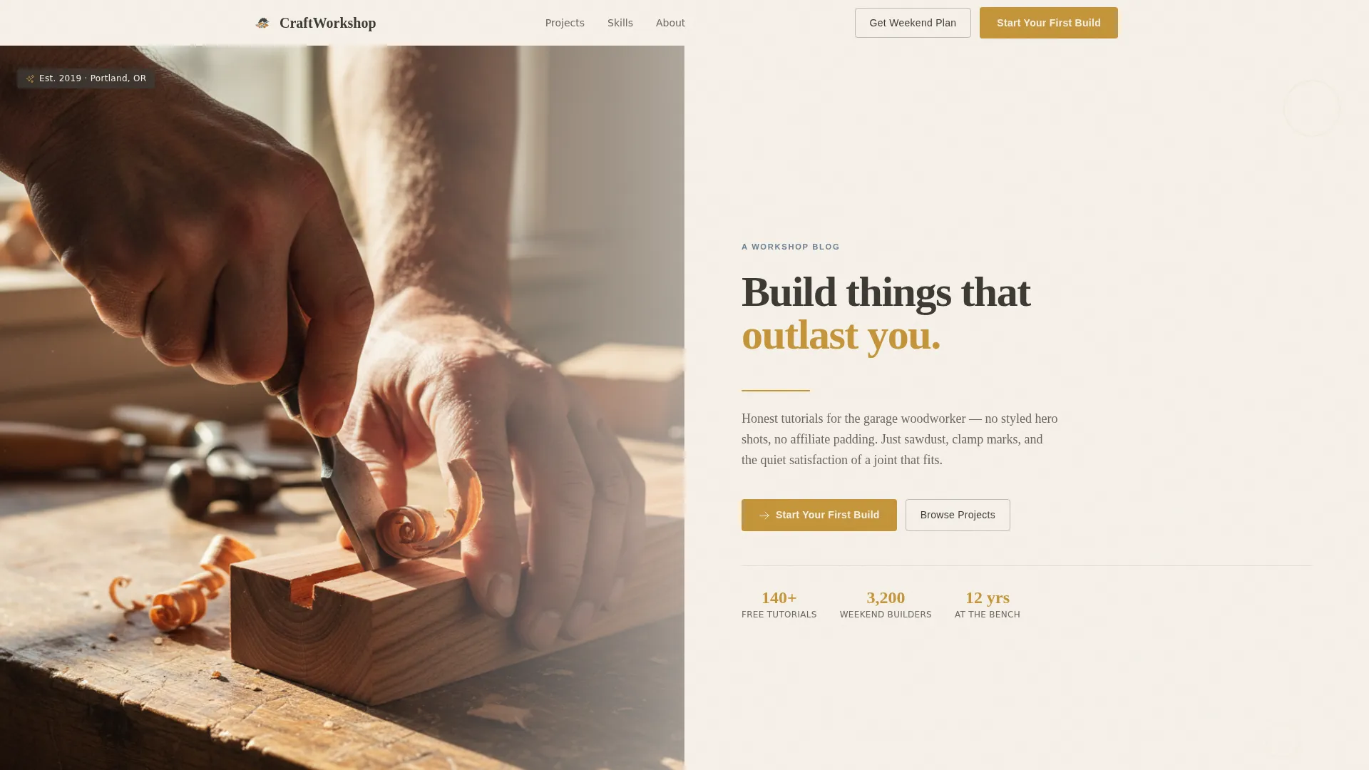
- Half-page hero with a cinematic photo split and mission statement in large serif type
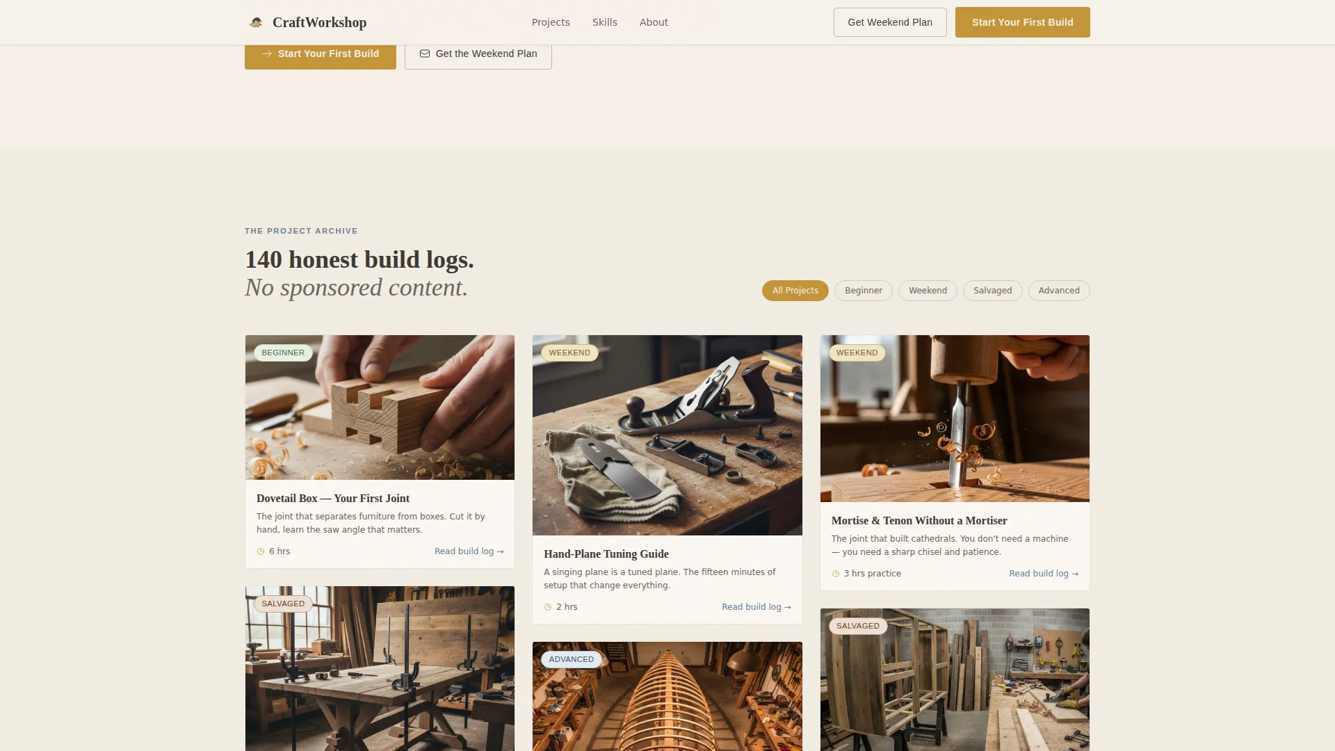
- Masonry project grid with hover-reveal card titles and build-time estimates
- Founder's letter section, floating amber call-to-action button, and a single-field email capture
Feature list
This section covers the core built-in capabilities of the Craftwork template, drawn directly from its design and structural brief.
Half-Page Cinematic Hero
The header splits the viewport in two. The left half holds a close-up photograph framed at a shallow depth of field, showing weathered hands mid-task with natural raking window light. The right half carries the blog's mission statement in large, unhurried serif type set against a parchment background with a hand-drawn rule beneath it.
Masonry Project Grid
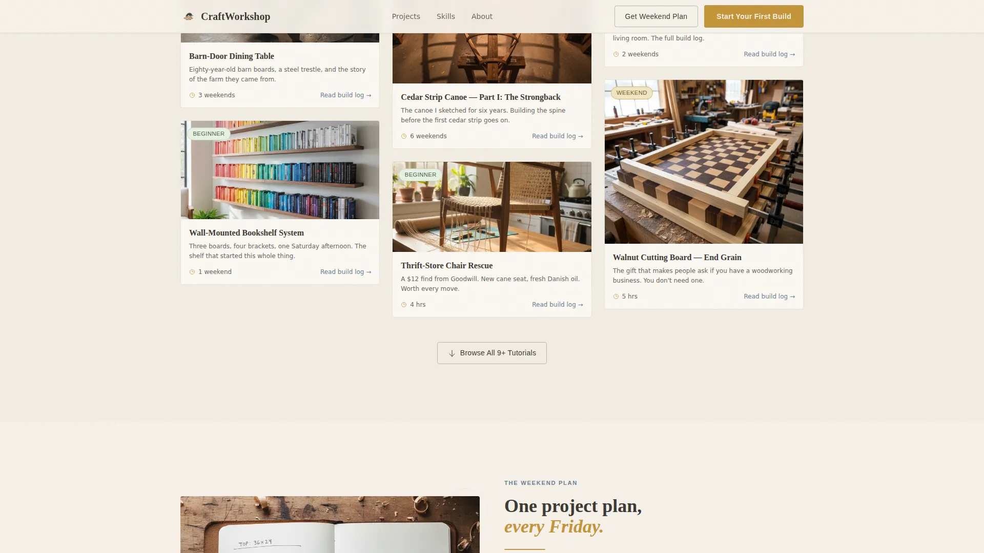
Project cards stack at varying heights like shelves in a real workshop. Each card shows a raw, mid-process thumbnail, and hovering reveals the project title and estimated build time. Cards are arranged to shift gradually from beginner to advanced as the visitor scrolls deeper into the page.
Handwriting-Style Founder's Letter
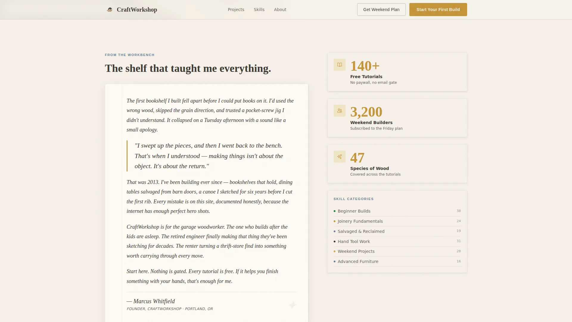
A short personal letter sits directly below the hero. It is styled to feel handwritten and tells the story of the first project that went wrong and the moment making became a calling. The primary call to action, "Start Your First Build," appears naturally inside this letter.
Skills Sidebar with Category Tracking
A pinned sidebar quietly organizes project categories as the visitor scrolls. It behaves like a table of contents in an old reference manual, using denim blue labels to surface skill levels without interrupting the reading flow.
Floating Amber Call-to-Action Button
A floating button styled in workshop amber appears after the visitor has scrolled through three depth thresholds. It links to the curated beginner pathway and stays visible without blocking the content grid below it.
Single-Field Email Capture
The "Get the Weekend Plan" section uses one input field to collect email addresses. In exchange, subscribers receive a free PDF project plan delivered each Friday. The form appears after the content grid, so readers already trust the page before they see the ask.
Page sections overview
| Section | Purpose |
|---|---|
| Half-Page Hero | Introduces the blog's mission with a split photo and serif statement |
| Founder's Letter | Builds personal trust through a story of the first failed project |
| Masonry Project Grid | Displays tutorials by skill level with hover-reveal details |
| Weekend Plan Capture | Collects one email field in exchange for a free Friday PDF |
| Skills Sidebar | Organizes project categories as a persistent scroll companion |
| Floating Action Button | Keeps the beginner pathway reachable at any scroll depth |
| Single-Row Footer | Closes the page with a clean, linear link structure |
Design & branding system
The visual identity follows a Heritage and Story theme. Every design choice references the physical workshop: aged paper, pencil marks, warm bulb light, and worn tool handles. Nothing feels digital-native or sterile.
- Parchment white (#F5F0E8) dominates the background; worn graphite (#3D3A35) anchors all headlines and body text in a hand-set serif style using Crimson Text
- Muted workshop amber (#C4953A) activates hover states, pull-quotes, and the floating button; faded denim blue (#6B7F94) labels skill tags and category links without competing for attention
- DM Sans handles interface labels and form fields, keeping utility elements clean against the editorial warmth of the serif body copy
Mobile & speed optimization
The template is designed desktop-first, with the masonry grid and sidebar built for wide viewports. Responsive behavior ensures the layout adapts cleanly on smaller screens without losing its visual character.
- The masonry grid reflows for narrower viewports so cards remain readable on tablets and phones
- Scroll-linked reveals use Intersection Observer, which activates animations only when elements enter the viewport
- CSS scroll-behavior handles smooth transitions without relying on heavy JavaScript libraries
How this template helps you convert
Craftwork is structured around a generosity-first conversion model. Visitors receive real value before any subscription or pathway prompt appears, which builds the trust that drives action.
- The content grid is fully open with no gate, so every project card links directly to a full tutorial and proves the blog's value before any ask is made
- The floating amber button and the inline call to action inside the founder's letter both point to the "Start Your First Build" beginner pathway, giving motivated visitors a clear next step at two natural moments
- The single-field email capture appears after the grid, where subscribers have already seen enough to want more, making the Friday PDF plan feel like a reward rather than a trade
Other information about this template
This template is part of a broader family of heritage-themed blog and editorial layouts suited for personal content brands in the maker and craft space.
- Template style: Masonry and Pinterest-style grid layout
- Creative direction: Vision and Mission, story unfolds before the offer
- Color system: Cloud Canvas, a warm editorial palette based on aged materials
- Header concept: Half-Page Photo plus Text, cinematic and editorial in equal measure
- Animation level: Medium, scroll-linked card reveals and hover states keep the page lively without feeling overbuilt
- Footer pattern: Linear Single-Row, a minimal close that keeps focus on the content above
Theme
Heritage & Story
Creative direction
Vision & Mission
Color system
Cloud Canvas
Style
Masonry/Pinterest
Direction
Content/Resource
Page Sections
Half-page Cinematic Hero Split
Masonry Project Grid with Hover Reveals
Handwriting-style Founder's Letter
Pinned Skills Sidebar
Floating Amber Action Button
Single-field Email Capture
Related questions
Who is this landing page template designed for?
Can I use this template without woodworking content?
Is the content grid gated or locked behind a signup?
How does the floating call-to-action button behave?
What typography does this template use?



