Creator Economy Newsletter Specialist Blog Website Template
Byline is a horizontal scroll landing page template built for creator economy interview newsletters. It uses a cinematic dark editorial style, an GSAP-powered gallery walk, and a chapter-opening hero to pull visitors through a curated sequence of creator profiles. The goal is simple: give away the atmosphere and the first paragraph, then earn the email signup.
by Rocket studio
Quick summary
Byline is a desktop-first horizontal scroll landing page for a weekly creator interview newsletter. The template uses a cinematic dark color system, an editorial magazine layout, and a gallery-walk scroll pattern to move visitors through creator profiles before asking for an email signup. Each section earns trust before the call to action appears.
Who this template is for
This template is built for newsletter publishers who cover the creator economy and need a landing page that feels as serious as the writing inside. It suits editorial-minded operators who want design to do some of the selling.
- Newsletter writers launching or relaunching a creator-focused publication
- Podcast hosts and videographers building an email list around interview content
- Mid-tier creators who want a professional home for their editorial brand
What problem this template solves
Most newsletter landing pages look like signup forms with a headline bolted on. That design fails when the product is a high-craft editorial newsletter, because the page gives visitors nothing to believe in before asking for their inbox.
- Readers need to experience the writing voice before they commit to subscribing
- Generic templates flatten editorial identity and make every newsletter look the same
- A weak first impression loses visitors who would have subscribed if the page had shown them more
What you get with this template
The template delivers a fully structured single-page layout built around a horizontal scroll gallery and a cinematic dark visual system. Every section is composed to feel like a page inside a printed magazine.
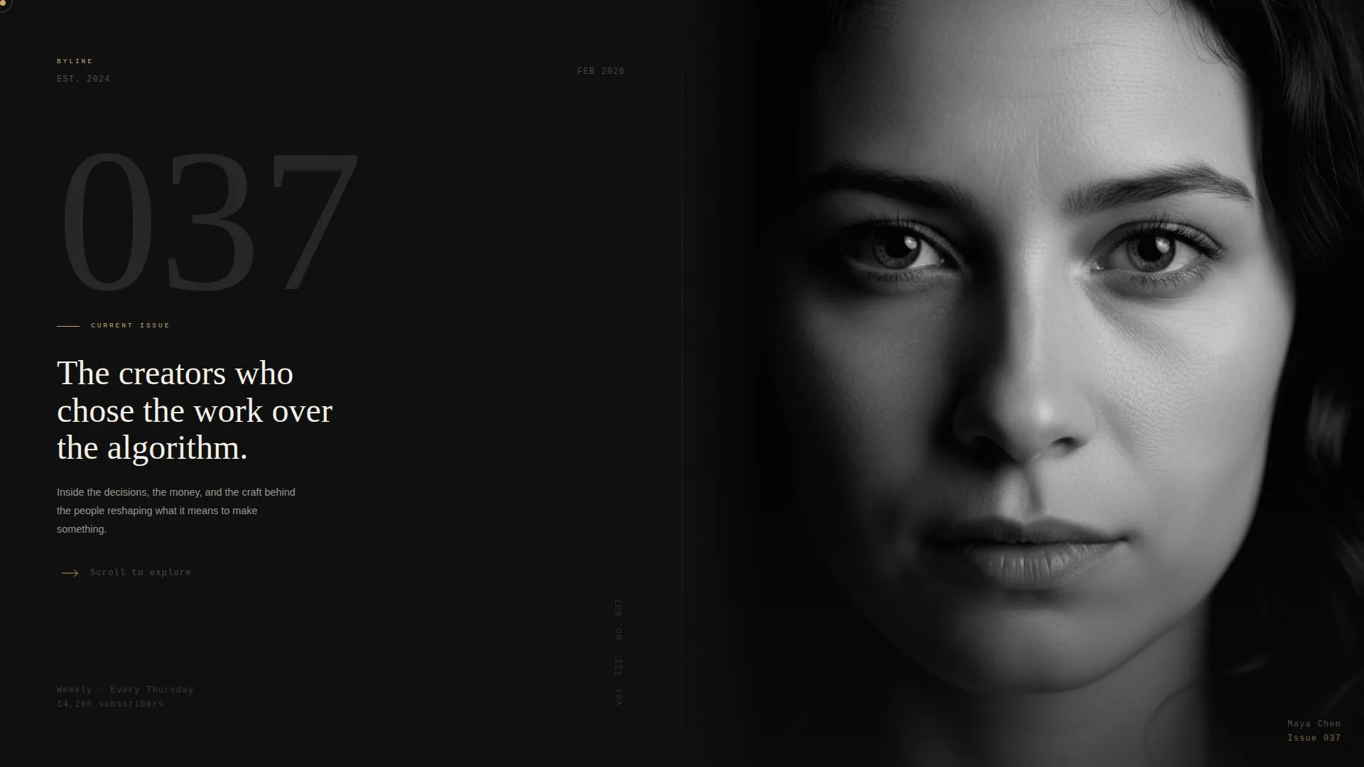
- A chapter-opening hero spread with a serif issue number, a one-line thesis, and a cropped black-and-white portrait
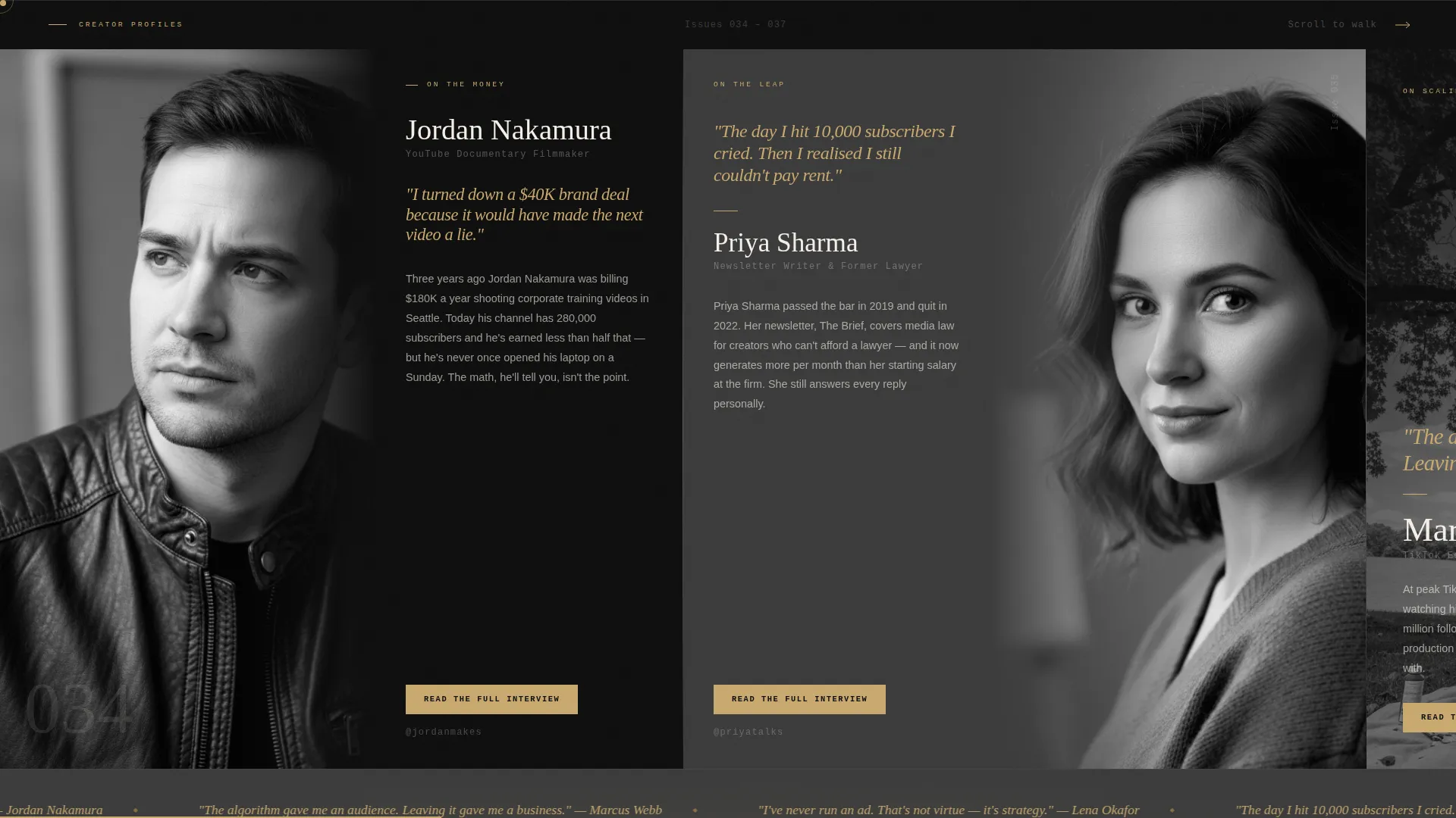
- A horizontal GSAP-powered gallery of creator profile panels, each with a portrait, an amber pull quote, and an excerpt
- A scrolling amber marquee strip, an archive proof section, a single-field email call to action, and a minimal footer
Feature list
Chapter-Opening Hero Spread
The hero fills the full viewport as a two-panel spread. The left side holds a large serif "Issue 037" label and a one-line thesis in cream type on pure black. The right side holds a tightly cropped black-and-white portrait with visible grain. There is no navigation, so the visitor's first feeling is that the story has already started.
Horizontal Scroll Gallery Walk
Four creator profile panels scroll laterally using GSAP-driven horizontal scroll. Each panel is composed differently: one tight crop, one wide environmental shot, one mid-motion frame. Thin vertical dividers appear between panels like page edges, reinforcing the tactile book metaphor. The sequence moves from emerging creators to established names, building narrative momentum.
Amber Pull Quote Marquee
A full-width scrolling text strip sits between gallery sections and displays pull quotes in the muted spotlight amber accent color. The marquee demonstrates editorial voice and keeps the page feeling alive as visitors scroll.
Gated Profile Excerpts with Email Signup
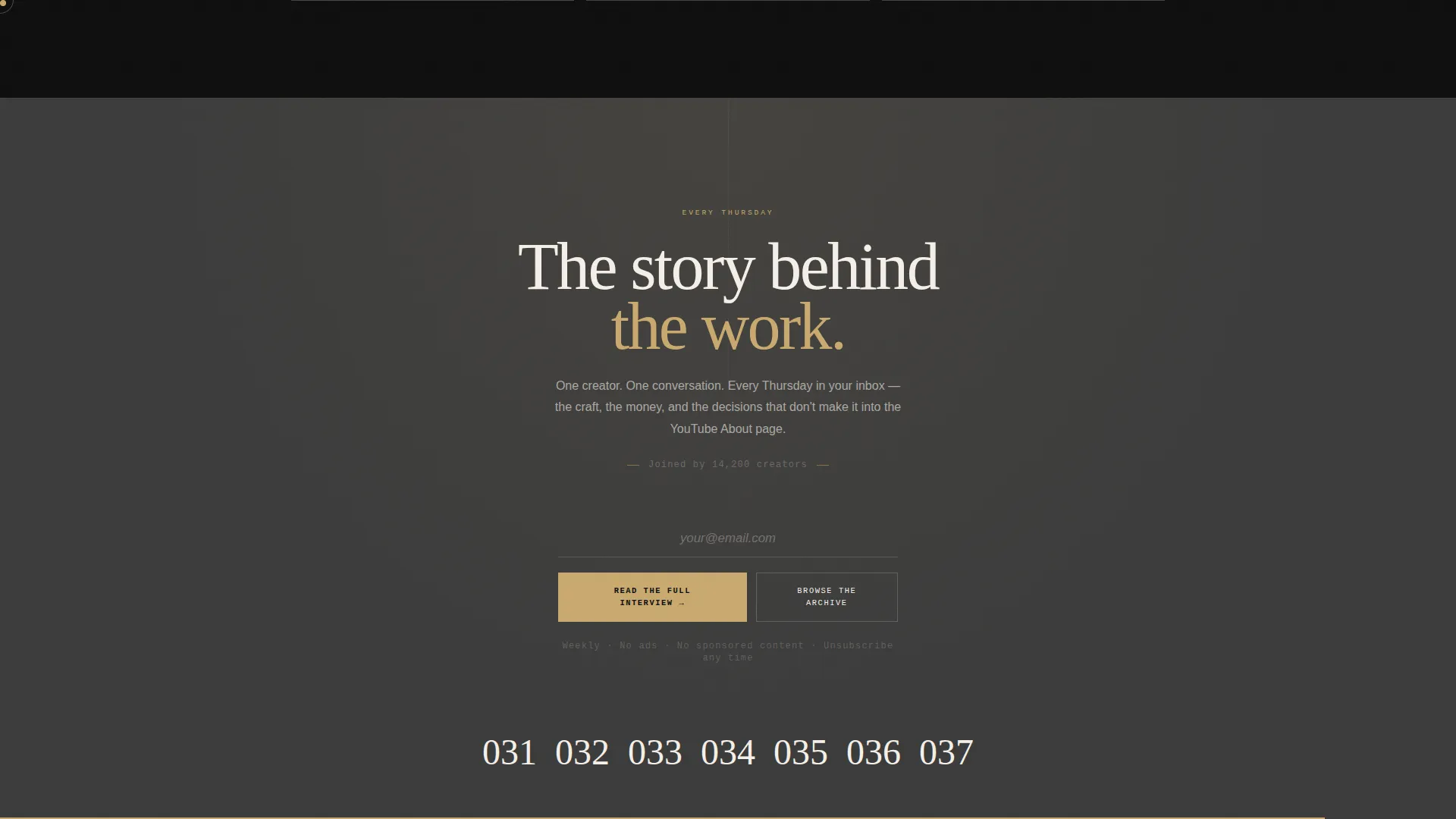
Each creator profile panel shows the first paragraph of the interview and a "Read the Full Interview" call to action. Clicking that button triggers an inline email gate with a single email field. A secondary "Browse the Archive" path offers lower-friction sampling for visitors who are not ready to commit.
Grayscale to Color Hover States
Creator portraits load in grayscale and shift to their natural tones on hover. This interaction is handled through GPU-accelerated CSS transitions driven by GSAP, giving the page a gallery-exhibition quality where each creator is revealed as the visitor's attention lands on them.
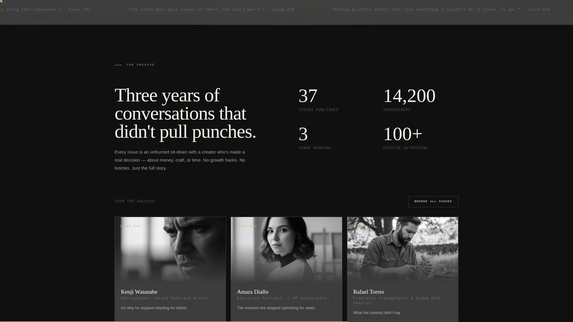
Archive and Social Proof Section
A dedicated section surfaces the newsletter's depth: issue count, subscriber number, and an archive browse path. This section converts skeptical visitors by showing that the publication has a history worth exploring before they decide to subscribe.
Page sections overview
| Section | Purpose |
|---|---|
| Hero chapter spread | Open with issue identity and featured portrait |
| Horizontal profile gallery | Walk visitors through four creator profiles |
| Pull quote marquee | Demonstrate editorial voice in motion |
| Archive proof section | Show publication depth and subscriber count |
| Email signup call to action | Gate full interviews behind a single email field |
| Minimal footer | Provide social links and copyright only |
Design & branding system
The visual identity follows an editorial magazine theme built on a cinematic dark color system. The palette is described as a 35mm contact sheet held up to a desk lamp: intimate analog warmth inside digital darkness, where every amber accent feels like a lamp illuminating a single face.
- Colors: deep darkroom black (#0D0D0D) for backgrounds, warm newsprint cream (#F5F0E8) for body type, muted spotlight amber (#C9A96E) for pull quotes and hover states, and quiet graphite (#3A3A3A) for secondary surfaces
- Typography: DM Serif Display for display headlines and chapter numbers, Manrope for body copy and user interface elements, JetBrains Mono for labels and metadata
- Texture: 35mm grain overlays on portraits, grayscale-to-color hover transitions, and staggered reveal animations reinforce the darkroom analog aesthetic throughout
Mobile & speed optimization
The template is built desktop-first, with the horizontal scroll gallery designed as the primary experience on wide screens. A mobile fallback converts the lateral scroll into a vertical stack so the content remains navigable on smaller devices.
- GPU-accelerated CSS transforms power the GSAP scroll and hover animations to keep motion smooth on desktop
- Images are lazy-loaded so that off-screen portrait panels do not block the initial page render
- Server Components handle static content sections, reducing the amount of JavaScript needed for non-interactive parts of the page
How this template helps you convert
The page is structured as a content destination first and a signup form second. Visitors earn the right to be asked for their email only after the template has already proved the newsletter is worth it.
- The hero and gallery give away the atmosphere, the photography, and the first paragraph of every profile, building genuine desire before the call to action appears
- The "Read the Full Interview" gate triggers at the exact moment curiosity peaks, keeping the ask small: one email field, no extra fields, no friction
- The "Browse the Archive" secondary path catches visitors who are not ready to commit but want to sample more, giving them a lower-stakes route that still moves them closer to subscribing
Other information about this template
This template was built specifically for the creator economy newsletter niche, where editorial identity is a product differentiator. A few practical notes for publishers considering this template:
- The layout is designed around a weekly publication cadence, so the hero "Issue 037" label can be updated each week to reflect the current issue
- The horizontal scroll pattern is intentionally desktop-first; the mobile vertical fallback preserves readability but the full gallery-walk experience is designed for larger screens
- The footer follows a minimal pattern with social links and copyright only, keeping the exit experience as clean as the entry
- The template uses DM Serif Display, Manrope, and JetBrains Mono as its type system; all three are available as web fonts and can be substituted if a publisher has existing brand typography
- Cursor follower animation and staggered reveal effects are included in the GSAP animation layer, contributing to the gallery-exhibition feeling across the full page
Theme
Editorial Magazine
Creative direction
Gallery Walk
Color system
Cinematic Dark
Style
Horizontal Scroll
Direction
Content/Resource
Page Sections
Chapter-opening Hero Spread
GSAP Horizontal Scroll Gallery
Gated Excerpts with Email Signup
Amber Pull Quote Marquee
Grayscale to Color Portrait Hover
Archive and Social Proof Section
Related questions
Who is this landing page template built for?
Can I update the issue number and featured portrait each week?
Does the horizontal scroll work on mobile devices?
How does the email gate work on each creator profile?
Can I replace the included fonts with my own brand typography?



