Cross-Stitch & Embroidery Content Blog Website Template
Stitch is a hub-and-spoke landing page template built for cross-stitch and embroidery newsletters. It guides visitors through four content pillars, Patterns, Techniques, Studio Visits, and Community, before delivering them to a single email signup. The Atelier Studio aesthetic, Japanese Zen color system, and custom illustration header make it feel like a handmade editorial destination, not a generic form page.
by Rocket studio
Quick summary
Stitch is a single-page, anchor-nav landing page template designed for a cross-stitch and embroidery newsletter. It organizes content across four pillar sections, earns trust through curated previews and social proof, and funnels every visitor toward one frictionless click-through to an email signup. The visual identity is deliberate, warm, and handmade in character.
Who this template is for
This template suits anyone launching or growing a craft-focused newsletter with a distinct editorial voice. It works especially well when your audience values depth over trend and your brand leans handmade and considered.
- Cross-stitch and embroidery newsletter creators who want a content-rich, subscriber-focused landing page
- Independent stitch designers and embroidery educators building a weekly reader community
- Slow-living and maker-culture publishers seeking an editorial aesthetic that signals craft seriousness
What problem this template solves
Most newsletter landing pages ask visitors to subscribe before they understand what they are joining. That creates friction and low conversion, especially for niche craft audiences who want to trust the voice first.
- Visitors leave without signing up because there is no content context to build desire
- A generic form page cannot communicate the texture and depth of a curated editorial newsletter
- Four isolated content pillars are hard to navigate without a clear, anchor-driven page structure
What you get with this template
You get a fully structured, click-through landing page with five distinct sections, an anchor navigation system, and a layered social proof setup. Every section is built to preview content and build trust before the subscriber button appears.
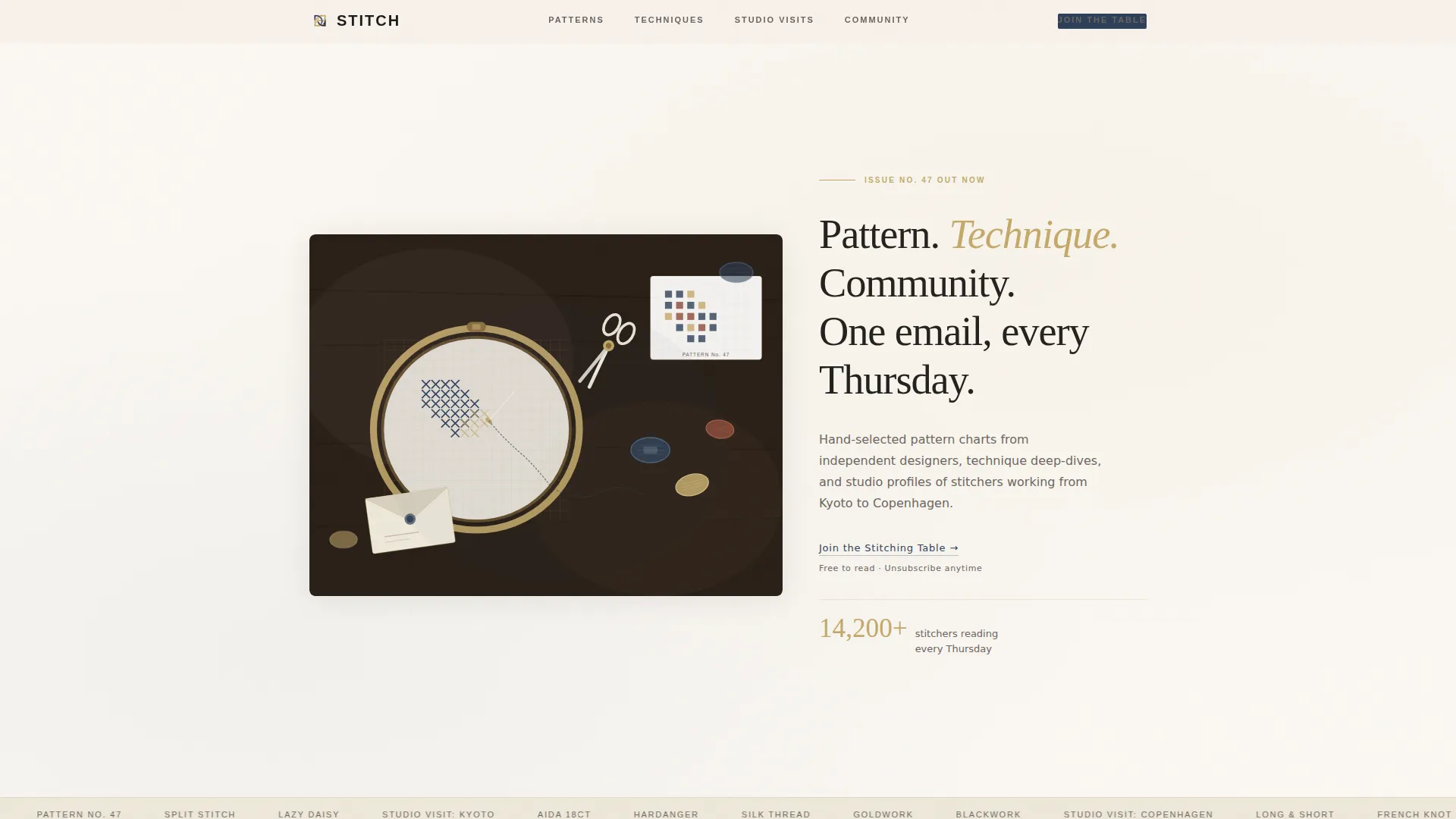
- Hero section with a custom ink-and-watercolor worktable illustration and an asymmetric editorial headline layout
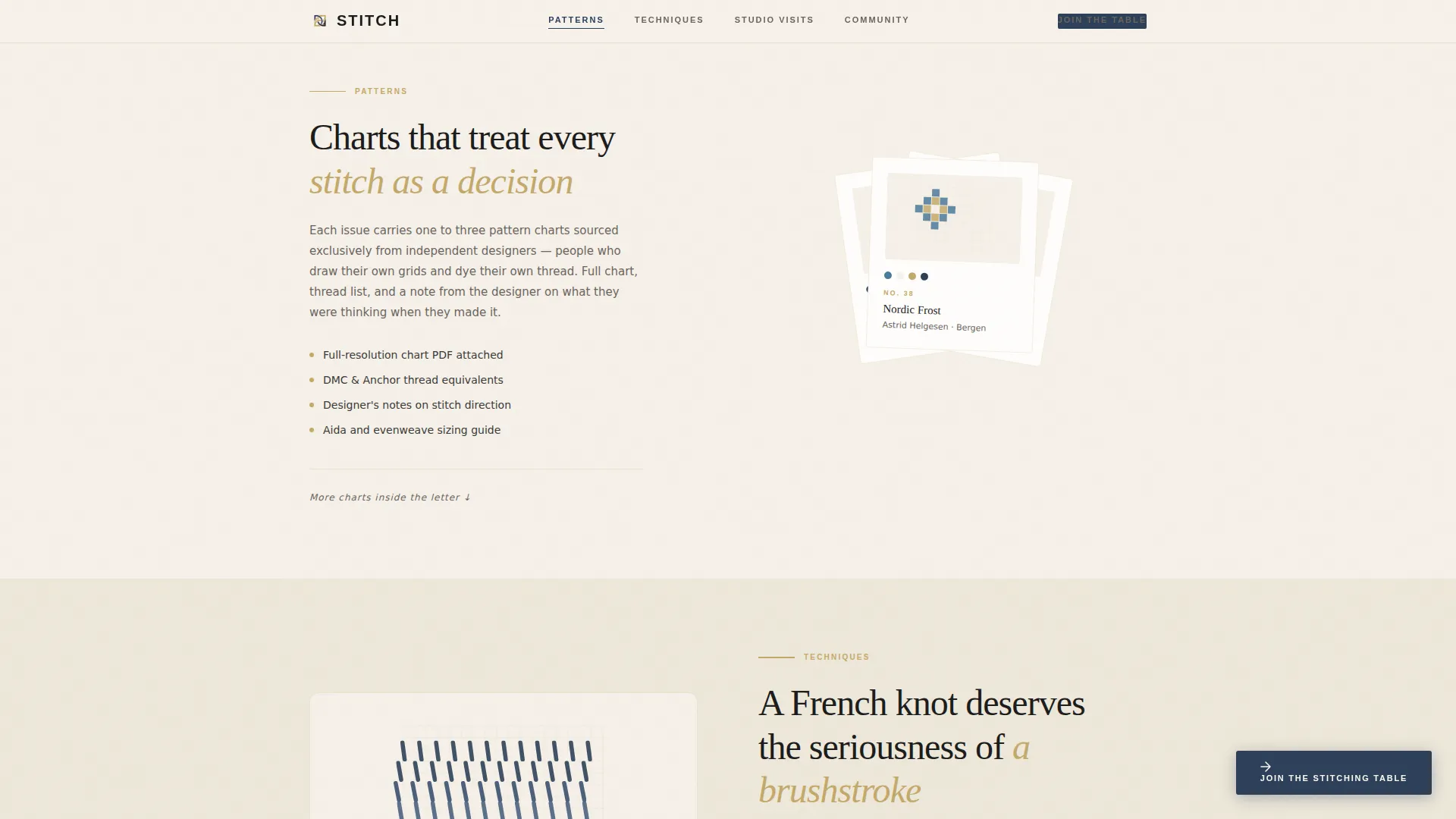
- Four anchor-nav content spokes covering Patterns, Techniques, Studio Visits, and Community with distinct visual treatments per section
- Social proof block combining a live subscriber count, rotating reader testimonials, and a past-issue email mockup
Feature list
This template is built around a specific set of features drawn directly from the source brief. Each one serves the goal of converting curious visitors into weekly readers.
Anchor Navigation Hub-and-Spoke Layout
The page uses a fixed anchor navigation bar that links directly to each content pillar, Patterns, Techniques, Studio Visits, and Community. Active nav states are highlighted in indigo dye, making orientation effortless as the visitor scrolls through the page.
Custom Ink-and-Watercolor Hero Illustration
The header features a top-down worktable scene rendered in a loose ink-and-watercolor style. Scattered floss skeins, a mid-stitch aida cloth, and a sealed envelope compose an asymmetric layout. The headline sits on the open right half in sumi ink.
Fixed Scroll-Triggered Call-to-Action Button
A fixed indigo subscribe button emerges on scroll after the first spoke section. It stays present without interrupting early content browsing. There are no form fields on the page, the button opens the signup flow in a single click.
Animated Satin-Stitch Technique Card
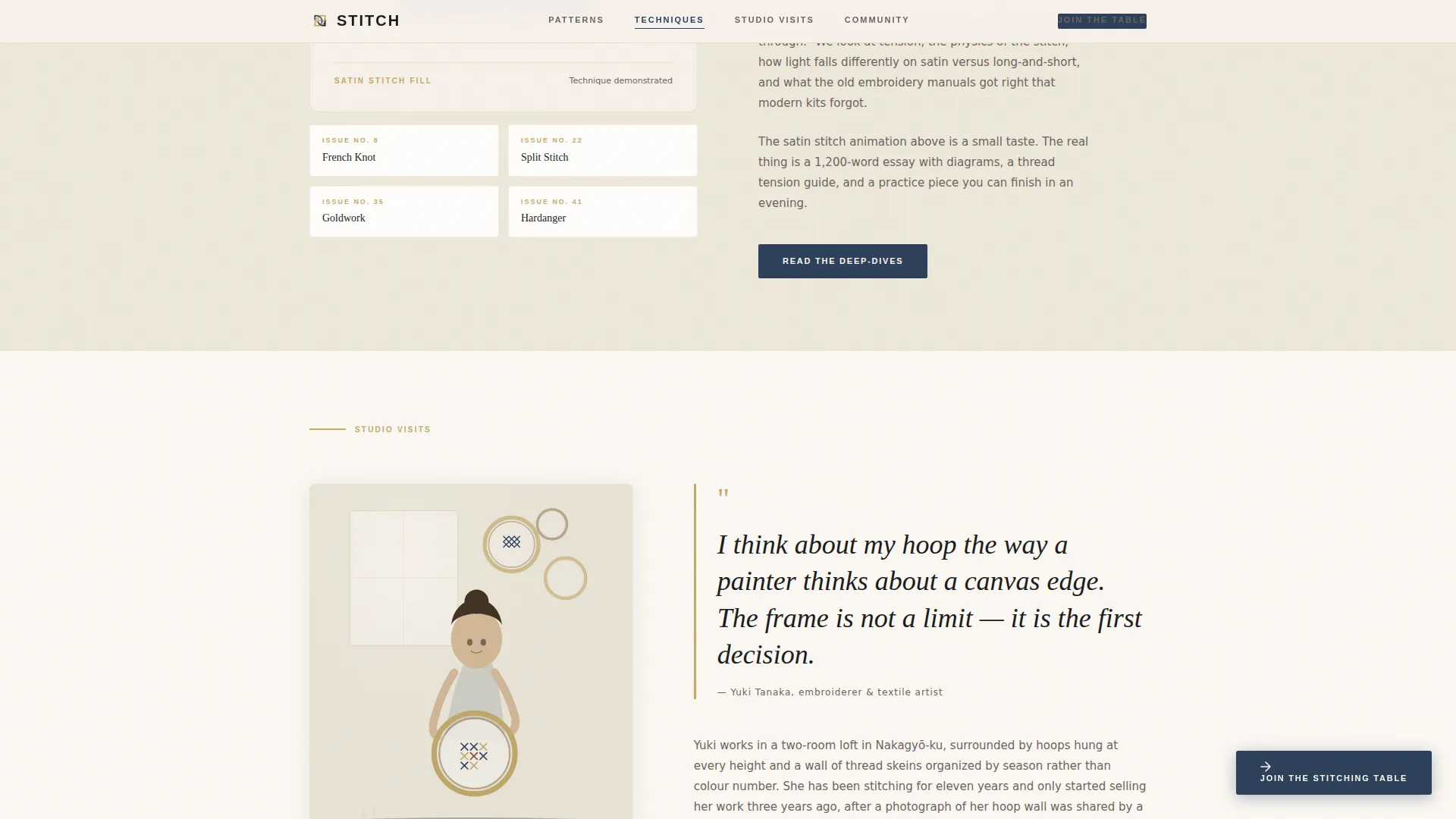
The Techniques section includes a CSS stitch-build animation that shows a satin-stitch fill building row by row. Technique cards are formatted in an accordion-style layout, letting visitors expand or collapse content at their own pace.
Rotating Testimonials and Social Proof Block
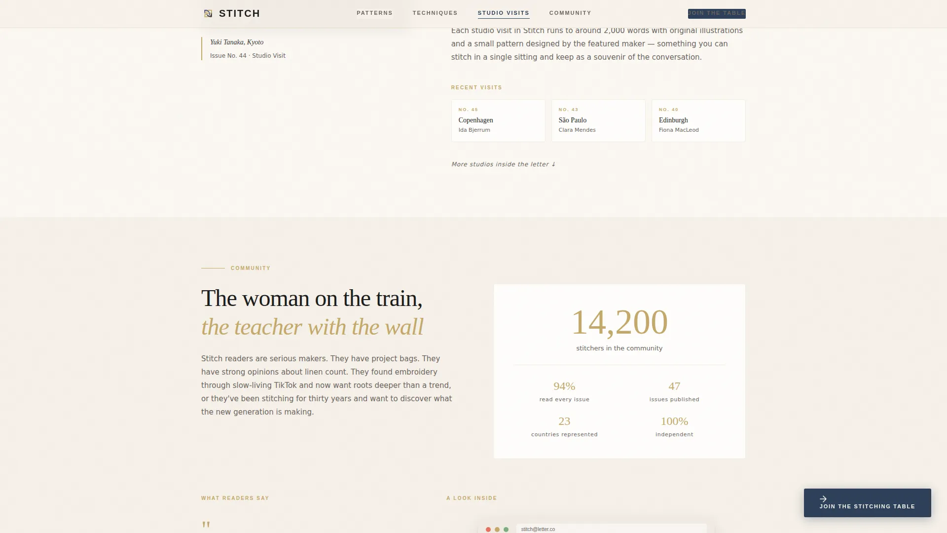
The Community section displays rotating reader testimonials where each quote names a specific pattern. A live subscriber count appears in tatami gold. A realistic past-issue email mockup gives visitors a concrete preview of what lands in their inbox.
Curated Content Spoke Sections
Each of the four pillar sections has a distinct visual treatment. Patterns fans three chart previews like fabric swatches. Studio Visits opens with a portrait-style illustration and a pull quote. Every section closes with a quiet nudge toward the newsletter signup.
Page sections overview
| Section | Purpose |
|---|---|
| Hero Worktable | Sets editorial tone and introduces the primary call to action as a soft text link |
| Anchor Navigation Bar | Lets visitors jump directly to any content pillar and tracks scroll position |
| Patterns Spoke | Displays three chart previews fanned as fabric swatches to preview curation depth |
| Techniques Spoke | Shows an animated satin-stitch build and accordion-style technique deep-dive card |
| Studio Visits Spoke | Presents a portrait illustration with a pull quote to humanize the editorial voice |
| Community and Past Issue | Combines testimonials, subscriber count, email mockup, and the final call to action |
| Footer | Ultra-minimal horizontal layout with essential links and no visual clutter |
Design & branding system
The design follows an Atelier Studio aesthetic shaped by a Japanese Zen color system. The result is a page that feels deliberate and warm without becoming precious or over-designed.
- Four-color palette: unbleached linen (#F5F0E8) for backgrounds, sumi ink (#1C1C1C) for body text, tatami gold (#C4A96A) reserved for dividers, icon strokes, and hover states, and indigo dye (#2D4059) used only for links, active nav states, and the subscribe button
- Typography pairs Fraunces for display headlines with DM Sans for body copy and user interface elements, creating editorial contrast between expressive and functional text
- No photography anywhere on the page, the custom illustration and restrained palette signal a handmade, non-stock world throughout
Mobile & speed optimization
The template is built desktop-first to match a newsletter audience that skews toward desktop and tablet reading. Mobile collapse is handled gracefully so the core experience holds at smaller sizes.
- Scroll-triggered reveals and the fixed call-to-action button are built with minimal JavaScript, keeping the interaction layer light
- Server Components handle all static content sections, reducing the interactive bundle to only what scroll behavior requires
- The anchor navigation collapses cleanly on smaller screens so pillar navigation remains usable without horizontal overflow
How this template helps you convert
Every layout decision on this page is aimed at one outcome: moving a curious visitor to click the subscribe button. The page earns that click through content before it asks for anything.
- The four content pillar sections show real editorial depth before the fixed call-to-action button fully appears, so visitors arrive at the signup moment already informed and interested
- The social proof block combines three independent trust signals, a specific subscriber count in tatami gold, named-pattern testimonials, and a visible past-issue mockup, to reduce hesitation at the final click
- The frictionless click-through model removes all form fields from the landing page itself, so the only action a visitor needs to take is one tap on the indigo button
Other information about this template
This template is part of a broader set of editorial and newsletter landing page designs. A few additional details are worth noting for buyers evaluating fit.
- The template style is Hub and Spoke with Anchor Navigation, suited to newsletters with multiple distinct content pillars
- The creative direction follows a Curated Collection approach, meaning sections feel like browsing a gallery rather than scanning a sales page
- The header concept uses a Custom Illustration rather than photography, which makes it especially appropriate for handmade, craft, and independent maker brands
- The click-through landing page direction means no email form is embedded on the page, the template is designed to connect to an external newsletter platform signup flow
- The marquee text animation and scroll-triggered section reveals add medium-level motion to the page without requiring heavy scripting
Theme
Atelier Studio
Creative direction
Curated Collection
Color system
Japanese Zen
Style
Hub & Spoke (Anchor Nav)
Direction
Click-Through
Page Sections
Anchor Navigation Hub-and-spoke Layout
Custom Ink-and-watercolor Hero Illustration
Fixed Scroll-triggered Subscribe Button
Animated Satin-stitch Technique Card
Rotating Testimonials and Social Proof Block
Curated Content Spoke Sections
Related questions
Does this template include a built-in email signup form?
Can I change the color palette to match a different brand?
What font pairing does this template use?
Is this template suitable for a new newsletter with few subscribers?
How many sections does this landing page include?



