Cinematic Dark Mobile Dev Newsletter Landing Page
Curate is a cinematic dark editorial landing page template built for mobile development curated newsletter creators. It combines a collage-style scrapbook header, a manifesto scroll, a three-question archetype quiz, and a sample issue spread into one cohesive single-page flow. The design uses deep black, warm cream, and terminal green to feel like a Criterion Collection title card crossed with a midnight code editor.
by Rocket studio
Quick summary
Curate is a single-page editorial landing page template designed to convert skeptical senior engineers into newsletter subscribers. It opens with a torn-fragment collage header, unfolds a typographic manifesto, runs a three-question diagnostic quiz, and closes with a personalized email capture. Every section is crafted to prove editorial taste before asking for anything.
Who this template is for
This template is built for creators who publish highly curated technical content and need a landing page that earns trust before asking for a sign-up. It suits people who understand that their audience is time-poor, skeptical, and allergic to generic aggregation.
- Mobile development newsletter editors who curate links for senior iOS and Android engineers
- Indie app makers or solo developers launching a paid or free dispatch for fellow builders
- Engineering leads or technical writers who want a polished editorial presence for a niche weekly send
What problem this template solves
Most newsletter landing pages look like form-first funnels. They list benefits, drop a subscriber count, and beg for an email. That approach fails with senior engineers who have been burned by low-signal aggregation before. This template solves the trust deficit by putting proof ahead of the pitch.
- Skeptical engineers scroll past generic benefits because nothing demonstrates actual editorial judgment
- Creators waste sign-ups by showing a form before the reader understands the value
- A flat landing page cannot communicate the craft, selectivity, or personality behind a curated product
What you get with this template
You get a fully structured, single-page editorial landing page with five distinct content zones, each doing specific conversion work. The page is designed desktop-first, with a strong mobile fallback, and prioritizes scroll-driven reveal animations to build narrative momentum.
- A collage scrapbook header with oversized serif display type and layered artifact fragments
- A manifesto scroll section with alternating pull-quotes and annotated link previews
- A three-question quiz with archetype reveal, personalized preview, and email capture form
Feature list
A paragraph introducing the feature list is included here. The features below represent the core interactive and design capabilities built into this template, drawn directly from the editorial and quiz-driven brief.
Collage Scrapbook Header
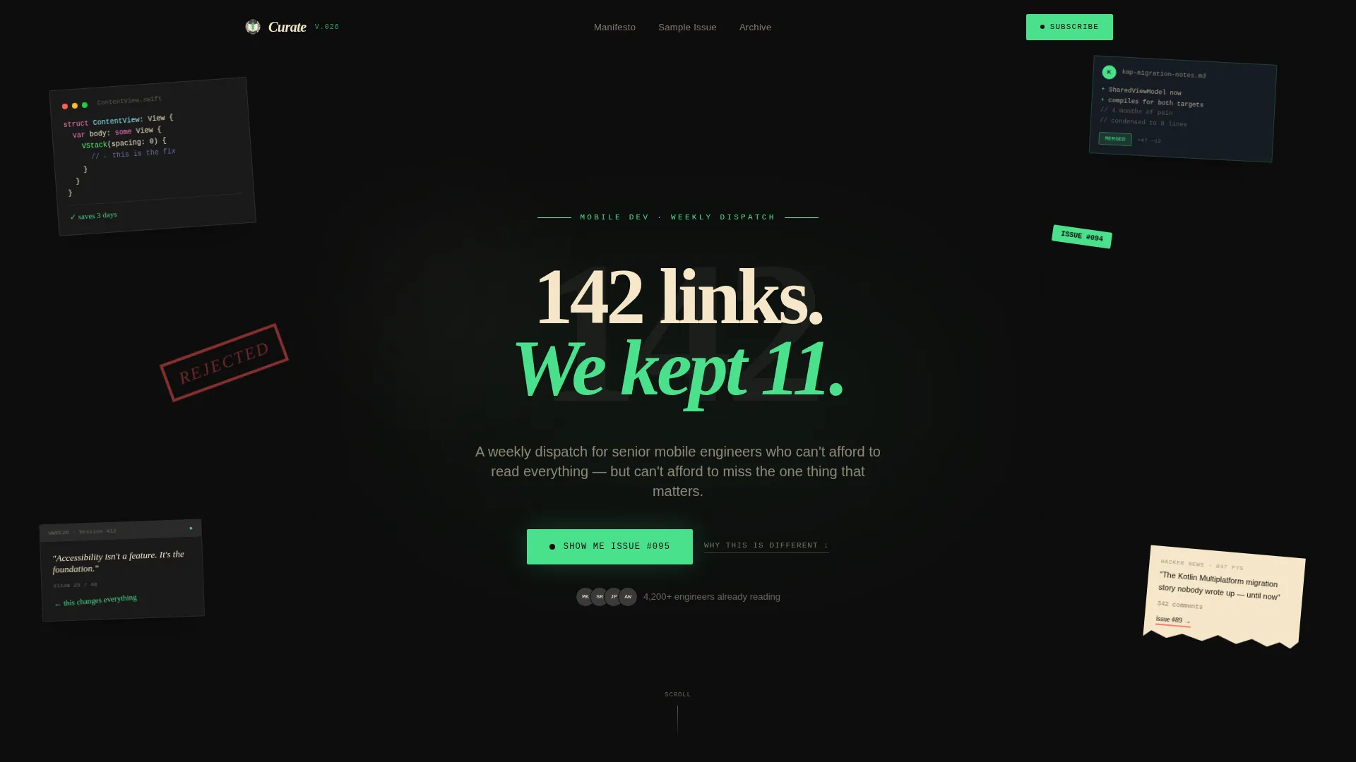
The header layers torn content fragments at slight rotations over a deep black canvas: a code snippet with syntax highlighting, a hand-circled conference slide, a pull request screenshot, and a handwritten annotation. A single oversized serif headline cuts through the collage. There is no hero image because the artifacts are the visual statement.
Manifesto Scroll Section
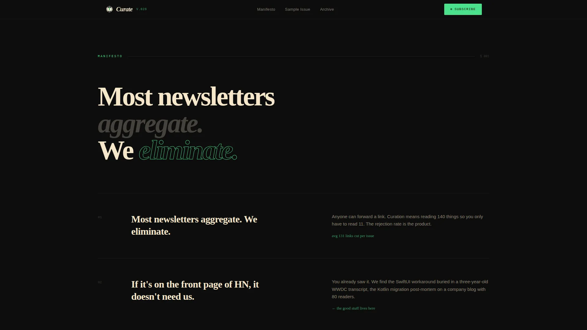
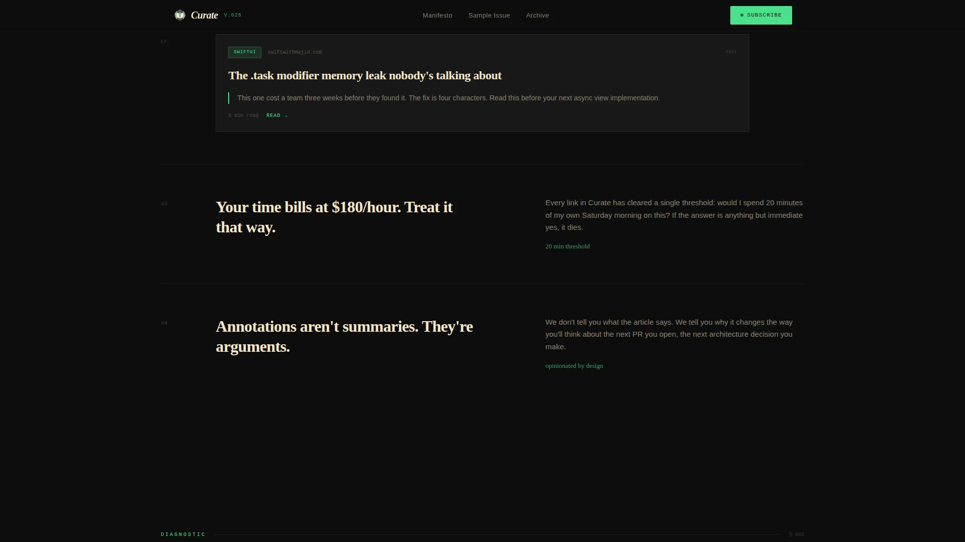
This section opens with a bold typographic declaration and then reveals editorial principles on each scroll beat. Pull-quotes alternate with single curated link examples and handwritten-style annotations. The rhythm accelerates from principle to proof to sample issue, building the case that curation is a craft.
Three-Question Archetype Quiz
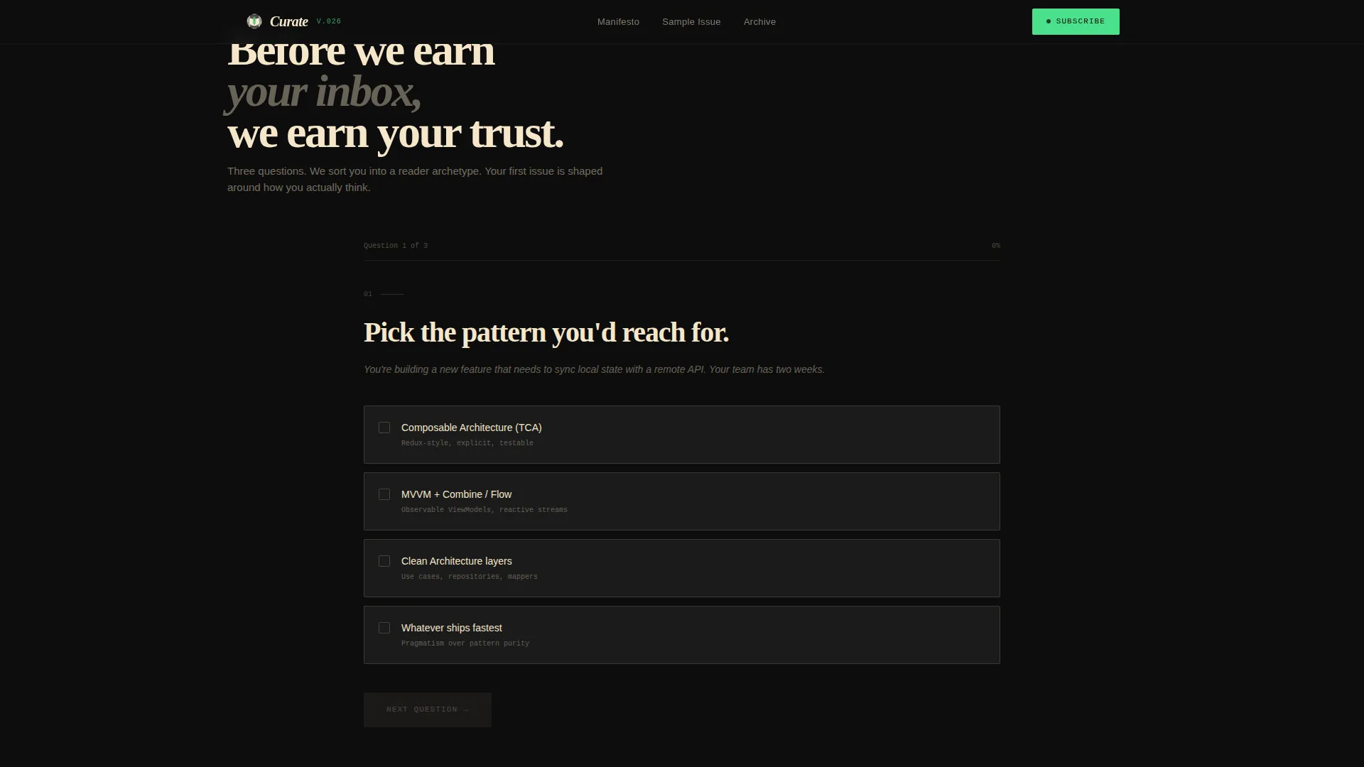
Before the email field appears, visitors answer three diagnostic questions covering code architecture preference, industry awareness, and their current information habits. Results sort them into one of three reader archetypes: The Deep Diver, The Skimmer, or The Team Lead. Each archetype gets a personalized preview of their first issue.
Sample Issue Magazine Spread
The page includes a full magazine-spread rendering of a sample issue with annotated links, rendered in the editorial dark color system. It gives readers concrete proof of the newsletter's format and quality before committing their email address.
Personalized Email Capture
The call to action reads "Show Me My First Issue" and asks only for email and primary platform choice (iOS, Android, or Cross-Platform). The quiz earns the subscription by demonstrating that the newsletter already understands how the reader thinks.
Social Proof Block
Named engineers with company and role context provide testimonial quotes alongside a visible subscriber count metric. This section reinforces trust immediately before the email form and is designed to convert readers who scrolled through the manifesto but still need a peer signal.
Page sections overview
| Section | Purpose |
|---|---|
| Hero collage header | Opens with artifact fragments and the editorial headline to establish taste immediately |
| Manifesto principles scroll | Reveals curation philosophy beat by beat to build belief before proof |
| Annotated link previews | Shows real examples of editorial judgment inline with the manifesto |
| Three-question quiz | Diagnoses reader archetype and creates a personalized first-issue preview |
| Sample issue spread | Demonstrates newsletter format as a full magazine layout |
| Social proof block | Reinforces trust with named testimonials and subscriber count |
| Personalized email capture | Converts with a platform-specific call to action after the quiz result is shown |
| Footer row | Closes with a clean linear single-row pattern |
Design & branding system
The visual identity follows an Atelier Studio editorial theme using the Cinematic Dark color system. Every color decision is intentional: black dominates the canvas, cream carries body text, terminal green marks only interactive moments, and gray separates content blocks like gutters in a printed broadsheet. Typography is set in three complementary typefaces to separate display, code, and body reading modes.
- Deep darkroom black (#0D0D0D) as the dominant background, warm lamplight cream (#F5E6C8) for all body text, developer terminal green (#4AE08C) for interactive elements and fresh issue badges, and muted film-grain gray (#3A3A3A) on card surfaces
- Fraunces serif for display headlines, JetBrains Mono for code and monospace elements, and DM Sans for body reading copy
- High-contrast deliberate negative space, with every element placed to feel typeset by hand rather than assembled by a drag-and-drop grid
Mobile & speed optimization
The template is designed desktop-first to match the primary audience of senior engineers working at a desk, but it includes a strong mobile fallback so the page holds up across all screen sizes. Animation performance is handled through CSS-first techniques to reduce JavaScript dependency.
- Scroll-linked transforms, clip-path reveals, and stagger animations are driven by CSS animations with IntersectionObserver triggering, keeping JavaScript minimal
- The quiz state machine and archetype reveal interactions are built for responsiveness, so the diagnostic flow works cleanly on smaller screens
- Desktop-first layout decisions ensure the collage header and magazine spread render with full editorial impact at wider viewports
How this template helps you convert
The page is engineered so that every section earns the next one. Nothing asks for an email before the reader has seen proof of value. The quiz is the key mechanism: it turns passive scrolling into active participation and makes the call to action feel like a reward rather than a request.
- The manifesto scroll builds belief progressively, from bold statement to specific principle to annotated proof, so readers arrive at the quiz already convinced the newsletter has taste
- The three-question quiz reveals the reader's own archetype to them, which creates a personalized stake in the outcome and makes "Show Me My First Issue" feel specific to them rather than generic
Other information about this template
This template is part of the Blog and Editorial category, specifically built for the Mobile Development Newsletter subcategory. It suits any technical newsletter creator who leads with editorial authority rather than volume. The intersection of the Manifesto creative direction, Quiz/Assessment landing-page direction, and Collage/Scrapbook header concept makes this a rare combination of storytelling and interactivity in one template.
- Template style: Editorial/Magazine with an Atelier Studio theme and Cinematic Dark color system
- The lp_direction is Quiz/Assessment, making this template distinct from standard opt-in or sales-style newsletter pages
- Well-suited for launch pages, revival issues, or repositioning campaigns where the creator wants to demonstrate taste before asking for a subscriber
Theme
Atelier Studio
Creative direction
Manifesto
Color system
Cinematic Dark
Style
Editorial/Magazine
Direction
Quiz/Assessment
Page Sections
Collage Scrapbook Header with Editorial Headline
Manifesto Scroll with Pull-quotes
Three-question Archetype Quiz
Sample Issue Magazine Spread
Personalized Email Capture with Platform Choice
Social Proof with Named Testimonials
Related questions
Can I use this template for a newsletter topic other than mobile development?
Does the quiz actually sort visitors into archetypes automatically?
What typefaces does this template use?
Is this template built for free newsletters or paid subscriptions?
How does the collage header look without a traditional hero image?



