Luxe Minimal user experience Design Newsletter Landing Page
The Curate landing page template is a luxe minimal, hub-and-spoke design built for user experience and design newsletters. It combines a dramatic didone headline over a full-bleed editorial photograph, a mosaic of past issues, pull-quote typography, and a single email sign-up form to turn senior designers into subscribers with quiet, editorial authority.
by Rocket studio
Quick summary
Curate is a minimalist landing page template crafted for design-forward email newsletters. It uses a Parchment and Rust color palette, high-contrast didone typography, and a Gallery Walk creative direction to guide visitors through five anchor-nav spokes. The primary goal is one action: email capture. Everything else earns that moment.
Who this template is for
Understanding your target audience is the starting point for great landing page design. Curate is built specifically for newsletter creators who lead with taste. It speaks the visual language that senior designers already trust.
- Senior product designers and design leads who need a daily digest that respects their attention
- Independent design consultants whose reputation is tied to staying current with craft
- Editorial newsletter publishers who want a landing page that matches the quality of their content
What problem this template solves
A landing page is often the first thing users see when they interact with your brand. For a premium design newsletter, that first impression has to hold up. Most newsletter landing pages feel like they were assembled quickly: cluttered layout, generic call to action, no editorial identity. Curate solves that directly.
- Designers distrust pages that look rushed, so Curate's restrained aesthetic signals credibility before a word is read
- Scattered page structures force visitors to work too hard, so the anchor-nav hub-and-spoke layout guides them step by step through a logical, trust-building sequence
- Generic sign-up forms convert poorly, so a single focused sign up form with one clear call to action removes all friction
What you get with this template
Curate delivers a fully structured, single-page hub-and-spoke layout. Every section has a defined purpose. Every element earns its place. You get a complete editorial landing page that grabs attention immediately and holds it through the final subscribe moment.
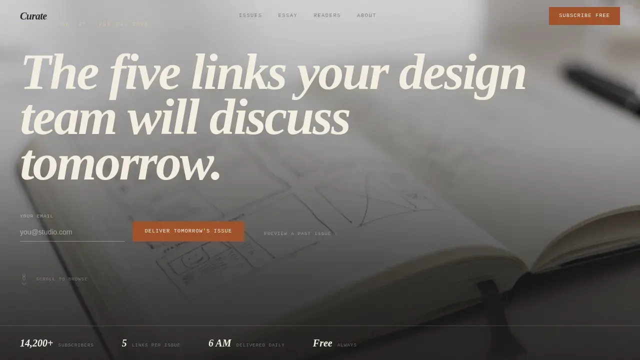
- A full-bleed cinematic hero with an 8vw Fraunces didone headline and an inline email sign up form
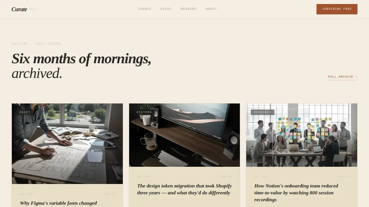
- Five anchor-nav spokes: past issues mosaic, essay excerpt pull-quote, testimonials as marginalia, how-it-works, and a fixed bottom subscribe rail
- A minimal footer following a horizontal pattern, plus a secondary path allowing visitors to preview a full past issue before committing
Feature list
This minimalist landing page template packs purposeful, prompt-backed components into every section. Each feature is designed to reduce cognitive load, reinforce value, and move visitors toward the desired action.
Cinematic Hero with Didone Headline
The hero opens with a desaturated, full-bleed desk photograph and a single oversized serif headline set at 8vw in Fraunces. The clear headline explains the primary benefit immediately. There is no animation, no parallax; just scale and editorial conviction. A slim inline email form sits directly below the headline, making the call to action impossible to miss.
Past Issues Mosaic Exhibit
The first anchor-nav spoke renders previous issue covers as minimal framed cards. Visitors hover to preview each card, turning content browsing into a tactile Gallery Walk. This section demonstrates real content quality, showing actual headlines and real typography rather than making promises. The hover-to-preview interaction is one of the key interactive elements that builds confidence before commitment.
Oversized Essay Pull-Quote Section
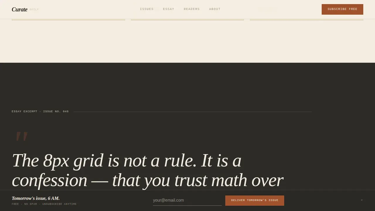
One section isolates a single essay excerpt in oversized pull-quote typography that fills the entire viewport. This is compelling content at its most direct. The visitor reads a real excerpt from a real issue and immediately understands the editorial voice. White space surrounds the quote, creating the visual balance that makes the words land harder.
Handwritten-Style Testimonials as Marginalia
Reader testimonials appear in a handwritten-style typographic treatment beside a scrolling issue mockup. Social proof presented this way feels editorial rather than promotional. It adds a personal touch that generic star-rating layouts cannot match. Each testimonial is a concise description of a reader's experience, not a paragraph of promotional copy.
Fixed Bottom Subscribe Rail
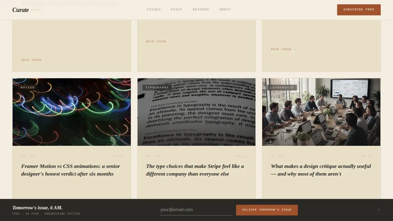
After visitors scroll past the second anchor-nav spoke, a fixed bottom rail resurfaces the email capture form. This is the primary call to action expressed twice: once in the hero and once in a persistent bottom bar. The rail uses an Intersection Observer so it appears only at the right moment, reducing visual noise in early sections.
How It Works Transparency Section
A dedicated section explains the newsletter's process with honest, step-by-step clarity. This transparency section resurfaces the subscribe form alongside a concise description of what readers receive: five curated links, one original essay, and a typeface recommendation, all delivered before 6 AM. Showing the process before asking for commitment is a proven trust-building strategy.
Page sections overview
| Section | Purpose |
|---|---|
| Hero full-bleed | Grabs attention with didone headline and inline email form |
| Past Issues Mosaic | Proves content quality through hoverable issue cards |
| Essay Excerpt Viewport | Demonstrates editorial voice with oversized pull-quote |
| Testimonials Marginalia | Builds trust through handwritten-style reader testimonials |
| How It Works | Explains the newsletter step by step and resurfaces the form |
| Fixed Subscribe Rail | Persistent email capture after visitors scroll past spoke two |
| Minimal Footer | Closes the page with clean horizontal minimal pattern |
Design & branding system
The visual identity follows a Luxe Minimal theme that draws from editorial print design. Key elements of this approach include ample white space, sophisticated typography, a restricted color palette, and one clear high-value proposition per page. Curate's design language feels like a first-edition design monograph left open on a walnut desk: deliberate, warm, and quietly authoritative. Consistent branding across every section reinforces brand recognition without repetition.
- Color palette: warm parchment (#F3EDE0) as the dominant background, deep editorial charcoal (#2B2926) for body text, oxidized rust (#A0522D) for links, hover states, and the subscribe button, and clay (#D4C4A8) for section dividers and card surfaces
- Typography: Fraunces for the high-contrast didone display headline, DM Sans for body copy, and IBM Plex Mono for metadata labels and section tags, creating clear typography across all text levels
- Visual style: no decorative gradients, no animation, no parallax; engaging visuals come from high quality images, bold typography, and generous white space that creates visual appeal through restraint rather than decoration
Mobile & speed optimization
A good minimalist landing page should load fast, look great on any device, and be easy to interact with across various devices. Mobile responsiveness is no longer a luxury but a necessity. Curate is built desktop-first for senior designers on large screens, with full support for mobile devices and different screen sizes.
- The layout adapts cleanly across screen sizes, maintaining visual consistency and clear visual hierarchy on every viewport
- Static sections use Server Components, and only the fixed subscribe rail uses a Client Component, keeping the overall structure light for users on mobile apps and smaller screens
- The design's simple, distraction-free structure keeps load behaviour clean, which matters for user engagement and first-impression performance across various devices
How this template helps you convert
The design's ultimate purpose is to support conversion rates. Curate approaches lead generation not by demanding sign ups immediately but by earning them through sequenced trust-building. A clear value proposition is the most important element of any landing page, and Curate delivers it visually before the visitor reads a single sentence. Incorporating trust-building elements into a landing page can significantly boost results, and every spoke in this layout adds another layer of earned credibility.
- The hero section grabs attention with a clear headline, engaging visuals, and an inline sign up form that places the desired action above the fold without pressure
- The Gallery Walk spokes build trust progressively: real issue cards, a real essay excerpt, and real reader testimonials as social proof all encourage visitors to commit before the bottom rail ever appears
- The fixed subscribe rail and the how-it-works section work together to optimize conversion rates by resurfacing the call to action only after the visitor has already seen enough to want access
Other information about this template
This section covers additional context and practical details about building with, customizing, and comparing this template against popular landing page examples and tools in the market.
- You can quickly customize the Parchment and Rust color tokens, typeface choices, and section copy to match your own newsletter's editorial identity, creating your own landing page without starting from scratch
- When you create landing pages for newsletters, the single-field sign up form pattern used here is widely considered best practice: asking only for an email address reduces friction and can increase sign ups measurably
- Among well-known newsletter landing page examples, pages like Demand Curve's use hoverable content cards to preview issues, and The GIST's features testimonials with a personal touch similar to Curate's marginalia approach; Unicorn Club's newsletter landing page uses a clear, concise description to set reader expectations, all ideas that inform Curate's structure
- High converting landing pages in the newsletter category share key elements: a strong value proposition above the fold, concise copy, social proof, and a single primary call to action; Curate is built around all of these
- Tools like ConvertFlow, Unbounce, Leadpages, and HubSpot offer landing page builders with A/B testing and lead generation features; Curate's template can be deployed within compatible build environments and used alongside those platforms for email list growth
- The curate luxe minimal ux design newsletter landing page template is positioned for newsletter creators who treat their publication as a product, not a side project
- Rocket.new supports building production-ready web pages from natural-language prompts, and Curate's structured architecture makes it a strong starting point for that kind of workflow
- A/B testing different headlines and calls to action is essential for improving conversion rates; the template's clean, modular structure makes it straightforward to test variations without redesigning from scratch
- For users building a business around a paid or free newsletter, this template supports lead generation at the top of the funnel by capturing emails before any content is gated
Theme
Luxe Minimal
Creative direction
Gallery Walk
Color system
Parchment & Rust
Style
Hub & Spoke (Anchor Nav)
Direction
Lead Generation
Page Sections
Full-bleed Cinematic Hero Section
Gallery Walk Past Issues Mosaic
Viewport-filling Essay Pull-quote
Handwritten Testimonials as Marginalia
Fixed Bottom Subscribe Rail
How It Works Transparency Section
Related questions
Who is this landing page template designed for?
Can I quickly customize the colors and typography?
Does this template support mobile devices?
How does the fixed subscribe rail work?
What makes this different from a generic newsletter landing page?



