Review & Comparison Site Booking Website Template
Curate is a single-column narrative landing page built for best-of lists sites and editorial review publishers. It walks readers through a day-in-the-life story where each handpicked recommendation appears naturally in context. The warm artisan design, book-chapter header, and terracotta calls to action earn reader trust before asking for a single click.
by Rocket studio
Quick summary
Curate is a single-column editorial landing page template for best-of lists sites and review publishers. It uses a day-in-the-life narrative structure to introduce handpicked product recommendations through lived moments rather than ranked grids. A book-chapter header, scroll-linked warmth shifts, and low-friction "Read the Full List" calls to action guide deliberate shoppers toward the full article.
Who this template is for
This template is built for editorial publishers and independent reviewers who lead with taste and trust, not traffic volume. It suits anyone who writes recommendation content that needs to feel earned rather than automated.
- Bloggers and content creators running best-of lists or curated review sites
- Independent editors and journalists writing consumer recommendation pieces
- Hobbyist writers and niche publishers whose audience distrusts generic affiliate pages
What problem this template solves
Deliberate shoppers have learned to distrust review pages that feel like product grids wrapped in thin copy. They need to feel a human voice behind every recommendation before they click anything. This template closes that gap.
- Generic review layouts signal affiliate spam before the reader scrolls past the first section
- Ranked product grids remove the editorial context that builds genuine reader confidence
- Standard calls to action ask for a click before the page has proven it deserves one
What you get with this template
You get a complete single-column landing page flow designed around narrative trust-building. Every section, color decision, and interaction has been planned to move a skeptical reader toward one low-friction click.
- A book-chapter hero with serif chapter number, hand-set title, and an italicized author's note
- Three day-in-the-life vignette sections covering morning, afternoon, and evening moments, each ending with a subtle secondary link
- A scroll-linked background warmth shift that deepens from cream to amber as the reader moves through the day
- A persistent bottom call-to-action bar that appears after the third scroll section, plus a trust manifesto section above the footer
Feature list
The template ships with a focused set of components built specifically for editorial recommendation content.
Book-Chapter Hero Header
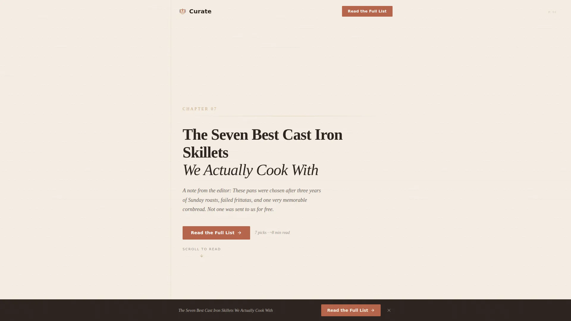
The header is styled as the opening page of a physical book. It includes a serif chapter number, a hand-set editorial title, and a one-sentence author's note in italics beneath it. No hero image is used. Typography, generous whitespace, and a faint paper texture carry the entire first impression.
Day-in-the-Life Narrative Sections
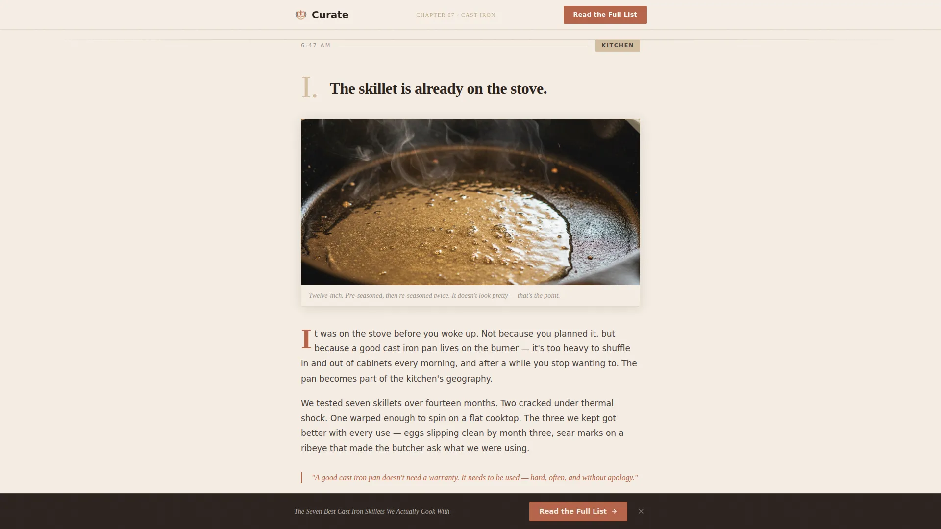
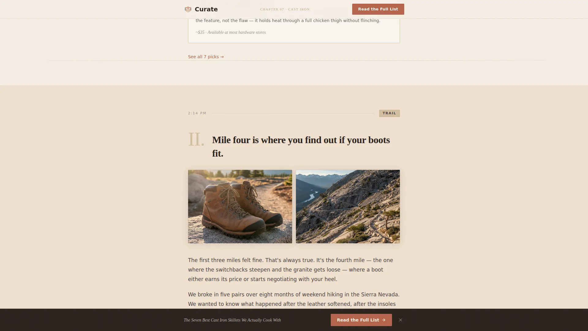
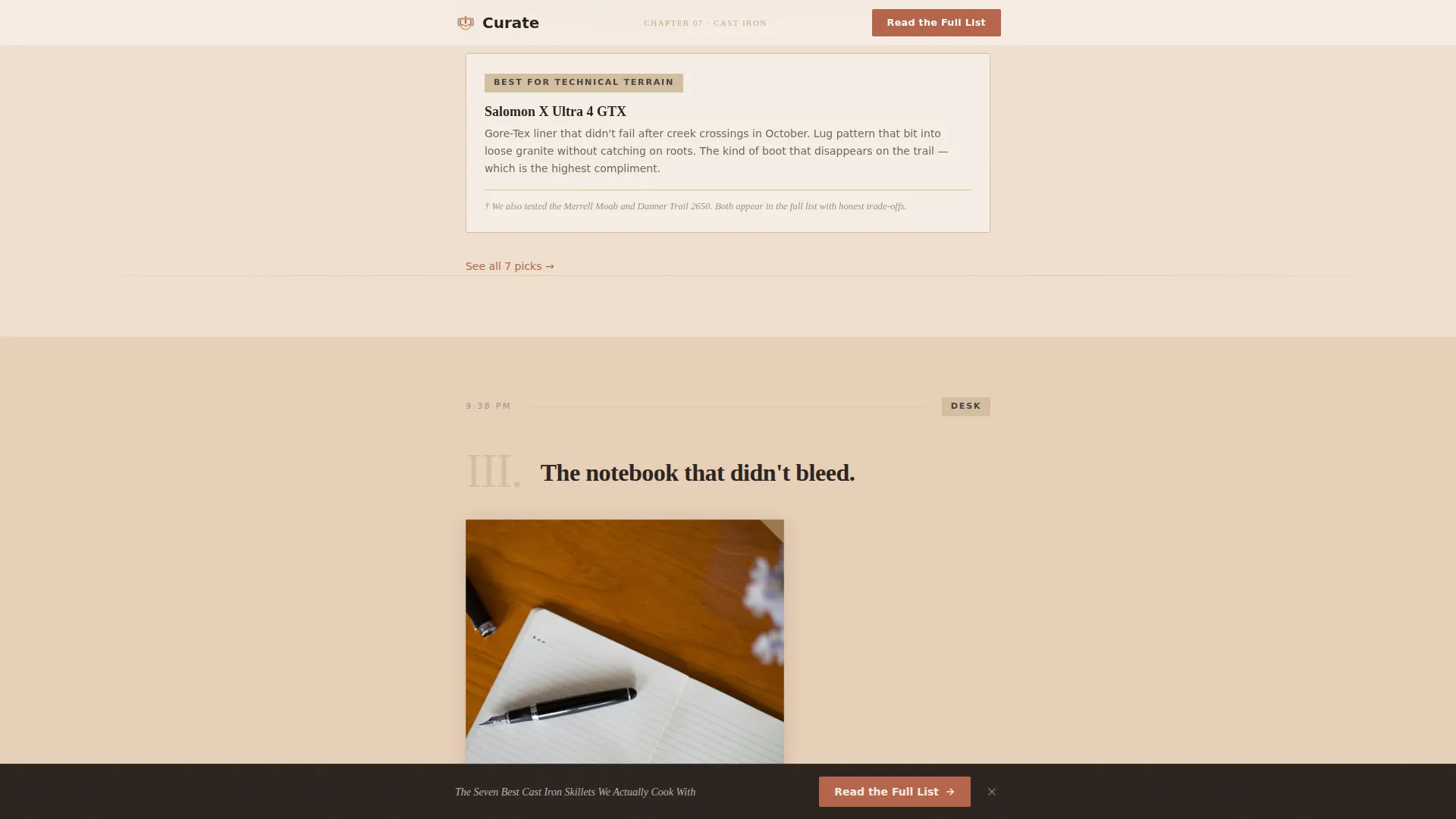
Three vignette sections each anchor a product recommendation inside a lived moment: morning light in the kitchen, an afternoon hike, and an evening journaling session. Products are introduced through use and sensory detail, not specifications. Each vignette ends with a low-friction secondary link pointing readers deeper into the full article.
Scroll-Linked Warmth Transition
As the reader scrolls through the page, the background color gradually deepens from kiln-fired cream through hearthstone tan toward amber warmth. The shift mirrors hours passing across the day. Staggered text reveals and parallax paper layers reinforce the sense of a living, physical document.
Persistent Bottom Call-to-Action Bar
After the reader passes the third scroll section, a fixed bottom bar appears carrying the primary "Read the Full List" call to action in terracotta. It stays visible without interrupting the reading flow and gives returning visitors an immediate path to the article.
Trust Manifesto Section
A short editorial note before the footer explains how recommendations on the site are made. It functions as a brief manifesto on testing philosophy and editorial independence. This section also serves as the trigger zone for the persistent bottom bar, reinforcing credibility at the exact moment commitment is highest.
Minimal Horizontal Footer
The footer follows a horizontal flow pattern with a clean, uncluttered layout. It keeps the page from trailing off into noise and matches the artisan restraint of the overall design.
Page sections overview
| Section | Purpose |
|---|---|
| Chapter Hero Header | Opens with editorial chapter number, title, author's note, and primary call to action |
| Morning Kitchen Vignette | Introduces the first product recommendation inside a morning kitchen scene |
| Afternoon Hike Vignette | Presents the second recommendation through an afternoon outdoor narrative |
| Evening Journal Vignette | Closes the day arc with a third recommendation inside an evening journaling moment |
| Editorial Trust Note | Shares the testing philosophy and triggers the persistent bottom call-to-action bar |
| Minimal Horizontal Footer | Closes the page with a clean, low-distraction horizontal footer layout |
Design & branding system
The visual identity follows a Warm Artisan theme built on a Warm Stone color palette. Every color choice is drawn from natural, tactile materials, so the page feels earned rather than designed.
- Kiln-fired cream (#F5EDE3) dominates the background like unbleached paper, with hearthstone tan (#C4A882) anchoring category badges and section dividers
- Pencil-margin gray (#6B6560) carries all body text with a soft, graphite quality, while aged terracotta (#B5654A) is reserved for links, buttons, and pull-quotes where a decision lives
- Fraunces is used for all serif display type including the chapter number and section titles; DM Sans handles body copy and interface elements for clean legibility
Mobile & speed optimization
The template is built mobile-first because deliberate shoppers frequently research at odd hours on their phones. The single-column flow means the layout requires no reflow or breakpoint gymnastics to remain readable on small screens.
- Static content is handled with Server Components to keep JavaScript payloads minimal and page interactivity focused
- Scroll-linked animations, staggered text reveals, and parallax paper layers are set to a medium intensity that works smoothly on mobile without draining battery or causing jank
How this template helps you convert
The conversion strategy is built around earning the click rather than demanding it. Every structural choice delays the ask until the reader is already invested.
- The primary "Read the Full List" call to action appears first beneath the author's note, then again as a persistent bottom bar after the third section, giving multiple natural exit points without repeating the same pressure twice
- Each day-in-the-life vignette ends with a subtle secondary link ("See all 7 picks →"), so readers who are ready early can leave at any point without friction
- The editorial trust manifesto section directly addresses reader skepticism about review credibility before the final call to action, removing the last barrier to the click
Other information about this template
This template is designed for the intersection of editorial blog content and consumer review publishing. A few additional details are worth noting for anyone evaluating it for their project.
- The template uses no email gate or form of any kind; the only conversion goal is a click through to the full article
- The day-in-the-life narrative style is especially well suited to niches where sensory context matters: cookware, outdoor gear, stationery, and similar tactile product categories
- The Single Column Flow layout keeps the reading experience linear and distraction-free, matching the focus of a reader who arrived with a specific buying question
- The paper texture and typographic hierarchy are handled through CSS and font choices, making the warm artisan aesthetic achievable without custom illustration or photography
Theme
Warm Artisan
Creative direction
Day-in-the-Life
Color system
Warm Stone
Style
Single Column Flow
Direction
Click-Through
Page Sections
Book-chapter Hero Header
Day-in-the-life Narrative Sections
Scroll-linked Warmth Transition
Persistent Bottom Call-to-action Bar
Editorial Trust Manifesto Section
Minimal Horizontal Footer
Related questions
Can I adapt the vignette sections for a different product niche?
Does the hero section require photography or illustrations?
How does the persistent bottom call-to-action bar get triggered?
Is there a form or email capture included in this template?
Can this template support more than three product recommendations?



