Review & Comparison Site Reviews Website Template
Curate is a masonry-style editorial landing page built for product review sites that earn trust through depth, not speed. It pairs a sumi-e illustrated header, Creator Spotlight rows, and ink-wash circle ratings with a Japanese Zen color system. Every card links directly to a full review, and the page is designed to make deliberate buyers click with confidence.
by Rocket studio
Quick summary
Curate is a single-page masonry landing page template for editorial product review sites. It opens with a hand-drawn sumi-e illustration, moves through three distinct content rows, and closes with a sticky call-to-action bar. The design prioritizes trust and click-through above all else, built for readers who research carefully before they buy.
Who this template is for
This template is made for content creators and editorial teams who publish long-form, lived-experience product reviews. It suits sites where the reviewer's credibility is the product, and where readers already know what they want but need one final, honest voice to confirm it.
- Independent product reviewers and editorial writers publishing in-depth verdicts
- Design-conscious content teams who want an editorial layout that reflects their voice
- Review site founders targeting deliberate buyers aged roughly 35 to 55 who research heavily before purchasing
What problem this template solves
Most review site templates look like search-result pages: dense grids of thumbnails, star ratings, and affiliate links. They signal speed over substance. Curate solves the problem of looking algorithmic when your value is genuinely human.
- Readers who find a generic review layout are more likely to distrust the content before they read it
- Standard grid templates give no visual cue that the reviewer actually used the product for weeks or months
- There is no layered content architecture that builds trust row by row, the way Curate does
What you get with this template
Curate delivers a complete, section-structured landing page ready to showcase your review site's personality, reviewers, and content catalog.
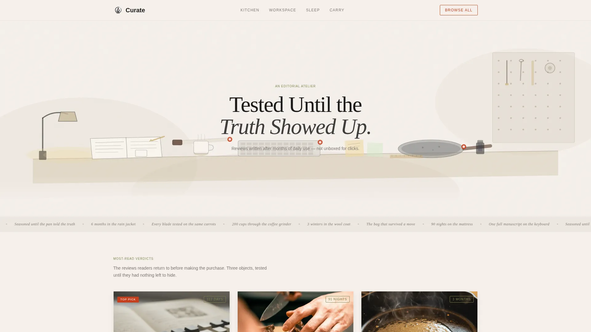
- A full-width sumi-e SVG illustration header with a serif headline and pulsing vermillion product accents
- Three content rows covering featured reviews, reviewer philosophy spotlights, and category collections
- A sticky bottom bar with a secondary call-to-action that activates after two scroll depths
Feature list
This template is built around one core idea: every visual element should make the reader more willing to click through to the full review. The features below serve that purpose directly.
Hand-Drawn Sumi-e Illustration Header
The full-width header is a custom ink-wash style panorama of a creator's studio. A desk with products mid-test, an open annotated notebook, a warm lamp, and a pegboard of tools fill the scene. Three featured products carry subtle pulsing vermillion accents that invite interaction. A single serif headline, "Tested Until the Truth Showed Up," fades in over the illustration.
Masonry Card Grid with Hover Reveals
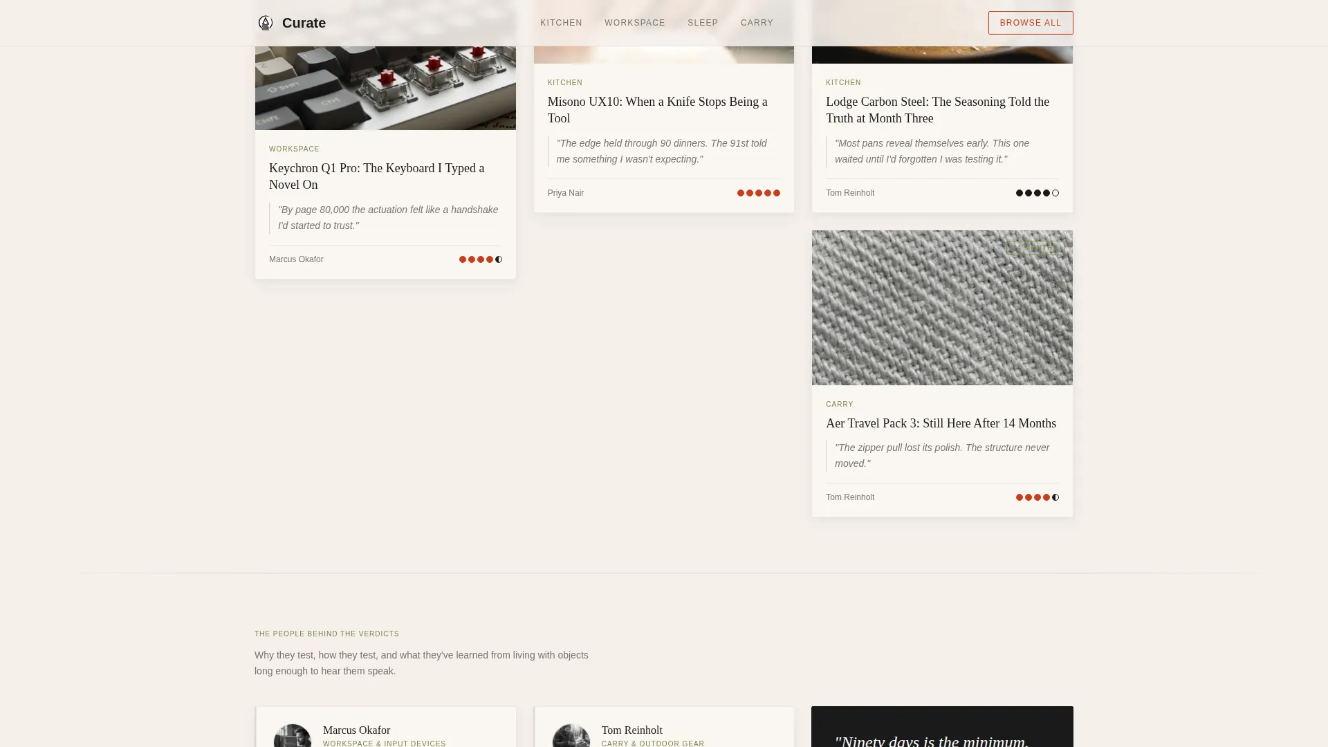
The masonry layout uses moment-driven photography: a hand on a chef's knife, a reviewer's desk at a candid angle, a close-up of fabric on a lightbox. On hover, each card reveals a "Read the Full Verdict" call-to-action in vermillion. Cards are pure portals; no review content expands on-page.
Three-Row Content Architecture
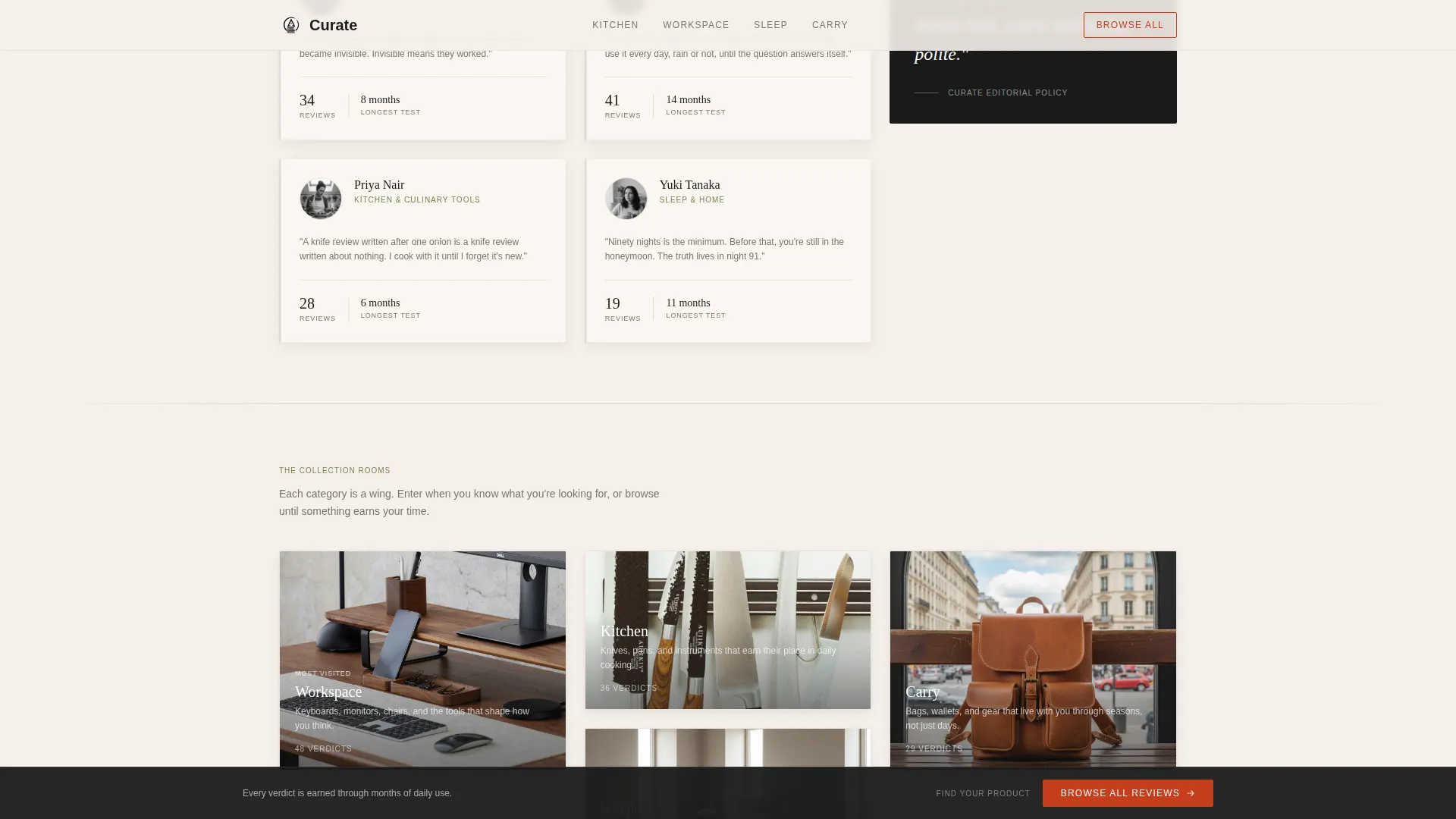
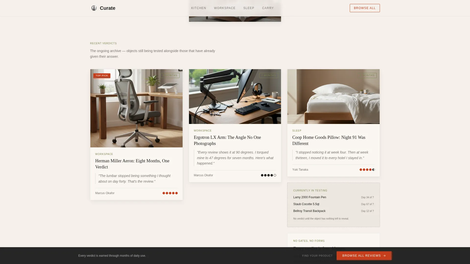
Row one shows the three most-read reviews with pull quotes and ink-wash circle ratings. Row two introduces the reviewers through short "why I test" philosophy cards. Row three opens into category collections styled as curated museum wings. Each row deepens the reader's sense that the site is genuinely authoritative.
Ink-Wash Circle Rating System
Star ratings are replaced with a hand-drawn circle rating system. Each circle moves from empty to filled in an ink-wash style that feels editorial and personal. The rating looks like a judgment, not an algorithm, which creates information gaps that motivate the click-through.
Sticky Browse Bar
After two scroll depths, a sticky bottom bar appears offering "Browse All Reviews" as a secondary navigation path. There are no forms or content gates. The bar stays available without being intrusive, giving readers a persistent path forward whenever they are ready.
Scroll Reveal Animations and Card Hover States
The template uses scroll-triggered reveal animations and CSS-based card hover states throughout. The pulsing vermillion on the hero illustration and the hover-triggered call-to-action reveal on each card are handled through CSS animations only, keeping the motion purposeful and lightweight.
Page sections overview
| Section | Purpose |
|---|---|
| Hero Illustration | Sets editorial tone with a full-width sumi-e studio scene and serif headline |
| Featured Reviews Row | Showcases three top-read reviews with pull quotes and circle ratings |
| Reviewer Spotlights Row | Builds personal trust through short "why I test" philosophy cards |
| Category Collections Row | Organizes review catalog into museum-wing style browsable groupings |
| Sticky Browse Bar | Provides persistent secondary navigation after reader scrolls two depths |
| Footer | Closes the page with a horizontal flow layout |
Design & branding system
The visual identity follows a Japanese Zen atelier approach. Warm negative space does more work than decoration, and every color has a defined role it never steps outside.
- Four-color palette: washi paper warm white (#F5F0EB) for backgrounds, sumi ink black (#1A1A1A) for text, tatami matte green (#7A8450) for accents, and torii vermillion (#C73E1D) reserved exclusively for interactive elements and rating highlights
- Typography pairing: Fraunces serif for display headings and DM Sans for body text, creating an editorial contrast that feels considered and calm
- Masonry cards use soft shadows that suggest handmade paper lifted slightly off a wooden surface, while generous leading and breathing white space reinforce the unhurried atelier mood
Mobile & speed optimization
The template is designed desktop-first, reflecting the research habits of deliberate buyers who typically evaluate products on larger screens. It scales responsively to mobile without compromising the layout hierarchy.
- Server Components power the static masonry grid, keeping the layout fast without client-side overhead
- All animations run on CSS only, with no external animation libraries required, keeping the motion layer lightweight
- The sticky bottom bar and card hover states are implemented to remain functional and unobtrusive across screen sizes
How this template helps you convert
Curate's conversion model is trust accumulation, not pressure. The page earns the click by showing just enough of each review's personality and conclusion to create a genuine information gap.
- The three-row content architecture moves readers from featured content to reviewer identity to full catalog, deepening trust at each level before asking for a click
- The vermillion "Read the Full Verdict" call-to-action appears only on hover, which means it feels earned rather than pushed, and the ink-wash circle rating system makes every score feel like a personal judgment worth understanding fully
Other information about this template
Curate is built for editorial product review sites that want a distinctive visual identity separate from typical affiliate-heavy layouts.
- The template style is masonry, similar to a Pinterest-style grid, but with editorial photography and moment-driven framing instead of product packshots
- The Atelier Studio theme and Creator Spotlight creative direction make it a strong fit for niches like kitchen tools, writing instruments, home goods, and any category where long-term use reveals meaningful differences
- The template uses an Atelier Studio theme with a Japanese Zen color system, making it visually distinct from review sites built on standard blog or magazine templates
- There are no forms, email gates, or subscription prompts built into this landing page; the page earns attention purely through design and content framing
- The footer follows a horizontal flow layout pattern, keeping the close of the page as clean and intentional as the opening
Theme
Atelier Studio
Creative direction
Creator Spotlight
Color system
Japanese Zen
Style
Masonry/Pinterest
Direction
Click-Through
Page Sections
Sumi-e Illustration Header
Masonry Grid with Hover Reveals
Three-row Trust Architecture
Ink-wash Circle Rating System
Sticky Secondary Navigation Bar
CSS Scroll Reveal Animations
Related questions
Is this template suitable for a product review site with multiple categories?
Does the template include actual review content or just the layout?
Does the page gate content or collect email addresses?
What kind of photography works best with this template?
Can I use this template if I only have a small number of published reviews?



