Editorial Creator Spotlight Social Media Newsletter Landing Page
Curate is a weekly social media intelligence newsletter landing page built on a 60/40 asymmetric grid. It pairs a collage scrapbook hero with editorial creator spotlight case studies, a five-question quiz funnel, and a Luxe Minimal Ink and Paper visual identity. The result is a landing page that reads like a boutique editorial zine and converts like a high-performance subscriber funnel.
by Rocket studio
Quick summary
Curate is a weekly dispatch that reverse-engineers what worked on social media before Monday's content calendar locks. This landing page is designed as a single-page, section-led experience built on a 60/40 asymmetric grid. It blends a collage scrapbook hero, scrollable creator spotlight case studies, a gated quiz funnel, and a Luxe Minimal visual identity into one cohesive, editorial-grade subscriber page.
Who this template is for
This template is purpose-built for newsletter creators and content professionals who need a landing page that earns trust fast. The editorial tone and quiz-led funnel speak directly to readers who make decisions based on data, not aesthetics alone. Understanding the target audience is key to tailoring the messaging and offer, and this template is shaped entirely around that principle.
- Solo content strategists who manage multiple client accounts and need to justify every recommendation with real metrics
- In-house social media leads at direct-to-consumer brands defending their budgets against leadership scrutiny
- Freelance creators and independent content professionals who want to stay ahead of format shifts and algorithm changes without wasting a filming week
What problem this template solves
Most newsletter landing pages fail because they look like every other page on the internet. They use a generic navigation bar, stock imagery, and a headline that says nothing specific. They compete with other pages for attention rather than commanding it. This template solves the core problem of undifferentiated subscription pages by making the experience feel like discovering a beautifully printed broadsheet at a design-forward coffee shop.
Effective landing page design requires a single conversion goal, not a sprawling menu of options. This template removes sidebar menus and unnecessary navigation to keep every element pointed at one outcome: the subscriber sign-up. A good landing page never wastes visual energy on elements that dilute the primary message, and this one holds that discipline throughout.
- Content strategists waste time scanning dozens of low-signal newsletters because no landing page clearly demonstrates editorial depth before the subscribe click
- Brand social leads have no quick way to assess whether a newsletter actually delivers actionable intelligence versus vague commentary
- Freelance creators need to trust a newsletter before they commit their inbox to it, and most landing pages give them no real reason to do so
What you get with this template
This template delivers a complete, ready-to-customize single landing page built on an editorial framework. Every section is structured to move a visitor from curious browser to committed subscriber through deliberate visual rhythm and benefit focused content. The landing page is designed with a single conversion goal in mind, which is a proven approach to increase conversions and keep the reader's attention focused.
You get a layout that functions as a powerful conversion tool because it does not try to do everything at once. Each section has a specific job, and those jobs stack in a logical narrative order from discovery through decision.
- A full 60/40 asymmetric grid framework with a collage scrapbook hero section, three escalating creator spotlight case studies, a five-question quiz funnel with a gated results screen, a sample issue preview section, and a social proof plus final subscribe call-to-action block
- An Ink and Paper color system using deep editorial black, warm parchment, pencil-sketch gray, and vermillion red as a single intentional accent, paired with DM Serif Display headings and Manrope body type
- A quiz flow with multi step forms styled as single-choice parchment cards, a vermillion progress bar, a result gate behind an email field, and a secondary plain text subscribe link for low-friction fallback access
Feature list
This section details the core built-in capabilities of the Curate landing page template. Each feature is grounded in the design brief and reflects what a subscriber-facing editorial landing page needs to stand out and perform.
Collage Scrapbook Hero with Bold Serif Headline
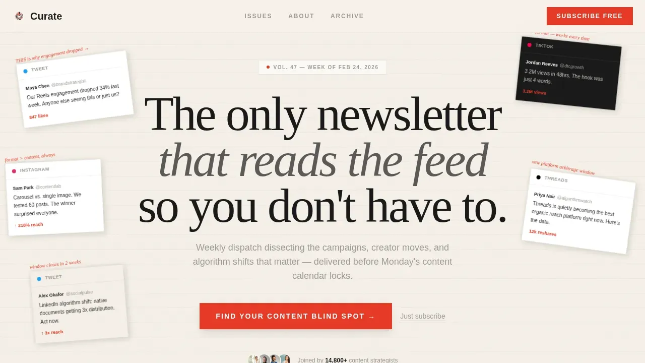
The hero section opens with an asymmetric collage composition: overlapping screenshots of tweets, TikTok stills, Instagram carousels, and Threads posts arranged at slight rotations as if pinned to a physical moodboard. Torn-paper edge textures and vermillion editorial annotations are layered across the composition. A single bold headline in DM Serif Display sits above the collage: "The only newsletter that reads the feed so you don't have to." An impactful hero section includes a bold headline, high quality visuals, editorial content, social proof cues, and a clear call-to-action, and this hero delivers all five in a single, unforgettable opening frame. The hero image and hero shot are built into the composition rather than treated as afterthoughts, giving the landing page an immediate sense of editorial authority.
60/40 Asymmetric Creator Spotlight Grid
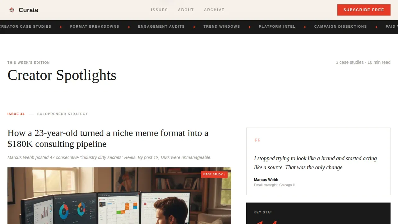
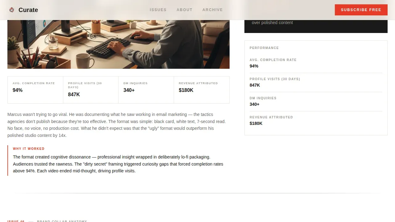
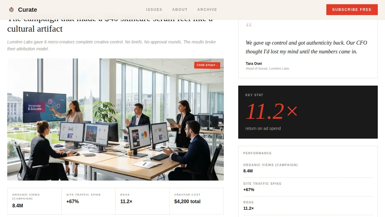
After the hero, the page reveals three escalating creator case studies arranged in the 60/40 grid. The wider column holds a full campaign breakdown: screenshots, annotated metrics, and a "why it worked" paragraph. The narrow column features a pull quote and a single key stat in oversized vermillion type. Each spotlight is separated by a thin pencil-rule divider. The scroll rhythm mimics flipping through a magazine, with each section functioning as a self-contained story. Creator narratives escalate from solopreneur to brand collaboration to viral moment, pulling the reader forward through benefit focused content that feels earned rather than advertised.
Five-Question Quiz Funnel with Gated Result
The primary conversion path is a "Find Your Content Blind Spot" interactive assessment. Five questions are styled as elegant single-choice cards on parchment backgrounds, displayed one per screen. A vermillion progress bar tracks advancement through the quiz. On completion, the result is gated behind an email field that doubles as the newsletter sign-up. This use of multi step forms converts curiosity into commitment by making the sign up process feel like receiving something personalized, not surrendering an email address. A secondary "Just Subscribe" text link in pencil gray sits below the fold for visitors who prefer a direct path, reducing friction without competing with the primary conversion.
Editorial Social Proof Block
Social proof is a psychological phenomenon where people copy the actions of others when they are uncertain about what to do. This template places social proof strategically across the landing page to build trust and encourage conversions. The social proof section includes a subscriber count metric, three customer testimonials presented as editorial cards with specific outcome language, and a publication frequency badge. Dynamic social proof with specific details and job-title context outperforms generic praise, and the testimonial card layout here is built to carry that level of specificity. Displaying detailed reviews can increase conversion rates substantially, and the template gives each testimonial card the visual weight to make that impact register. Client testimonials and customer testimonials each carry distinct credibility signals, and the layout treats both with editorial care.
Sample Issue Preview with Editorial Card Layout
Before the final subscribe call-to-action, the page presents a "What's Inside" section using an editorial card layout. This gives prospective customers and potential customers a real look at the newsletter's content structure before they commit. Landing pages increasingly use live-content previews to let visitors interact with the product experience directly. The sample issue preview serves this purpose without requiring a separate page or external link. It keeps the visitor inside the landing page experience rather than sending them to other pages, which protects conversion momentum.
Ultra-Minimal Footer with Horizontal Flow
The footer uses a clean horizontal flow layout with minimal links and no competing calls-to-action. It avoids overwhelming visitors with secondary menus or navigation options that pull attention away from the subscription goal. Most landing pages that underperform do so because the footer reintroduces the navigation bar and opens escape routes. This template's footer keeps the focus locked on brand identity and legal essentials only.
Page sections overview
| Section | Purpose |
|---|---|
| Hero Collage Header | Opens with a bold serif headline and moodboard collage of social content |
| Creator Spotlight Grid | Three escalating case studies in a 60/40 asymmetric grid layout |
| Quiz Call-to-Action | "Find Your Content Blind Spot" five-question interactive assessment |
| Sample Issue Preview | Editorial card layout showing what subscribers receive each week |
| Social Proof Block | Subscriber count, testimonial cards, and publication frequency badge |
| Final Subscribe call to action | Email sign-up with primary quiz path and secondary plain-text link |
| Ultra-Minimal Footer | Horizontal flow footer with brand essentials and no competing links |
Design & branding system
This landing page uses the Luxe Minimal theme with an Ink and Paper color system. The palette was chosen to feel like a freshly printed broadsheet from a boutique press, where every color choice carries editorial intention. Brand consistency across every section is achieved through a strict rule: vermillion red appears only on links, calls-to-action, key stats, and pull quotes, making every instance feel deliberate. Minimalist design is a growing trend in landing page design because it reduces cognitive load, and this template commits to that principle without sacrificing personality.
- Colors: deep editorial black (#1A1A1A) for typographic weight, warm parchment (#F5F0E8) and true white (#FFFFFF) for alternating backgrounds, pencil-sketch gray (#9E9A94) for secondary text and dividers, and vermillion red (#E63926) as the single intentional accent throughout the page
- Typography: DM Serif Display for all headings to deliver editorial authority, Manrope for all body copy and interface elements to maintain clean legibility, with a deliberate contrast between serif weight and sans-serif utility that mirrors magazine layout conventions
Mobile & speed optimization
This template is desktop-first by design, reflecting the reality that content strategists and social media leads do most of their deep-reading work on larger screens. However, the layout is built with mobile responsive layouts so that every section adapts cleanly to smaller viewports. Mobile responsiveness is a non-negotiable baseline, and this template maintains the editorial hierarchy across all screen sizes. Mobile-first design best practice calls for large tap targets and responsive fast-loading images to serve the high volume of users on mobile devices, and the template's component structure supports this approach.
- The 60/40 grid collapses gracefully to a single-column stack on smaller screens, preserving the reading order and visual hierarchy of each creator spotlight without breaking the narrative flow
- The quiz funnel cards are designed as full-screen single-choice interactions that work naturally as touch-friendly tap targets on mobile devices, keeping the sign up process smooth regardless of device
How this template helps you convert
An editorial-style landing page requires balancing high-end magazine aesthetics with high-conversion digital strategy. This template achieves that balance by structuring every design decision around a single conversion goal: the newsletter subscription. A landing page designed around one focused outcome consistently outperforms pages that split attention across multiple goals.
- The quiz funnel creates a personalized path to subscription. Visitors answer five questions about their content challenges and receive a tailored result, which is gated behind the email field. This transforms the sign up process from a passive surrender of contact information into an active exchange with perceived value, which directly supports stronger conversion rates across the landing page.
- The creator spotlight grid builds credibility before the ask. By presenting three escalating case studies with annotated metrics and pull quotes, the landing page demonstrates the newsletter's editorial depth in a format the target audience already trusts. Social proof elements are placed throughout the page, and the escalating narrative structure encourages visitors to keep reading, which increases the time-on-page and the likelihood of conversion.
Other information about this template
This template is part of the broader landscape of customizable templates built for editorial and newsletter creators who want a landing page that functions as a powerful conversion tool without sacrificing design quality. The following points cover additional context that helps clarify where this template fits relative to other landing page examples and approaches.
- Landing pages built with a clear value proposition and a single conversion goal consistently outperform pages with multiple competing calls-to-action. This template follows that principle by focusing all energy on one outcome: the subscriber sign-up.
- The quiz funnel format is one of the most effective approaches in modern landing page design for high-intent audiences. Multi step forms that deliver personalized results gate naturally behind an email field, making the sign up process feel reciprocal rather than transactional.
- Squarespace's landing page ecosystem and semrush's landing page guides both highlight the importance of clear value propositions and social proof in editorial contexts. This template's structure is consistent with those principles: the value proposition is stated in the hero, social proof follows immediately in the creator spotlight grid, and the landing page's call to action is reinforced by the quiz result before the final email ask.
- Effective landing page examples from brands like HubSpot, Mailchimp, and Typeform all demonstrate that placing essential elements above the fold, using conversational copy, and minimizing navigation bar distractions are key to high converting landing pages. This template applies all of those lessons within an editorial creative direction.
- The 5-3-2 content rule for social media curation recommends that out of ten posts, five should be curated third-party content, three should be original branded content, and two should be humanizing personal content. Curate's editorial premise is built around a similar balance, and the landing page communicates that mix clearly through the spotlight grid and sample issue preview.
- Using video on landing pages can significantly boost conversion rates, with some reports indicating increases of up to 86%. While this template does not include a built-in video component, the hero collage and animated floating card layout deliver comparable visual energy to engage visitors on arrival.
- The common recommended content mix for social media curation follows a 40/60 or 75/25 split between original and curated content. Curate's weekly dispatch reflects this editorial balance, and the landing page communicates that mix through the spotlight case studies and issue preview section.
- Pop ups are a common feature in newsletter landing page design, but this template deliberately avoids intrusive pop ups in favor of the inline quiz flow, which reduces friction for prospective customers and keeps the editorial reading experience intact.
- The money back guarantee principle does not apply to a free newsletter, but the template addresses the equivalent concern through the no-hidden-fees and no-hidden commitments tone built into the secondary "Just Subscribe" text link, which signals that access to the newsletter has no barriers.
- Curate positions itself among the best landing page examples in the social media newsletter niche by combining analog editorial textures with digital conversion mechanics. The result is a landing page that feels like a natural extension of the social media content that brought the visitor there, which is a recognized principle of effective landing page design.
- The navigation bar is intentionally removed from the header to avoid overwhelming visitors with exit paths before they reach the primary call-to-action. This is a widely recommended best practice for effective landing pages.
- Contact forms in this template are replaced by the quiz flow and the gated email field, which perform the same data-collection function while delivering perceived value to the visitor at the same time.
- Comparison tables are not included in this template, as the editorial focus is on depth of individual creator case studies rather than feature-by-feature product comparisons.
- The landing page's overall web design draws on broadsheet and editorial zine conventions, using analog textures, typographic hierarchy, and deliberate imperfection to differentiate it from generic digital templates.
- Using the Curate editorial creator spotlight social media landing page template gives newsletter creators a distinctive starting point that combines boutique press aesthetics with a conversion-oriented structure few customizable templates deliver at this level of editorial specificity.
- Paid ads driving traffic to this landing page will benefit from the template's focused single-goal structure, since targeted campaigns perform best when the destination page matches the intent of the ad creative. The editorial aesthetic of this landing page also reduces the visual dissonance that weakens conversion rates when ad creative and landing page design feel mismatched.
- Industry leaders in newsletter growth consistently recommend personalizing the subscription offer, which is exactly what the quiz funnel delivers. It helps you become your own boss of your content inbox by matching new subscribers with the content track most relevant to their specific challenge.
- Software stands or falls based on how quickly it communicates value. This landing page template makes the value proposition visible in the first three seconds of the visit through the hero collage, the bold headline, and the red editorial annotations layered across the social media screenshots.
- A/B testing is a common practice for optimizing landing pages. The modular section structure of this template makes it straightforward to test alternative headline copy, quiz question ordering, or call-to-action phrasing without rebuilding the entire landing page from scratch.
- Dark background sections are not used in this template. The Ink and Paper palette deliberately avoids heavy dark background containers, using deep black only for typographic weight against parchment and white surfaces.
- Custom photography and professional photography are not required for this template. The hero collage is designed to work with screenshots and digital content stills, making it accessible to solo creators without a custom photography budget. The editorial annotations and composition structure do the visual heavy lifting that custom photography would otherwise provide.
- Pop ups that interrupt reading flow are replaced here by scroll-triggered reveals and inline quiz transitions, keeping the experience elegant and the reading rhythm intact.
- Center stage in the visual hierarchy belongs to the creator case studies, not to branding elements. The wide column of the 60/40 grid gives each campaign breakdown the space it needs to be read rather than skimmed.
- The hero shot in the collage header is a composite of real social media content rather than a single posed image, which makes it immediately recognizable to the content professionals this landing page is designed to reach.
- Feature highlights are distributed across the creator spotlight sections rather than consolidated in a single feature list block, which keeps the page reading like editorial content rather than a product brochure.
- The sign up process is designed to feel earned. Visitors who complete the quiz receive a personalized content playbook result alongside the newsletter subscription, which frames the email exchange as a transaction that benefits the subscriber first.
- Encouraging visitors to take the quiz rather than immediately asking for their email is a deliberate friction-reduction strategy. It respects the intelligence of the target audience and builds the trust needed for a successful landing page.
- This template supports targeted campaigns aimed at content professionals arriving from social media platforms, paid ads, or creator referrals, because the landing page aesthetic mirrors the content environment those visitors already inhabit.
- The overall approach positions Curate as a next landing page benchmark in the social media newsletter niche, giving both new creators and established content brands a reference-quality starting point for their subscriber acquisition pages.
Theme
Luxe Minimal
Creative direction
Creator Spotlight
Color system
Ink & Paper
Style
Asymmetric Grid (60/40)
Direction
Quiz/Assessment
Page Sections
Collage Scrapbook Hero Section
60/40 Asymmetric Creator Spotlight Grid
Five-question Quiz Funnel with Email Gate
Editorial Social Proof Block
Sample Issue Editorial Preview
Ultra-minimal Horizontal Footer
Related questions
Can I customize the color palette and typography?
Do I need a quiz platform to use the quiz funnel section?
Is this template suitable for a paid newsletter or only a free one?
How do I populate the creator spotlight sections with my own content?
What makes this landing page different from a standard newsletter template?



