No-Code Newsletter Landing Page Template
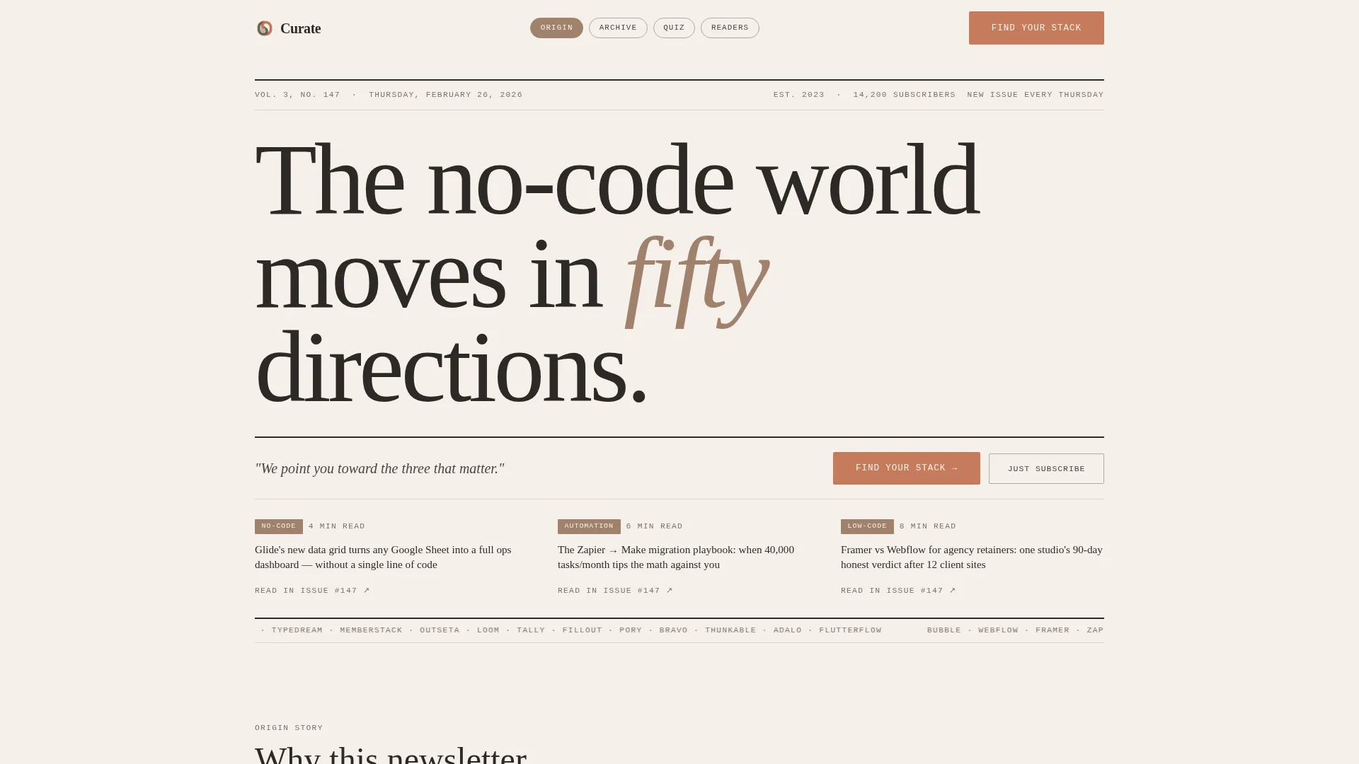
Curate is a hub-and-spoke landing page template built for no-code and low-code newsletter publishers. It pairs a broadsheet-style masthead with an interactive five-question "Find Your Stack" quiz, letting each visitor discover a personalized reading path. The warm, letterpress-inspired design signals editorial craft from the first scroll, helping builders trust the curation before they subscribe.
by Rocket studio
Quick summary
Curate is a single-page newsletter landing page template designed for curated no-code and low-code dispatches. It opens with a broadsheet masthead, walks visitors through an origin story, and closes the loop with a personalized quiz that segments subscribers by builder type and platform. The result feels like a considered editorial product, not a generic sign-up form.
Who this template is for
This template is built for newsletter publishers who serve the no-code and low-code builder community. It works equally well for solo operators and small editorial teams who want their landing page to reflect the quality of their curation.
- Solo founders launching a curated weekly dispatch for fellow builders
- Ops professionals and agency owners who need a polished subscribe page with audience segmentation
- No-code creators who want a conversion-focused landing page without sacrificing editorial personality
What problem this template solves
Most newsletter landing pages look identical: a headline, a field, and a button. For a curated no-code dispatch, that sameness undercuts the very thing that makes the product worth subscribing to. Visitors cannot tell whether your curation is thoughtful or just another roundup.
- Generic templates do not communicate editorial voice or curatorial philosophy
- One-size sign-up forms miss the chance to segment subscribers by tool stack and builder type
- Flat hero sections do not build the trust that converts a curious visitor into a long-term reader
What you get with this template
You get a fully structured, anchor-navigated landing page with five distinct content sections, a five-step interactive quiz, and a dual call-to-action system. Every design decision reinforces editorial credibility before asking for an email address.
- A newspaper-style masthead section with dateline, columnar headline links, and dual subscribe paths
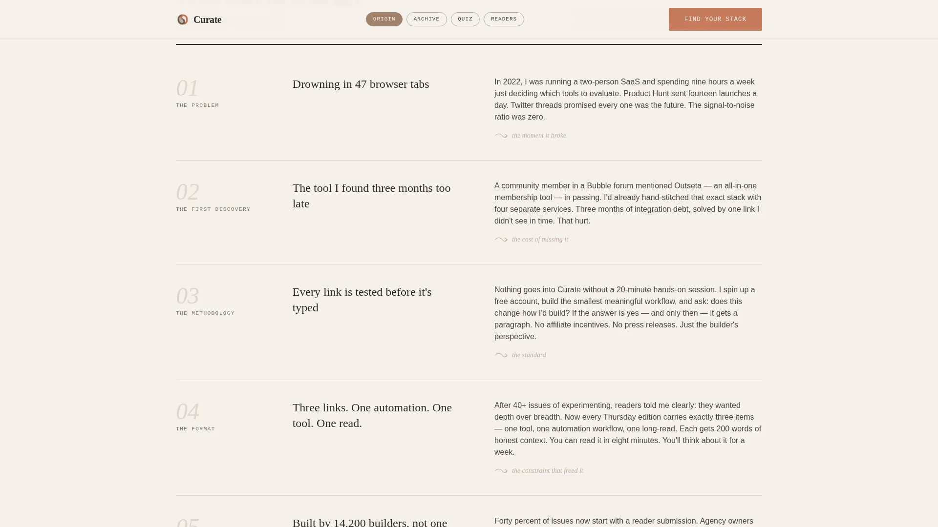
- An origin story section that walks visitors through the editorial philosophy and curation process
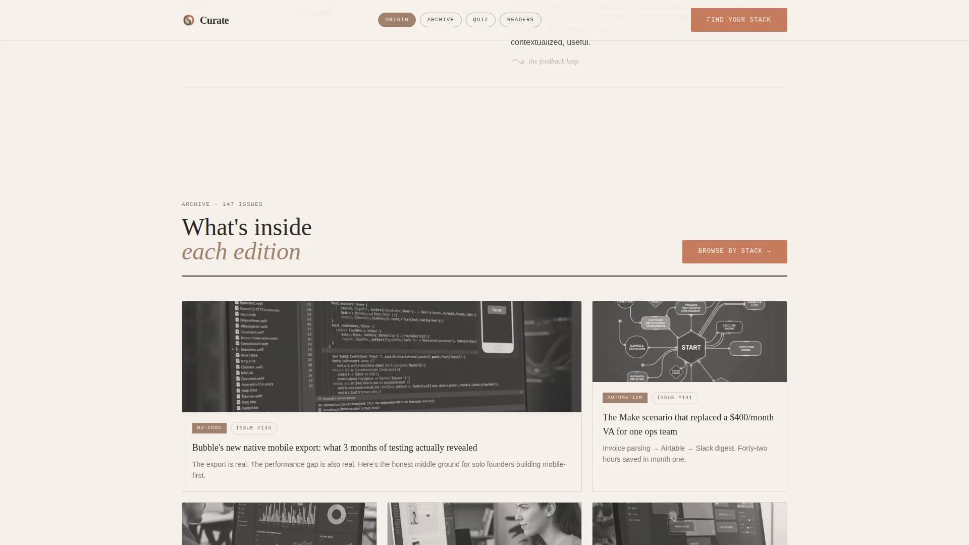
- A bento-grid archive preview, subscriber proof section, and a complete footer with logo and navigation split
Feature list
This template includes purpose-built features derived directly from its editorial newsletter brief. Each one serves a specific conversion or trust-building role.
Broadsheet Masthead Header
The header is built as a publication masthead, not a hero section. It presents the newsletter name in a bold serif typeface, a dateline showing the latest issue number and date, and three columnar headline links from the most recent edition. A quiet secondary call to action sits below the fold line for visitors who are ready to subscribe immediately.
Five-Step Interactive Quiz
The primary call to action is a five-question "Find Your Stack" assessment. It asks about builder type, primary platform, biggest bottleneck, time spent evaluating tools, and preferred content depth. Results deliver a personalized reading path from the archive and auto-subscribe the visitor with tag-based segmentation applied to their profile.
Origin Story Scroll Section
Scrolling past the masthead reveals the founder narrative. Each spoke of the hub-and-spoke layout deepens trust by revealing how links are sourced, how they are tested, and how the weekly edition is assembled. The scroll reads like a studio tour rather than a marketing pitch.
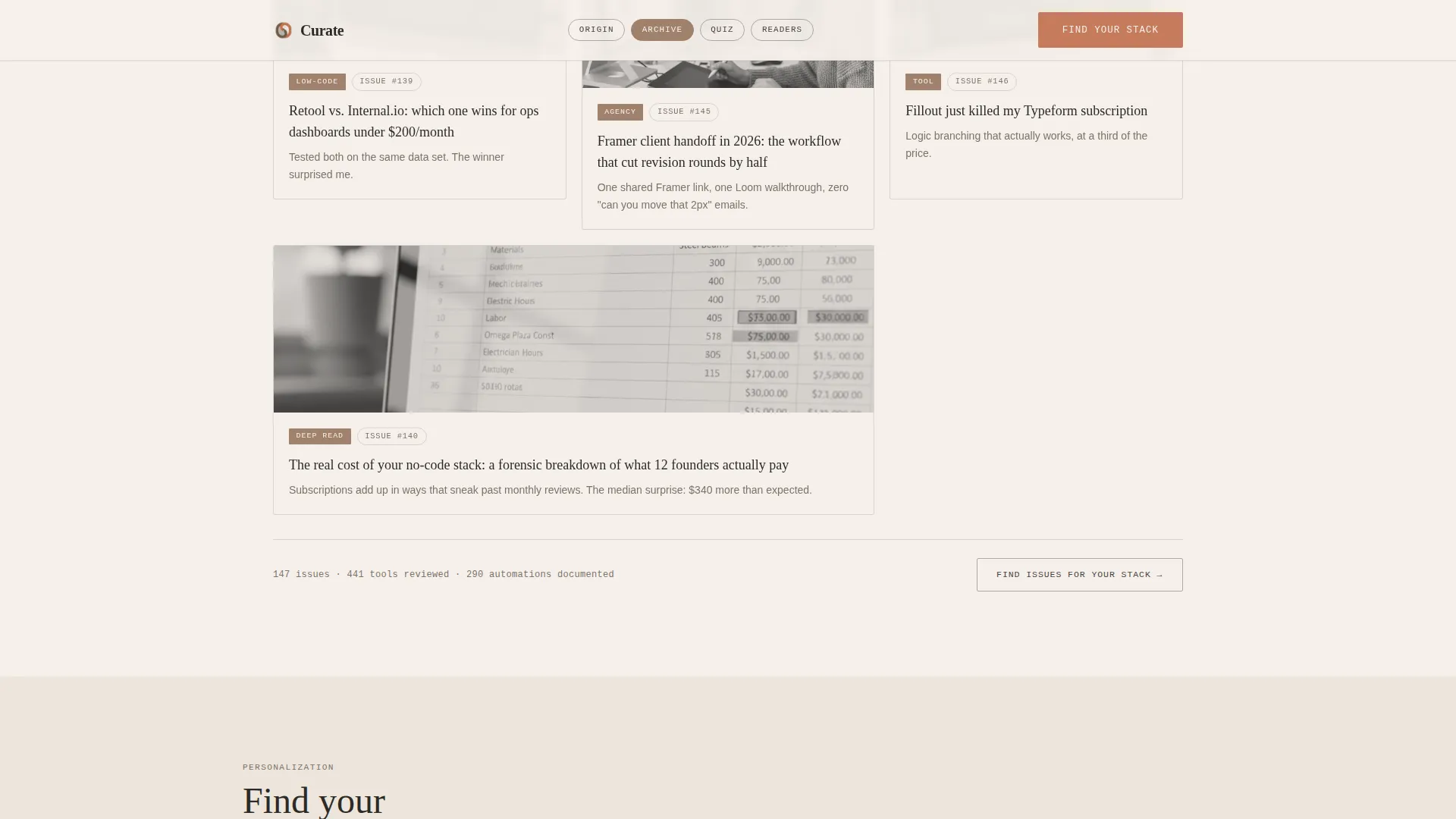
Bento Grid Archive Preview
A bento-style grid shows sample content from the archive, giving visitors a concrete sense of category depth and editorial range before they commit to subscribing. This section answers the natural question: "What will I actually receive?"
Subscriber Proof Section
This section holds testimonials with role and tool specificity, stack coverage statistics, and the total issue archive count. Social proof here is grounded in builder-specific detail rather than vague endorsements.
Anchor Navigation System
The hub-and-spoke layout uses anchor navigation to let visitors jump directly to the section most relevant to them. This structure respects the scanning behavior of experienced builders who do not read every word in sequence.
Page sections overview
| Section | Purpose |
|---|---|
| Masthead Hero | Establish editorial identity and present dual subscribe paths |
| Origin Story | Build trust through founder narrative and curation philosophy |
| What's Inside | Show archive depth and content categories via bento grid |
| Find Your Stack | Deliver personalized reading path through five-question quiz |
| Subscriber Proof | Reinforce trust with testimonials, stats, and issue count |
| Site Footer | Provide logo, tagline, and navigation links in split layout |
Design & branding system
The visual identity follows an Atelier Studio direction built around a Warm Stone color palette. The overall feeling is analog letterpress craft translated into a digital editorial product.
- Parchment (#F5F0EB) dominates the background, graphite (#2D2A26) carries body text, and kiln-fired clay (#A0826D) wraps section dividers and navigation pills
- Terracotta (#C67B5C) is reserved exclusively for interactive elements and hover states, drawing the eye only where a click matters
- Typography uses DM Serif Display for headlines, Fraunces for subheadings, and IBM Plex Mono for labels and datelines, creating a layered editorial hierarchy
Mobile & speed optimization
The template is designed desktop-first to match the reading habits of newsletter audiences, while maintaining a solid and functional mobile layout across all sections.
- Interactive quiz components are built as client-side elements only, keeping the static base lean and fast to load
- Scroll reveal animations and stagger fades are applied at medium intensity, giving the page movement without sacrificing readability on smaller screens
How this template helps you convert
Every structural decision in this template is built to move a skeptical builder from first impression to committed subscriber.
- The broadsheet masthead signals editorial credibility immediately, setting expectations that this is a curated product worth trusting before a single scroll happens.
- The "Find Your Stack" quiz earns the email address by promising specificity: not just a newsletter, but a personally filtered dispatch matched to the visitor's actual tool stack and builder type.
Other information about this template
This template is part of the Blog and Editorial category, specifically designed for the no-code and low-code newsletter niche. It is well suited for publishers in the broader no-code ecosystem who want a landing page that reflects the quality of their editorial work.
- The hub-and-spoke anchor navigation pattern keeps visitors oriented across a content-rich single page
- The quiz segmentation system supports tag-based subscriber tagging, making it a practical tool for publishers managing audience segments across different builder types
- The template style and design system are consistent with editorial products built on platforms popular in the no-code community, including those used for publishing, prototyping, and audience management
Theme
Atelier Studio
Creative direction
Origin Story
Color system
Warm Stone
Style
Hub & Spoke (Anchor Nav)
Direction
Quiz/Assessment
Page Sections
Broadsheet Masthead Header
Five-step Interactive Quiz
Origin Story Scroll Section
Bento Grid Archive Preview
Subscriber Proof Section
Anchor Navigation System
Related questions
Can I customize the quiz questions for my specific newsletter topics?
Does the template include the subscriber segmentation logic?
How does the dual call-to-action system work?
Is this template suitable for newsletters outside the no-code niche?
What does hub-and-spoke anchor navigation mean in practice?



