Horizontal Scroll Review Blog Landing Page Template
Curate is a horizontal scroll landing page built for editorial e-commerce review blogs. It guides deliberate shoppers from testing methodology to a clear product recommendation, using a Heritage and Story visual identity rooted in Japanese Zen design. Affiliate click-throughs are the single conversion path, with trust earned through transparent scoring and field-notebook editorial craft.
by Rocket studio
Quick summary
Curate is a single-page, horizontal scroll template for affiliate-driven e-commerce review blogs. It leads readers through a structured editorial journey: methodology first, comparative matrix second, editor's pick third. Every panel is designed to build trust before a click is ever requested. The result feels less like a storefront and more like a well-edited buying guide from someone who actually tested the product.
Who this template is for
This template is built for editorial creators who take product testing seriously and want their page to reflect that. It suits affiliate writers, independent reviewers, and niche e-commerce media brands whose audience arrives already narrowed to a few final options.
- Independent product reviewers publishing affiliate-driven content for deliberate shoppers
- Niche e-commerce media brands covering categories like kitchen tools, home office gear, or baby products
- Content creators who want their testing process visible and their recommendations trusted
What problem this template solves
Most review pages either feel like ad copy or bury the verdict under endless text. Readers who arrive at decision stage need clarity, not more noise. Curate solves the credibility gap that sits between "I read the review" and "I clicked the link."
- Readers distrust review pages that skip methodology and jump straight to affiliate links
- Scattered layouts force shoppers to hunt for the comparison data they actually need
- Generic blog templates offer no structure that builds authority progressively across a session
What you get with this template
Curate delivers a complete, ready-to-customize horizontal scroll landing page structured around five editorial panels. Each panel has a distinct role, and together they form a trust-building sequence from process to proof to recommendation.
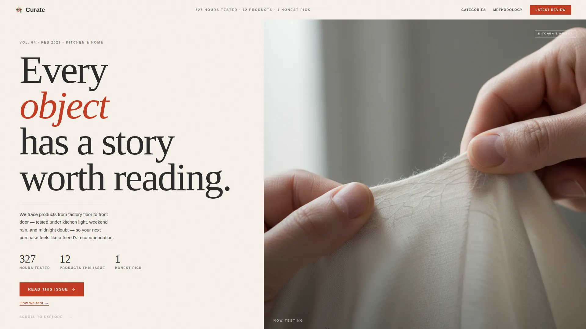
- A hero reel panel with ambient video loop, serif text overlay, and editorial tone-setting copy
- A methodology panel, a comparative matrix panel, an editor's pick panel, and a trust signals section
- A linear single-row footer and a clear affiliate click-through path via vermillion call-to-action buttons
Feature list
This template packs specific, prompt-grounded capabilities across layout, motion, and editorial structure.
Horizontal Scroll Panel Layout
Each product category is presented as a self-contained horizontal panel. The layout mimics flipping through a printed buying guide, with each swipe revealing a new editorial spread. GSAP scroll-linked animations drive the transitions between panels smoothly.
Autoplay Hero Video Reel
The header features a vertical-format video loop showing hands unboxing, testing, and comparing products. It autoplays muted with ambient sound implied in the design structure, and carries serif text overlays like "327 Hours Tested. 12 Products. 1 Honest Pick." to set editorial authority immediately.
Comparative Matrix Panel
A photography grid presents multiple products side by side with star breakdowns across scored categories. This data-rich panel gives deliberate shoppers the comparison view they need without requiring them to navigate away.
Editor's Pick with Dual Call-to-Action
Each editor's pick panel closes with two distinct action paths. A vermillion "See Current Price" button routes to the retailer via affiliate link. An underlined "Read Full Review" text link serves readers who want deeper context before committing to the click.
Trust Signals Section
A dedicated section surfaces reader voices and transparent scoring data. Specific test hours, product counts, and reader quotes with specificity are built into the layout to reinforce editorial credibility at the point closest to conversion.
GSAP Staggered Reveal Animations
Panel transitions and content reveals are powered by GSAP scroll-linked animation. Staggered entry effects give each element room to land with intention, keeping the reading experience unhurried and deliberate rather than visually chaotic.
Page sections overview
| Section | Purpose |
|---|---|
| Hero Reel Panel | Sets editorial authority with ambient video loop and serif overlay copy |
| Methodology Panel | Explains how products are sourced, tested, and scored to build process trust |
| Comparative Matrix | Presents side-by-side photography and star breakdowns across product options |
| Editor's Pick Panel | Delivers the long-form micro-review and dual click-through action paths |
| Trust Signals Section | Reinforces credibility with reader quotes and transparent scoring data |
| Linear Footer Row | Closes the page with a clean, single-row footer pattern |
Design & branding system
The visual identity follows a Heritage and Story theme interpreted through a Japanese Zen color system. Every design choice is intentional. Cream dominates the reading surface, charcoal anchors text, stone gray separates panels, and vermillion appears sparingly as a stamp of editorial conviction.
- Color palette: washi paper cream (#F5F0E8) as base, bamboo charcoal (#2C2C2B) for type, stone garden gray (#4A4A48) for panel separation, and torii vermillion (#C23B22) reserved for links, active states, and call-to-action elements
- Typography: Fraunces serif for display headings and editorial tone, DM Sans for interface labels and mono-style annotations
- Visual feel: a field notebook aesthetic, with every element earning its place on the page rather than filling space
Mobile & speed optimization
The template is designed desktop-first with horizontal scroll as the primary experience. On mobile devices, the layout falls back to a vertical scroll flow so content remains readable on smaller screens.
- Desktop-first horizontal scroll powered by CSS smooth scroll and GSAP panel transitions
- Mobile fallback to vertical layout ensures the full editorial sequence remains accessible on phones and tablets
- High-interactivity features including a testimonial carousel and hover states are built into the template structure
How this template helps you convert
Curate builds toward a single, low-friction conversion action. There is no form, no sign-up gate, and no friction between the editorial recommendation and the affiliate click. Trust does the selling.
- The methodology panel earns reader trust early by showing exactly how products are sourced and scored, so the final recommendation feels earned rather than sponsored.
- The comparative matrix gives shoppers the side-by-side data they need to confirm the editor's pick matches their situation, reducing hesitation before the click.
- The dual call-to-action on every editor's pick panel captures both the ready-to-click reader and the reader who needs one more layer of detail, maximizing click-through at each decision point.
Other information about this template
Curate is built specifically for the e-commerce review blog niche, where editorial depth and affiliate monetization need to coexist without one undermining the other. A few additional details worth knowing before you customize:
- The template is localized for English-language audiences using United States dollar pricing, the MM/DD/YYYY date format, and USA regional conventions
- Animation intensity is high by design: GSAP scroll-linked reveals and staggered panel entries create an editorial rhythm that slower, static templates cannot replicate
- The affiliate link structure uses vermillion buttons reading "See Current Price" as the primary path, with "Read Full Review" text links as a secondary route, keeping the conversion flow transparent and non-pressured
- This template fits review content across product categories such as kitchen tools, strollers, desk chairs, and similar considered-purchase items where buyers spend time comparing before deciding


Theme
Heritage & Story
Creative direction
Industry Report
Color system
Japanese Zen
Style
Horizontal Scroll
Direction
Click-Through
Page Sections
Horizontal Scroll Panel Layout
Autoplay Hero Video Reel
Comparative Matrix Panel
Editor's Pick with Dual Call-to-action
Trust Signals Section
GSAP Staggered Reveal Animations
Related questions
Does this template require a video to work in the hero section?
Can I add more product categories beyond the included panels?
Is there a sign-up form or email gate included?
How does the mobile fallback work?
Can I change the accent color from vermillion to match my brand?



