Email Marketing Newsletter Blog Website Template
Dispatch is an asymmetric 60/40 grid landing page template built for curated email newsletter creators who want to earn the signup before they ask for it. It pairs a Japanese Zen ink-and-paper visual identity with a manifesto-style scroll, a looping desk-animation header, a live accordion archive, and a single frictionless email capture field, all in one focused, editorial landing page.
by Rocket studio
Quick summary
Dispatch is a single-page landing page template designed for weekly curated newsletters. It uses a 60/40 asymmetric grid, an Ink and Paper visual identity, and a manifesto scroll format to prove editorial taste before asking for a subscription. The primary call to action is one email field. No pop-ups, no multi-step forms, no noise.
Who this template is for
This template is built for newsletter creators who believe that restraint is a competitive advantage. If your value proposition is that you read everything so your subscribers do not have to, this landing page communicates that message with every pixel.
- Solo email marketers who run their own lists and want a website that reflects the same editorial discipline as their newsletter
- Agency copywriters managing multiple client accounts who need a clean, credible signup page they can customize and launch quickly
- In-house lifecycle managers and content leads who have stopped trusting algorithmic feeds and want to build a direct relationship with their audience through a well-curated weekly digest
What problem this template solves
Most newsletter landing pages look like every other SaaS signup screen. They list features nobody asked about and bury the actual product. For a curated links newsletter, that approach actively works against trust. Your subscribers are skeptical marketing professionals. They have seen every trick. They do not respond to generic benefit bullets or vague promises.
The Dispatch template solves the credibility gap directly. It puts your curation on display before it asks for a commitment.
- Visitors can read a past issue in full before they decide to subscribe, which means the product earns the signup rather than a headline doing the heavy lifting
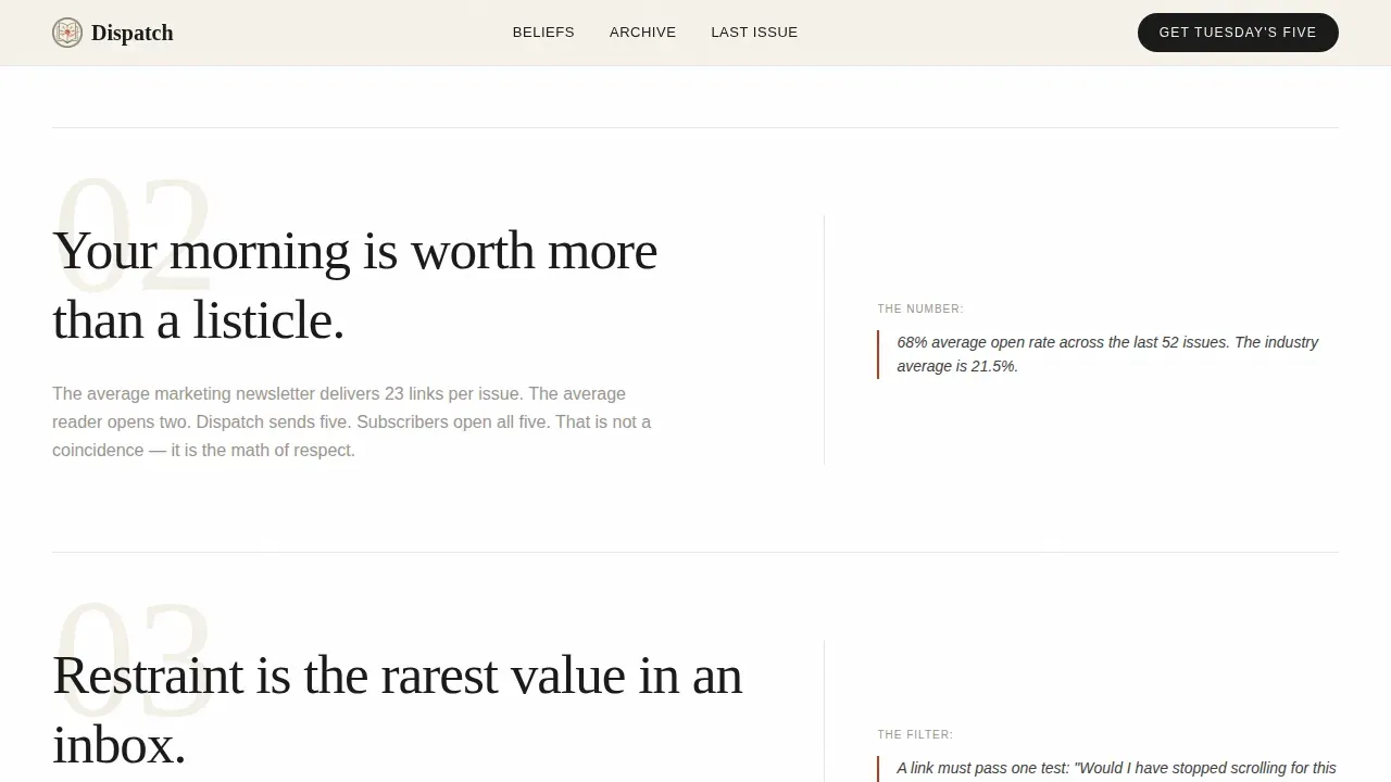
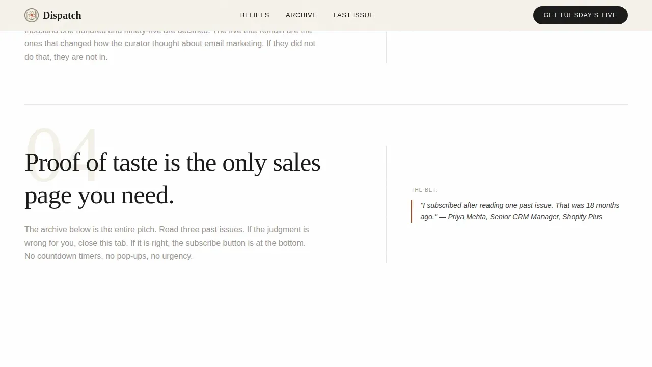
- The manifesto scroll format lets you declare your editorial convictions in large type and back each one with real evidence in the sidebar column, creating a rhythm of claim and proof that builds confidence as users scroll
- The accordion archive creates a living log of past issues with one-line editorial annotations, giving first-time visitors immediate access to the body of work behind the newsletter
What you get with this template
You get a complete, ready-to-adapt single-page landing page that covers every stage of the subscriber journey, from first impression through social proof to frictionless signup. Every section is purposeful. Nothing is decorative without also being functional.
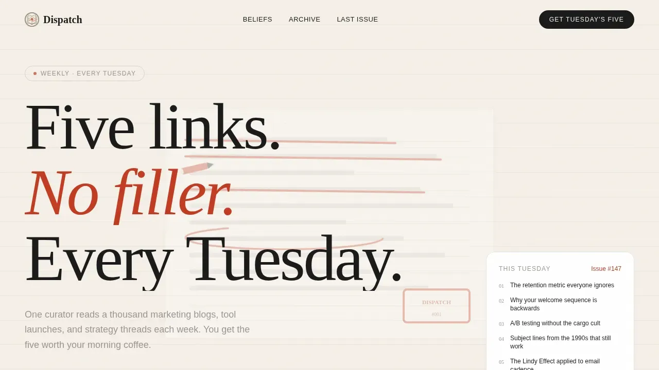
- A looping fifteen-second header animation showing a hand crossing out mediocre links and circling one keeper, immediately communicating the editorial premise of the newsletter
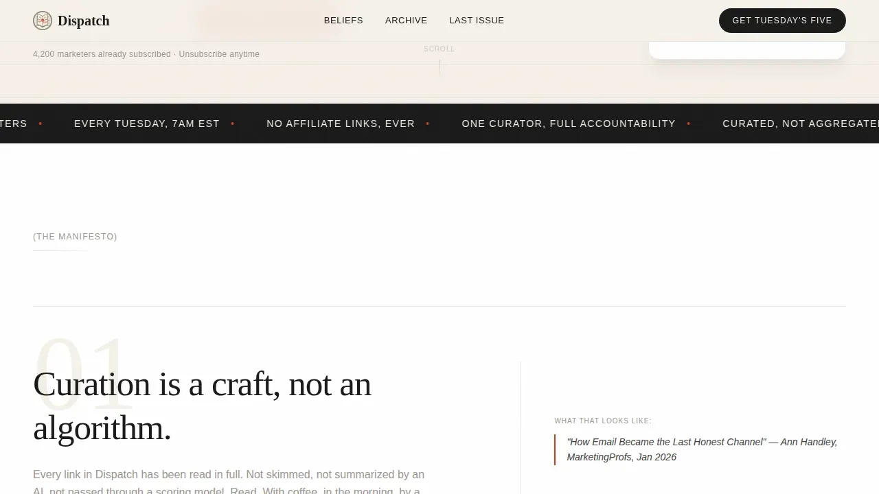
- An asymmetric 60/40 manifesto scroll where each belief declaration occupies the wide column and supporting evidence or a sample link sits in the narrow sidebar, creating a natural reading rhythm that rewards attention
- A minimal accordion archive of past issues, each expandable to reveal that week's five links with editorial annotations, plus a secondary call to action to read the full last issue as a free preview
Feature list
This section describes each built-in component in the Dispatch template. Every item listed here appears in the source brief and is present in the delivered template.
Short-Form Reel Header Animation
The header plays a fifteen-second looping animation shot top-down on a wooden desk. A hand drags a red pen through printed links, crossing out the mediocre ones and circling the one worth keeping. The sequence ends with a single headline fading in over the final frame. The motion is unhurried, and the scratch of pen on paper gives the animation an almost ASMR quality that sets the editorial tone before a single word of body copy is read. This image immediately signals to users what the newsletter stands for.
Asymmetric 60/40 Manifesto Scroll
Past the header, the page does not list features. It declares beliefs. Each scroll section is a single conviction set large in the 60-column, with supporting evidence or a sample article link tucked into the 40-column sidebar. Statements like these create a rhythm that escalates from editorial philosophy to concrete proof. The format encourages visitors to slow down and read rather than scan, which is precisely the response a taste-driven newsletter needs to earn trust. The writing style in this section is intentionally direct.
Living Accordion Archive
Below the manifesto scroll, a minimal accordion houses past issues. Each entry is collapsed by default and can be expanded to reveal that week's five curated links, each with a short editorial annotation explaining why it was worth including. This component creates a searchable, browsable log of the newsletter's editorial judgment. Visitors who arrive for the first time can spend ten minutes exploring the archive and leave as informed subscribers. The archive is the most powerful trust-building element on the page.
Frictionless Single-Field Email Capture
The primary call to action is one email input and one submit button. The button label reads "Get Tuesday's Five." There is no secondary field, no name requirement, no preference checklist, and no friction. The cost of subscribing is a single email address. This design choice is intentional: it respects the visitor's time and signals that the newsletter itself will treat their inbox with the same economy. A high-contrast vermillion call-to-action button is positioned clearly within the conversion section to drive immediate action.
Social Proof Section
The page includes a dedicated social proof block containing open-rate data, subscriber count, and three pull quotes from named subscribers. Each quote is attributed to a real person by name and role. The data points address the most common concern a skeptical professional has before subscribing: is this newsletter actually worth reading? Open-rate figures are a direct measure of how much subscribers value what lands in their inbox each week, and presenting them here creates a credible, evidence-based response to that concern.
Full Issue Preview Path
A secondary conversion path allows visitors to read the previous week's complete issue before committing to a subscription. The "Read Last Week's Issue" link opens a full preview that lets anyone experience the product without first handing over their email address. This is the template's clearest statement that it earns the signup by proving taste. Every visible link in the preview is evidence that the curator's judgment is worth a slot in a professional inbox.
Page sections overview
| Section | Purpose |
|---|---|
| Hero Header Animation | Immediately communicates the editorial premise through a looping red-pen desk animation and a single punchy headline |
| Manifesto Scroll Sequence | Declares editorial beliefs in the 60-column with supporting evidence and sample links in the 40-column sidebar |
| Live Past Archive | Accordion of past issues with expandable five-link lists and one-line editorial annotations |
| Social Proof Block | Open-rate data, subscriber count, and three attributed pull quotes from named subscribers |
| Primary Signup Section | Single email input field with a vermillion call-to-action button and zero additional friction |
| Full Issue Preview | Secondary path to read last week's complete issue before subscribing |
| Minimal Footer | Ultra-minimal horizontal flow footer with essential links only |
Design & branding system
The Dispatch template is built on a Japanese Zen color system called Ink and Paper. The palette is restrained on purpose. Generous negative space does more visual work than any graphic element ever could.
- Color system: washi cream (#F5F0E8) and pure white alternate as section backgrounds, sumi ink (#1A1A1A) carries almost all body text and headlines, stone garden gray (#9B9590) handles secondary labels and supporting copy, and vermillion seal red (#C23B22) is reserved exclusively for links, buttons, and editorial emphasis, a single accent that draws the entire eye exactly where the page needs it to go
- Typography: Fraunces is the serif typeface for all editorial headlines and manifesto declarations, giving the page the feeling of a well-set broadsheet; DM Sans handles all body copy and user interface elements with clean, readable neutrality; together they create a hierarchy that feels deliberate and calm
- Visual rhythm: the page alternates between washi cream and white section backgrounds, uses large negative space between content blocks, and relies on scale and weight rather than color or decoration to create emphasis; the overall feeling is a calligraphy studio at dawn, unhurried black strokes on handmade paper with one red stamp in the corner
Mobile & speed optimization
The Dispatch template is designed desktop-first, using the broadsheet metaphor as its primary reference. The 60/40 asymmetric grid is built for a wide screen reading experience. On smaller screens, the layout stacks elegantly into a single-column flow that preserves the editorial hierarchy.
- The manifesto scroll collapses to a single-column format on mobile, with the wide belief declaration stacked above the sidebar evidence block, maintaining the logical reading order without losing the claim-and-proof rhythm
- All links and the email capture form are fully functional on smartphones, following the principle that mobile-friendly design requires every interactive element to work perfectly regardless of screen size
- The header animation is handled as a looping video asset that scales to viewport width, and all static Server Components are separated from interactive Client Components to keep the initial page load focused on content delivery rather than script execution
How this template helps you convert
The Dispatch template is built around one conversion goal: earning the email address by proving editorial worth before asking for it. Every design and layout decision on the page supports that goal in sequence.
- The header animation creates an immediate emotional response by showing the curation process in motion. Visitors understand within fifteen seconds that someone is reading everything and keeping only the best. That single image does more to establish trust than a paragraph of benefit copy ever could. It encourages a forward lean rather than a backward scroll.
- The manifesto scroll builds the case through a rhythm of conviction and evidence. Each belief statement is backed by a data point, a subscriber quote, or a sample link in the sidebar. By the time a visitor reaches the email capture section, they have read the editorial philosophy, seen the open-rate data, browsed the archive, and read a full past issue. The signup decision has already been made by the content. The button is just the confirmation.
Other information about this template
The Dispatch template is a strong choice for any newsletter creator in the email marketing industry who wants a landing page that matches the quality of the publication itself. The sections below cover additional context that buyers commonly ask about before deciding to use this template.
- This template is categorized under Blog and Editorial, with a subcategory focus on Email Marketing Newsletter products and services. It is built specifically for the email marketing curated links newsletter niche.
- An email newsletter is a marketing email sent to a list of subscribers on a regular basis, aiming to provide them with updates on new products and services, share company news, or educate them in general. The purpose of a newsletter is to give subscribers updates regarding a business, its products and services, while also engaging and connecting with the audience.
- Email newsletters are among the most effective digital marketing tools available to modern marketers, achieving high click-through rates that translate into better conversions for any company that invests in them consistently. Email marketing offers a return on investment of $42 for each $1 spent, making it a highly effective channel for driving business growth.
- To create an email newsletter, a creator needs an email service provider, often abbreviated as ESP, that allows sending newsletters to a large group of people and lets the sender measure important data like open rates and click-through figures. Personalization is essential: customers need to feel that each email was crafted for them personally to address their needs.
- Crafting an attention-grabbing email subject line is crucial for the success of a newsletter, as it influences open rates significantly. The best time to send an email newsletter is between 9 and 11 in the morning, with Tuesday and Thursday being the most effective days, which makes the Dispatch template's Tuesday-morning framing directly relevant to how subscribers engage with their inbox.
- Email newsletters should include an unsubscribe option to maintain a healthy list and comply with regulations including CAN-SPAM and GDPR. The importance of newsletters lies in their ability to allow regular contact with customers, which builds trust and loyalty over time.
- Using bullet points and bold text can keep a landing page scannable by highlighting key value propositions. Including a short video or a text testimonial can build trust immediately on a landing page.
- Clarity, urgency, and mobile optimization are essential for capturing users on a Tuesday morning landing page. A high-contrast call-to-action button positioned above the fold can drive immediate conversions, and incorporating high-quality, relevant images can increase emotional connection on a landing page.
- Effective components for a landing page include a mix of productivity signals, motivation, and visual appeal. Enhancing a Tuesday morning landing page template involves focusing on resources that boost engagement, provide quick value, and encourage action before the morning rush begins.
- Offering access to a full past issue or an actionable checklist increases engagement by providing users with immediate value before they commit to subscribing. This approach reflects a broader best practice: earn the form submission by delivering something real first.
- The template's manifesto format draws on a writing tradition of declaration-then-proof, which is distinct from feature-list templates. It is a format that appears rarely in newsletter landing page design and gives Dispatch a strong point of difference in the market.
- Context from the broader economy and government policy landscape appears regularly in the types of links that a curator like Dispatch might feature. For example, topics around the Finance Bill and its proposed changes to income tax thresholds, business property relief, agricultural property relief, and the tax burden on family farms and small businesses in the United Kingdom are exactly the kind of high-signal, high-stakes subjects a curated marketing newsletter might surface for its readers who manage business decisions each week.
- The Finance Bill's proposed measures touch areas including changes to inheritance tax thresholds, freezes on income tax bands, and questions about how government decisions affect the private sector and small business owners. Family farm tax changes are expected to require farmers to pay tax on farm values over a one million pound threshold, raising concerns about food security and the consolidation of rural land. The Government has committed to lifting the two-child benefit cap and to maintaining the highest level of public investment in 40 years, which the bill proposes as a mechanism for driving economic growth. A prime minister overseeing these measures faces pressure from rural communities, small business advocates, and employees who worry about the real-world cost of policy changes on their income. These subjects represent exactly the kind of article that a curated newsletter might flag as the one link worth your Tuesday morning coffee.
- Topics touching on the gig economy also appear regularly in marketing and business newsletters. As an example, companies like Uber employ hundreds of social scientists and data scientists to experiment with behavioral science techniques that influence how their workers operate. Uber uses noncash rewards and video game-style mechanics to encourage drivers to continue working toward earnings goals, and its forward dispatch feature sends drivers their next opportunity before a current ride ends, keeping them on the road for longer. The gig economy allows companies to minimize labor costs by classifying workers as independent contractors rather than employees, a business model that raises questions about pay, progress, and the long-term income of people who log hours in the platform economy. These are the kinds of subjects where a trusted curator adds genuine value by pointing readers to the one article that actually advances understanding rather than repeating noise.
- The Dispatch template is built with Server Components handling all static content and Client Components reserved only for interactive elements like the accordion and the email capture form. This separation reflects a deliberate technical plan to keep the user experience responsive without unnecessary script overhead.
- The template's footer follows a horizontal flow pattern that is ultra-minimal. It carries essential links only, keeping the end of the page as clean as the beginning.
- Buyers who want to use this template for a different newsletter subject can adapt the manifesto copy, the archive data, and the social proof section to match their own publication. The layout, color system, and animation framework remain the same. The template is built to accept a wide range of editorial voices while keeping the visual identity consistent.
- The Dispatch Five Links Worth Your Tuesday Morning Landing Page Template is available for use within the platform. Users can access it, adapt it, and launch it without needing to build the animation, accordion, or grid structure from scratch.
Theme
Ink & Paper
Creative direction
Manifesto
Color system
Japanese Zen
Style
Asymmetric Grid (60/40)
Direction
Content/Resource
Page Sections
Short-form Reel Header Animation
Asymmetric 60/40 Manifesto Scroll
Living Accordion Past-issue Archive
Frictionless Single-field Email Capture
Social Proof Block with Open-rate Data
Full Issue Preview Secondary Path
Related questions
Can I adapt the manifesto copy to match my newsletter's subject?
Does the accordion archive require a large back-catalog of past issues?
How does the full issue preview path work?
What does the email capture section include?
Is this template suitable for newsletters outside the marketing niche?



