Hobby & Passion Content Blog Website Template
Curd is a hub-and-spoke landing page template built for serious home cheesemaking blogs and community hubs. It pairs a cinematic hero with a fixed anchor navigation and five deep content spokes, Why, Learn, Make, Join, and a minimal footer, all wrapped in a warm Heritage and Story visual identity that earns trust before asking for a single click.
by Rocket studio
Quick summary
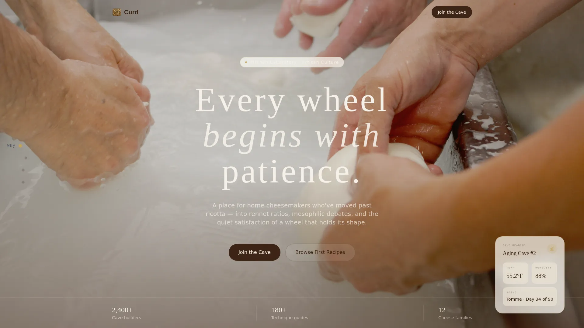
Curd is a single-page, anchor-nav landing page template for post-beginner home cheesemakers. It opens with a full-bleed hands-and-curds hero, then scrolls through a mission manifesto, course and recipe sections, technique cards, and member stories. The goal is simple: move engaged visitors into a free community hub before they ever feel pressured.
Who this template is for
This template was designed for people who have moved well past basic recipes. It speaks to the late-night curd-stretcher, the forum lurker who debates mesophilic versus thermophilic cultures, and the blogger who wants their page to feel as deliberate as their aging process.
- Home cheesemakers running hobby blogs or community hubs who need a structured, story-first landing page
- Fermentation educators and artisan food creators wanting to grow a free membership community around their content
- Independent creators in the hobby food niche who want a desktop-first, editorial design that converts through trust rather than urgency
What problem this template solves
Most hobby blog templates look like generic listicles. They do not reflect the depth of knowledge or the quiet obsession that serious home cheesemakers bring to their craft. Curd fixes that mismatch.
- A shallow visual identity makes experienced visitors distrust the source before reading a single word
- No clear content hierarchy means visitors bounce before they find the course archive, technique guides, or community forum
- Generic call-to-action placement asks for commitment before the visitor feels they belong, killing sign-ups before they start
What you get with this template
You get a fully structured, five-spoke hub-and-spoke landing page ready to fill with your own content, community proof, and brand voice. Every section has a defined purpose and a deliberate visual weight.
- A cinematic hero section with a serif headline layout, followed by four distinct content spokes covering mission, learning, technique, and community
- A fixed left-side anchor navigation with four labeled dots (Why, Learn, Make, Join) for smooth scroll and instant section jumping
- Two contextually earned primary call-to-action placements and a secondary browse path in each spoke, all click-through with no on-page form
Feature list
This template includes prompt-backed components built specifically for the home cheesemaking community niche.
Fixed Anchor Navigation
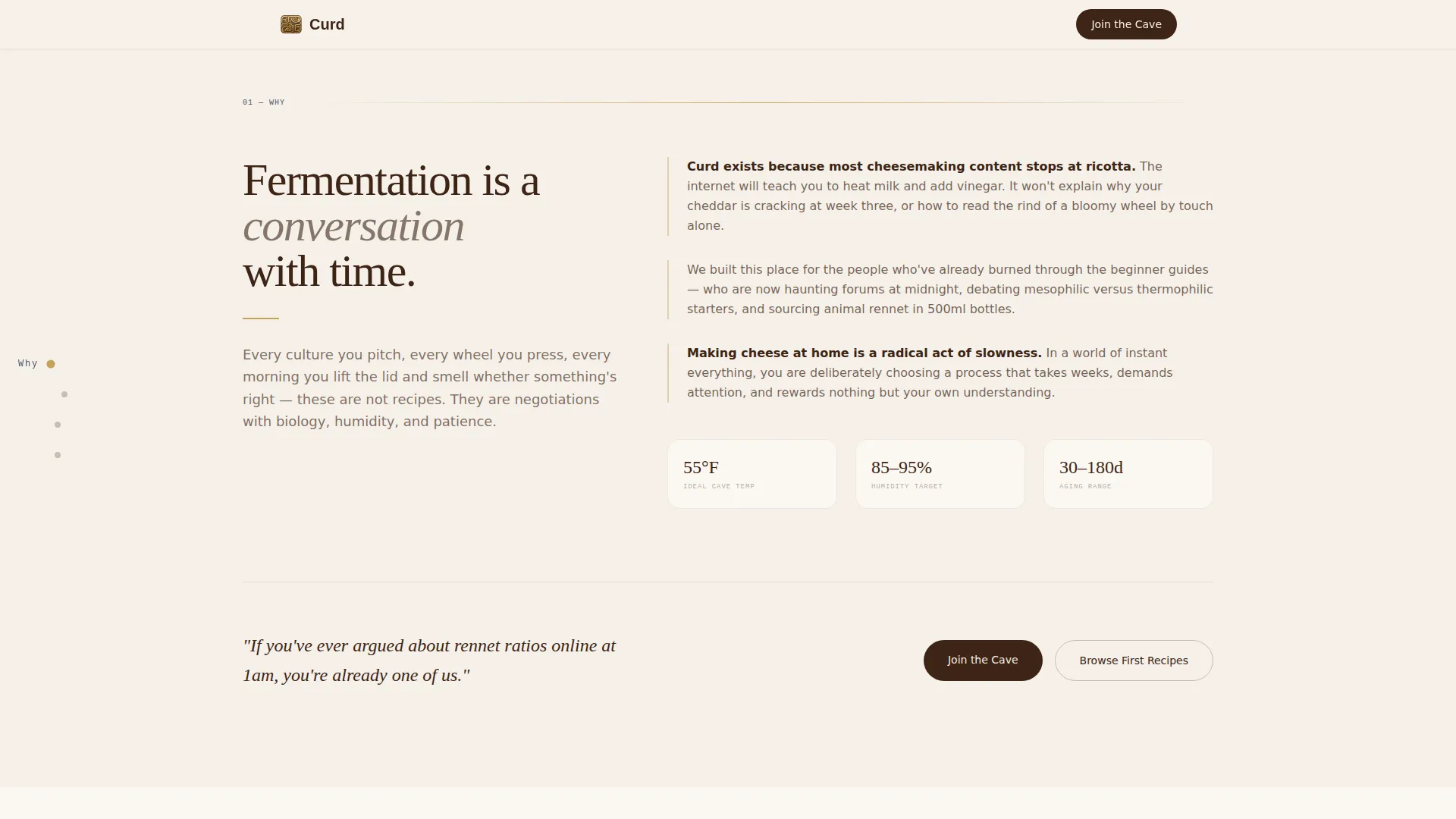
A vertical dot navigation sits fixed on the left side of the page throughout the scroll. Each dot carries a single word label. Visitors can jump directly to any spoke or surrender to the natural scroll flow.
Cinematic Hero Section
A full-bleed photographic header pairs a large cream serif headline with a warm, still composition. The hero is built for Type Over Image layout, designed to establish mood and authority in the first breath without relying on animation.
Mission Manifesto Spoke
The Why spoke unfolds as a philosophy statement about fermentation and time. It grounds the community in a shared belief before introducing the first primary call-to-action placement, earning context before asking for commitment.
Bento Grid Learn Spoke
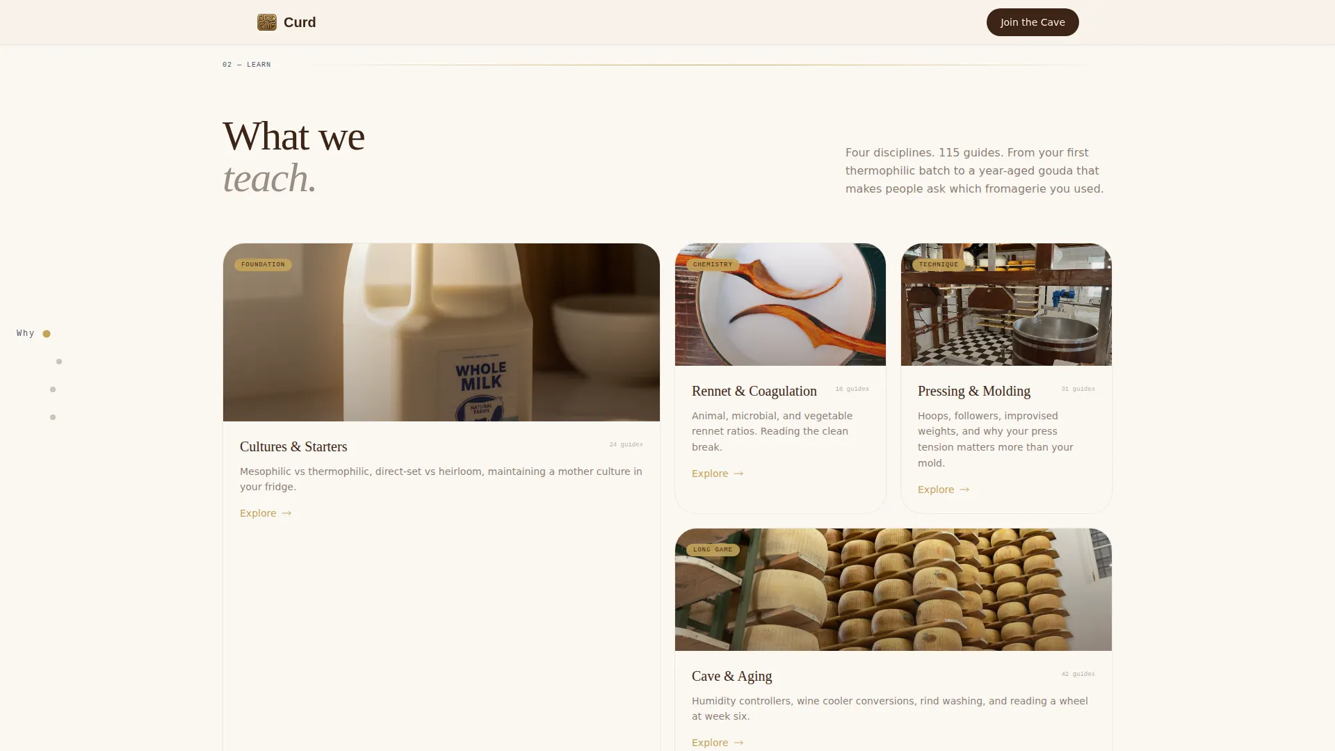
The Learn spoke uses an asymmetric bento grid to display course categories and a recipe archive. The grid layout lets visitors scan multiple content types at once without losing the editorial calm of the overall design.
Technique Depth Make Spoke
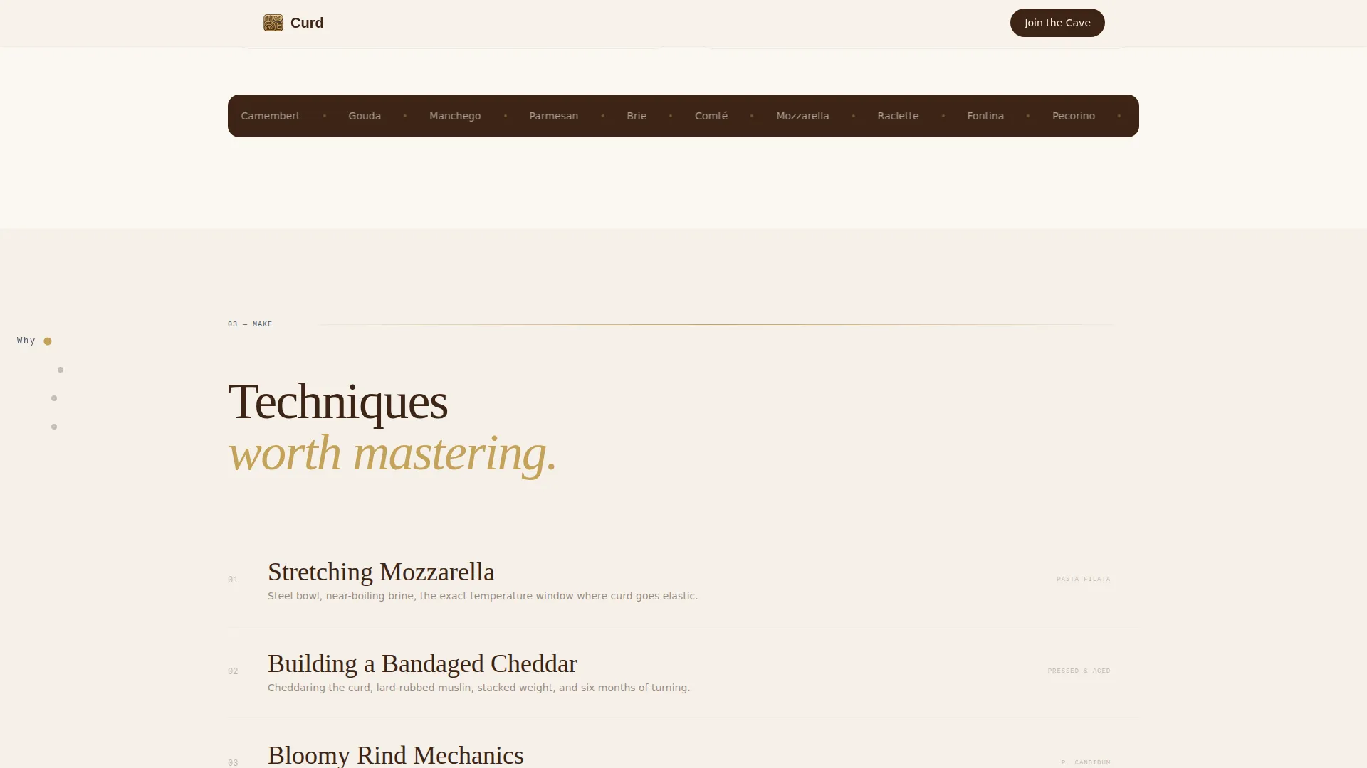
The Make spoke presents a technique list with hover-translate interactions and paired process depth cards. Visitors can preview the depth of method content the community offers before deciding to join.
Member Stories Join Spoke
The Join spoke uses a masonry card layout for member stories and includes a forum preview section. A member count stat adds social proof. The second primary call-to-action appears here after the visitor has built genuine connection with the community.
Page sections overview
| Section | Purpose |
|---|---|
| Hero Header | Establishes mood and tone with a cinematic photo and serif headline |
| Why Spoke | Delivers the mission manifesto and first call-to-action |
| Learn Spoke | Showcases course categories and recipe archive in a bento grid |
| Make Spoke | Presents technique list and process depth cards with hover states |
| Join Spoke | Displays member stories, forum preview, and second call-to-action |
| Minimal Footer | Closes the page with a clean horizontal flow pattern |
Design & branding system
The visual identity follows a Heritage and Story theme interpreted through a Japanese Zen restraint. Every color choice is deliberate and quiet, referencing handmade pottery rather than polished digital gloss.
- Off-white (#F5F0E8) dominates all backgrounds like aged parchment; deep brown (#3C2415) anchors body text with the density of a handwritten recipe journal; straw gold (#C4A35A) marks section dividers and hover states
- Muted indigo (#4A5568) is reserved for the anchor nav dots and active interactive states, providing calm visual authority without competing with the warm palette
- Typography pairs Fraunces for serif display headlines, DM Sans for readable body copy, and JetBrains Mono for small labels, creating a layered editorial hierarchy that feels both artisan and legible
Mobile & speed optimization
The template is designed desktop-first to match the forum and laboratory audience, but mobile parity is built into the layout structure.
- Anchor nav, masonry cards, and bento grid sections are all structured to reflow cleanly for smaller screens without losing the editorial tone
- Animations use IntersectionObserver-based reveals and parallax scrolling on the hero, keeping client-side JavaScript minimal and static sections handled by Server Components
How this template helps you convert
The page earns its click-through conversions through progressive trust rather than aggressive prompting.
- The hero and Why spoke build philosophical alignment first, so visitors feel understood before they see any call-to-action button
- The Learn and Make spokes demonstrate content depth, giving visitors a taste of the recipe archive and technique library before committing to join
- The Join spoke closes with member stories and a forum preview, so clicking "Join the Cave" feels like returning home rather than signing up for something unknown
Other information about this template
This template sits at the intersection of the Blog and Editorial category and the Hobby and Passion Content subcategory, purpose-built for the home cheesemaking niche. A few additional details worth knowing:
- The creative direction is Vision and Mission, meaning the entire scroll is structured as a manifesto rather than a feature list
- The landing page direction is Click-Through, so there is no on-page form; both primary and secondary calls-to-action point visitors to a dedicated registration page
- A secondary browse path labeled "Browse First Recipes" sits beneath each primary call-to-action, giving hesitant visitors a lower-commitment entry point into the content
Theme
Heritage & Story
Creative direction
Vision & Mission
Color system
Japanese Zen
Style
Hub & Spoke (Anchor Nav)
Direction
Click-Through
Page Sections
Fixed Left Anchor Navigation
Cinematic Type Over Image Hero
Mission Manifesto Spoke
Asymmetric Bento Grid Learn Section
Hover-translate Technique Cards
Member Stories and Forum Preview
Related questions
Does this template include a sign-up form on the page?
Can I adapt this template for a different artisan food or fermentation niche?
How many call-to-action placements does the template include?
What level of animation does this template use?
Is the anchor navigation easy to relabel or reorder?



