Plus-Size Fashion Editorial Landing Page Template
Curve is an editorial-style plus-size fashion landing page built as a hub-and-spoke layout with a pinned anchor navigation. It combines a hand-drawn hero illustration, bold stat-led section openers, curated product grids, and a sticky "Shop the Edit" call to action. The result reads like a glossy magazine feature and converts like a focused storefront.
by Rocket studio
Quick summary
Curve is a single-page editorial landing page for a plus-size fashion magazine. It uses a hub-and-spoke layout with a pinned anchor navigation, cinematic scroll-reveal animations, and a warm stone color system. The page flows like a long-form feature article and ends with a full-width "Shop the Edit" call to action block.
Who this template is for
This template suits fashion writers, content-commerce editors, and independent magazine publishers who cover plus-size style. It is built for creators who want to pair editorial voice with genuine product discovery, not just inspiration boards.
- Fashion bloggers and digital editors covering size-inclusive style
- Independent magazine publishers running content-commerce operations
- Style writers who want to move readers from article to purchase without friction
What problem this template solves
Most fashion editorial templates are built around a standard blog grid or a generic hero and three-column layout. They do not support long-form, section-led storytelling with embedded product moments. Curve solves the mismatch between editorial ambition and conversion design.
- Generic blog layouts break the reading flow when product cards appear mid-article
- Single-purpose landing pages lack the editorial depth needed to build taste authority
- Plus-size fashion content is often presented as motivational rather than technically detailed
What you get with this template
You get a fully structured, single-page layout with five distinct editorial sections connected by a pinned anchor navigation bar. Every design decision reinforces the magazine feel while keeping conversion paths clear and uncluttered.
- A full-width hero with a hand-drawn fashion illustration and a cinematic headline entrance
- Four editorial spoke sections: "The Brands," "The Gaps," "The Fits," and "The Closet Edit"
- A sticky "Shop the Edit" terracotta call to action bar that appears after the second spoke section
Feature list
This section walks through the core built-in components that make Curve work as both a reading experience and a conversion tool.
Pinned Hub-and-Spoke Anchor Navigation
The navigation bar pins to the top of the viewport as the reader scrolls. Each link is labeled like a magazine section title. Smooth scroll anchoring moves the reader directly to the correct spoke without a page reload.
Custom Editorial Hero Illustration
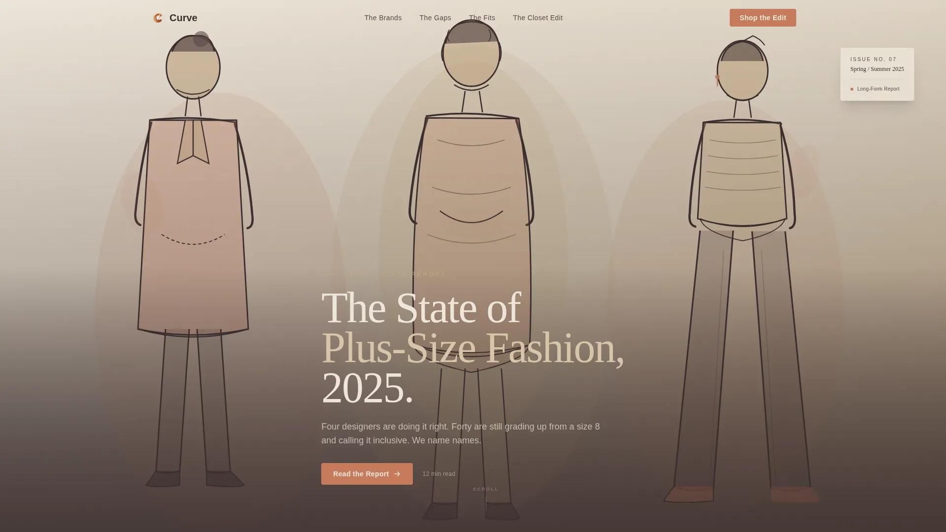
The header features a full-width, hand-drawn fashion illustration of three women in motion. The artwork uses loose ink lines with terracotta and sandstone watercolor washes. A single headline, "The State of Plus-Size Fashion, 2025," fades in below the illustration on entrance.
Stat-and-Quote Section Openers
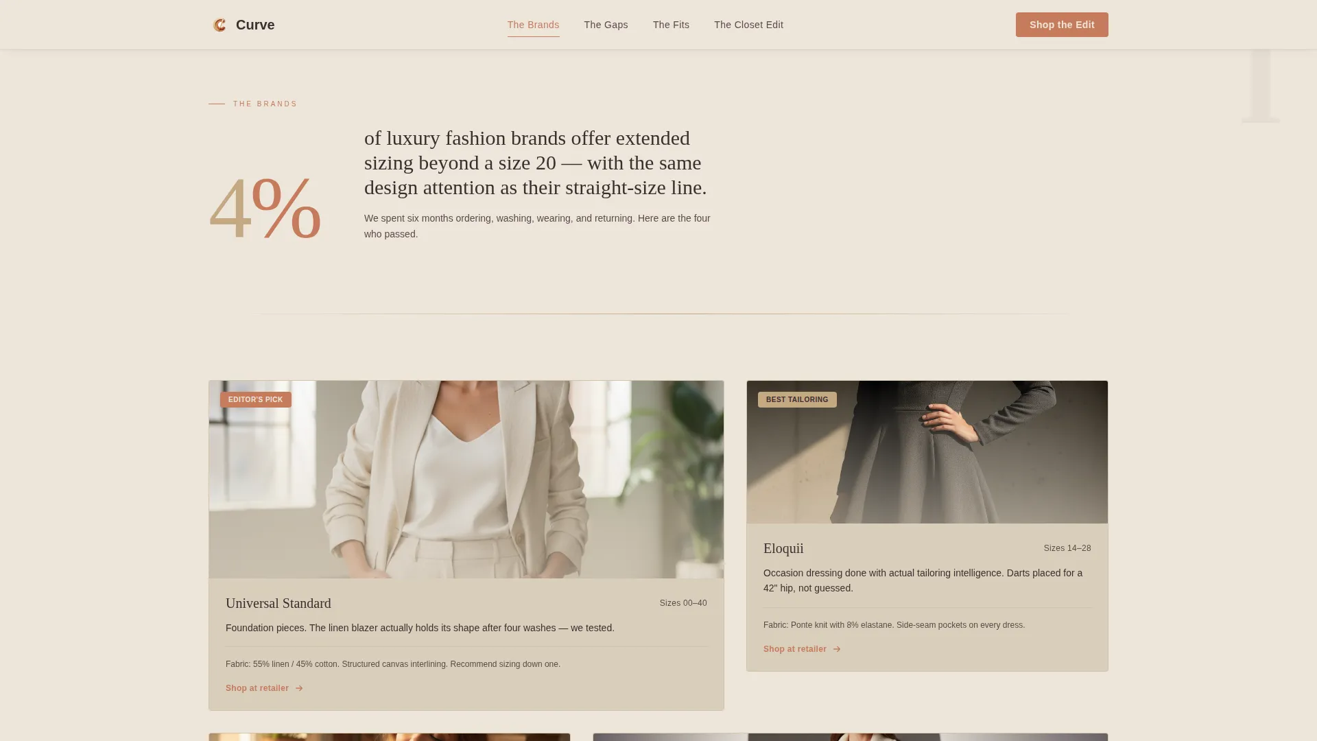
Each spoke section opens with an oversized serif stat or provocative pull quote. These openers are set in Fraunces and styled with terracotta borders to create immediate visual impact before the editorial body paragraphs begin.
Curated Product Card Grids
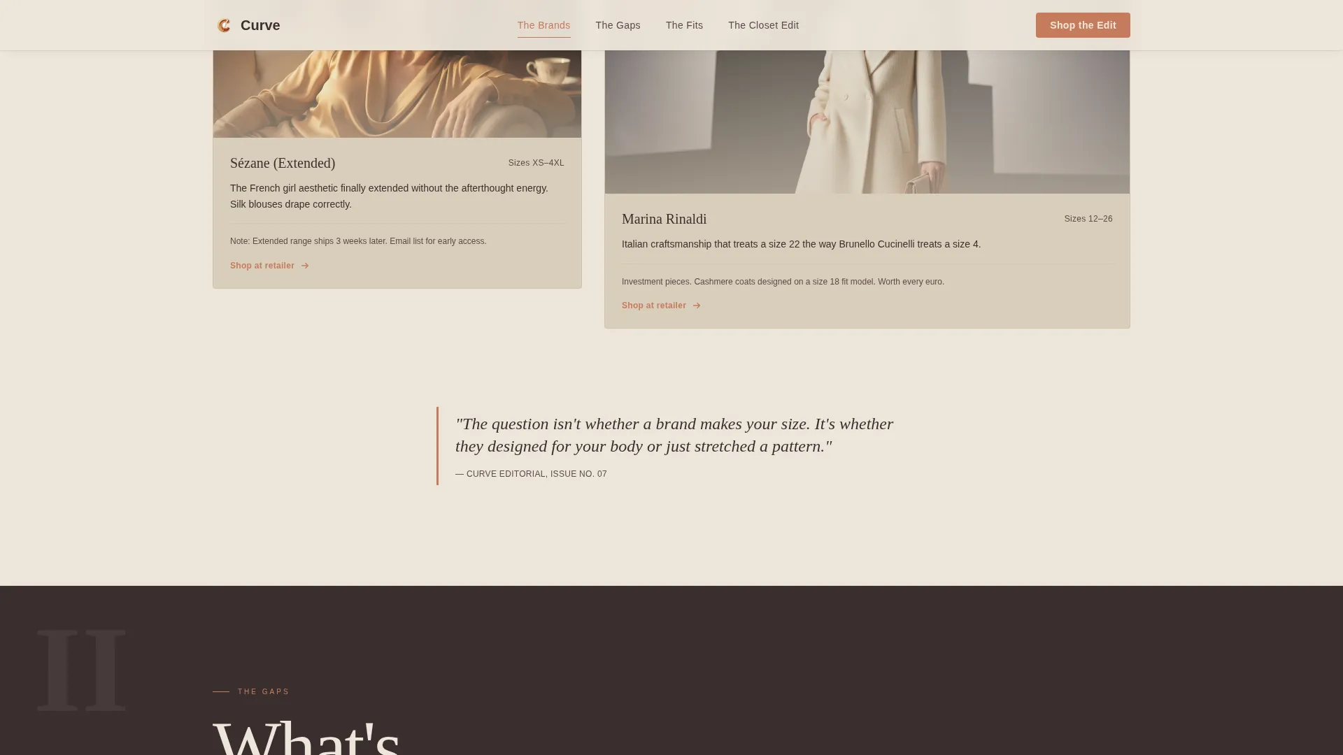
Each relevant section includes a staggered product card grid with hover states. Each card links outward to the retailer. The cards are designed to feel editorial rather than transactional, consistent with the magazine reading experience.
Sticky "Shop the Edit" Call to Action Bar
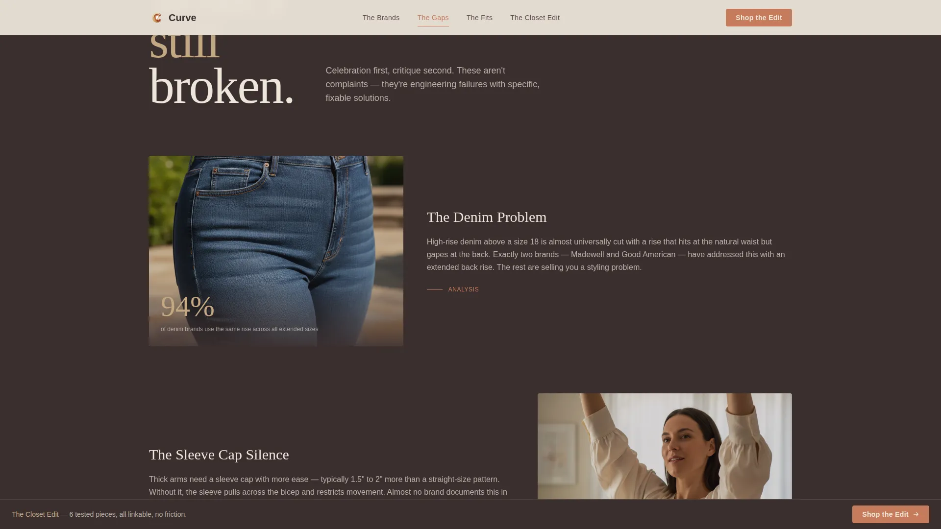
A terracotta sticky bar appears after the reader passes the second spoke section. It persists through the rest of the scroll journey and drives to a curated storefront page. The final section also includes a full-width closing version of this call to action.
Arc Browser Split Footer
The footer uses a split layout with the magazine logo and tagline on the left and navigation links on the right. The warm stone palette carries through so the footer feels like a natural closing page rather than a utility block.
Page sections overview
| Section | Purpose |
|---|---|
| Hero Illustration | Opens the editorial with a cinematic full-bleed hand-drawn illustration and fade-in headline |
| The Brands | Bold stat opener followed by curated brand cards with editorial annotation |
| The Gaps | Provocative pull quote introducing a critique section with inline photography |
| The Fits | Tailoring detail grid with outward-linking product cards |
| The Closet Edit | Curated product grid anchored by the sticky and full-width "Shop the Edit" calls to action |
| Split Footer | Logo and tagline left, navigation links right, in the warm stone palette |
Design & branding system
The palette is built around four warm stone tones that work together to create a Mediterranean linen shop atmosphere at golden hour. Typography pairs a high-contrast serif with a clean sans-serif for body and navigation text.
- Sandstone (#C4A882), espresso (#3B2F2F), raw linen (#EDE6DB), and terracotta (#C67B5C) form the full color set
- Fraunces handles all editorial headlines and pull quotes; DM Sans handles body copy, navigation labels, and captions
- Terracotta is reserved for calls to action, inline links, and pull-quote borders to direct attention without visual noise
Mobile & speed optimization
The template is designed desktop-first to honor the Sunday morning magazine reading experience. It scales down responsively so the editorial flow remains intact on smaller screens without losing the hierarchy that makes the desktop version feel premium.
- Scroll-reveal and staggered card animations use medium timing to feel cinematic rather than heavy
- Server components handle static editorial sections to keep the page load lean as content scales
- The sticky call to action bar and pinned navigation remain functional and unobtrusive on mobile viewports
How this template helps you convert
Curve is built around a clear editorial persuasion arc. The reader moves from celebration to critique to action across four spoke sections, arriving at the final call to action already primed to click.
- The stat and quote openers establish editorial credibility early, so product recommendations carry genuine authority when they appear in "The Fits" and "The Closet Edit" sections.
- The sticky "Shop the Edit" bar appears after the second spoke and stays visible through the end of the page, creating a persistent but non-intrusive path to the curated storefront without any form or sign-up friction.
Other information about this template
Curve is a strong fit for fashion content creators who want the look of a print magazine with the conversion logic of a focused product page. A few additional details worth noting before you build with it.
- The template is localized for English (United States), with USD currency formatting and MM/DD/YYYY date display
- The creative direction follows an Industry Report structure, meaning stakes escalate across sections so the reader feels informed and ready to act by the final block
- The hero illustration style references gestural fashion drawing in the tradition of editorial illustrators known for confident, body-specific figure work
- The design system is intentionally desktop-first, making it well suited for readers who engage with long-form fashion content from a laptop or desktop browser on leisurely reading sessions
Theme
Editorial Magazine
Creative direction
Industry Report
Color system
Warm Stone
Style
Hub & Spoke (Anchor Nav)
Direction
Click-Through
Page Sections
Pinned Anchor Navigation Bar
Custom Editorial Hero Illustration
Stat and Pull-quote Section Openers
Staggered Product Card Grids
Sticky Shop-the-edit Call to Action Bar
Arc Browser Split Footer
Related questions
Who is the target reader for a Curve-style landing page?
Does this template include a sign-up form or email capture?
Can I rename the four spoke section labels in the anchor nav?
How does the sticky call to action bar work?
Is this template suitable for desktop and mobile readers?



