Women's Health Editorial Landing Page Template
Cycle is a hub and spoke anchor-nav landing page built for a women's health editorial brand. It delivers three full chapters of substantive content before asking for an email, using a Cinematic Dark palette, serif editorial typography, and an industry-report creative direction to build deep reader trust and convert through depth rather than urgency.
by Rocket studio
Quick summary
Cycle is a single-page editorial landing page for a women's health blog. It opens like a chapter book, guides readers through three dense content chapters covering hormones, perimenopause, and pelvic floor health, and converts through a lead generation form that lets readers choose their own topic preferences. The template earns trust long before it asks for an email address.
Who this template is for
This template is built for editorial brands, independent health writers, and digital publishers who want to do more than run a standard wellness blog. It suits creators who have real, cited things to say and want a page that reflects that seriousness.
- Women's health content creators who want a flagship editorial presence
- Independent health journalists building a subscriber-first readership
- Digital magazine founders launching a niche health publication
What problem this template solves
Most health blog templates look like content mills. They lead with generic hero images, push a newsletter pop-up in the first five seconds, and give readers no reason to stay. Cycle solves the trust gap that keeps serious editorial content from converting.
- Readers dismiss shallow health content immediately; this template earns attention through substance
- Generic subscribe forms feel transactional; the chapter-preference selector makes sign-up feel personal
- Wellness aesthetics often undercut credibility; this design signals rigor and editorial authority
What you get with this template
You get a fully structured, single-page editorial layout with six distinct navigable chapter anchors, three built-in content chapter sections, and a lead generation section with a topic-preference email form. Every layout decision is built to support long-form reading and confident conversion.
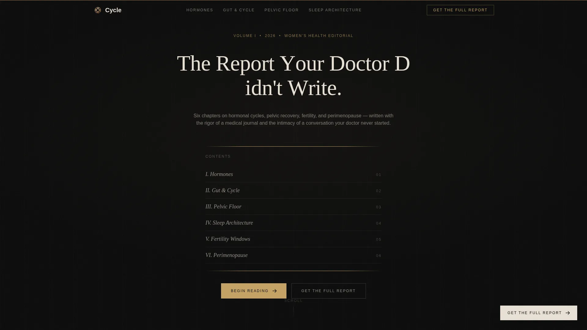
- A chapter-style hero with a letter-by-letter serif headline and a clickable table-of-contents anchor navigation
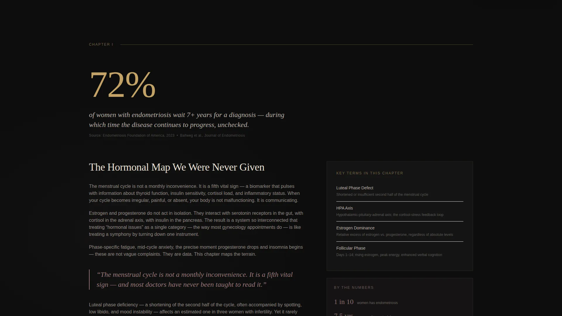
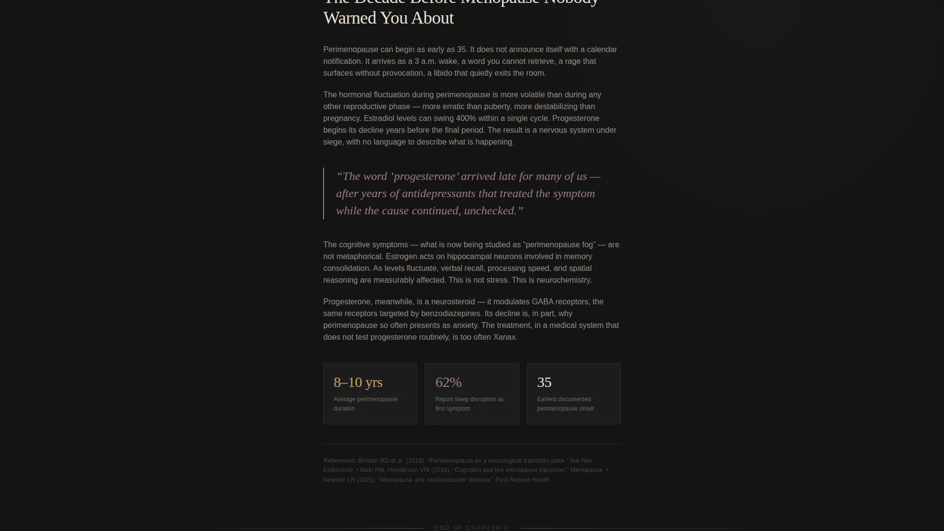
- Three editorial content chapters with oversized statistic displays, pull quote treatments, and cited source styling
- A dual-path lead generation section featuring a first-name-and-email form alongside a chapter preference selector
Feature list
A paragraph overview of features follows. Each feature below is drawn directly from the template brief and represents a distinct, built-in capability.
Chapter-Style Hero with Anchor Navigation
The hero opens on a pure black viewport with a thin gold rule across the top. A serif headline fades in letter by letter. Below it, a table-of-contents style chapter index lists six health topics, Hormones, Gut, Pelvic Floor, Sleep, Fertility, and Perimenopause, each as a clickable anchor that scrolls the reader to the matching chapter section.
Oversized Editorial Statistic Blocks
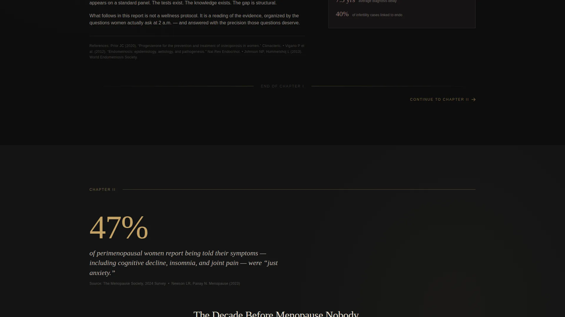
Each chapter opens with a single high-impact statistic rendered in oversized aged gold type against the black background. This treatment draws the reader in immediately and frames the editorial content that follows with authority and specificity.
Pull Quotes and Cited Source Styling
Editorial prose within each chapter is broken up by pull quotes set in dusted rose type. Cited sources appear in small parchment-colored text below relevant passages. This typographic system communicates credibility without interrupting the reading flow.
Floating and Full-Width Call-to-Action Placements
A floating parchment-colored "Get the Full Report" button appears after Chapter Two. A second, full-width version of the same call to action appears before the footer. Both placements are timed to when the reader has already consumed substantial content.
Chapter Preference Email Form
The lead generation section offers two sign-up paths. The primary path collects first name and email only. The secondary path lets readers select the health topics they care about most, turning a standard subscribe action into a personalized content preference.
Page-Turn Scroll Animation
A scroll-linked page-turn animation reinforces the editorial book metaphor throughout the reading experience. The animation is built into the scroll behavior and does not require additional interaction to trigger.
Page sections overview
| Section | Purpose |
|---|---|
| Hero Chapter Opening | Introduces the editorial brand with a letter-by-letter serif headline and gold rule |
| Table of Contents Nav | Anchor navigation listing six clickable chapter topics for quick scroll access |
| Chapter One: Hormones | Opens with an oversized gold statistic, editorial prose, pull quote, and cited sources |
| Chapter Two: Perimenopause | Continues the editorial arc with stat display, dense content, and floating call-to-action trigger |
| Chapter Three: Pelvic Floor | Delivers the third content chapter with editorial prose, pull quote, and gold divider close |
| Lead Generation Section | Full-width email form with first name, email, and chapter preference topic checkboxes |
| Minimal Footer | Horizontal parchment-on-black footer closing the page |
Design & branding system
The visual identity follows a Luxe Minimal theme executed through a Cinematic Dark color system. The palette is deliberately restrained and weighted, built to feel editorial rather than decorative. Typography carries the full visual load in place of photography or illustration.
- Colors: deep editorial black (#0D0D0D) as the base, muted parchment (#E8E0D5) for body text and the footer, dusted rose (#9C7B7B) for pull quotes, and aged gold (#C4A265) reserved for anchor navigation highlights, interactive states, and statistic displays
- Typography: Fraunces as the serif display face for headlines and pull quotes; DM Sans as the clean sans-serif face for body copy and user interface elements
- Visual tone: a velvet-lined jewelry case opened under a single warm lamp, restrained, weighted, and deliberately feminine without reaching for pink
Mobile & speed optimization
The template is designed desktop-first to support the editorial long-form reading experience. It reflows fully for mobile screens so readers on any device can navigate the chapter structure and complete the sign-up form without friction.
- Desktop-first layout with responsive reflow for mobile and tablet viewports
- Static content built with server components to keep JavaScript minimal and page rendering clean
- Anchor navigation and chapter preference checkboxes remain fully functional on smaller screens
How this template helps you convert
This template converts by earning trust first. It does not ask for an email until the reader has moved through three full chapters of substantive content. The conversion architecture is built on depth and relevance rather than urgency or pressure.
- Three complete editorial chapters deliver real value before any call to action appears, so the reader arrives at the sign-up form already convinced the content is worth their inbox
- The floating call-to-action button appears at the precise moment engagement is highest, after Chapter Two, reinforcing the offer without interrupting the reading experience
- The chapter preference selector transforms the email form into a personalized act, increasing sign-up intent by letting readers signal what they actually want to receive
Other information about this template
This template is well suited for founders and content strategists who want a premium editorial starting point without building from scratch. A few additional points worth knowing before you use it.
- The template is categorized under Blog and Editorial, Health and Wellness Blog, and Women's Health Blog niches
- The creative direction follows an Industry Report editorial style, which pairs especially well with fact-based, cited content in health, science, or advocacy publishing
- The hub and spoke anchor-nav structure means every chapter section is also independently addressable, making it straightforward to link directly to a specific health topic from external sources
- The footer follows a horizontal minimal pattern using parchment text on a black background, consistent with the overall Cinematic Dark system
- Localization is set for English (United States) with no currency symbols or date-specific content shown in the layout
Theme
Luxe Minimal
Creative direction
Industry Report
Color system
Cinematic Dark
Style
Hub & Spoke (Anchor Nav)
Direction
Lead Generation
Page Sections
Chapter-style Hero with Anchor Navigation
Oversized Editorial Statistic Blocks
Pull Quotes and Cited Source Styling
Dual-placement Call-to-action Design
Chapter Preference Email Form
Page-turn Scroll Animation
Related questions
Can I add more chapter sections to the template?
Is the email form connected to a mailing list provider?
Do I need design experience to customize the colors and fonts?
Can this template work for a paid newsletter or subscription editorial?
Who is the target reader this template is designed around?



