Backend Engineering Newsletter Pre-Launch Website Template
Daemon is a coming-soon landing page template for a monthly backend engineering publication. Built on a Luxe Minimal editorial aesthetic with a Japanese Zen color palette, it guides senior engineers through a narrative scroll, captures waitlist sign-ups with a single email form, and communicates depth and intent before a single issue ships.
by Rocket studio
Quick summary
Daemon is a single-page waitlist template for a deep-dive backend engineering publication. It opens with a cinematic looping video header, moves through a narrative origin story, reveals the publication format, and closes with two "Reserve Issue One" waitlist forms. The design is typeset-quality editorial: deliberate whitespace, serif display type, and a restrained Japanese Zen palette.
Who this template is for
This template is built for practitioners who want their publication to feel earned before it launches. It works best when the content itself is the product and the audience already knows the difference between shallow and serious.
- Technical founders or engineers launching a paid or free newsletter with a strong editorial voice
- Engineering managers or staff-plus engineers building an audience before releasing their first issue
- Independent writers in backend infrastructure, distributed systems, or systems programming who want a coming-soon page that reflects the quality of their work
What problem this template solves
Most newsletter landing pages look interchangeable. They lean on generic benefit lists and stock photography, which signals nothing to a reader who has seen a thousand of them. A senior engineer deciding whether to give you their email needs to feel the register of the publication before they commit.
- Generic templates dilute editorial credibility before the first word is read
- A long sign-up form or cluttered layout breaks the focused, monastic feeling that serious long-form content demands
- A page without narrative gives no reason to believe the publication will be different from everything else already in the reader's inbox
What you get with this template
You get a complete, single-page waitlist layout designed from the ground up for editorial-quality technical publishing. Every section is ordered to build trust through story before asking for an email.
- A 12-second cinematic video header with grain overlay, desaturated warm footage, and a single fade-in headline
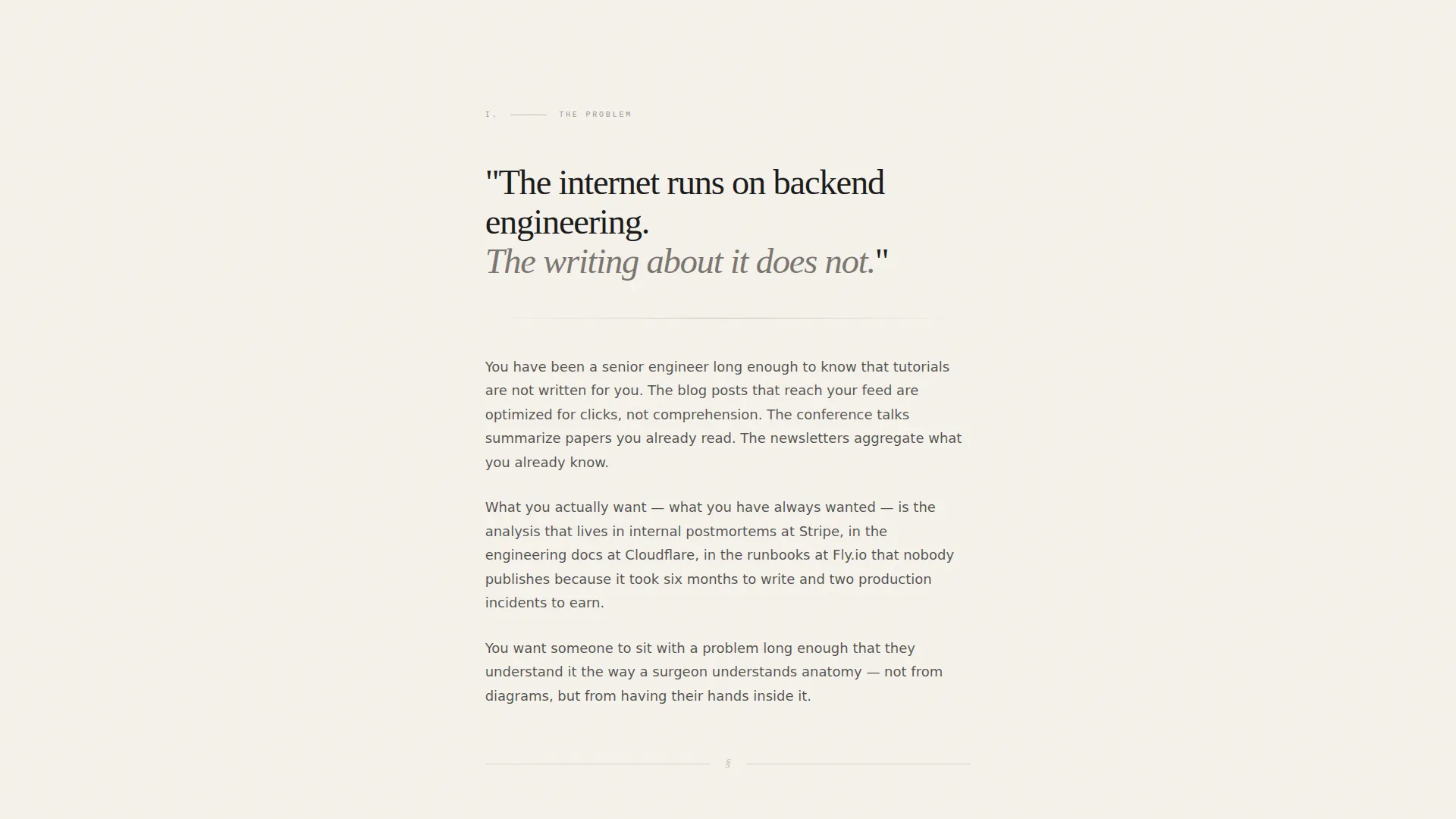
- An Origin Story scroll structure with four narrative beats: frustration, the specific moment, the format reveal, and the issue one tease
- Two waitlist form placements with a moss-green submit button and a live waitlist counter display below the final form
Feature list
This template delivers a specific set of built-in design and interaction decisions. Each one reflects the editorial intent of the brief rather than general-purpose flexibility.
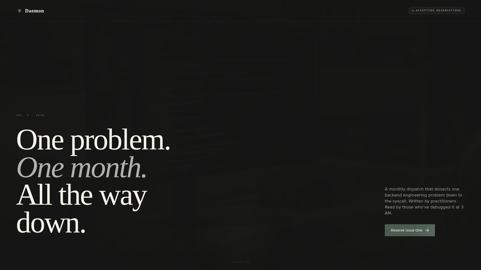
Cinematic Looping Video Header
The hero section runs a 12-second looping video: a tight shot on hands at a mechanical keyboard, terminal output in a monospaced font cascading down the screen, then a slow pull-back to one engineer at a clean desk. The footage is desaturated with just enough warmth to feel human. A single line of editorial typography fades in over the final frame.
Narrative Origin Story Layout
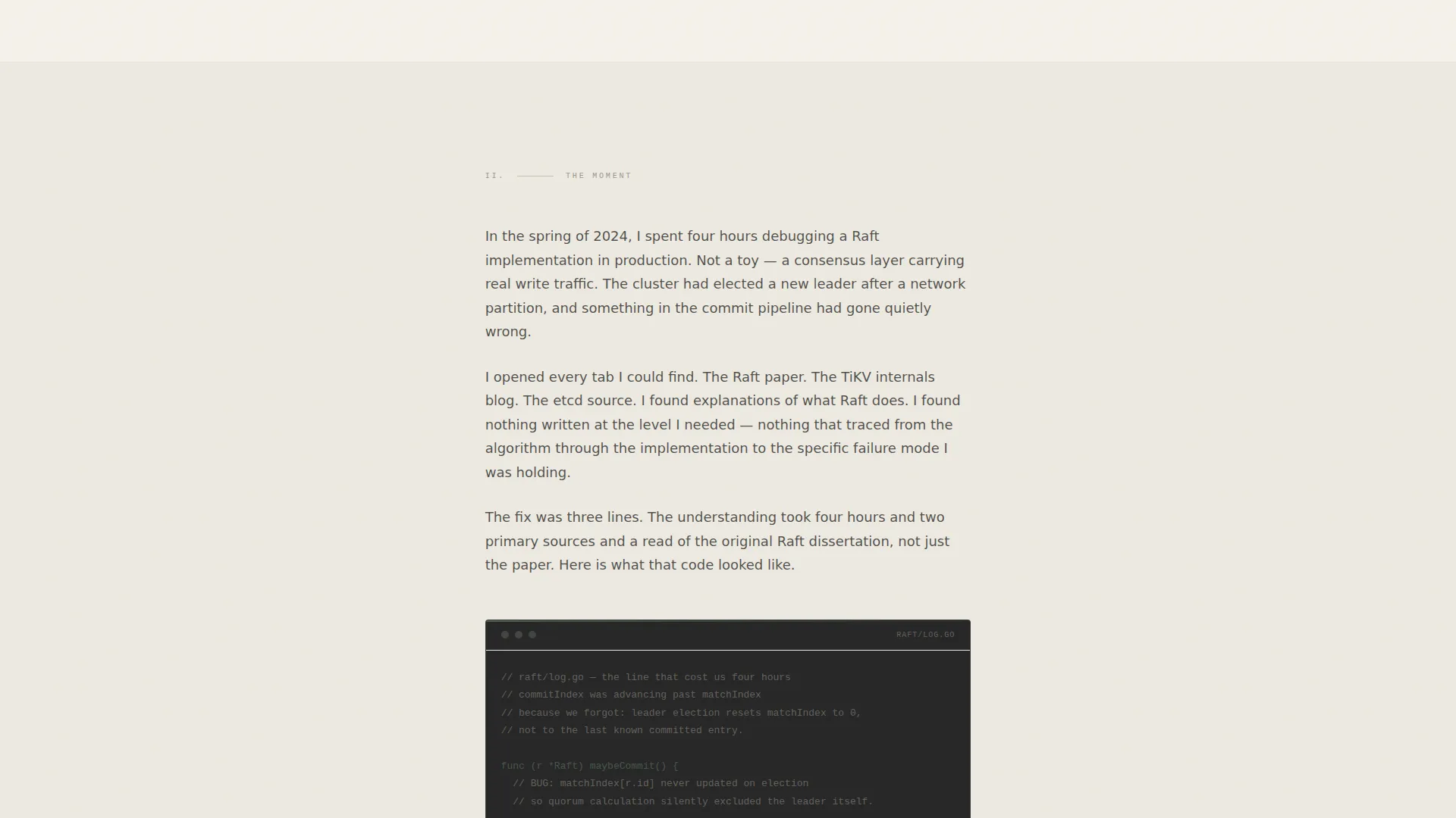
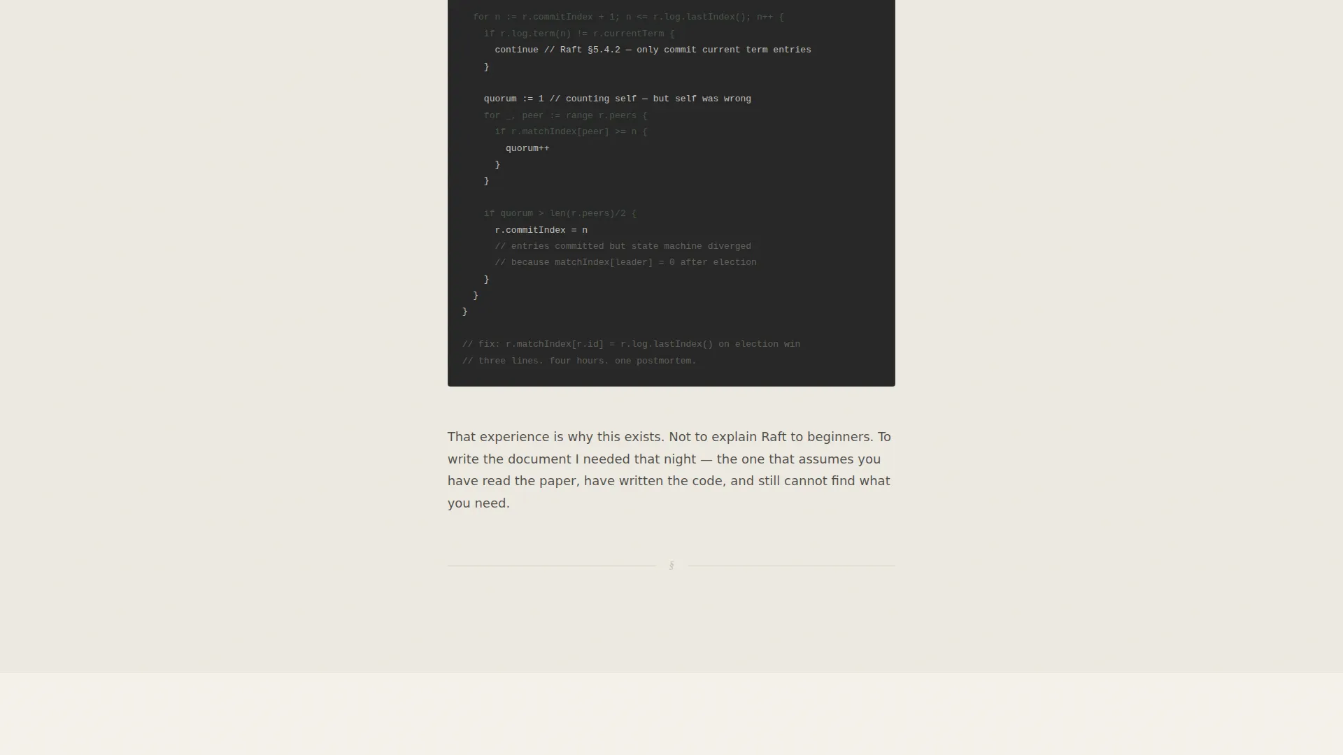
The page body is structured as a four-beat scroll: the frustration with surface-level content, a specific production debugging moment with an inline code fragment, the format reveal, and a magazine cover-line tease for issue one. Each beat is a single typeset column with generous margins and one image or code block per section.
Dual Waitlist Form Placement
Two "Reserve Issue One" email capture forms appear on the page. The first follows the format reveal at the emotional peak of the origin story. The second anchors the bottom of the page. Both use a single email field and a moss-green submit button, keeping the conversion path clean and unambiguous.
Live Waitlist Counter
A live counter below the final form displays the current waitlist size. The counter is wired to a Client Component interaction and shows real numbers without fabrication or placeholder text.
Japanese Zen Color System
The palette uses four intentional values: stone garden off-white (#F5F2EB), sumi ink black (#1A1A1A), wet moss green (#4A5D4F), and raked sand warm gray (#C4BFB3). Backgrounds alternate between off-white and ink black for section contrast. Moss green appears only on interactive elements and the call to action button. Warm gray handles secondary text and divider lines.
Editorial Typography Stack
Display headings use Fraunces, a high-contrast optical-size serif that reads like a printed monograph. Body prose uses Manrope for clean readability at longer line lengths. Code fragments and terminal output render in DM Mono, keeping technical content visually distinct without breaking the typographic rhythm.
Page sections overview
| Section | Purpose |
|---|---|
| Hero video loop | Cinematic opening with fade-in headline |
| The Frustration | Prose origin: surface-content problem |
| The Moment | Production debugging narrative + code fragment |
| Format reveal + call to action | Publication format description + first email form |
| Issue One tease + call to action | Cover-line teaser + live counter + final form |
| Footer | Minimal copyright-only footer |
Design & branding system
The visual identity is Luxe Minimal, drawing from a Japanese Zen editorial tradition where negative space does more structural work than color or decoration ever could. Every object on the page is placed with intention.
- Four-color palette: off-white (#F5F2EB) and ink black (#1A1A1A) for section backgrounds, moss green (#4A5D4F) restricted to interactive elements and the single call to action, and warm gray (#C4BFB3) for secondary text and dividers
- Typography trio of Fraunces (serif display), Manrope (body), and DM Mono (code) creates a clear visual hierarchy between prose, interface, and technical content
- Alternating off-white and ink-black section backgrounds provide structural contrast without introducing new colors
Mobile & speed optimization
The template is desktop-first by design, reflecting the reading habits of its primary audience: senior engineers reading long-form analysis on a monitor. Responsive mobile layout is included so the page remains readable on any device.
- Server Component architecture handles the static page render; a dedicated Client Component manages the email form submission and live counter interaction
- Scroll-linked fade-ins use IntersectionObserver so animations only run when sections enter the viewport, keeping the experience smooth without unnecessary overhead
- Grain texture overlay and shimmer call to action animation are applied with restraint to avoid visual noise on smaller screens
How this template helps you convert
The entire scroll is designed around a single conversion action: reserving a spot on the waitlist. Every layout and copy decision narrows attention toward that one outcome.
- The narrative structure builds emotional investment before the first form appears, so the reader is already curious about the publication by the time they see the email field
- Removing secondary paths, social links, and multiple calls to action eliminates the decision fatigue that causes readers to leave without acting
- The live waitlist counter creates social proof grounded in real numbers, giving the reader a concrete signal that others have already made the same choice
Other information about this template
This template is well-suited for launches in backend infrastructure, distributed systems, and systems programming publishing. The constrained design signals editorial seriousness that a technically sophisticated audience reads and respects immediately.
- The footer follows a Superhuman Extreme Minimal pattern: copyright line only, no navigation, no social icons
- Company references in the prose (such as infrastructure teams at well-known technology companies) are placeholder narrative hooks that you replace with your own production story
- The page is built with a Next.js Server Component and Client Component split, consistent with modern React application architecture
- Animation intensity is set to medium: grain texture, scroll-triggered fade-ins, and a shimmer effect on the call to action button are all included and tunable
- The template supports English-language copy with US date formatting out of the box
Theme
Luxe Minimal
Creative direction
Origin Story
Color system
Japanese Zen
Style
Editorial/Magazine
Direction
Waitlist/Coming Soon
Page Sections
Cinematic Looping Video Header
Four-beat Origin Story Scroll
Dual Waitlist Form Placement
Live Waitlist Counter Display
Japanese Zen Editorial Palette
Editorial Typography Stack
Related questions
Can I change the waitlist counter to show my real subscriber count?
Does the template include video footage for the hero section?
Can I use this template for a paid newsletter or subscription product?
Is the page easy to adapt for a different engineering topic?
How many fields does the waitlist form use?



