Sneaker Newsletter Landing Page Template
Deadstock is a hub and spoke landing page template built for sneaker collecting newsletters. It uses a letterpress-inspired Ink and Paper design with a Warm Stone color palette, a giant serif headline hero, sticky anchor navigation, and four spoke sections. Visitors experience real-feeling issue excerpts before subscribing, earning trust through demonstrated craft rather than promised value.
by Rocket studio
Quick summary
Deadstock is a single-page newsletter landing page template for sneaker collecting content. It pairs a massive display serif headline with four anchor-linked spoke sections, margin-annotated issue excerpts, and a minimal subscribe form. The Warm Stone color palette and Ink and Paper visual style give it the feel of a heavyweight auction catalog, built for collectors who want depth over hype.
Who this template is for
This template is made for independent newsletter creators who cover sneaker culture seriously. It fits editorial voices that need a destination page rather than a plain sign-up form.
- Dedicated sneaker collectors running a weekly dispatch who need credibility signals beyond a basic subscribe button
- Independent editors and culture writers who want to showcase past issues as proof of editorial quality
- Design students or culture observers launching a content hub that doubles as a browsable archive
What problem this template solves
Most newsletter landing pages ask for an email before giving anything back. Readers who care about depth leave without subscribing because nothing demonstrates the quality of what they would actually receive.
- Generic sign-up pages offer no sample content, so first-time visitors cannot judge whether the writing matches their standards
- Mainstream sneaker media covers drops but skips the market intelligence, archival research, and cultural framing that serious collectors want
- A single subscribe form creates one conversion path; this template builds a reference destination that earns repeat visits and subscriptions over time
What you get with this template
You get a fully structured hub and spoke landing page with every section laid out and typeset. The design system, typography, and color tokens are baked in and ready to customize.
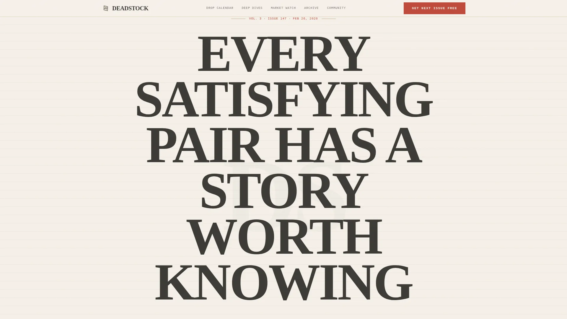
- A hero section with a giant Fraunces serif headline, an ink-bleed text effect, and an issue dateline line in monospaced type
- Four spoke sections (Drop Calendar, Deep Dives, Market Watch, Archive Picks) reachable from a sticky anchor navigation bar, each typeset as a printed page with margin annotations
- A subscribe form that asks only for an email address plus one optional field ("What's your current grail?"), plus a community section displaying reader grail submissions and a subscriber count signal
Feature list
This template delivers specific, built-in components that work together as a coherent editorial experience.
Giant Headline Hero with Ink-Bleed Effect
The hero opens with an oversized Fraunces serif headline scaled so the letterforms become visual texture. A subtle ink-bleed animation on the edges mimics freshly pressed letterpress type. An issue dateline in JetBrains Mono sits below, grounding visitors in the rhythm of a living publication.
Sticky Anchor Navigation Bar
A persistent navigation bar stays fixed at the top of the page as visitors scroll. It links directly to each of the four spoke sections and includes a persistent "Get the Next Issue Free" call-to-action button in editor's red, so the subscribe path is always one click away.
Spoke Sections with Printed-Page Excerpts
Each of the four content sections (Drop Calendar, Deep Dives, Market Watch, Archive Picks) displays a real-feeling excerpt typeset as a printed page complete with margin annotations. Visitors read actual content from past issues before deciding to subscribe.
Tab-Switching Spoke Cards
The spoke sections use client-side tab switching so readers can move between Drop Calendar, Deep Dives, Market Watch, and Archive Picks without leaving the page. Hover states on spoke cards and scroll-reveal animations with stagger keep the experience active and engaging.
Minimal Subscribe Form with Grail Field
The subscribe form captures only an email address plus one optional question: "What's your current grail?" The question signals community membership and provides segmentation context without making the form feel like a survey.
Community Social Proof Section
A dedicated community section surfaces reader grail submissions and a subscriber count as social proof. These signals show new visitors that real collectors are already part of the dispatch, reducing hesitation at the subscription step.
Page sections overview
| Section | Purpose |
|---|---|
| Hero Headline | Establish editorial voice with oversized type, ink-bleed effect, and issue dateline |
| Anchor Navigation | Sticky bar linking all spoke sections with persistent subscribe button |
| Origin Story | Explains why the newsletter exists and the coverage gap it fills |
| Drop Calendar | Spoke section showing upcoming release coverage with printed-page excerpt |
| Deep Dives | Spoke section with archival and cultural research excerpt and margin notes |
| Market Watch | Spoke section covering resale market intelligence with typeset excerpt |
| Archive Picks | Spoke section highlighting curated back-issue selections with margin annotations |
| Community Section | Reader grail submissions and subscriber count as social proof signals |
| Subscribe Form | Email capture with optional grail field and archive access path |
| Footer | Minimal footer with copyright, privacy, terms, and archive links |
Design & branding system
The visual identity follows an Ink and Paper theme built on a Warm Stone color system. Every color choice reinforces the feeling of a vintage auction catalog printed on heavyweight stock.
- Four-color palette: unbleached cotton (#F5F0E8) for backgrounds, pencil graphite (#3B3A36) for body text, tobacco-stained kraft (#C4A882) for accents and borders, and editor's red (#BF4A3A) reserved sparingly for calls to action, links, and margin annotations
- Typography stack: Fraunces for large display headlines, JetBrains Mono for datelines and labels, and DM Sans for readable body copy
- Tactile details including ink-bleed text edges, margin annotation styling, and a printed-page layout within spoke sections give the template a letterpress, field-guide quality that distinguishes it from digital-first designs
Mobile & speed optimization
The template is built desktop-first to match the collector-at-desk context, but mobile layouts are respected throughout so the reading experience holds on any screen size.
- Static sections use server components to keep page delivery lean; interactive elements like tab switching and the subscribe form use client components only where needed
- Scroll-reveal animations use staggered timing so they feel intentional on both large and small screens without overwhelming slower connections
- The sticky anchor navigation collapses cleanly on smaller viewports so the subscribe path and spoke links remain accessible without crowding the reading area
How this template helps you convert
The page is designed to earn the subscription rather than demand it. Every section moves a visitor closer to clicking "Get the Next Issue Free" by showing rather than telling.
- Real issue excerpts in each spoke section let visitors read the actual writing before committing, replacing vague promises with demonstrated editorial quality that builds genuine trust
- The persistent "Get the Next Issue Free" button in the sticky anchor navigation keeps the primary call to action visible throughout the entire scroll, so the decision to subscribe can happen at any point
- The optional grail field and the community section turn the subscribe step into a moment of belonging rather than a transaction, which lowers resistance for readers who are already engaged but not yet decided
Other information about this template
This template is categorized under Blog and Editorial with a Sneaker Collecting Newsletter niche focus. It is designed as a Content and Resource hub that rewards repeat visits as much as first-contact conversions.
- The Hub and Spoke structure with anchor navigation means the page functions as a permanent reference destination, not just a one-time conversion page
- The footer follows a minimal pattern with copyright, privacy, terms, and archive links, keeping the reading experience clean and the legal essentials visible
- The intersection match between the Blog and Editorial category, the Sneaker Collecting Content subcategory, and the Origin Story creative direction means every design and copy decision in this template is aligned to a specific editorial voice and collector audience


Theme
Ink & Paper
Creative direction
Origin Story
Color system
Warm Stone
Style
Hub & Spoke (Anchor Nav)
Direction
Content/Resource
Page Sections
Giant Headline Hero with Ink-bleed Effect
Sticky Anchor Navigation Bar
Printed-page Spoke Excerpts
Tab-switching Spoke Cards
Minimal Subscribe Form with Grail Field
Community Social Proof Section
Related questions
Can I customize the spoke sections for a different newsletter topic?
Does the template include the subscriber form logic?
Is this template suitable for a brand-new newsletter with no back issues?
Can visitors browse past issues directly from this page?
How does the optional grail field help the newsletter creator?


