Photography Blog Pre-Launch Website Template
Decay is an editorial landing page template built for an abandoned places photography newsletter. It combines a half-page hero split, a gallery-walk anchor navigation, parallax depth layers, and three strategically placed waitlist calls to action. The design uses a four-color Cloud Canvas palette and large serif typography to create the still, unsettling atmosphere of a curated magazine exhibition.
by Rocket studio
Quick summary
Decay is a single-page newsletter landing page template built for an abandoned places photography newsletter. It pairs full-width photo essays with editorial serif typography, a live waitlist counter, and a scroll-triggered call-to-action bar. The overall experience feels like moving through a gallery of forgotten spaces, one silence at a time.
Who this template is for
This template is designed for creators who work at the intersection of photography, history, and storytelling. It suits anyone launching a content subscription where the visual experience is as important as the offer itself.
- Urban exploration enthusiasts and documentary photographers building a subscriber base
- Architecture students and history writers who want a launch page that reflects their editorial sensibility
- Newsletter creators in niche photography or forgotten-places content looking for a high-atmosphere waitlist page
What problem this template solves
Generic newsletter sign-up pages feel flat. They cannot carry the mood of a subject as specific and atmospheric as abandoned-places photography. Visitors arrive, feel nothing, and leave without subscribing.
- The template solves the atmosphere gap by making the page itself feel like the content, not just a sign-up form
- It addresses hesitation by offering a locked PDF preview of Issue #001 that visitors unlock with their email
- It removes friction by asking only for an email address across all three conversion touchpoints
What you get with this template
You get a fully structured, single-page editorial layout built around a hub and spoke anchor navigation system. Every section has a defined purpose, and every scroll gesture is choreographed to build tension toward the subscribe action.
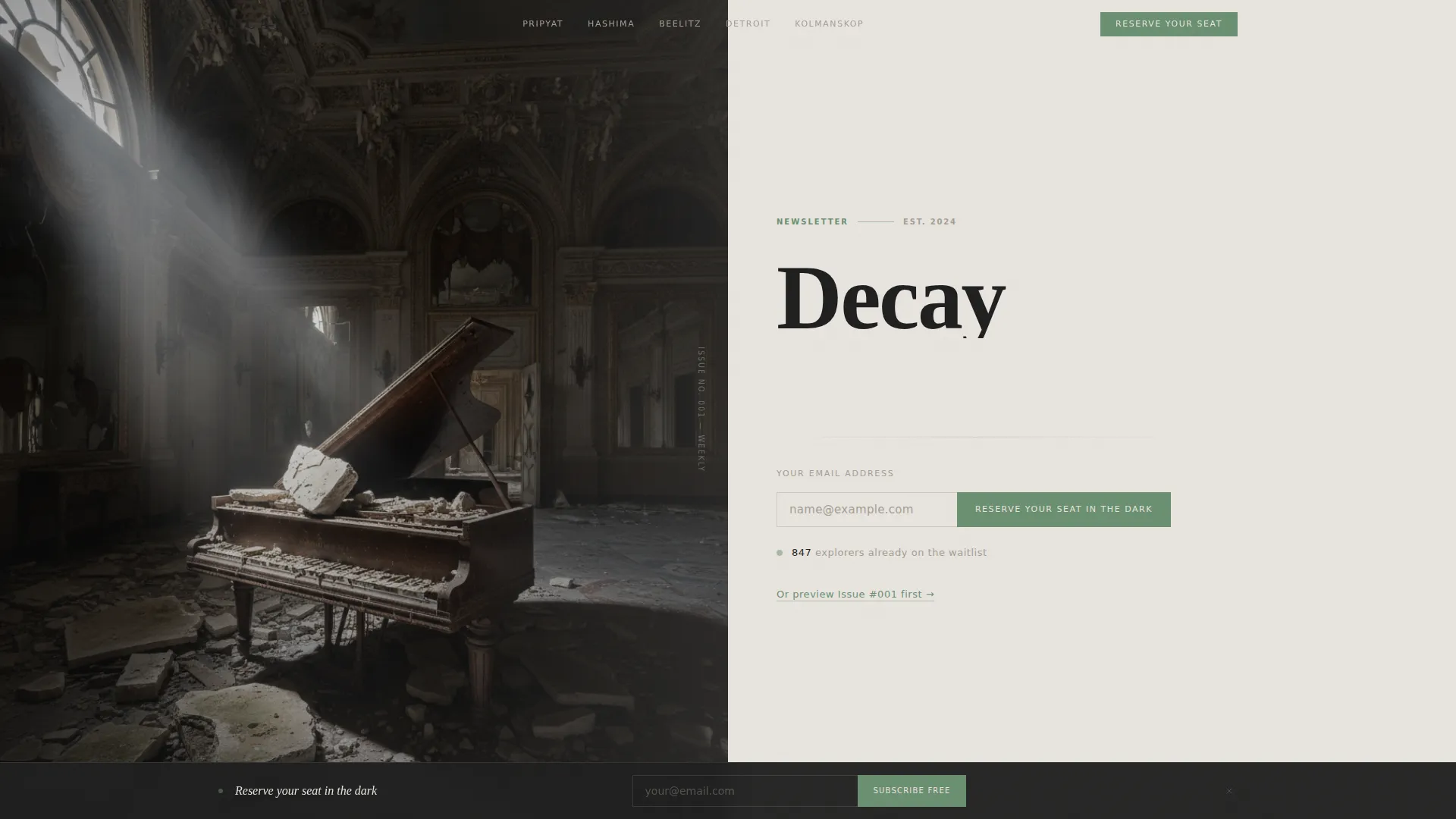
- A half-page hero section with a high-contrast ballroom photograph, oversized editorial serif, email field, and live waitlist counter
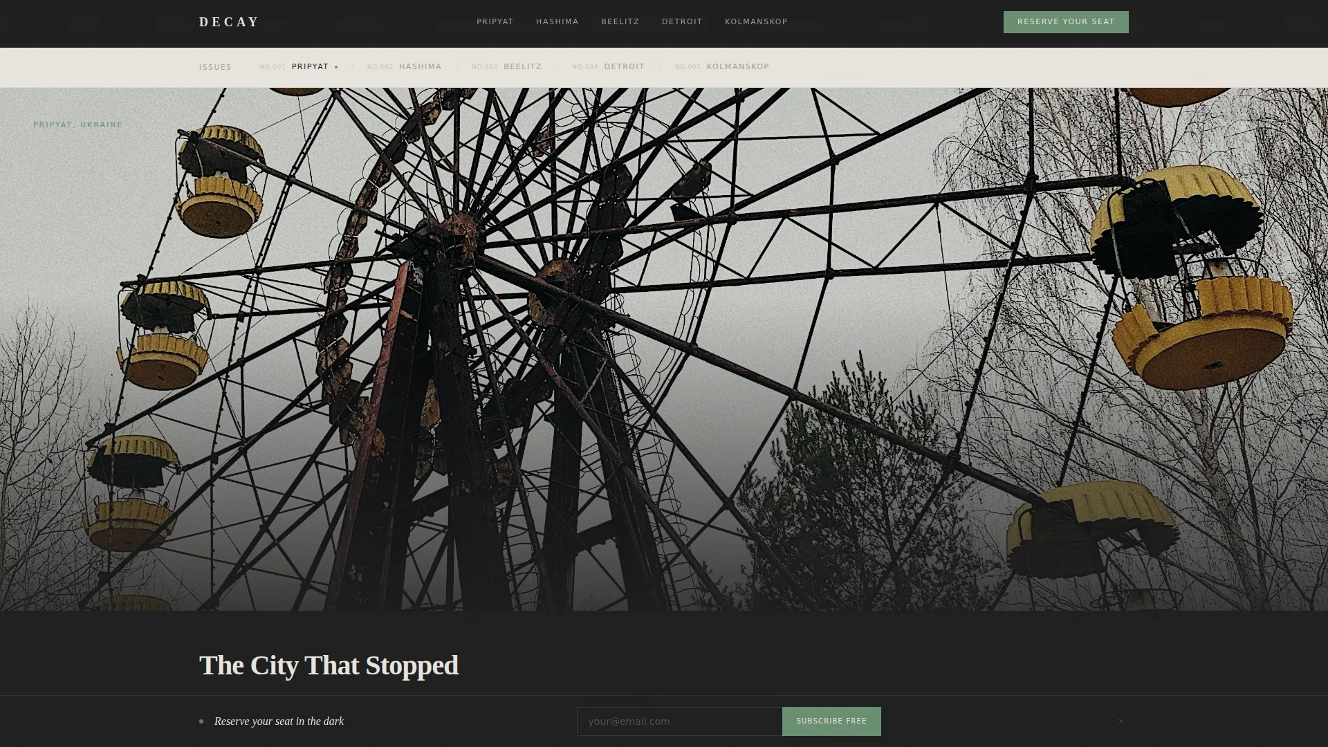
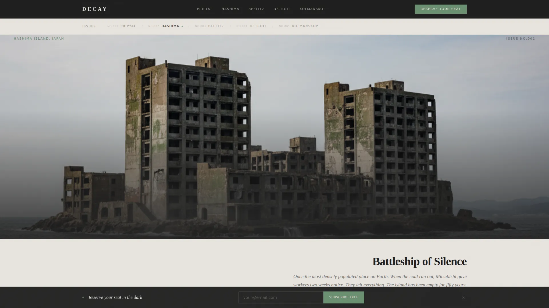
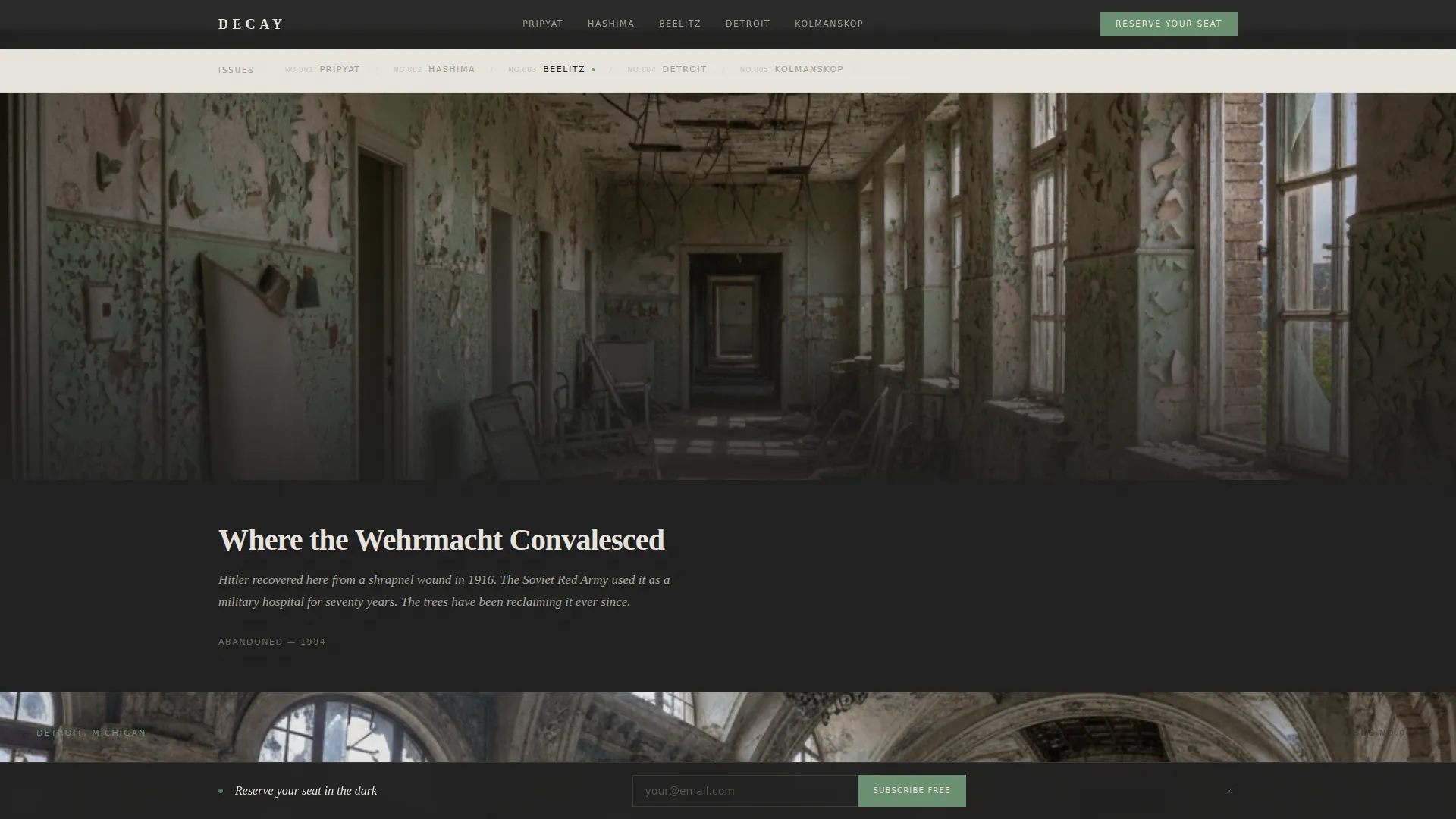
- A gallery-walk section with location-named anchor navigation, full-width photographs, two-line captions, and location stamps
- A parallax depth section, a mid-gallery call-to-action block, a locked PDF preview gate, and a scroll-triggered fixed bottom bar
Feature list
This section covers the key built-in capabilities that give Decay its editorial character and conversion structure.
Half-Page Hero Split
The header divides into two equal panels. The left panel holds a high-contrast photograph of a grand piano in a decaying ballroom. The right panel presents the newsletter name in oversized serif, a one-sentence promise, and a minimal email subscribe form.
Live Waitlist Counter
A live counter displayed beneath the header call to action shows the current waitlist size. This social proof element reinforces momentum and gives new visitors a reason to act immediately rather than return later.
Location-Named Anchor Navigation
The anchor navigation bar uses location names such as Pripyat, Hashima, and Beelitz instead of generic labels. Navigation itself becomes a form of exploration, and each anchor links directly to its corresponding full-width gallery section.
Gallery Walk with Location Stamps
Each spoke off the anchor nav is a past-issue preview. It presents a full-width photograph, a two-line caption, and a location stamp. The gallery is lazy-loaded, and images grow progressively more immersive as the visitor scrolls.
Parallax Depth Section
Midway through the page, three images layer at different scroll speeds to simulate depth. The effect mimics the experience of peering through doorways into successive rooms inside an abandoned structure.
Scroll-Triggered Fixed Bottom Bar
After a visitor scrolls past forty percent of the page, a fixed bottom bar emerges with the primary call to action. It stays visible without interrupting reading, and it disappears cleanly if the visitor reaches the footer.
Page sections overview
| Section | Purpose |
|---|---|
| Hero split header | Introduce the newsletter and capture the first email submission |
| Live waitlist counter | Display social proof beneath the header call to action |
| Anchor nav bar | Let visitors jump to named gallery locations |
| Gallery walk issues | Showcase past issues as full-width editorial photo essays |
| Parallax depth layer | Create atmospheric depth midway through the scroll |
| Mid-gallery call to action | Re-engage visitors after the fifth gallery image |
| Issue #001 preview gate | Convert hesitant visitors via a locked PDF email gate |
| Fixed bottom bar | Persistent scroll-triggered subscribe nudge |
| Minimal footer | Close the page with a clean horizontal flow |
Design & branding system
The visual identity follows an Editorial Magazine theme built on a four-color Cloud Canvas palette. Backgrounds alternate between overcast white and deep shadow charcoal to create a rhythm that feels like turning the pages of a printed magazine.
- Colors: overcast white (#E8E4DF), concrete dust (#A39E93), deep shadow charcoal (#1E1E1E), and oxidized copper (#6B8F71) reserved for links, hover states, and the subscribe button
- Typography: Fraunces for large serif display headings, DM Sans for body text and interface elements, with generous whitespace throughout
- Visual effects include a noise texture overlay, staggered text reveals on scroll, and CSS-first animations that keep the experience cinematic without relying on heavy scripts
Mobile & speed optimization
The template is designed desktop-first to honor the editorial magazine feel, with graceful adaptation for smaller screens. The hero split stacks vertically on mobile without losing its photographic impact.
- The hero image is loaded as a static asset, while gallery photographs use lazy loading so they only render as the visitor scrolls into view
- CSS-first animations and parallax layers are built to degrade cleanly on devices where reduced-motion preferences are active
- The fixed bottom bar and email gate work across screen sizes, keeping all three conversion touchpoints accessible on mobile
How this template helps you convert
Every layout decision in Decay is oriented toward a single action: getting a visitor to submit their email address. The page uses three distinct moments to make that ask.
- The header places the email form immediately beside the hero photograph, supported by a live waitlist counter that shows real subscriber momentum
- The mid-gallery call to action reappears after the fifth image, catching visitors who were drawn in by the photography but scrolled past the header form
- The scroll-triggered fixed bottom bar and the locked PDF preview gate offer two additional paths for hesitant visitors, reducing the chance of a scroll-and-leave without any conversion
Other information about this template
This template was built under a Hub and Spoke architecture, meaning the anchor navigation at the top acts as the central hub and each named location section serves as a spoke. The structure suits any newsletter or content subscription that benefits from an exhibition-style browsing experience.
- The template style is classified as Hub and Spoke with Anchor Nav, under the Blog and Editorial category and the Abandoned Places Photography Content subcategory
- The primary call to action reads "Reserve Your Seat in the Dark" and appears in the header, after the fifth gallery image, and in the fixed bottom bar
- The locked PDF preview path reads "Preview Issue #001" and uses an email gate to convert visitors who want to sample content before committing to the waitlist
- The footer follows a minimal horizontal flow pattern, keeping the close of the page as unhurried as the rest of the editorial experience
Theme
Editorial Magazine
Creative direction
Gallery Walk
Color system
Cloud Canvas
Style
Hub & Spoke (Anchor Nav)
Direction
Waitlist/Coming Soon
Page Sections
Half-page Hero Split with Subscribe Form
Location-named Anchor Navigation
Gallery Walk with Full-width Photo Essays
Parallax Depth Scroll Section
Scroll-triggered Fixed Bottom Bar
Locked PDF Preview Email Gate
Related questions
Can I replace the gallery photographs with my own images?
How does the locked PDF preview gate work?
Can I update the live waitlist counter to show my real subscriber number?
Does the scroll-triggered fixed bottom bar come included?
Is this template only useful for abandoned places content?



