Minimalism & Decluttering Instagram Landing Page
Declutter is a minimalism and decluttering landing page template built for Instagram account launches. It guides visitors through a scroll-driven narrative that literally empties as you move down the page. A sticky waitlist bar, a single email field, and a terracotta call-to-action button work together to turn philosophy into signups before a single word of explanation is needed.
by Rocket studio
Quick summary
Declutter is a single-page waitlist template for a minimalism-focused Instagram account. The page opens on a full-bleed photo, fades in a whisper-weight serif headline, then guides visitors through a founder origin story that grows quieter with every scroll. By the time they reach the email field, the philosophy has already done the convincing.
Who this template is for
This template is made for creators who want their page to communicate a feeling before it communicates a message. It suits anyone launching a minimalism or intentional-living account who needs to capture early interest in a meaningful way.
- Lifestyle and content creators launching a decluttering or minimalism Instagram account
- Founders who want a waitlist page that reflects their editorial aesthetic
- Early-stage creators who need a single, polished landing page before a full site is ready
What problem this template solves
Most waitlist pages are generic. They ask for an email before they earn it. For a minimalism account, a cluttered or forgettable signup page directly contradicts the message. This template solves that gap.
- Visitors arrive expecting one more busy webpage and instead experience the philosophy of subtraction firsthand
- The page narrative does the persuading, so the email ask feels natural rather than transactional
- The design matches the content niche, building immediate trust with the intended audience
What you get with this template
You get a complete hub and spoke landing page with anchor navigation, built around a scroll-driven origin story. Every section is purposeful and self-contained.
- A full-bleed hero section with a cinematic photo header and a serif fade-in headline
- A multi-spoke narrative flow that moves from visual overwhelm to near-empty white space
- A sticky bottom bar with a one-field email form and a secondary Instagram link
Feature list
This template is built around a small number of deliberate, well-executed features rather than a long list of options.
Scroll-Driven Subtraction Narrative
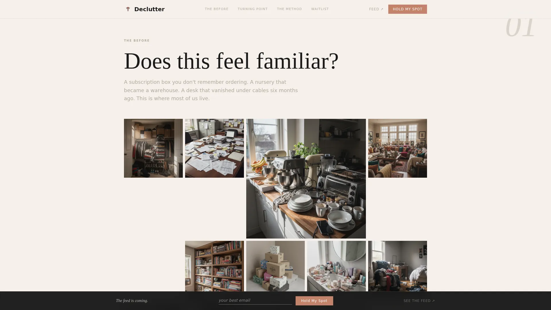
The page uses a hub and spoke structure where each spoke removes more visual content than the last. The first spoke shows a dense, cluttered photo grid. The final section is almost entirely white space with a single line of text. The scroll itself teaches the visitor what minimalism feels like.
Full-Bleed Cinematic Hero
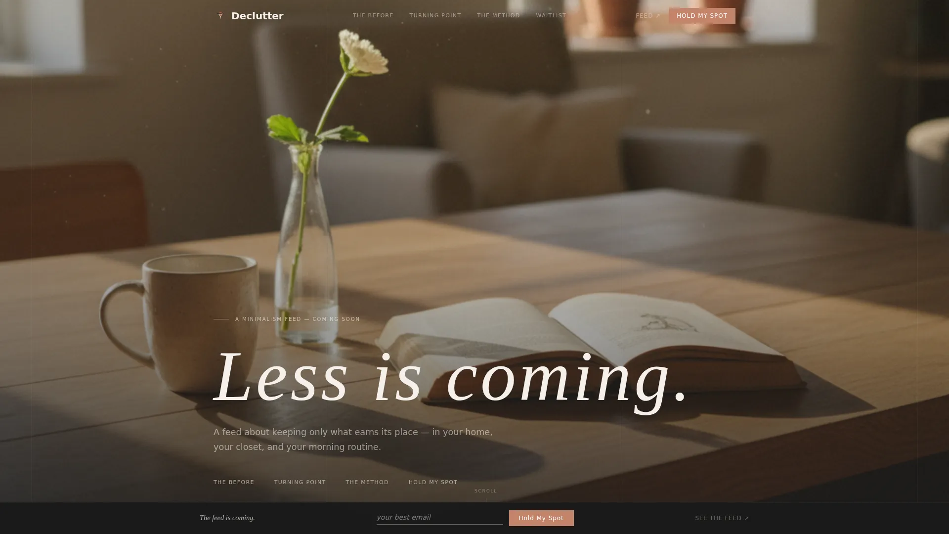
The header is a full-bleed overhead photo of a bare oak table holding only a ceramic mug, a single stem in a glass vase, and one open book. Natural morning light casts long shadows from the left edge of the frame. Negative space fills roughly eighty percent of the composition. A light-weight serif headline fades in at the bottom third of the image.
Sticky Waitlist Bar with One-Field Form
After the first scroll, a sticky bottom bar appears with a single email input field. The placeholder text reads "your best email" with no additional labels. The primary call-to-action button reads "Hold My Spot" and is styled in terracotta. The bar stays visible throughout the rest of the page without interrupting the reading experience.
Secondary Instagram Micro-Conversion
Alongside the waitlist form, a secondary tap target lets visitors open the Instagram profile in a new tab. This gives curious visitors a low-commitment next step and keeps the primary conversion goal uncluttered.
Anchor Navigation Hub Structure
The template uses anchor-based navigation so visitors can move between named sections without losing their place in the scroll story. This keeps the single-page experience organized while preserving the narrative flow.
Editorial Ink and Paper Design System
The entire color palette uses manuscript black, warm cotton stock, pencil-line gray, and a single soft terracotta accent. Terracotta appears only on interactive elements and the waitlist button. Typography pairs a serif display face with a clean sans-serif body font, creating the feel of a printed independent zine with generous margins and breathing space.
Page sections overview
| Section | Purpose |
|---|---|
| Hero Photo Header | Opens with full-bleed photo and fade-in serif headline to set the tone immediately |
| Before: The Overwhelm | Dense cluttered photo grid designed to feel intentionally overwhelming as the first spoke |
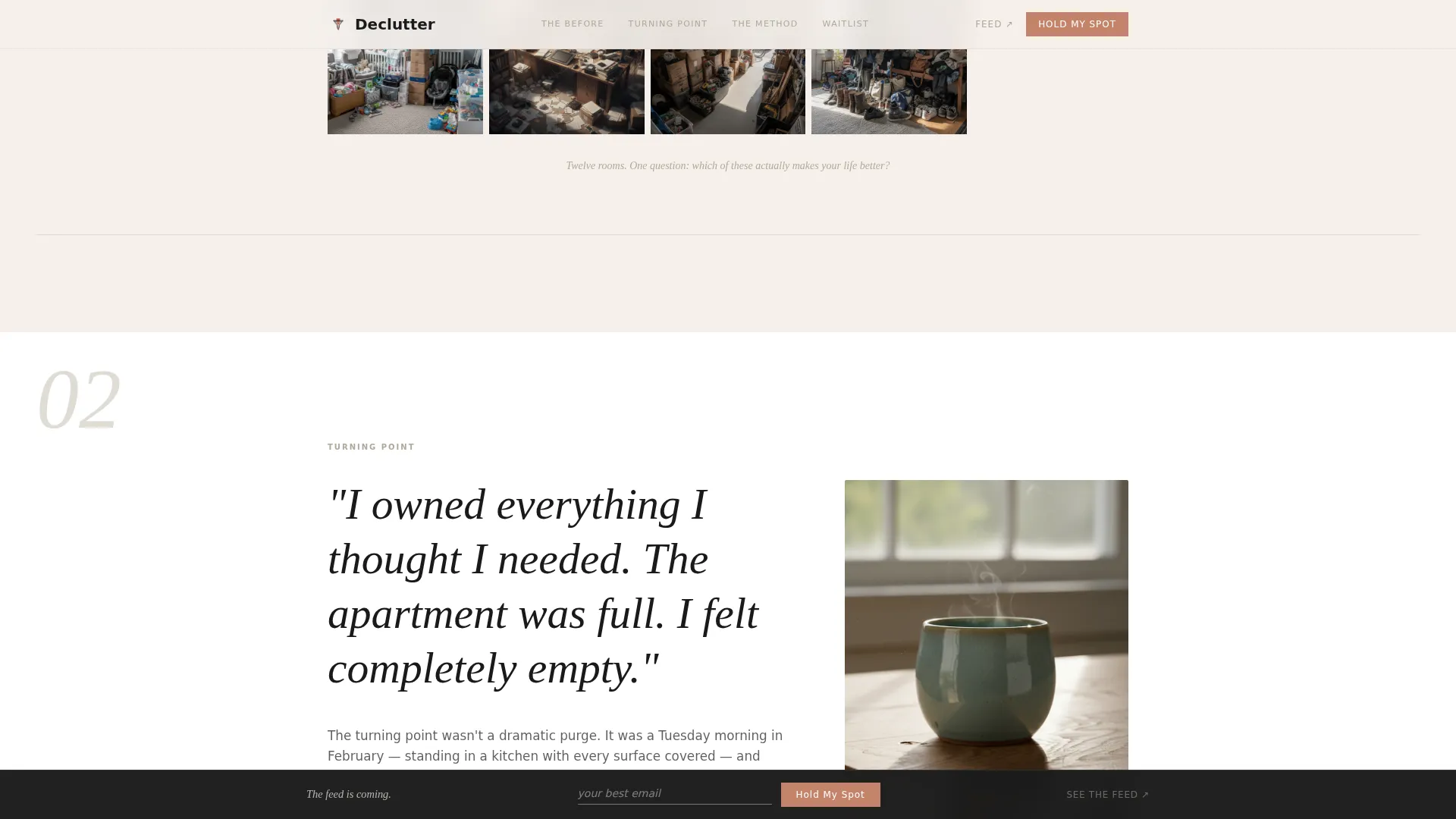
| Turning Point | Single image with founder arc text that marks the shift away from clutter |
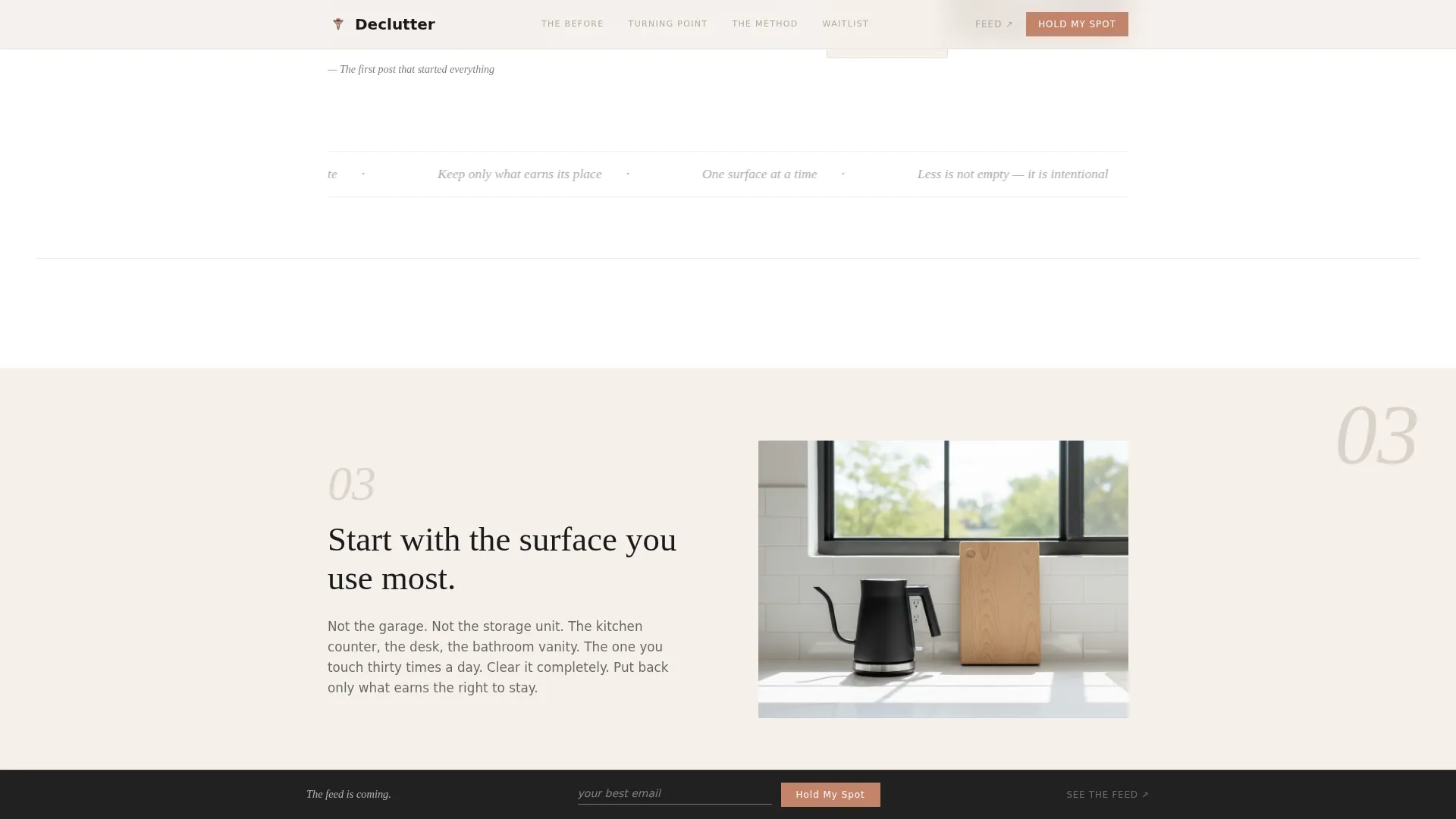
| The Philosophy | Alternating white and cotton sections, each sparser than the last, using text subtraction |
| Waitlist Signup | Near-empty white space with one line of text and a single email input field |
| Minimal Footer | Ultra-minimal single-row footer following a horizontal layout pattern |
Design & branding system
The visual identity follows an editorial magazine direction inspired by independent zine printing. Every design choice reinforces the minimalism concept the account teaches.
- Four-color palette: manuscript black (#1A1A1A), cotton stock (#F5F0EB), pencil-line gray (#B0A999), and terracotta (#C4836A) used only for interactive elements
- Typography uses a serif display typeface for headlines and a humanist sans-serif for body text and interface elements
- Backgrounds alternate between cotton stock and pure white, with gray reserved for dividers, captions, and navigation states
Mobile & speed optimization
The template is built mobile-first to match the browsing habits of an Instagram audience. Every layout decision starts at the smallest screen size and scales up.
- Sticky bottom bar and one-field form are sized and spaced for thumb-friendly interaction on mobile screens
- Animations are driven by CSS and scroll-linked opacity fades, keeping the JavaScript footprint minimal
- Image-first layout prioritizes visual storytelling while keeping the page lean and responsive
How this template helps you convert
The conversion strategy is built into the narrative architecture itself. The page does not rely on persuasive copy alone.
- The scroll-driven design makes visitors experience the feeling of less before they encounter any explanation, so the waitlist signup arrives at the moment of highest emotional readiness.
- The sticky bottom bar keeps the "Hold My Spot" call-to-action visible throughout the entire scroll journey without interrupting the story.
- The secondary Instagram link provides a gentle second option for visitors who want more context before committing, reducing the risk of losing them entirely.
Other information about this template
This template sits within the Blog and Editorial category and is designed specifically for the minimalism and decluttering Instagram account niche. It is a strong fit for creators who want their launch presence to reflect the same editorial standards as their planned content.
- The template style is hub and spoke with anchor navigation, making it easy to extend or adjust individual spokes without rebuilding the page structure
- The creative direction follows an Origin Story arc, which works well for personal-brand creators whose own journey is central to the account concept
- The Waitlist and Coming Soon landing page direction means the template is purpose-built for pre-launch momentum rather than general audience browsing
- The color system and typographic pairing are set up so that brand customization requires changing only a small number of defined values
Theme
Editorial Magazine
Creative direction
Origin Story
Color system
Ink & Paper
Style
Hub & Spoke (Anchor Nav)
Direction
Waitlist/Coming Soon
Page Sections
Scroll-driven Subtraction Narrative
Full-bleed Cinematic Hero Header
Sticky One-field Waitlist Bar
Secondary Instagram Link
Hub and Spoke Anchor Navigation
Editorial Ink and Paper Visual System
Related questions
Can I use this template for a niche other than minimalism?
Does the waitlist form connect to an email platform automatically?
Is the sticky bottom bar visible on mobile devices?
Can I add more spokes to the hub and spoke structure?
What makes this different from a generic coming soon page?



