Insider Telecom Education Landing Page Template
Signal is an editorial-style telecom blog landing page built for publishers who want to turn complex billing jargon into plain-language guides that readers actually act on. The asymmetric 60/40 grid, Ink & Paper colour palette, and manifesto-driven scroll give every section the weight of a well-researched technical manual, while two strategically placed lead capture forms convert informed visitors into newsletter subscribers.
by Rocket studio
Quick summary
Signal is the signal telecom bill decoder blog landing page template built for telecom educators, independent publishers, and B2B content marketers. It pairs a cinematic Type Over Image hero with a conviction-led manifesto scroll, a persistent sidebar newsletter form, and a full-width lead generation block. The result is a landing page that earns trust before it asks for action.
Who this template is for
This landing page template is built for people who have real knowledge to share and real readers to serve. It suits any company, solo publisher, or content team that wants to build authority in a technically dense industry.
- IT managers and network engineers who want to publish plain-language telecom guides for their peers
- Small business owners who need a landing page to promote a newsletter that decodes vendor proposals and monthly telecom bills
- Junior engineers and technical writers who want to reach a growing audience of professionals checking their own invoices for the first time
What problem this template solves
Most technical blog landing pages look like software documentation: cold, dense, and impossible to scan. Visitors click away before they find the value. The design and copy structure here solve that problem directly.
- Relevant content is hard to display when a page has no clear hierarchy, leaving visitors unsure where to look or what to do next
- A landing page with no clear lead capture process wastes the trust built by well-written editorial content
- Telecom topics intimidate non-specialist readers, so the page must speak with authority and warmth at the same time
What you get with this template
You get a fully designed, single-page editorial layout ready to customize and launch. Every section is purposeful, and the design work is already done so you can focus on your content and your audience.
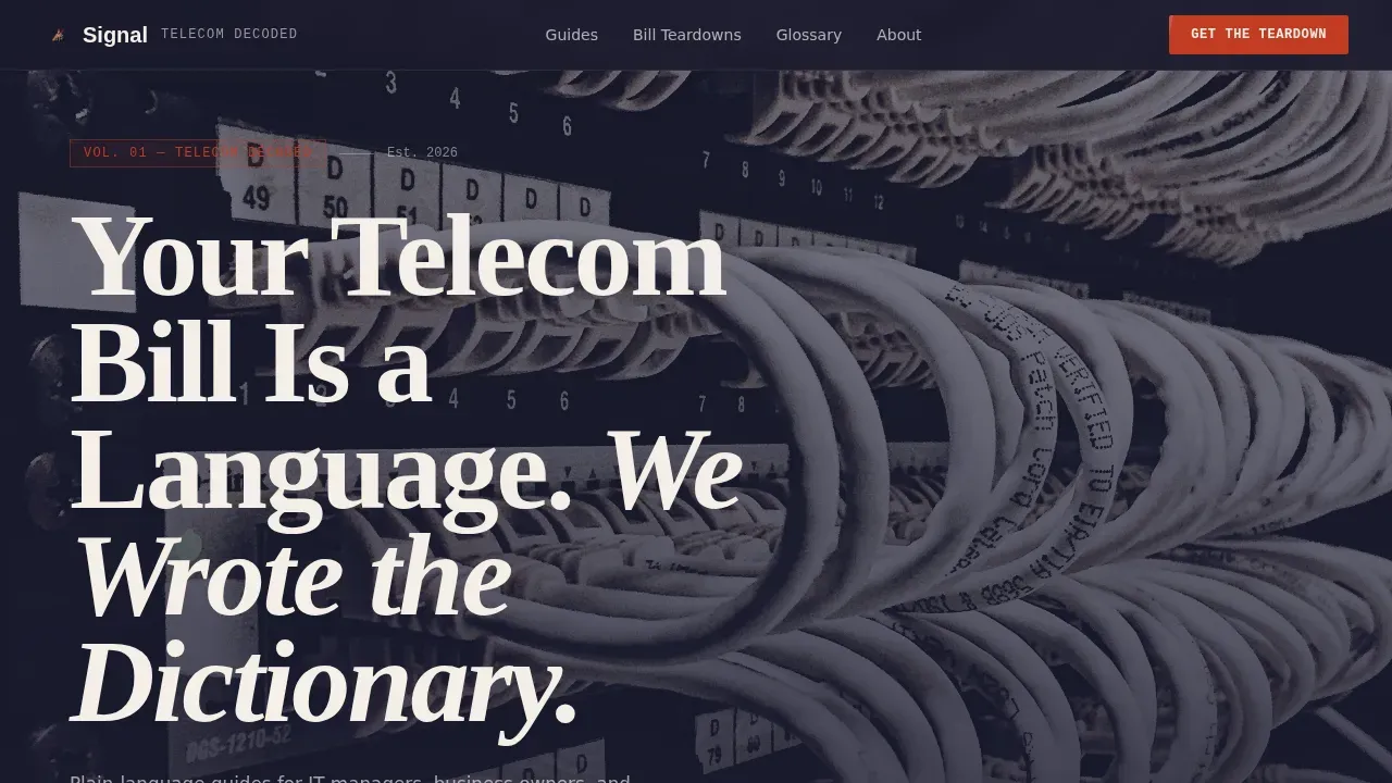
- A cinematic hero section with a bold serif headline displayed over a moody server rack photograph, set in warm parchment type with no call-to-action above the fold
- A six-section manifesto scroll with a 60/40 asymmetric grid, persistent sidebar lead capture form, annotated evidence panels, and a full-width email sign-up block at the close
- Two lead generation paths: a weekly newsletter subscription form and a free downloadable PDF offer, both using a minimal work email plus job-role dropdown to segment your audience
Feature list
This landing page template is engineered around one goal: convert informed readers into subscribers. Every design element and layout decision serves that goal directly.
Asymmetric 60/40 Editorial Grid
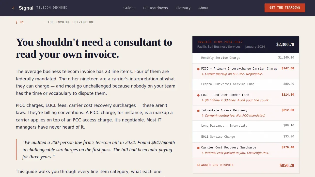
The 60-column side carries long-form essay content, while the 40-column side holds supporting evidence like annotated invoice panels and before-and-after bandwidth charts. The layout creates visual tension that rewards careful readers and gives a designer the flexibility to build a page that feels genuinely editorial rather than templated.
Manifesto-Driven Scroll Structure
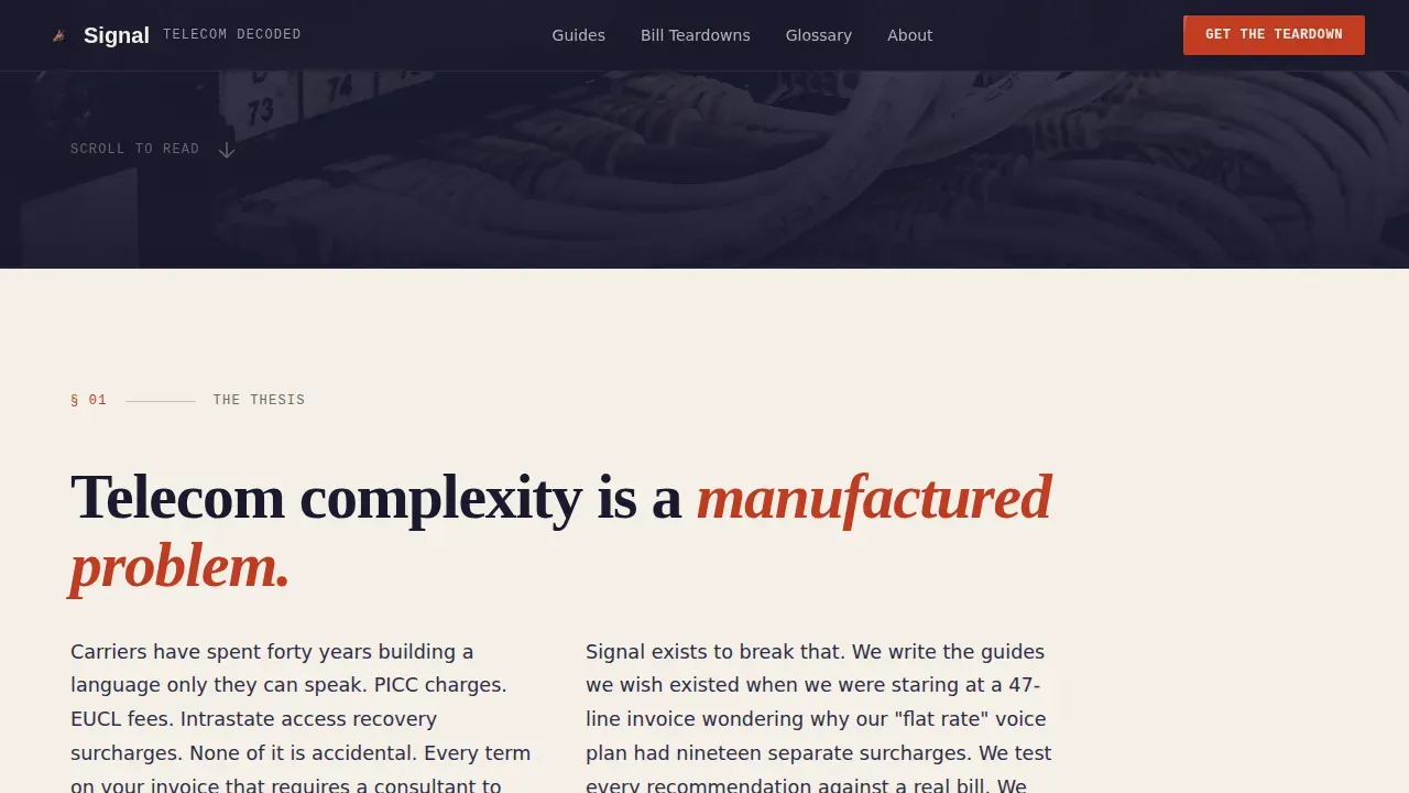
The scroll reads like a declaration of belief. Each section presents a single conviction, building momentum from the opening thesis to the final call-to-action. This structure keeps visitors engaged section by section and makes the page feel like a destination rather than a landing spot.
Persistent Sidebar Lead Capture Form
A newsletter sign-up form sits as a persistent element in the 40-column gutter. It stays visible as visitors scroll through the manifesto content. The form asks only for a work email and a job-role dropdown, keeping the process frictionless and making it easy to segment content by audience type.
Full-Width Lead Generation Block
After the final conviction section, the page delivers a full-width call-to-action block. This is where earned trust converts to action. Visitors can subscribe to the weekly newsletter or access the free nine-page PDF guide, with both offers gated behind the same simple form.
Ink & Paper Visual Identity System
The colour system uses deep manuscript black, warm parchment, pencil-graphite gray, and a single editorial red reserved for callouts, pull quotes, and hover states. Typography is set in Fraunces for display, DM Sans for body text, and JetBrains Mono for code and callout elements.
Scroll-Reveal Animation and Interactive Elements
Medium-weight animations include scroll reveal transitions, entrance fade-ups, and an accordion sweep for frequently asked question sections. A horizontal scroll proof-point strip and interactive email form with dropdown add engagement without adding distractions.
Page sections overview
| Section | Purpose |
|---|---|
| Cinematic Hero | Headline over server-rack photo; sets editorial tone with no action above fold |
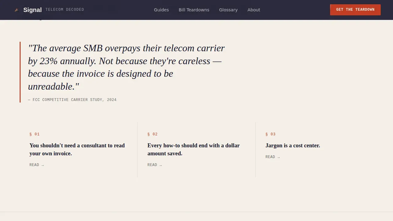
| Manifesto Thesis | Full-width opening essay with pull quote and central conviction statement |
| Conviction One: Invoices | 60/40 grid with essay left, annotated invoice panel right, persistent sidebar form |
| Conviction Two: Savings | 60/40 grid with essay left, before-and-after savings evidence panel right |
| Conviction Three: Jargon | Dark bento grid with decoded terms, subscriber proof points, and PDF offer |
| Full-Width Call-to-Action | Email form, job-role dropdown, and PDF download offer for final conversion |
| Footer | Linear single-row footer with links and site information |
Design & branding system
The Ink & Paper theme is the backbone of this landing page. Every colour and type choice reinforces the idea that this is a page built by someone who has actually read the manual, not just written about it.
- Colours: deep manuscript black (#1A1A2E), warm parchment (#F5F0E8), pencil-graphite gray (#6B6B6B), and editorial red (#C23B22) used only for callouts, pull quotes, and hover states
- Typography: Fraunces serif for bold display headlines, DM Sans for clear body text, and JetBrains Mono for technical callouts and code examples, giving the page three distinct visual registers
- The overall design aesthetic references a freshly printed broadsheet on a wooden desk: authoritative, readable, and free of decorative noise that would pull attention from the content
Mobile & speed optimization
The template is built desktop-first to match the primary audience of IT managers working at workstations, with a solid mobile fallback that keeps the landing page readable and functional on any device.
- Responsive layout adjusting automatically to smaller screen sizes, so the 60/40 grid and all page elements remain clearly displayed on a phone or tablet
- Server Components handle static content delivery while Client Components manage the email form and animation interactions, keeping the page light and fast on every device
- No heavy background video or gradient layers; the design relies on typography and whitespace so the page loads cleanly and visitors do not drop off before they reach the lead capture section
How this template helps you convert
A landing page converts when visitors feel understood and trust the offer. This template builds that trust through design, structure, and a frictionless action path.
- The benefit-driven headline immediately tells visitors they can understand their telecom bill, framing the value proposition before they read a single paragraph, which reduces the time required to capture their attention and move them toward the form
- Two conversion paths work together: the persistent sidebar form catches ready subscribers early in the scroll, while the full-width block at the end converts readers who needed the full manifesto to feel confident enough to click
- The job-role dropdown lets you personalize follow-up content for IT managers, engineers, and business owners without asking visitors for more than their work email, keeping friction low and sign-up rates high
Other information about this template
This template is tailored to meet the specific needs of telecom-focused companies and independent publishers who want a landing page that can stand on its own as a content destination. It provides a clear structure that is faster and easier to work with compared to building from scratch.
- Users can customize every text block, colour value, and layout element to suit their brand, campaign topic, or audience segment without needing a designer or developer for routine changes
- Landing page builders that allow users to create and personalize pages quickly are a proven approach for content-led marketing; this template gives you that same flexibility in a purpose-built editorial format, similar to how tools like ConvertFlow enable rapid page creation and how platforms like SITE123 offer user-friendly templates for those without deep coding experience
- The template supports A/B testing different page elements, such as adjusting the headline copy or the call-to-action description, to find which version drives the best results for your specific audience
- Trust indicators, including social proof like subscriber count displays and real bill examples in the evidence panels, are built into the design to protect credibility and encourage conversions from cautious visitors
- You can add or remove content blocks, personalize the PDF offer description, and update the job-role dropdown options to match your services and clients as your company grows
- The page is designed to minimize distractions and keep visitors focused on a single conversion goal, which is the core principle of effective landing page marketing and the reason this layout works as well as it does for technical content sites
- The interactive frequently asked question accordion, horizontal scroll proof-point strip, and annotated invoice panel examples give visitors multiple ways to engage with the content and learn about the value you provide before they decide to act
- Sharing the page on social channels, including Facebook, is straightforward because the open-graph metadata fields let you control exactly how the page is displayed when visitors share a link
Theme
Ink & Paper
Creative direction
Manifesto
Color system
Ink & Paper
Style
Asymmetric Grid (60/40)
Direction
Lead Generation
Page Sections
Asymmetric 60/40 Editorial Grid
Manifesto Scroll with Conviction Sections
Persistent Sidebar Lead Capture
Full-width Closing Conversion Block
Ink and Paper Visual Identity
Interactive Animations and Accordion Elements
Related questions
Can I change the colours and typography to match my brand?
Do I need a designer to launch this landing page?
What lead capture forms does this template include?
Is the template suitable for topics other than telecom billing?
How does the PDF download offer work within the template?



