Hobby & Passion Content Blog & Content Website Template
Frost is an editorial masonry landing page template built for cookie decorating blogs and communities. It pairs a full-bleed Type Over Image hero with a chronological day-in-the-life grid that moves from dawn mise en place to midnight finishing shots. The layout is restrained, the typography is magazine-quality, and every element is designed to earn the click through to a long-form tutorial.
by Rocket studio
Quick summary
Frost is a single-page editorial landing page template for cookie decorating blogs. It uses a masonry grid organized as a morning-to-midnight narrative, a Type Over Image hero with a large serif headline, and a raspberry glaze call-to-action bar that appears after the third scroll depth. The page earns the click by showing the process beautifully before asking for anything.
Who this template is for
This template is built for creators who teach cookies through story. It speaks to bakers who care as much about the picture as the process, and who want their site to feel like a magazine rather than a social media feed.
- Home bakers who document their icing work for friends and family, from recital cookies to holiday sets
- Cottage bakery owners who want a professional landing page that reflects the care they put into each cookie shape and finish
- Hobbyist decorators who are curious about building a community around their craft and want a page that earns trust on first scroll
What problem this template solves
Most cookie decorating blogs live on platforms that were not built for editorial storytelling. The page looks like a feed. The photos are small. The reader has no reason to click deeper. Frost solves that problem by giving your landing page the weight and confidence of a printed food magazine.
- Visitors leave before they reach the call to action because the page gives away everything upfront with no narrative tension
- Process photos, icing detail shots, and finished cookie spreads are mixed without a sense of sequence, so the scroll feels random rather than satisfying
- The link to the full tutorial gets buried, and the page never builds enough desire to make the click feel inevitable
What you get with this template
You get a complete, single-page editorial landing page file with every section pre-built and ready to populate with your own photos, icing videos, and tutorial links. The layout is structured to guide a reader from first impression to click without a single moment of confusion.
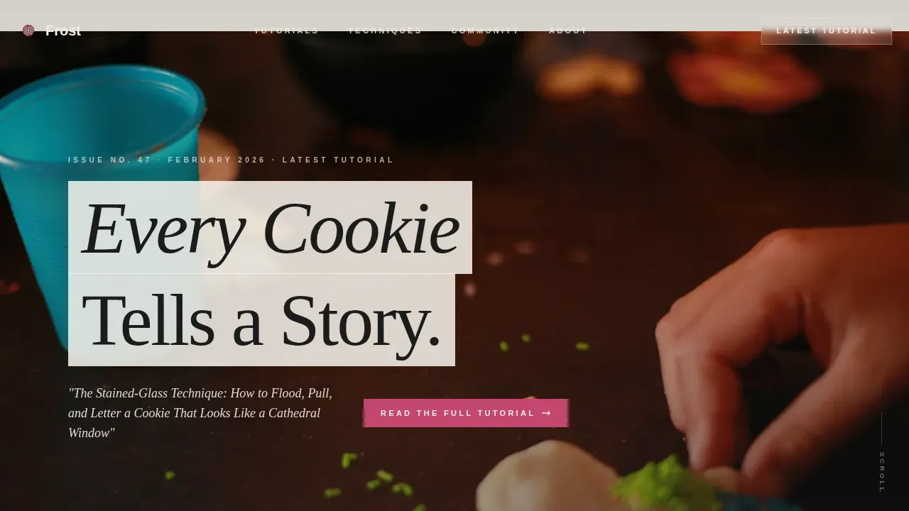
- A full-bleed hero section with a Type Over Image layout, a large serif headline slot, and a dateline-style subhead that links to your latest post
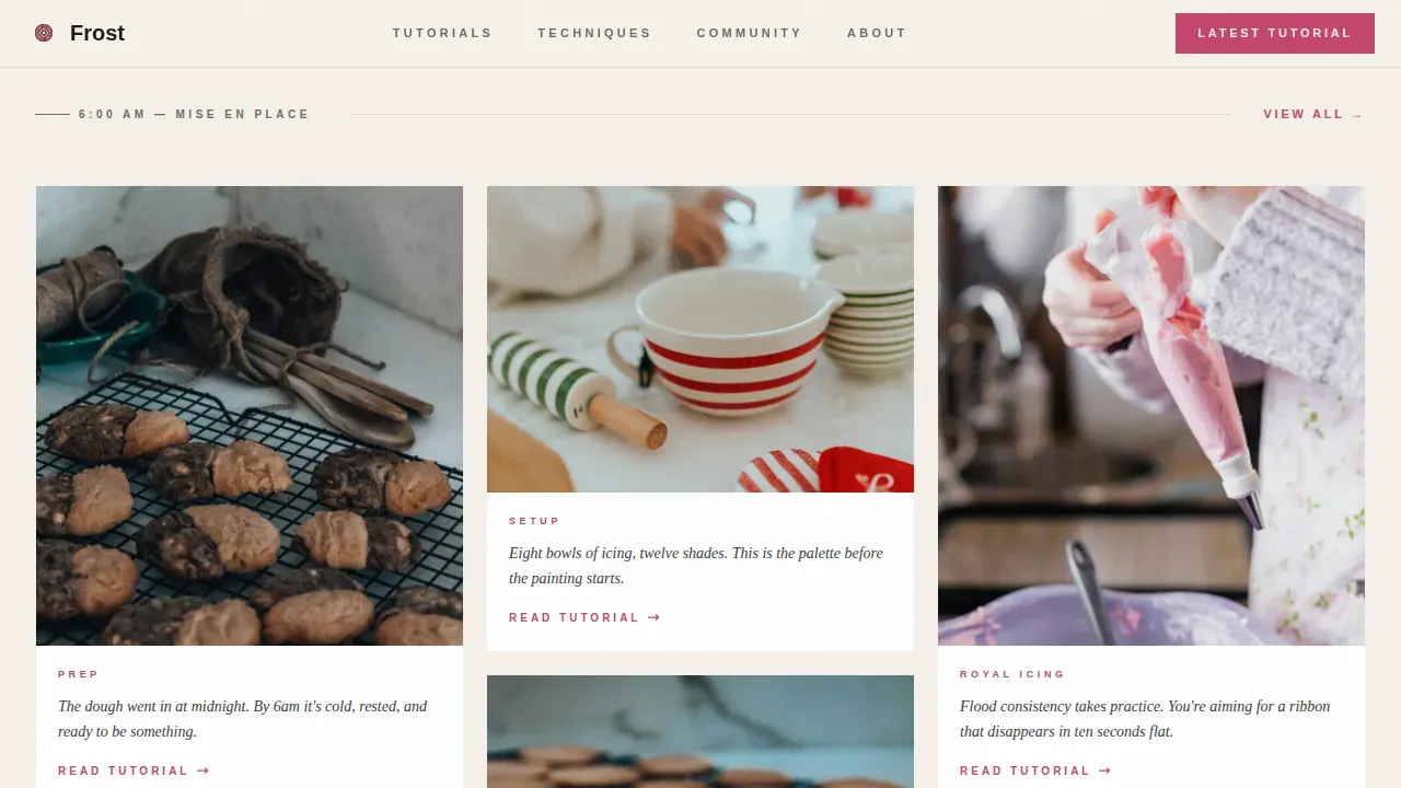
- A three-part masonry grid set up as a dawn-to-midnight narrative, with card slots for process photos, short video loops, and magazine-style caption text
- A persistent bottom call-to-action bar that appears after scroll depth three, plus a quiet community membership link styled as a subscription card insert between grid rows
Feature list
This landing page template is built around a small number of carefully decided features. Each one serves the same point: get the reader to the tutorial.
Type Over Image Hero
The hero section uses a full-bleed overhead photo slot with a large Fraunces serif headline and a thin cream backing that lets the type breathe. A dateline-style subhead sits below, styled like a magazine issue slug. This is the first thing a visitor sees, and it sets the editorial theme immediately without a heavy overlay blocking the photography.
Day-in-the-Life Masonry Grid
The masonry grid is divided into three chronological acts. Dawn cards show mise en place and dough prep in soft morning light. Golden-hour cards hold process shots, flooding sequences, and short video loops of icing detail work. Midnight cards arrive at finished cookie spreads, packaged boxes, and the social media moment. Each card carries a caption slot for a voice-y, columnist-style aside. The scroll feels like living someone's most satisfying creative day, not browsing a feed.
Persistent Call-to-Action Bar
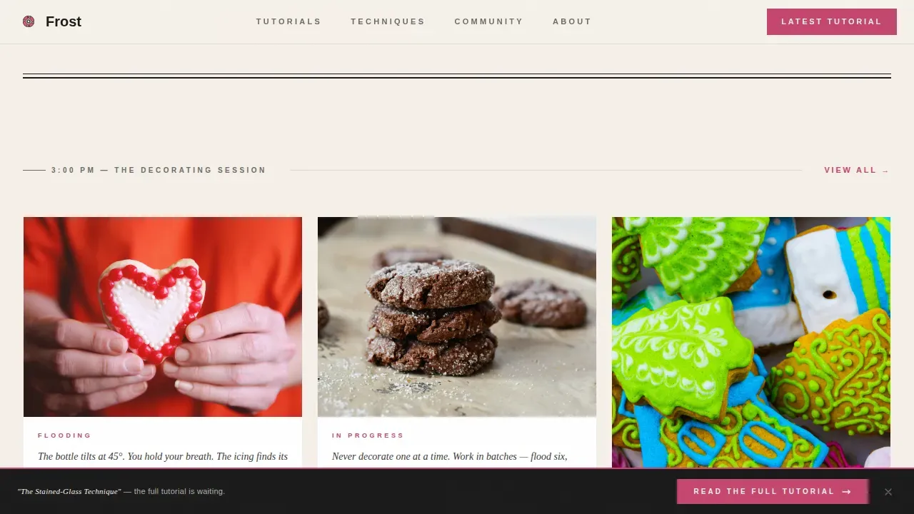
A bottom bar with a raspberry glaze "Read the Full Tutorial" link activates after the third scroll depth. It stays visible as the reader moves through the grid. A second endpoint call to action appears as a natural finish below the final masonry row. Neither interrupts the editorial feel, and neither asks for a form fill.
Community Membership Insert
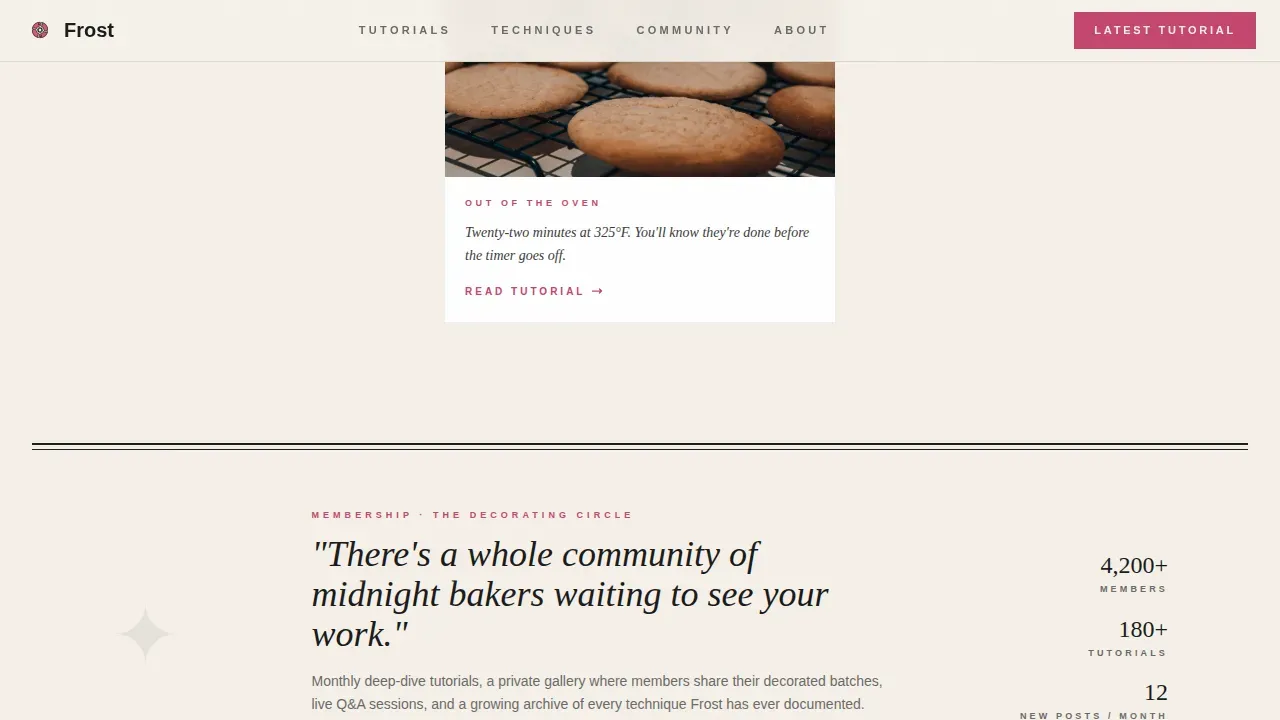
Between the golden-hour and midnight grid rows, a quiet text link appears styled as a magazine subscription card. It points to the community membership page with the label "Join the Decorating Circle." This is the secondary conversion path. It is unobtrusive and reads like a natural editorial aside, not a banner ad.
Editorial Ink and Paper Color System
The palette uses four values: newsprint cream (#F5F0E8) as the page base, editorial black (#1A1A1A) for headlines and primary text, soft graphite (#6B6B6B) for secondary captions, and raspberry glaze (#C4446E) reserved for links, buttons, and pull-quote accents. Three working colors keep the layout uncluttered so the photos carry the visual weight.
Scroll-Triggered Animation System
The template includes GSAP ScrollTrigger reveals with staggered masonry card entrances and floating element animations. The persistent call-to-action bar activates on a scroll-depth trigger. Static grid sections use Server Components for stability, while scroll interactions run as Client Components. The result is a page that loads cleanly and feels alive as the reader moves through it.
Page sections overview
| Section | Purpose |
|---|---|
| Full-Bleed Hero | Sets the editorial theme with a Type Over Image serif headline and dateline subhead |
| Dawn Masonry Grid | Opens the day-in-the-life narrative with mise en place and dough prep cards |
| Community Insert Card | Surfaces the "Join the Decorating Circle" membership link as a subscription-style aside |
| Golden Hour Grid | Centers the decorating process with flooding shots, stencil work, and video loop cards |
| Midnight Masonry Grid | Closes the narrative with finished cookies, packaging photos, and the social media moment |
| Persistent call to action Bar | Locks the "Read the Full Tutorial" link to the bottom of the screen after scroll depth three |
| Editorial Footer | Provides a minimal Vercel Horizontal footer pattern in the Ink and Paper palette |
Design & branding system
The design follows an Editorial Magazine theme. It is restrained on purpose. The page does not compete with the photography; it frames it. Think of a letterpress broadsheet laid across a marble countertop.
- Typography is set in two fonts only: Fraunces as the bold serif display face for headlines and pull elements, and DM Sans as the clean sans-serif for body text, captions, and interface labels
- The color system uses newsprint cream (#F5F0E8) as the warm page base, editorial black (#1A1A1A) for all primary type, graphite (#6B6B6B) for secondary detail text, and raspberry glaze (#C4446E) as the single accent for links and buttons
- Glassmorphism-style semi-transparent backing sits behind headline type in the hero, letting the full-bleed image breathe without a solid color block cutting across it
Mobile & speed optimization
The template is built mobile-first. Bakers browse on their phones at midnight, and the page is designed to feel as good on a small screen as it does on a wide desktop layout.
- The masonry grid reflows correctly for mobile viewports, keeping the chronological narrative intact and each card picture legible at smaller sizes
- Scroll-triggered animations are handled as Client Components, while the static grid content uses Server Components to keep the page stable and fast to navigate
- The persistent call-to-action bar is sized and positioned for thumb reach on mobile, so the "Read the Full Tutorial" link is always within easy access on any screen size
How this template helps you convert
This landing page is designed to be clear, distraction-free, and goal-oriented. It earns the click by showing just enough of the process that the reader needs to know what happens next.
- The day-in-the-life masonry scroll creates narrative desire. The reader sees dawn prep, watches the icing process unfold card by card, and arrives at the finished cookies wanting the full story. The call to action lands at exactly the right moment to point them in the right direction.
- The persistent bottom bar keeps the primary link visible without interrupting the editorial experience. The reader never has to scroll back to find the tutorial link. It is always one tap away, reinforcing the single conversion goal on every section of the page.
- The community membership insert gives curious readers a second path forward. It is styled softly so it does not compete with the primary call to action, but it catches the reader who is not quite ready to click through to a tutorial and gives them a lower-friction way to sign up and stay connected.
Other information about this template
This template is delivered as a ready-to-use file. The sections are pre-built and the layout system handles the visual logic, so you can focus on populating it with your own content.
- The page is built to support a quick video loop in the golden-hour masonry cards, sized for a one-to-two minute behind-the-scenes process clip that builds an authentic connection with viewers
- The template works cleanly on both Mac and Windows computers, and the layout renders correctly across modern desktop browsers without broken element alignment
- Cookie decorating can be adapted across seasons and occasions, so the card grid is flexible: swap in Easter egg cookies painted with royal icing, chalkboard-effect fondant holiday designs, or stencil-finished shapes for any event without changing the layout structure
- The stencil card slot in the golden-hour grid is specifically sized to showcase stencil work close-up, including magnetic stencil frame details and finished painted cookie examples
- The print-style editorial design means the page photographs and screen-captures well for sharing on platforms like Facebook or saving as a reference PDF without losing the magazine feel
- Resources like free PDF downloads, printable coloring pages, and royal icing transfer sheet links can be pointed to from the community insert card or footer link slots
- The Cookie Countess and similar cookie decorating resource companies offer free digital downloads, including royal icing transfer sheets, that pair naturally with the content strategy this landing page supports
- The Cookie Architect platform provides free printable coloring pages for cookie designs and encourages users to share their colored versions, a style of community engagement this template's membership path is built to support
Theme
Editorial Magazine
Creative direction
Day-in-the-Life
Color system
Ink & Paper
Style
Masonry/Pinterest
Direction
Click-Through
Page Sections
Type Over Image Editorial Hero
Chronological Day-in-the-life Masonry Grid
Persistent Scroll-depth Call to Action Bar
Community Membership Insert
Ink and Paper Color System
GSAP Scroll-triggered Animation
Related questions
Can I swap in my own photos and videos without breaking the layout?
Does the template include the persistent call to action bar and scroll-trigger behavior?
Can I use this template for seasonal content like Easter or holiday cookie sets?
Is the template built for mobile visitors?
What file format does the template come in and what do I need to run it?



