Real Estate Blog & Media Education Website Template
Deed is a warm, horizontal-scroll landing page template built for a first-time homebuyer education blog. It guides readers through real estate documents with kitchen-table honesty, using a Heritage and Story aesthetic, chapter-style scroll panels, ungated resource cards, and a single focused email capture for a free checklist.
by Rocket studio
Quick summary
Deed is a single-page, horizontal-scroll template for a real estate how-to blog. It turns intimidating closing documents into approachable, chapter-led reading. The design feels like a well-loved notebook, warm and unhurried. A sticky amber call to action collects first-name and email after the third scroll panel, while ungated resource cards build trust before asking for anything.
Who this template is for
This template is built for educators, writers, and content creators who want to demystify the homebuying process for readers who have never done it before. It suits anyone running a real estate education blog where trust must come before conversion.
- First-time homebuyer blog owners who want a warm, story-driven content hub
- Independent real estate educators and writers serving renters, solo buyers, or immigrant families
- Content creators who prioritize building reader trust before capturing an email address
What problem this template solves
Most real estate content online is either too legal, too salesy, or written for people who already know what escrow means. First-time buyers searching for plain-language help at midnight find walls of jargon instead of a guiding voice. This template creates that guiding voice.
- Visitors overwhelmed by closing disclosures and deed language need a page that feels human, not clinical
- Blogs without a clear story structure lose readers before the call to action ever appears
- Generic templates do not signal the warmth and specificity that nervous first-time buyers need to feel safe enough to sign up
What you get with this template
You get a fully structured horizontal-scroll landing page with a clear narrative arc, a focused email capture form, and a set of resource card slots that can point readers to full guides without a gate. Every section is positioned to earn the next swipe before asking for anything in return.
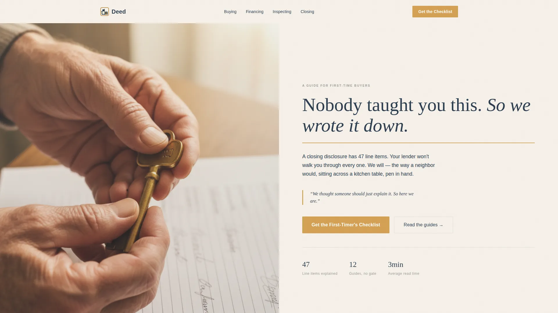
- A hero section with a half-page photo and text layout, a warm serif headline, and a staged visual of hands holding keys on a worn wooden countertop
- A horizontal scroll story sequence covering "The Problem," "The Moment," and four content pillar panels: Buying, Financing, Inspecting, and Closing
- An amber sticky call-to-action button and a two-field email form with empathetic placeholder text, plus ungated resource cards throughout
Feature list
This template is built around a specific set of decisions that serve the real estate education use case directly.
Horizontal Scroll Chapter Navigation
The page advances like turning pages in a memoir. Each panel snaps into view with a fade-in transition, and every panel ends mid-thought to earn the next swipe. The scroll structure keeps readers oriented without overwhelming them.
Half-Page Hero with Photo and Text
The hero splits the viewport into two halves. The left side holds a close-up photograph of hands holding house keys on a worn wooden countertop, with natural window light and a blurred signed contract in the background. The right side carries the headline in a large warm serif typeface.
Sticky Amber Call to Action
After the third scroll panel, an amber "Get the First-Timer's Checklist" button pins gently to the bottom edge of the page. It stays visible without interrupting the reading experience, giving readers a consistent path to sign up whenever they are ready.
Two-Field Email Capture Form
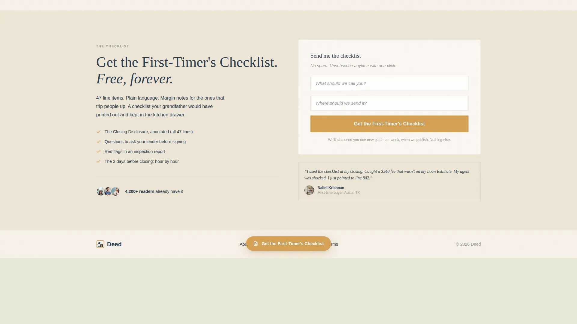
The email capture form asks only for a first name and an email address, in that order. Placeholder text reads "What should we call you?" and "Where should we send it?" The form is intentionally minimal to reduce friction for anxious first-time buyers.
Ungated Resource Cards
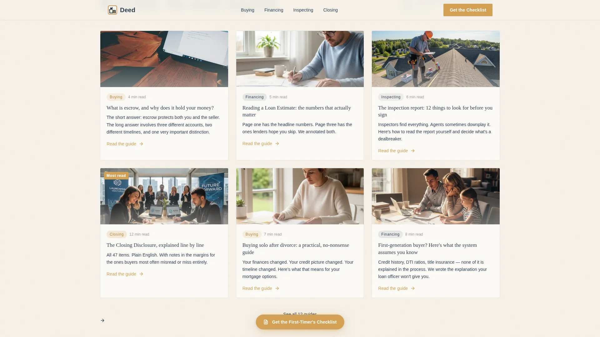
Each content pillar panel dissolves into a set of resource cards. Visitors can tap any card to read the full guide immediately, with no form required. This trust-first approach lets readers sample the content before deciding whether to sign up.
Origin Story Scroll Panels
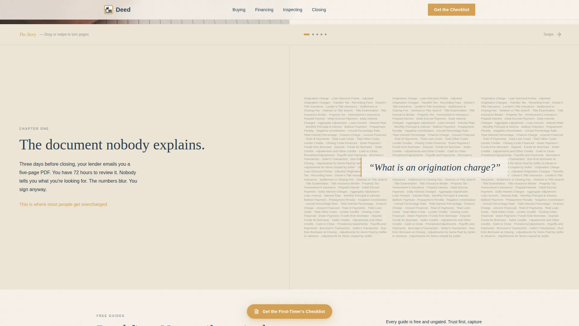
The horizontal scroll opens with "The Problem," a visual of real closing document jargon, then moves to "The Moment," a single clarifying sentence. Subsequent panels each introduce a content category through a short personal anecdote before transitioning to resource cards.
Page sections overview
| Section | Purpose |
|---|---|
| Hero: Photo + Text | Establishes tone with a warm serif headline and a key-holding photograph |
| Problem Panel | Confronts readers with real closing-document jargon to validate their frustration |
| The Moment Panel | Delivers the origin sentence that explains why this blog exists |
| Buying Pillar Panel | Introduces the buying process through a personal anecdote and resource cards |
| Financing Pillar Panel | Covers mortgage and financing basics with a story-led entry point |
| Inspecting Pillar Panel | Guides readers through the inspection stage via anecdote and resource links |
| Closing Pillar Panel | Explains closing documents, deed language, and escrow with plain-language notes |
| Checklist call to action | Captures first name and email in exchange for the First-Timer's Checklist |
| Footer: Linear Row | Provides essential links in a single horizontal row |
Design & branding system
The visual identity follows a Heritage and Story theme. Every design choice references the feeling of a trusted, handwritten notebook left open on an afternoon windowsill, pages slightly warm, nothing rushed.
- Color palette: parchment white (#F5F0E8) for backgrounds, pencil-sketch gray (#6B6B6B) for body text, faded ink navy (#2C3E50) for headings, and warm margin-note amber (#D4A054) reserved for highlights, pull quotes, the call-to-action button, and hover states
- Typography: Fraunces, a warm serif typeface, is used for all headlines, and DM Sans handles body text for clean readability at every size
- Texture and feel: the palette and type choices work together to feel like a well-loved reference notebook, not a corporate listing site
Mobile & speed optimization
The template is designed desktop-first to support the horizontal scroll experience, with a graceful fallback to vertical scrolling on smaller screens. Static content is prioritized throughout to keep load times predictable.
- The horizontal scroll chapter structure converts to a vertical page flow on mobile, so no content panel is lost on smaller devices
- Images across the template are lazy-loaded, meaning they load only as a reader reaches them rather than all at once
- Animations are set to a medium intensity, using scroll-snap, fade-in panel transitions, and cursor-reactive amber highlights that do not interfere with reading speed
How this template helps you convert
The conversion strategy is built around earning trust before asking for anything. Every structural decision is designed to move a nervous first-time buyer from curiosity to confidence to sign-up.
- The ungated resource cards let visitors read full guides without a barrier, proving the value of the blog before the email form ever appears
- The sticky amber call-to-action button appears only after the third scroll panel, giving readers enough context to understand what the checklist is and why they want it
- The two-field form with empathetic placeholder text removes friction at the final step, making the act of signing up feel as low-stakes as leaving a name on a notepad
Other information about this template
This template fits naturally into the Blog and Editorial category, specifically within the Real Estate Blog and Media subcategory. It is designed for the Real Estate How-To Blog niche, where the reader relationship depends entirely on credibility and warmth rather than flashy design.
- The template style is Horizontal Scroll, suited for desktop-first storytelling experiences with a vertical fallback for mobile visitors
- The creative direction follows an Origin Story framework, meaning the page structure is built around a founding moment that explains why the blog exists
- The header concept is Half-Page Photo and Text, which divides the hero viewport equally between a human photograph and a chapter-title headline
- The landing page direction is Content and Resource Hub, meaning the primary goal is to deliver value through guides and then capture interest through a single, low-friction email form
Theme
Heritage & Story
Creative direction
Origin Story
Color system
Cloud Canvas
Style
Horizontal Scroll
Direction
Content/Resource
Page Sections
Horizontal Scroll Chapter Navigation
Half-page Hero Layout
Sticky Amber Call-to-action Button
Two-field Email Capture Form
Ungated Resource Cards
Origin Story Scroll Sequence
Related questions
Who is this landing page template designed for?
Can visitors read the guides without signing up?
What does the email capture form ask for?
Does the horizontal scroll work on mobile devices?
Can I customize the content pillar panels?



