Backend Engineering Newsletter Specialist Blog Website Template
Deploy is a masonry-style landing page template built for a weekly backend engineering newsletter. It pairs an oversized serif manifesto header with a curated archive grid of varied-height issue cards, a floating click-through call-to-action bar, and a minimal subscribe anchor. The design draws from editorial magazine restraint, using warm parchment backgrounds, ink-wash black type, and precisely rationed vermillion accents.
by Rocket studio
Quick summary
Deploy is a single-page newsletter landing page template for a weekly backend engineering publication. It leads with a typographic manifesto, flows into a masonry archive grid of past issue cards, and closes with a focused subscribe form. The entire layout is built around editorial restraint, technical credibility, and a deliberate click-through path toward the latest issue.
Who this template is for
This template is made for practitioners who publish to other practitioners. It speaks directly to the people building and running systems at scale, not general tech audiences.
- Newsletter creators targeting senior backend engineers, staff architects, or platform leads
- Engineering-adjacent publishers who want a design that signals depth and rigor
- Solo technical writers or small editorial teams launching a high-signal weekly publication
What problem this template solves
Most newsletter landing pages look like marketing pages. They use stock photography, vague benefit bullets, and conversion copy borrowed from SaaS. That approach repels the senior engineer who has already seen through it.
- Generic templates fail to communicate technical credibility at first glance
- Archive-less layouts waste the strongest proof that a newsletter delivers consistent value
- Busy, visually noisy pages lose readers who expect signal, not spectacle
What you get with this template
You get a desktop-first editorial landing page that earns trust through design restraint and curated content density. The layout does the persuading before a word of marketing copy is needed.
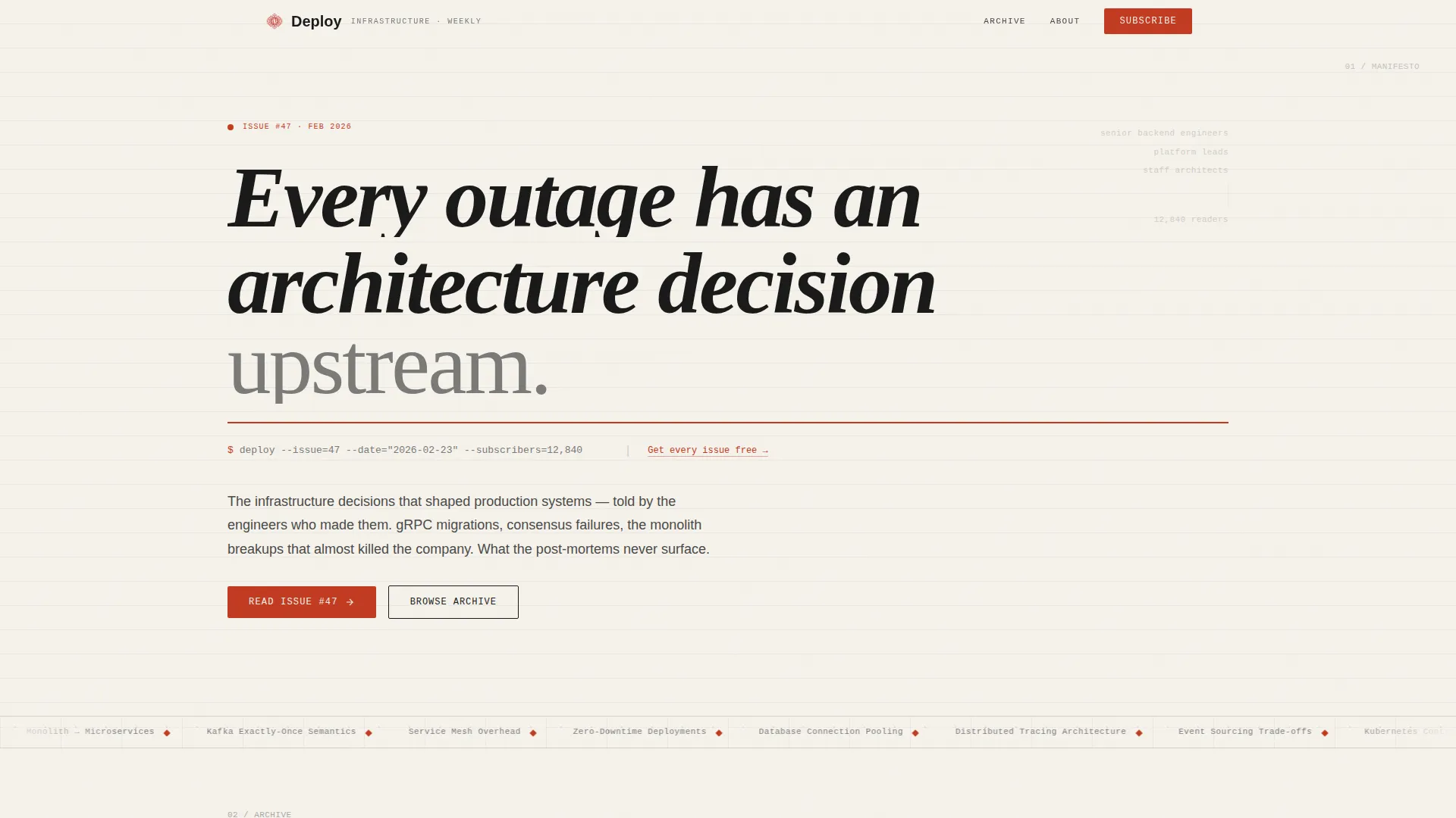
- A hero section with an oversized serif manifesto line, a thin vermillion rule, and a monospace terminal metadata line showing issue number, date, and subscriber count
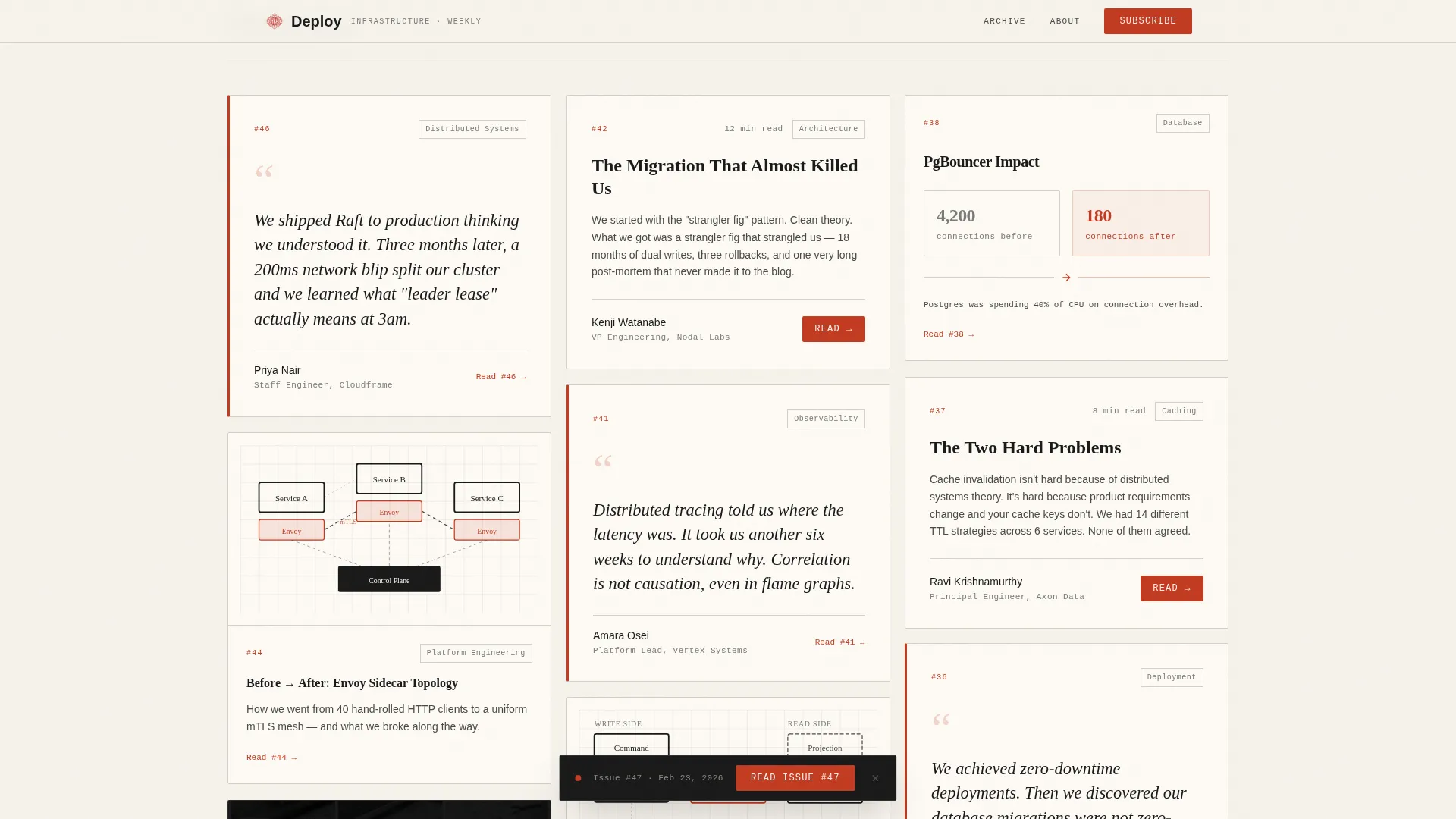
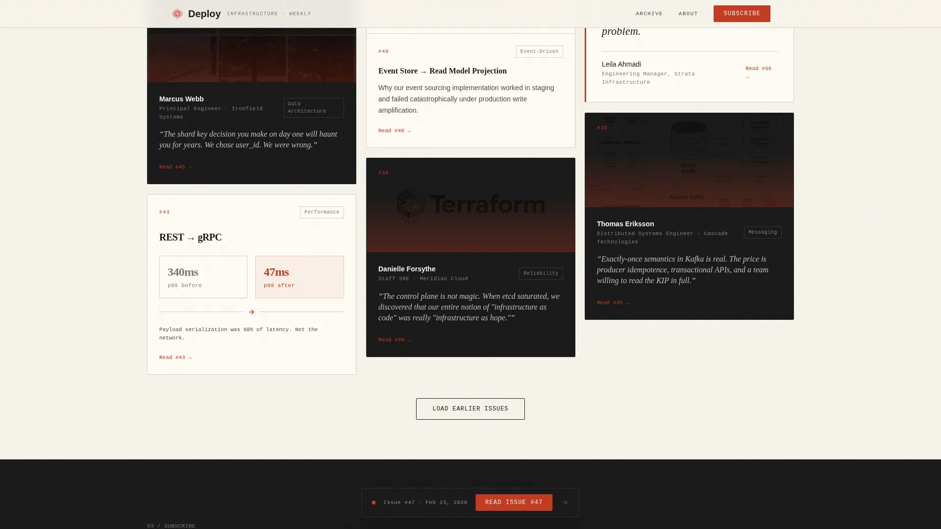
- A masonry archive grid of varied-height issue cards featuring pull-quote excerpts, system diagram captions, contributor names and roles, and desaturated duotone contributor headshots
- A floating call-to-action bar pinned after the first scroll, a subscribe anchor with a single email field, and an ultra-minimal footer in horizontal flow
Feature list
This section covers the core built-in capabilities of the Deploy template as described in the source brief.
Oversized Serif Manifesto Hero
The hero section is built around a single typographic statement set in large serif type against a warm parchment background. A thin vermillion rule separates it from a monospace metadata line that renders the current issue number, date, and subscriber count like a terminal prompt. No images, no illustrations. The typography carries the entire visual weight.
Masonry Archive Grid
A Pinterest-style masonry grid displays past issue cards at varied heights. Cards alternate between pull-quote excerpts in large serif type, system diagram or flame graph captions, and contributor headshots rendered in desaturated duotone. Scroll reveal animations surface cards progressively, and a spotlight hover effect rewards exploration without overwhelming the layout.
Floating Click-Through Bar
After the visitor scrolls past the hero, a subtle floating bar pins to the viewport. It carries the primary call to action, directing readers straight to the latest issue. The bar appears only after the first scroll, so it never competes with the manifesto on first impression.
Subscribe Anchor with Trust Line
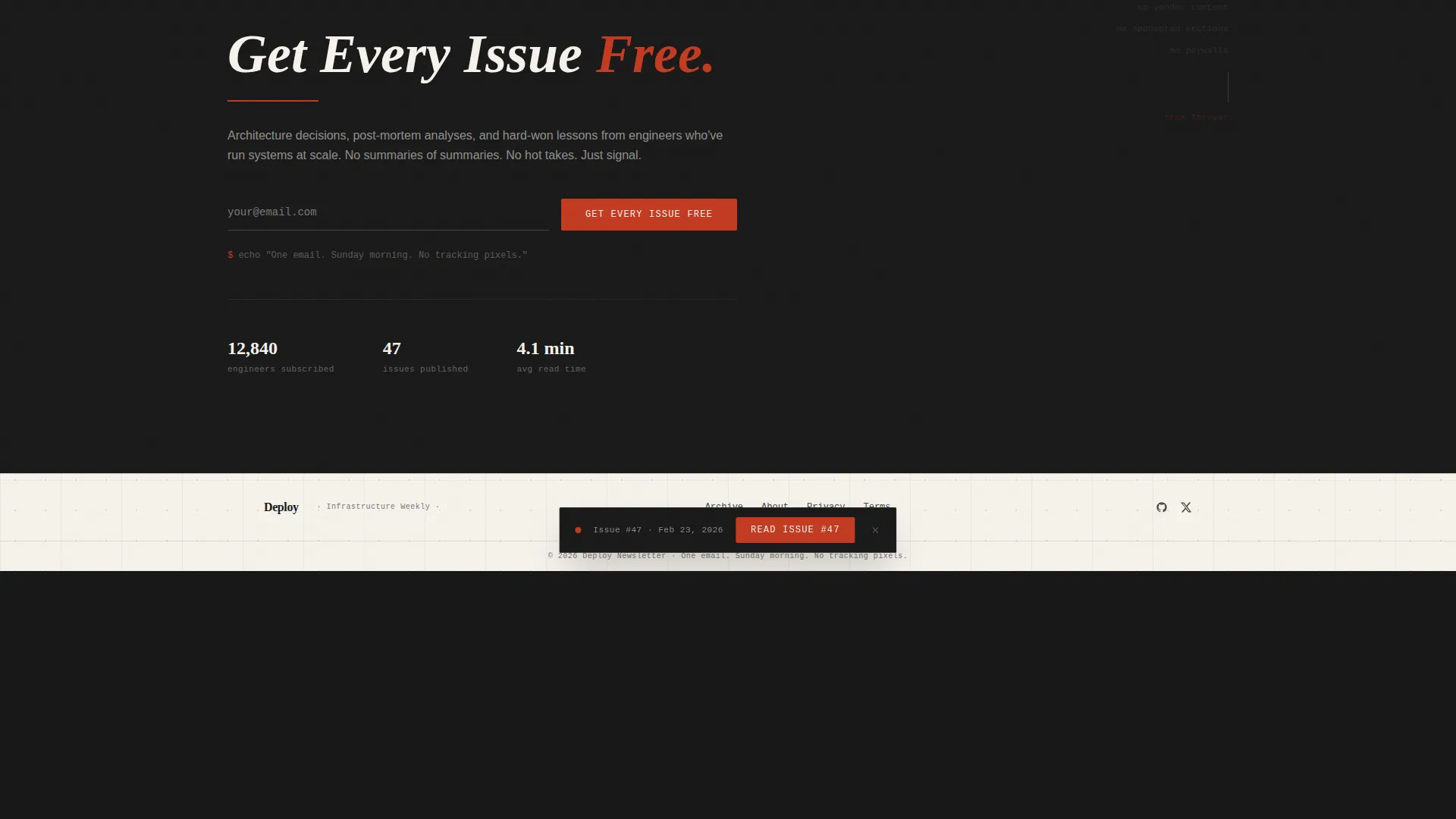
At the base of the masonry grid sits a single-field email subscribe form. A short monospace note accompanies it, reinforcing the newsletter's one-email-per-week, no-tracking-pixels promise. The copy is set to match the terminal-prompt aesthetic of the hero metadata line.
Editorial Japanese Zen Color System
The palette uses four deliberate values: shoji screen white (#F5F2EB) for backgrounds, ink-wash black (#1A1A1A) for body text, stone garden gray (#4A4A48) for alternating section backgrounds, and torii vermillion (#C23B22) reserved exclusively for links, issue numbers, and subscribe buttons. Vermillion appears sparingly, commanding attention precisely because it is rare.
Scroll Reveal and Card Interactivity
Cards in the masonry grid animate into view on scroll using medium-intensity reveal transitions. Hover states on individual cards create a spotlight effect that draws focus without disrupting the grid rhythm. The floating call-to-action bar and the subscribe form are handled as interactive client components, while static archive content uses server-side rendering.
Page sections overview
| Section | Purpose |
|---|---|
| Hero Manifesto | Establishes editorial authority with oversized serif type, a vermillion rule, and a terminal metadata line |
| Masonry Archive Grid | Displays curated past issue cards with pull quotes, diagrams, and contributor spotlights |
| Floating call to action Bar | Pins a scroll-triggered call to action directing visitors to the latest issue |
| Subscribe Anchor | Captures email signups with a single field and a monospace trust statement |
| Minimal Footer | Closes the page in a horizontal ultra-minimal pattern matching the overall restraint |
Design & branding system
The design system is rooted in Japanese Zen restraint applied to an editorial magazine format. Every color, typeface, and spacing decision is intentional. Nothing decorative earns a place unless it adds signal.
- Typography pairs Fraunces serif for headlines and pull quotes with JetBrains Mono for all metadata, issue numbers, and the trust line, reinforcing the engineering notebook feel
- Backgrounds alternate between warm parchment white (#F5F2EB) and stone garden gray (#4A4A48), with generous leading and negative space giving the text room to breathe
- Vermillion (#C23B22) appears only on interactive elements: links, issue numbers, and subscribe buttons, making every accent feel deliberate and high-stakes
Mobile & speed optimization
The template is built desktop-first, matching the morning reading habits of its primary audience. Responsive behavior is included, but the desktop experience is the designed priority.
- Server components handle all static archive content, keeping the initial page load lean before any interactive client components mount
- The masonry grid, scroll reveal animations, and floating call-to-action bar are scoped as client-side interactive components, isolating them from the static render path
- Medium-intensity animations use scroll-triggered reveals rather than auto-playing effects, reducing unnecessary processing on first paint
How this template helps you convert
The conversion strategy is built on letting the archive prove the value before asking for anything. By the time a visitor has browsed six or seven cards, the ask feels earned, not forced.
- The manifesto hero establishes instant credibility, telling senior engineers within three seconds that this publication respects precision and does not waste words
- The masonry grid surfaces varied social proof through pull quotes, contributor names, and technical diagram captions, each card adding a layer of trust before the call to action appears
- The floating bar and subscribe anchor work as two distinct commitment levels, a low-friction read of the latest issue and a higher-commitment email signup, meeting visitors wherever they are in their decision
Other information about this template
The Deploy template is suited to any technically rigorous newsletter that wants an archive-forward landing page. It is a strong fit for publications covering infrastructure, distributed systems, platform engineering, or any engineering-adjacent beat that values editorial depth over marketing polish.
- The template ships with five planned sections: hero, masonry grid, floating call-to-action bar, subscribe anchor, and footer, giving creators a complete single-page structure out of the box
- The creative direction follows a Creator Spotlight pattern, meaning each archive card can surface a different contributor or team, making the grid feel like a curated journal rather than a feed
- The header concept is a Quote or Manifesto pattern, designed for any single authoritative statement that frames the newsletter's editorial point of view
- This template is categorized under Blog and Editorial and is specifically designed for the backend engineering newsletter niche, making it a focused tool rather than a general-purpose page builder
Theme
Editorial Magazine
Creative direction
Creator Spotlight
Color system
Japanese Zen
Style
Masonry/Pinterest
Direction
Click-Through
Page Sections
Oversized Serif Manifesto Hero
Masonry Archive Grid with Cards
Floating Click-through Call to Action Bar
Single-field Subscribe Anchor
Japanese Zen Editorial Color System
Scroll Reveal and Interactive Components
Related questions
Can I change the manifesto line in the hero section?
Does this template include newsletter content or just the landing page structure?
Can I add more issue cards to the masonry grid over time?
Who is this template built for?
What interactive elements are included in this template?



