Editorial DevOps Jobs Newsletter Landing Page Template
Deploy is a ready-to-use editorial landing page template built for DevOps, SRE, and platform engineering job newsletters. It pairs a Japanese Zen color system with broadsheet-inspired masonry design to showcase curated roles, editorial principles, and past issues. One email field, zero friction, and a persistent call to action bar do the converting.
by Rocket studio
Quick summary
Deploy is a masonry-style newsletter landing page template designed for the DevOps and platform engineering jobs niche. It combines a broadsheet masthead, staggered job cards, and an editorial manifesto into a single focused page. The design is restrained, typographic-first, and built to earn the subscription before asking for it.
Who this template is for
This template is built for newsletter creators who serve senior engineers, not general audiences. It speaks directly to people who value signal over noise in their inbox.
- DevOps engineers and SREs tired of recruiter noise and aggregator spam
- Platform team leads quietly exploring their next role without broadcasting intent
- Newsletter operators and agencies building a professional subscription product in the jobs and hiring space
What problem this template solves
The DevOps hiring landscape is crowded. Generic job boards promote volume over quality, and most newsletter landing pages look like they were built in an afternoon. Readers arrive skeptical, and a weak landing page design confirms their doubts immediately.
- Engineers do not trust a landing page that makes promises without showing proof
- Most job newsletter pages bury the content and lead with marketing copy, killing conversions
- Building a credible, editorial-feeling page from scratch takes time and design experience most operators do not have
What you get with this template
You get a fully structured, single-page layout that earns the signup by showing real content before asking for anything. Every section is prepared and ready to edit with your own details.
- A typographic newspaper masthead with issue number, publication date, and editorial subhead
- Staggered masonry job cards with role titles, company names, stack tags, and salary bands displayed right below the fold
- An editorial manifesto block, a principles section, an archive of past issues, and a frictionless subscribe section with one email field
Feature list
This template includes purpose-built components that match the editorial and conversion needs of a curated jobs newsletter.
Broadsheet Newspaper Masthead
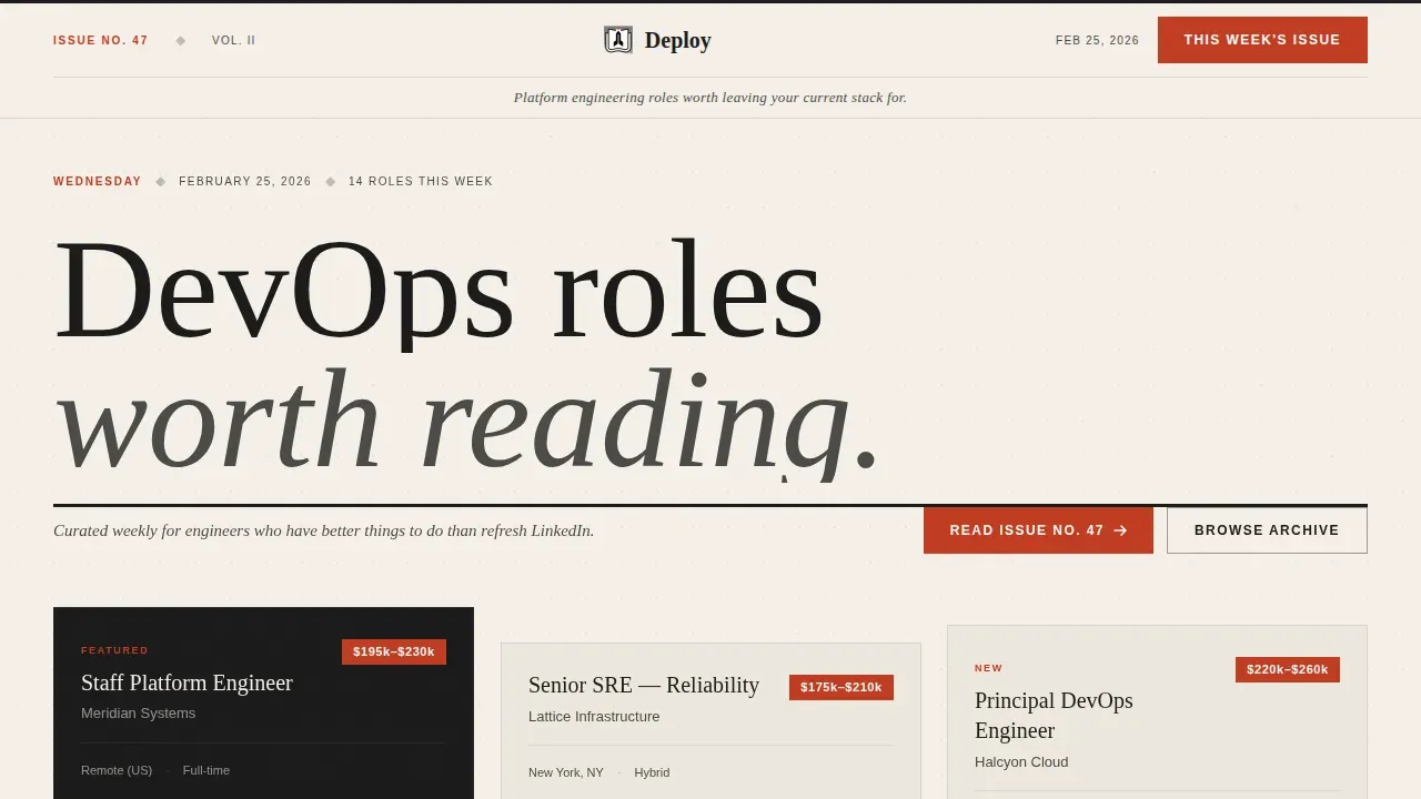
The header is set in a serif display typeface and functions like a publication masthead. It shows the newsletter name, an issue number, a publication date, and a single editorial subhead line. A high-contrast vermillion call to action button sits directly inside this section, so visitors can act on their first interest without scrolling.
Masonry Job Card Grid
Three sample job cards are arranged at staggered masonry offsets below the masthead. Each card shows a role title, company name, relevant stack tags such as Terraform, ArgoCD, and Crossplane, and a USD salary band. This lets visitors assess the quality of listings before deciding whether to subscribe.
Editorial Manifesto and Principles Section
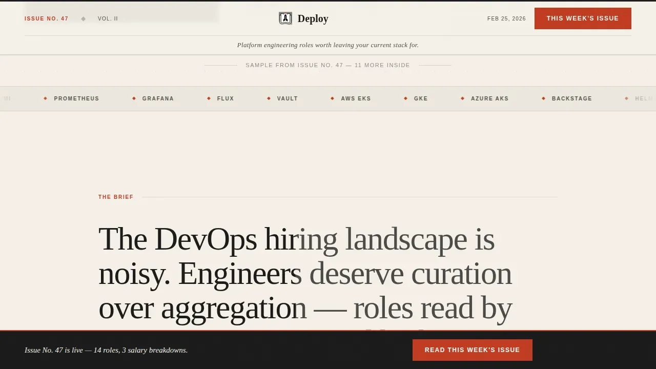
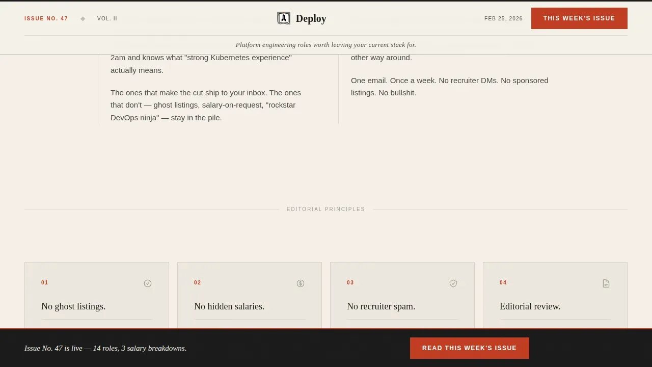
Past the masthead, a scroll-scrub manifesto block states why the newsletter exists. Below it, broadsheet-style column cards each carry one editorial commitment, for example no ghost listings, no hidden salaries, no recruiter spam. The rhythm alternates between dense information blocks and single-sentence declarations in open white space.
Archive and Sample Issues Block
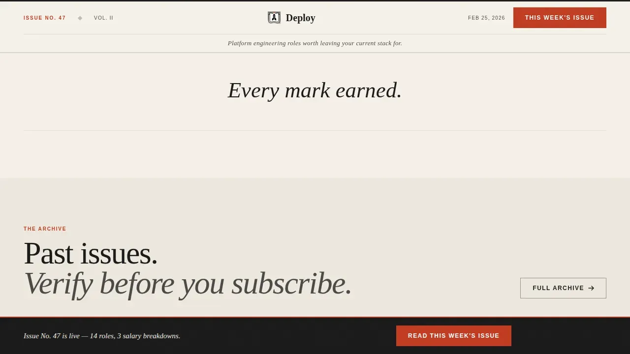
Three past issue cards tile across the grid at staggered heights. Each card shows a real subject line, an open rate, and a reader quote. This section acts as social proof, letting visitors review a sample of real content before entering their email.
Frictionless Subscribe Section
The subscribe section uses a single email input field with placeholder text and one action button. No labels, no extra fields, no distractions. A short reassurance note near the call to action encourages signups by confirming there is no spam and that unsubscribing is always easy.
Persistent Bottom Call to Action Bar
A sticky bar fades in on scroll and repeats the primary call to action across the entire page. Visitors never have to scroll back up to subscribe. This keeps conversions front of mind without interrupting the reading flow.
Page sections overview
| Section | Purpose |
|---|---|
| Newspaper Masthead Header | Introduce the newsletter with editorial authority and a primary call to action |
| Masonry Job Cards | Showcase three real role listings with salary and stack details |
| Manifesto Block | State the editorial mission with scroll-scrub text animation |
| Principles Column Cards | Present editorial commitments in broadsheet-style card components |
| Archive Issue Grid | Display past issues with open rates and reader testimonials |
| Subscribe Section | Capture the email with one field and one button, zero friction |
| Persistent call to action Bar | Repeat the call to action on scroll for continuous conversion opportunity |
| Minimal Footer | Show essential links and contact details without clutter |
Design & branding system
The design draws on a Japanese Zen color system and editorial broadsheet typography. Every visual decision is intentional, restrained, and built around negative space rather than decoration.
- Color palette: washi paper warm white (#F5F0E8) for page backgrounds, sumi ink black (#1A1A1A) for body text, stone garden gray (#4A4A48) for masonry card backgrounds with deep ink borders, and torii gate vermillion (#C23B22) used exclusively for call to action buttons and issue number accents
- Typography: Fraunces serif display for headings and the masthead, DM Sans for body text and user interface elements, creating a clear visual hierarchy that mirrors a hand-bound technical journal
- Layout approach: generous negative space, staggered masonry card offsets, and parallax grain texture create a reading cadence that feels deliberate rather than assembled
Mobile & speed optimization
The template is built desktop-first to serve senior engineers who read on work machines, and it scales responsively to mobile devices. Mobile-responsive design matters because a meaningful share of web traffic arrives from smaller screens even in technical audiences.
- Server Components handle all static content sections so the page can perform without unnecessary client-side overhead
- Client Components are used only for scroll interactions, including scroll-scrub text, staggered masonry card reveals, spotlight hover effects, and the persistent call to action bar fade-in
- The layout keeps external links and navigation menus minimal so visitors stay focused on the single goal of subscribing
How this template helps you convert
A high-converting landing page for a job newsletter needs clarity, trust, and a seamless user experience from the first scroll to the final button click. This template is optimized for exactly that workflow.
- The masthead leads with a benefit-driven headline and a high-contrast action button, so visitors immediately understand what the newsletter offers and how to get it. Real job card details and salary bands displayed below the fold act as instant proof of content quality.
- The archive section and reader testimonials add a second layer of credibility. Showing real open rates and reader quotes helps visitors decide to subscribe without needing any extra reassurance. The single email field with a "No spam. Unsubscribe anytime" note removes the last point of hesitation.
Other information about this template
This template is a strong starting point for newsletter operators, freelance web developers, and agencies who want to promote a curated jobs product without building from scratch. Pre-made templates like this one save time and energy that can go directly into marketing and content work. You can edit colors, swap icons, update image assets, and add your own copy without touching complex code.
- The template is available for downloading and is prepared to publish immediately after you enter your own content details
- It can help promote any niche newsletter in the DevOps, platform engineering, or SRE industry, and the brand color tokens are simple to match to your own palette
- Agencies building subscription web products for business clients can use this as a default starting layout, then customize components, links, and app integrations as needed
- Teams doing A/B testing on landing page design can treat this as a baseline and mix in variant elements to measure conversions across different audience segments
- Tools like Dropbox or similar file-sharing apps make it straightforward to share template assets with collaborators during the build process
- The included HTML structure is clean and advanced enough for a web developer to extend, while staying approachable for operators with limited time
- For limited time access to the full template, visit the platform and start with the free tier before deciding on a paid plan
Theme
Editorial Magazine
Creative direction
Vision & Mission
Color system
Japanese Zen
Style
Masonry/Pinterest
Direction
Content/Resource
Page Sections
Broadsheet Newspaper Masthead
Masonry Job Card Grid
Editorial Manifesto and Principles
Archive and Sample Issues Block
Frictionless Subscribe Section
Persistent Scroll Call to Action Bar
Related questions
Can I use this template without writing code from scratch?
What makes this different from a generic newsletter landing page template?
Does the template support a frictionless sign-up process?
Is this template optimized for both desktop and mobile?
Can agencies or freelancers use this template for client projects?



