Instant Cloud Infrastructure Landing Page Template
Dispatch is a masonry-style landing page template built for a monthly SaaS and cloud intelligence briefing. It converts portfolio managers, CFOs, and DevOps leads into subscribers through a research-wall layout, a cinematic studio header, and a frictionless email capture flow that unlocks a free sample card on submit.
by Rocket studio
Quick summary
Dispatch is a single-page lead generation template designed for a monthly SaaS and cloud intelligence briefing. The layout uses a masonry research-wall grid, a looping studio header video, and a two-step email capture form. It is built for B2B media and research intelligence publishers who need to convert sharp, senior readers into paying subscribers.
Who this template is for
This template is for publishers, analysts, and media teams who produce high-signal B2B research content. It is especially useful when your audience is sophisticated and skeptical of generic newsletter pitches.
- Portfolio managers and CFOs who track software earnings and subscription model pricing changes
- DevOps leads and engineering budget owners benchmarking multi-cloud infrastructure spend against peers
- Research-led media brands that need a landing page matching the depth of their content
What problem this template solves
Senior financial and technical readers do not convert on generic newsletter templates. They need to see the quality of your thinking before they hand over their work email. Most landing pages ask for trust before delivering proof.
- The template leads with evidence first, placing dense research cards and data excerpts before any subscription ask
- It removes friction by offering a free sample card unlocked instantly on email submit, so readers taste the product before committing
- It separates the briefing's signal from the surrounding vendor noise through a deliberate, editorial visual system that feels like a curated research library
What you get with this template
You get a fully structured, single-page lead generation layout with every major section pre-built and ready to customize with your own content and branding.
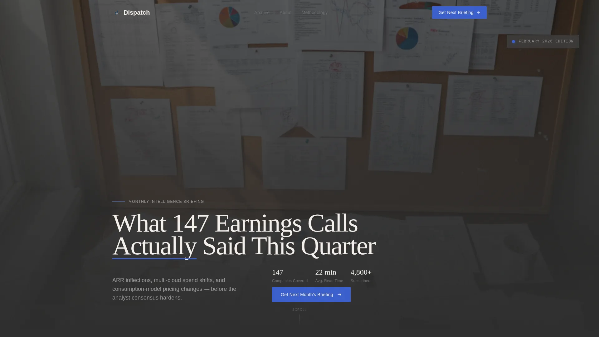
- A cinematic looping studio header with a large serif headline and an ultramarine accent underline
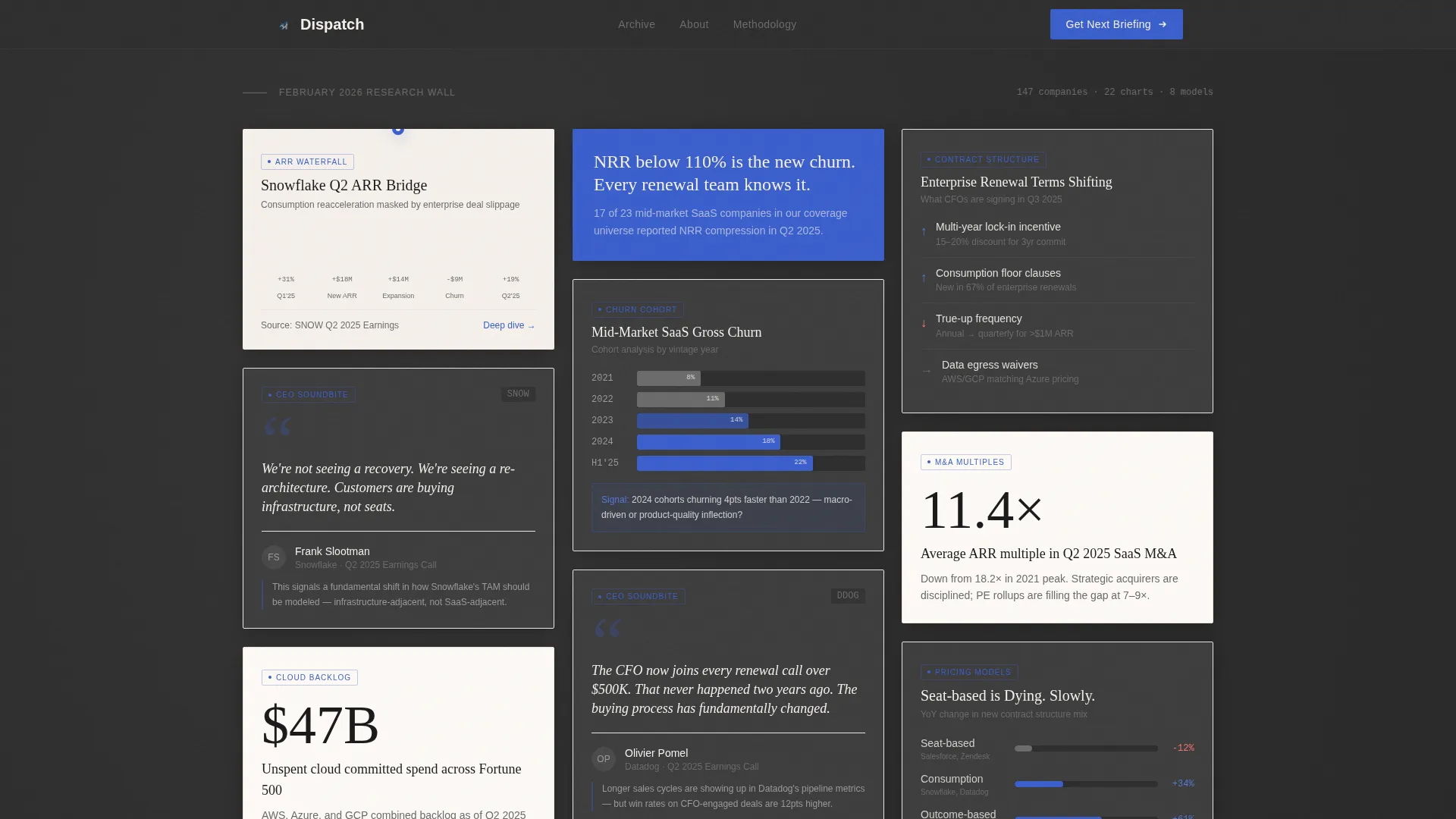
- A masonry research-wall grid with varied card sizes, Studio Note editorial asides, and scroll-triggered entrance animations
- A two-step subscription capture form with a role-segment dropdown and a free sample card unlock flow
Feature list
This template packages a precise set of built-in components designed specifically for a research-intelligence subscription landing page. Each feature connects directly to the goal of earning trust from a demanding, senior audience.
Cinematic Studio Header with Looping Reel
The header plays a fifteen-second looping sequence showing a hand pulling a printed chart from a wide-format printer, pinning it to a corkboard layered with annotated earnings transcripts, and tapping a circled metric. Typography lands mid-loop over the studio scene, with the ultramarine accent underscoring a key word.
Masonry Research-Wall Grid
The page body uses a Pinterest-style masonry grid that arranges cards like a curated analyst pinboard. No two cards share the same height. Some cards are data-dense with revenue waterfall charts or competitive positioning maps; others carry a single provocative sentence in large type. Card density escalates as the reader scrolls deeper.
Studio Note Editorial Asides
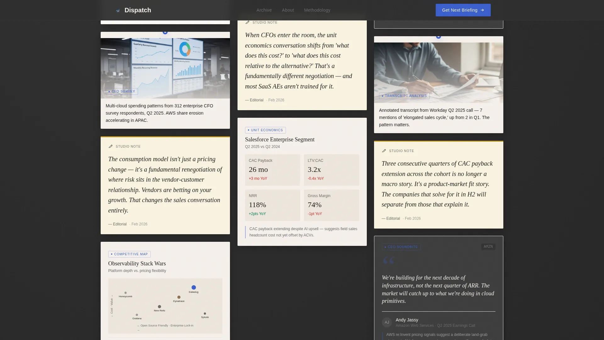
Every third row of the masonry grid introduces a Studio Note: a handwritten-style editorial card that contextualizes the surrounding data. These notes create a rhythmic contrast between raw evidence and human interpretation, keeping the reading experience from feeling purely transactional.
Slim Subscription Bar with Shimmer Animation
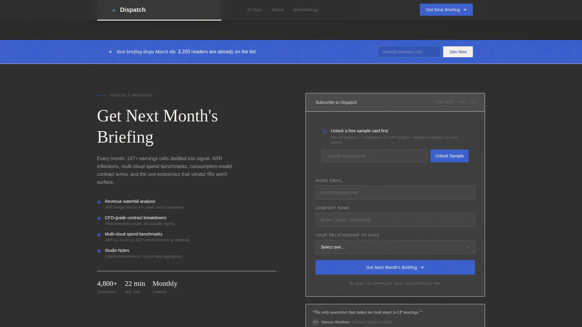
After the third masonry row, a slim ultramarine bar presents the primary call to action: "Get Next Month's Briefing." The bar uses a shimmer animation on the call-to-action button to draw the eye at exactly the point where reader interest peaks.
Free Sample Unlock Capture Form
The full-width closing module contains an email capture form that asks for work email, company name, and a single role-segment dropdown. On email submit, one complete analysis card is unlocked instantly, reducing commitment friction by proving depth before asking for a subscription.
Scroll-Triggered Card Reveal Animations
The masonry grid uses staggered scroll-triggered entrance animations. Cards reveal in sequence as the reader moves down the page, creating a sense of progressive discovery that mirrors the experience of scanning a physical research wall.
Page sections overview
| Section | Purpose |
|---|---|
| Studio Header Hero | Establishes editorial authority with a looping studio reel and serif headline |
| Masonry Research Wall | Presents curated research cards in a varied-height Pinterest-style grid |
| Studio Note Cards | Adds handwritten editorial asides every third row to contextualize data |
| Slim call to action Bar | Delivers the primary subscription prompt after the third masonry row |
| Deep Masonry Cards | Escalates density with unit economics and contract structure breakdowns |
| Full-Width call to action Module | Captures work email and role segment, unlocks a free sample card instantly |
| Linear Footer | Provides a single-row footer with publication and contact essentials |
Design & branding system
The visual identity follows an Atelier Studio theme built on the Cloud Canvas color system. The palette is inspired by a designer's worktable: a dark felt surface, cream paper samples pinned at angles, and a single blue pencil marking what matters most.
- Surface and structure: matte charcoal (#2D2D2D) as the primary background, warm linen white (#F5F0EB) for all card faces, and soft graphite (#6B6B6B) for secondary body type
- Accent and interaction: ultramarine (#3A5FCD) is reserved strictly for links, data highlights, and interactive states; it never competes with the surface but always guides the reader's eye
- Typography: Fraunces serif for all headlines and editorial display text; DM Sans for body copy, labels, and user interface elements
Mobile & speed optimization
The template is built desktop-first to match the primary audience of portfolio managers and institutional analysts working on large screens. The layout is fully responsive and adapts gracefully to smaller viewports.
- The masonry grid reflows to a single-column stack on mobile, preserving card readability without requiring horizontal scrolling
- Server Components handle all static content sections, keeping JavaScript payloads minimal and page interactions snappy
- Scroll-triggered animations are designed to degrade cleanly on devices that have reduced-motion preferences enabled
How this template helps you convert
Every structural decision in this template is oriented toward one outcome: turning a skeptical senior reader into a subscriber without pressuring them before they are ready.
- The research-wall layout leads with proof before the ask, letting data-rich cards build credibility through the first three rows before any subscription prompt appears
- The free sample unlock flow removes the highest conversion barrier by letting a reader receive one full analysis card immediately on email submit, converting curiosity into demonstrated value before the commitment is made
- The role-segment dropdown in the capture form qualifies leads by audience type at the point of signup, giving the publisher clean segmentation data from day one
Other information about this template
This template is designed for the specific intersection of B2B media, research intelligence publishing, and SaaS subscription newsletter production. A few additional details worth noting:
- The template style is Masonry/Pinterest, making it well suited for content-rich briefings where variety in card size signals variety in insight depth
- The header concept is a Short-Form Reel, a format that communicates editorial production quality without relying on text alone
- The creative direction follows an Industry Report aesthetic, which positions the publication alongside institutional research rather than consumer newsletters
- The landing page direction is Lead Generation, with every section sequenced to move the reader from awareness to email capture in a single scroll session
- The color system is called Cloud Canvas and is designed to feel premium and restrained, avoiding the loud gradients common in SaaS marketing templates
- Publication cadence and a subscriber count metric are included as social proof elements within the masonry grid to reinforce the briefing's established audience
Theme
Atelier Studio
Creative direction
Industry Report
Color system
Cloud Canvas
Style
Masonry/Pinterest
Direction
Lead Generation
Page Sections
Cinematic Studio Header with Looping Reel
Masonry Research-wall Grid
Studio Note Editorial Asides
Scroll-triggered Card Reveal Animations
Free Sample Unlock Capture Form
Slim Ultramarine Subscription Bar
Related questions
What kind of business is this template built for?
Can I customize the masonry cards with my own data and content?
How does the free sample unlock work?
Is the header video footage included in the template?
Who are the ideal readers this landing page is designed to attract?



