Premium Macro Photography Landing Page Template
This macro luxe minimal close-up photography blog landing page template is built for macro photography writers, educators, and enthusiasts who want a visually commanding web presence. A horizontal-scroll format guides readers through survey data, gear comparisons, and image dissection panels. The Parchment and Rust color palette and viewport-filling typography make every panel feel like a beautifully typeset field journal entry worth reading in full.
by Rocket studio
Quick summary
This landing page template transforms a macro photography blog into a panel-by-panel editorial experience. It uses a horizontal scroll format, a Luxe Minimal design system, and contextual calls-to-action to build reader trust before directing them to a full content archive. The result is a photography portfolio landing page that feels as considered and intimate as the subject matter it covers.
Who this template is for
A photographer landing page is a dedicated webpage designed to showcase a photographer's work and convert visitors into clients or loyal readers. This template is built specifically for the macro photography world, where depth of knowledge is the primary currency. It works equally well as a content showcase, a photography portfolio hub, or the front door to a blog archive.
This template suits:
- Hobbyist photographers chasing their first publishable close-up and seeking a credible online home for their work
- Working professionals who need a landing page that signals technical authority in stacking, diffusion, and lighting techniques
- Gear-focused naturalists who want a visually serious site to match the precision of their photography skills
What problem this template solves
Most photography landing page designs ask the visitor to trust the creator immediately. They drop a gallery, add a contact button, and hope the images speak for themselves. That approach works for a portrait photographer or a food photography studio, but it falls flat for a macro photography blog where the audience is technically sophisticated and deeply skeptical of surface-level content.
This template solves that trust problem by delivering knowledge first:
- Each horizontal panel provides a standalone insight, from focal length survey data to gear magnification diagrams to layered image dissection
- The layout guides visitors naturally toward the archive only after it has proven the depth of the content behind the door
- Every section is designed to reduce bounce rate by giving readers an immediate reason to keep scrolling
What you get with this template
Using a photography website template like this one simplifies the process of creating a compelling online presence without starting from scratch. This template gives you a fully structured landing page with five distinct content zones, each serving a precise editorial and conversion purpose. High-quality images are essential to the experience, and the layout is built to frame them with maximum impact.
You get:
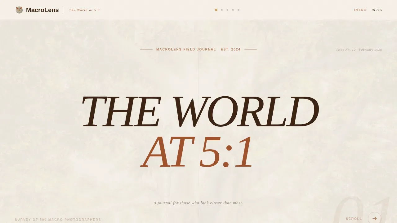
- A viewport-filling hero panel with a typographic statement set at monumental scale, a subtle lichen-texture background, and a pulsing horizontal scroll arrow
- Four editorial panels covering focal length data, gear comparison, image dissection, and a final archive call-to-action, each ending with a contextual rust-colored button
- A single-row footer in a clean Linear pattern that closes the page without visual noise
Feature list
This template's features are drawn directly from its horizontal-scroll, editorial-first design brief. Each capability below is present in the template as described.
Horizontal Scroll Panel Layout
The template uses a horizontal scroll container as its primary navigation model. Each panel snaps cleanly into view using CSS scroll-snap behavior, creating the feeling of turning through a beautifully typeset annual report. On vertical mobile devices, the layout stacks into a readable single-column flow. This structure lets visitors interact with content at their own pace, mirroring the slow, deliberate movement of a macro rail inching toward its subject.
Viewport-Filling Typographic Hero
The hero panel is a single typographic event. "THE WORLD AT 5:1" is set in an ultra-thin serif typeface at a scale that fills the entire viewport. Letterform negative space becomes its own composition. Behind the headline, a full-bleed macro image of lichen texture breathes through the parchment background at five percent opacity. A slow-pulsing horizontal arrow at the right edge signals the first scroll without breaking the quiet visual mood.
Editorial Data Panels
Panel one presents focal length survey data from five hundred macro shooters, rendered as elegant rust and brass data bars. This is not decorative: it is detailed information that a technically minded reader will find genuinely useful. Panel two provides a gear comparison with magnification-ratio diagrams, giving the reader a visual grammar for understanding the difference between competing lens systems. These panels reward close-ups of the data as much as the photography itself.
Contextual Click-Through Calls-to-Action
Every panel closes with a rust-colored button whose label matches the content of that panel exactly. Labels like "Read the Full Lens Report," "See the Stacking Tutorial," and "Download the Lighting Diagram" tell the reader precisely what they are clicking toward. This contextual approach is far more effective than a generic "Learn More" button. The final panel consolidates the full value proposition into one call-to-action: "Enter the Archive."
Image Dissection Panel
Panel three breaks down a single award-winning macro image into its component layers: focus stack, lighting map, and post-processing curve. This kind of transparency builds significant reader trust. Macro photography allows photographers to capture small subjects in great detail, and this panel demonstrates that depth of craft visibly. Visitors see exactly how a finished image is constructed, which makes the blog feel like a genuine educational resource rather than a content marketing exercise.
Parchment and Rust Branding System
The color system is not decorative. Each color in the palette carries a specific role. Parchment dominates every background surface. Walnut carries all body text. Rust marks headlines and pull-quotes. Brass appears only on hover states and active navigation indicators, creating a restrained but tactile interactivity. Soft gradients are avoided in favor of flat, aged-linen tones that reinforce the field journal visual identity from the first panel to the last.
Page sections overview
| Section | Purpose |
|---|---|
| Hero Typographic Panel | Sets editorial tone and invites horizontal scroll |
| Focal Length Report | Presents survey data as rust and brass data bars |
| Gear Comparison Panel | Compares lenses with magnification-ratio diagrams |
| Image Dissection Panel | Deconstructs award-winning image layer by layer |
| Enter the Archive | Consolidates value and delivers final call-to-action |
| Linear Single-Row Footer | Closes the page with minimal visual weight |
Design & branding system
The design language of this landing page is rooted in the aesthetic of a field journal left open on a wooden desk. Every visual decision is deliberate. The typography uses Fraunces as the serif display face and DM Sans for body text, pairing editorial weight with clean readability. Visual interest comes from restraint: large type, aged tones, and precise color roles rather than decorative flourishes or soft gradients layered over content.
The branding system is defined by four colors with strict roles:
- Parchment (#F5F0E8) covers all background surfaces, giving every panel the warmth of aged linen
- Rust (#A0522D) marks all headlines, pull-quotes, and call-to-action buttons, creating clear visual hierarchy
- Walnut (#3B2414) carries all body text, grounding the reading experience in quiet authority
- Brass (#C9A96E) appears only on hover states and active navigation indicators, rewarding interaction without disrupting the calm
Mobile & speed optimization
This template is designed desktop-first, with horizontal scroll as the primary experience. The desktop layout is built for precision and visual impact at full viewport width. On mobile devices, the horizontal panels restack into a vertical single-column flow using an IntersectionObserver fallback, so readers on smaller screens still get the full content experience in a readable format.
The layout is optimized to navigate efficiently across all screen sizes:
- CSS scroll-snap governs panel transitions on desktop, creating smooth and deliberate movement between editorial sections
- Staggered scroll-linked animations and panel reveals are high-fidelity on desktop and gracefully simplified on mobile
- The single-row footer pattern keeps the closing section lightweight and fast to render on any connection
How this template helps you convert
It takes about 50 milliseconds for users to form an opinion about a website, making first impressions critical. This landing page earns trust before it asks for a click. The conversion logic is sequential: each panel delivers enough insight that the visitor wants to see what comes next. By the time they reach the final "Enter the Archive" call-to-action, they have already decided the content is worth their time.
The template is built to convert through a clear three-step editorial sequence:
- The hero panel establishes immediate authority with monumental typography and a textured background, giving the site the feel of a serious publication from the first frame
- The editorial data panels (focal length report, gear comparison, image dissection) provide visitors with standalone value, so the call-to-action at each panel end feels like a natural next step rather than a sales push
- The final archive panel consolidates the full promise of the blog in a single screen, making "Enter the Archive" feel like an earned reward rather than a cold conversion ask
Other information about this template
This section covers additional practical context for buyers considering this template for their photography business or blog project.
A photography website builder that provides visitors with a well-structured, informative content landing page needs the right combination of editorial clarity and conversion intent. This template delivers both. It is a great idea for any macro photography content creator who wants a landing page that does more than display images. It provides informative content in a format that respects the intelligence of its target audience.
When your site collects data or connects to third-party services, understanding how those services work matters. The following points cover common questions about web tracking, cookie behavior, and security services that often apply to photography landing pages built on modern platforms:
- When a site uses Google Analytics to track site usage, the site's analytics report will reflect metrics such as traffic source, bounce rate, unique visitors, and session duration. The duration session description in a standard analytics report tells you how long a visitor stayed on a given panel or page. Google Analytics sets cookies that store information anonymously: a randomly generated number assigned as a unique user id is used to recognise unique visitors without capturing personally identifiable data. The collected data includes campaign data, key performance indexes, and general behavior patterns. The description Google Analytics provides in its help documentation covers how analytics analytical cookies work and how collected data is used to calculate visitor behavior over time. Google Tag Manager is often used alongside Google Analytics to manage tracking scripts and other third party features from a single interface. Always active necessary cookies handle certain functions like providing secure log in and session continuity. The cookie rc and related cookies store information needed for secure log in and form validation. A site may use the Google reCAPTCHA service to identify bots and protect against malicious spam attacks. The Google reCAPTCHA service uses a cookie that stores information anonymously to assess whether visitors interact with the site in human or automated patterns. Support for cloudflare bot management provides an additional layer of protection. Cloudflare bot management helps identify bots and block malicious spam attacks before they affect website's performance. The cookie stores information about whether a user's browser supports cookies and whether they visit anonymously or as a returning visitor who has visited previously. Analytics analytical cookies and the consent category settings allow users to set their consent preferences and preferences accept or decline non-essential tracking. The expires description for each cookie varies: some cookies expire at the end of a session (duration session description: session), while others persist for a set number of days. Experiment advertisement efficiency cookies, campaign data cookies, and ad campaigns tracking are typically managed through consent preferences settings. The google recaptcha service also helps prevent malicious spam attacks on contact or subscription forms. Other third party features such as social media platforms embeds may use their own cookies to store information and collect feedback from visitors who have visited previously. These cookies can collect personally identifiable data only when the user has explicitly granted consent. The site may use a unique user id tied to a randomly generated number to provide visitors with a consistent experience. Certain functionalities like collecting feedback forms or live chat require certain functions that depend on cookies to operate correctly. Visit anonymously options and consent preferences controls let visitors navigate efficiently while respecting their data choices.
- This template supports photography portfolio pages across multiple niches. While it is tailored to macro photography, the horizontal-scroll editorial format can be adapted for a portrait photographer, a food photography journal, or any photographer building a stunning online portfolio. The layout's clean structure also supports photo album showcases and editorial series where close-ups of detailed work are the primary visual content.
- Low angle shooting and natural light techniques are among the topics this blog template is designed to cover. The image dissection panel is specifically built to handle complex visual breakdowns, including focus stack layers and lighting maps that explain how a low angle or natural light setup contributes to a finished image. Macro photography can be practiced indoors using everyday objects, and the template's editorial format is well-suited to covering those kinds of technique-focused posts alongside gear reviews and survey data.
- Using a photography website template can simplify the process of creating a well-structured landing page that functions as both an editorial hub and a photography portfolio. Photography website templates often feature customizable layouts to suit different photography styles. This template's layout is designed to provide a better user experience by keeping navigation simple, panels purposeful, and calls-to-action contextually matched to the content they follow. Responsive design is a key feature, ensuring the landing page looks good on all devices. Potential clients and readers who find the site through social media platforms or ad campaigns will land on a page that immediately communicates authority and depth.


Theme
Luxe Minimal
Creative direction
Industry Report
Color system
Parchment & Rust
Style
Horizontal Scroll
Direction
Click-Through
Page Sections
Horizontal Scroll Editorial Layout
Viewport-scale Typographic Hero
Editorial Data and Gear Panels
Award-winning Image Dissection Panel
Contextual Call-to-action Buttons
Parchment and Rust Color System
Related questions
Is this template suitable for a hobbyist macro photography blog?
Does the horizontal scroll layout work on mobile devices?
Can I change the color palette or typography in this template?
Does this landing page include a contact form or email opt-in?
How many panels does this landing page include?



