Dialpath - Reliable Telecom Landing Page Template
Dialpath is a scroll-reveal landing page template built for cloud business phone systems. It opens with a live-data dashboard preview, builds its case through seven oversized statistics, and guides visitors toward a free trial through a progressive sign-up form. The design uses a glassmorphic palette of navy, cyan, and lilac to feel both polished and immediately trustworthy.
by Rocket studio
Quick summary
Dialpath is a single-page, scroll-reveal landing page template designed for cloud business phone systems. It leads with a realistic call analytics dashboard, walks visitors through seven stat-forward sections, and closes with a frictionless two-step sign-up flow. Every design choice serves one goal: turning a skeptical operations manager into a confident free-trial starter.
Who this template is for
This template is built for businesses selling or marketing a cloud-based business phone system. It speaks directly to the people who feel the pain of unreliable call infrastructure every single workday.
- Operations managers dealing with dropped transfers and missed calls that cost real money
- IT directors replacing outdated on-premise PBX (private branch exchange) systems with a modern cloud alternative
- Founders and small business owners whose personal cell phone can no longer handle growing call volume
What problem this template solves
Legacy phone infrastructure creates invisible revenue leaks. Missed calls, long hold times, and manual routing errors frustrate customers and exhaust staff. Most landing pages for phone systems bury the proof in paragraph text. Dialpath fixes that by letting the numbers lead.
- No clear visual proof that the product works, leaving prospects unconvinced before they scroll past the fold
- No structured path from curiosity to sign-up, so visitors leave before they encounter the free-trial offer
- No way for a prospect to self-qualify the value, resulting in high bounce rates and low conversion
What you get with this template
You get a complete, conversion-focused landing page layout built around a stats-first storytelling structure. Every section is ready to populate with your own product data, copy, and branding.
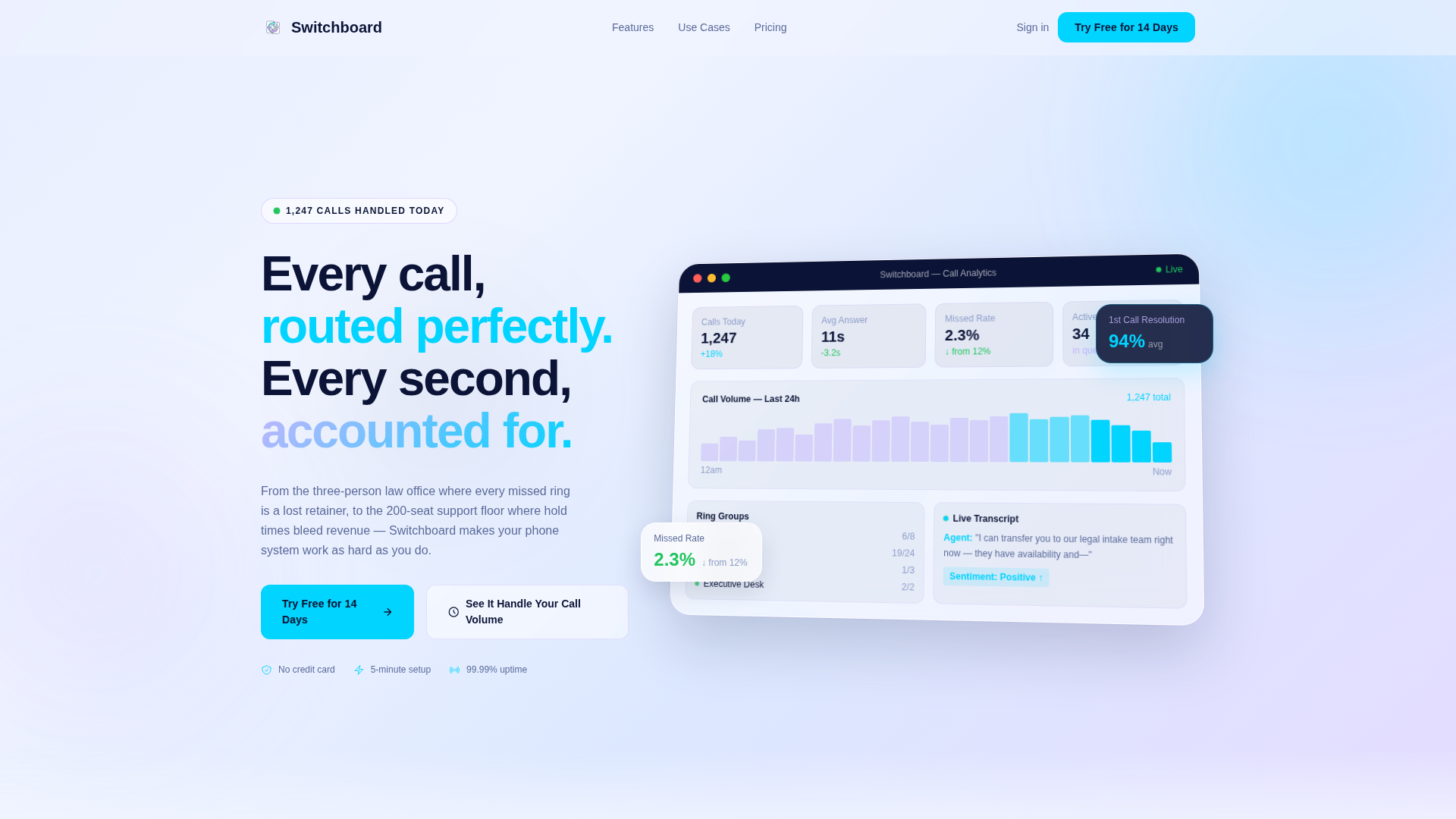
- A glassmorphic dashboard preview header with a realistic call analytics panel, live-data indicators, and depth-creating z-axis tilt
- Seven scroll-triggered statistic reveals, each paired with supporting feature copy, building an ROI case without a single generic subheading
- A two-step progressive sign-up form starting with business email only, followed by company size and current phone provider fields, with no credit card required
Feature list
This template includes a focused set of purpose-built components. Each one maps directly to a specific moment in the visitor's decision journey.
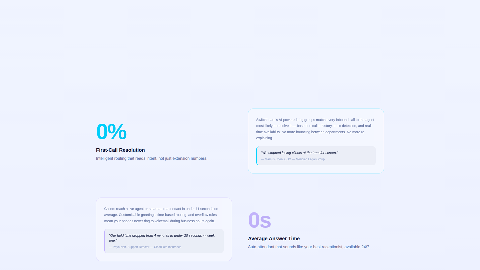
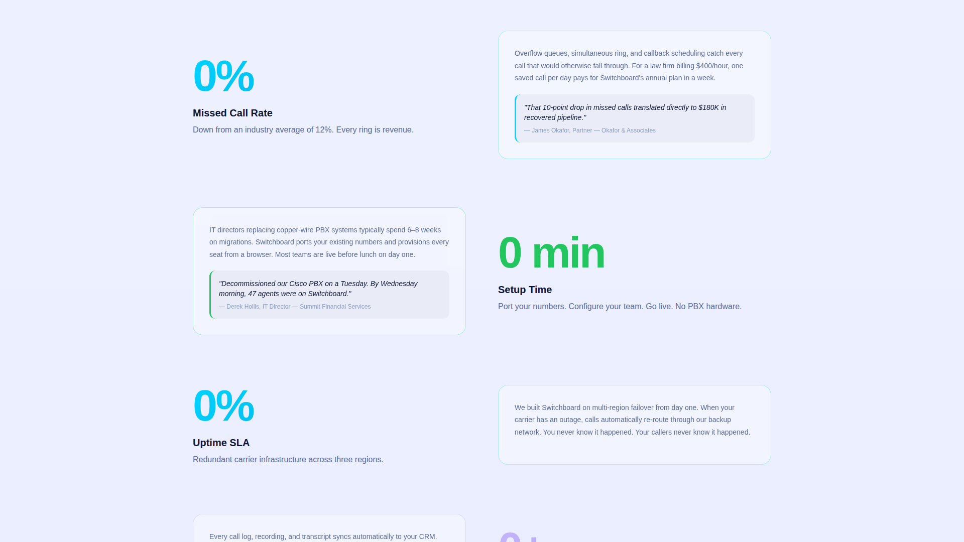
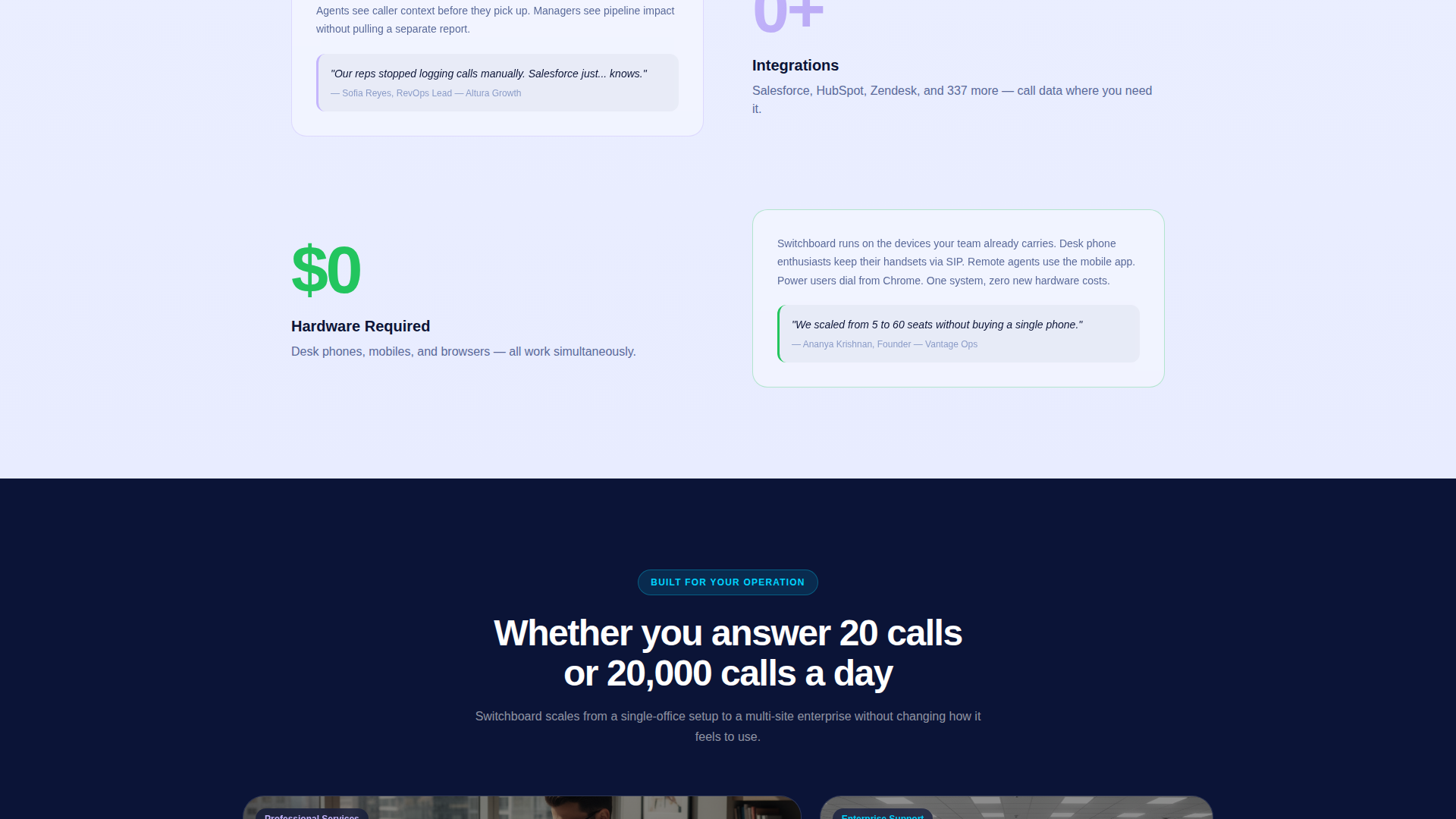
Stats-First Scroll Sections
Each major section opens with a single oversized statistic, such as "94% first-call resolution" or "11 seconds average answer time," rendered at large display size. The supporting paragraph appears beneath it as the visitor scrolls, building a procurement-style case progressively.
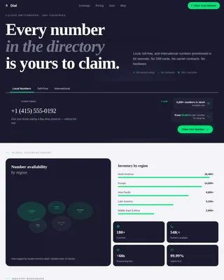
Glassmorphic Dashboard Header
The hero area features a realistic product screenshot of a call analytics panel inside a frosted-glass card, tilted on a z-axis for visual depth. Visible data points include a live call volume graph, a ring group status panel, a missed-call rate dropping from 12% to 2.3%, and a real-time transcription snippet.
Interactive Call Volume Calculator
An inline secondary call-to-action labeled "See It Handle Your Call Volume" opens a calculator. Visitors enter their current monthly call count and average hold time, then watch projected improvements animate in real time on screen.
Floating Primary Call-to-Action Button
After the first scroll checkpoint, a "Try Free for 14 Days" button in signal-active cyan on deep navy pins itself to the viewport. It stays accessible throughout the scroll journey without interrupting the reading flow.
Progressive Two-Step Sign-Up Form
The sign-up form collects only a business email on the first step. The second step asks for company size via a dropdown (1 to 10, 11 to 50, 51 to 200, 200 or more employees) and current phone provider. No credit card is required at any point.
Alternating Glassmorphic Card Reveals
Feature cards slide in from alternating sides as the visitor scrolls, stacking with frosted depth like transparent index cards on a light table. The effect creates visual momentum and keeps attention moving down the page.
Page sections overview
| Section | Purpose |
|---|---|
| Dashboard Preview Header | Anchors credibility with a realistic analytics panel and live call data |
| First Stat Reveal | Opens the stats-first narrative with an oversized performance figure |
| Intelligent Routing Feature | Pairs the first-call resolution stat with routing feature copy |
| Answer Time Stat Block | Delivers the average answer time figure before auto-attendant details |
| Auto-Attendant Feature Set | Explains call routing and auto-attendant capabilities around the stat |
| Call Volume Calculator | Lets visitors self-qualify value using their own call metrics |
| Ring Group Status Panel | Shows real-time group availability as a live product detail |
| Progressive Sign-Up Form | Converts interest into a free trial start with a two-step email-first form |
| Floating Trial Button | Keeps the primary conversion action pinned throughout the scroll |
Design & branding system
The visual identity follows a Directory and Discovery theme. The palette uses frosted-glass layering to feel organized, calm, and immediately professional, like a well-run reception desk rather than a cluttered sales page.
- Core colors: deep switchboard navy (#0B1437) for text and navigation, signal-active cyan (#00D4FF) for primary buttons and live data highlights, soft divider lilac (#C4B5FD) for borders and secondary labels, and frosted panel white (#FFFFFF at 40% opacity over #F0F4FF) for card backgrounds
- The background shifts from cool white at the top to a faint blue as the visitor scrolls deeper, creating a sense of the system warming up around them
- Typography and contrast follow the glassmorphic principle: navy anchors all readable content, cyan fires on action elements, and lilac traces structural detail without competing for attention
Mobile & speed optimization
The scroll-reveal structure and glassmorphic cards are designed to translate cleanly to smaller screens. Frosted layers and z-axis depth cues remain readable on mobile without requiring full-width desktop real estate.
- Alternating card reveal animations adapt to vertical stacking on narrow viewports, preserving the progressive storytelling sequence on mobile devices
- The floating call-to-action button is sized and positioned for thumb-reachable interaction on touchscreens throughout the scroll
How this template helps you convert
The page earns the click before asking for it. Every structural decision reduces friction and increases the visitor's confidence that the product delivers what it claims.
- The stats-first layout places proof at the top of each section, so visitors encounter seven concrete performance figures before they reach the sign-up form, removing the most common objections before they form
- The interactive call volume calculator makes the value personal, the visitor inputs their own data and sees projected improvements in real time, turning abstract claims into a number that feels specific to their business
- The progressive sign-up form removes the credit card barrier entirely and starts with only a business email, lowering the perceived commitment and making the first step feel almost effortless
Other information about this template
This template is categorized under Telecom and Connectivity, specifically within the Communication and Unified Communications subcategory, targeting the business phone system niche. It is built as a scroll-reveal, single-page layout suited for freemium and free-trial conversion goals.
- The template style is Scroll Reveal (Progressive), meaning each section and statistic enters view as the visitor scrolls, rather than loading all at once
- The header concept is a Dashboard Preview, using a realistic product interface render rather than abstract illustration, which is well suited for software and cloud communication products
- The creative direction is Stats-First Impact, a structure that mirrors how procurement decisions are made, with numbers establishing trust before features fill in the detail
- This layout works for businesses of varying sizes, from small professional offices such as legal or medical practices to mid-size support centers managing hundreds of daily calls
- The freemium and free-trial conversion path, with no credit card required, is specifically designed to reduce sign-up hesitation for visitors comparing multiple business phone system options
Theme
Directory & Discovery
Creative direction
Stats-First Impact
Color system
Glassmorphic
Style
Scroll Reveal (Progressive)
Direction
Freemium/Trial
Page Sections
Stats-first Scroll Storytelling
Glassmorphic Dashboard Hero
Interactive Call Volume Calculator
Floating Free Trial Button
Progressive Two-step Sign-up
Alternating Card Reveal Animation
Related questions
Is this template suitable for a small business phone system?
Does the template include the interactive call volume calculator?
Can I replace the dashboard preview with my own product screenshot?
What information does the two-step sign-up form collect?
When does the floating call-to-action button appear during scroll?