Artisan Food & Beverage Newsletter Landing Page
Digest is a hub-and-spoke landing page template built for a professional food and beverage newsletter. It uses a collage-style header, sticky anchor navigation, and five richly styled content spokes to prove editorial value before asking for a click. The warm artisan aesthetic, earthy ceramics, burnt crust type, and fermented berry accents, makes every section feel like a page torn from a well-worn industry dossier.
by Rocket studio
Quick summary
Digest is a single-page newsletter landing page template designed for a professional food and beverage weekly. It leads with a scrapbook collage header, organizes content into five anchor-navigated spoke sections, and drives clicks to a live issue rather than a form. The result is a page that earns trust by showing its work before asking for a commitment.
Who this template is for
This template is built for newsletter creators who serve a professional food and beverage audience. It works especially well when the content itself is the strongest sales tool, and the goal is to get the right reader to click through to a real issue.
- Independent café owners and roastery operators who scan for cost and supplier intelligence each week
- Consumer packaged goods brand managers and food journalists who track flavor trends and founder moves before Monday briefings
- Newsletter publishers, editorial teams, and food media operators launching or relaunching a professional industry briefing
What problem this template solves
Most newsletter landing pages ask visitors to subscribe before showing them anything worth reading. That trade-off kills trust with professional readers who are selective about what fills their inbox. This template flips the sequence entirely.
- Professionals scroll past vague promises, this template leads with actual content excerpts, data callouts, and pull quotes that prove the newsletter's value immediately
- A typical sign-up form creates friction for high-intent readers who just want to see the product first
- Without a clear content hierarchy, visitors cannot quickly identify which sections matter to their specific role or interest
What you get with this template
You get a fully designed, single-page layout built around five editorial spoke sections, each styled to feel like a page sampled directly from the newsletter. Every section is paired with a clear call to action so the page converts at multiple scroll depths.
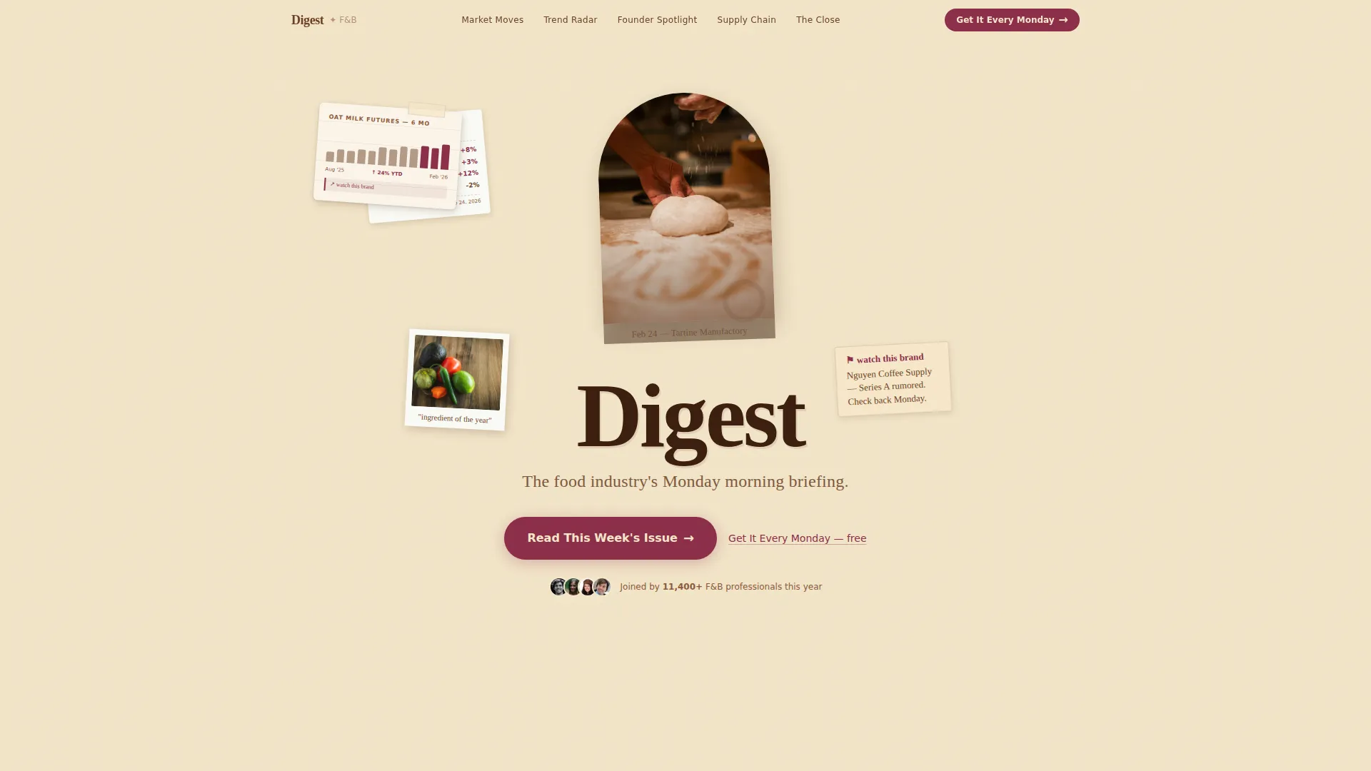
- A collage scrapbook header with layered torn-edge clippings, a stamped serif title, and a handwritten script tagline beneath it
- Five anchor-navigated spoke sections, Market Moves, Trend Radar, Founder Spotlight, Supply Chain, and The Close, each presenting a real-feeling content excerpt
- Two call-to-action placements: a primary button beneath the header and a persistent bottom bar that appears after the visitor scrolls past two spokes, plus a secondary inline text link inside each spoke
Feature list
This template is built around a specific set of design and structural features drawn directly from the source brief. Each one is described below.
Collage Scrapbook Header
The header is a layered composition of torn-edge grocery receipt clippings, hand-drawn ingredient sketches, a partially visible oat milk futures chart, and a Polaroid of a chef kneading dough. Elements sit at slight rotations with tactile drop shadows. The newsletter title appears in a heavy serif, slightly off-center, stamped over the collage. A handwritten script line below reads: "The food industry's Monday morning briefing."
Sticky Anchor Navigation
A sticky navigation bar sits at the top of the viewport as visitors scroll. It links directly to each of the five spoke sections, Market Moves, Trend Radar, Founder Spotlight, Supply Chain, and The Close, so readers can jump to the category most relevant to their role without losing their place.
Hub and Spoke Content Spokes
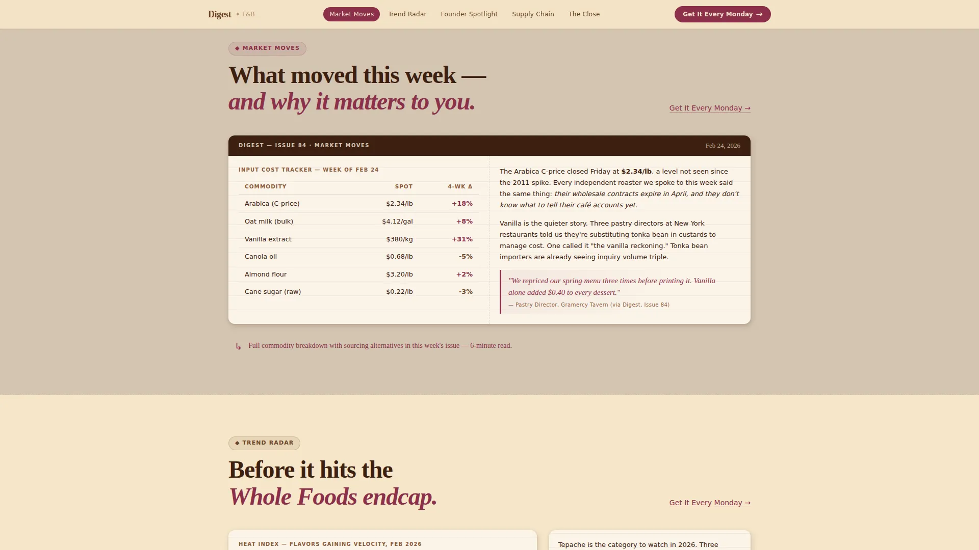
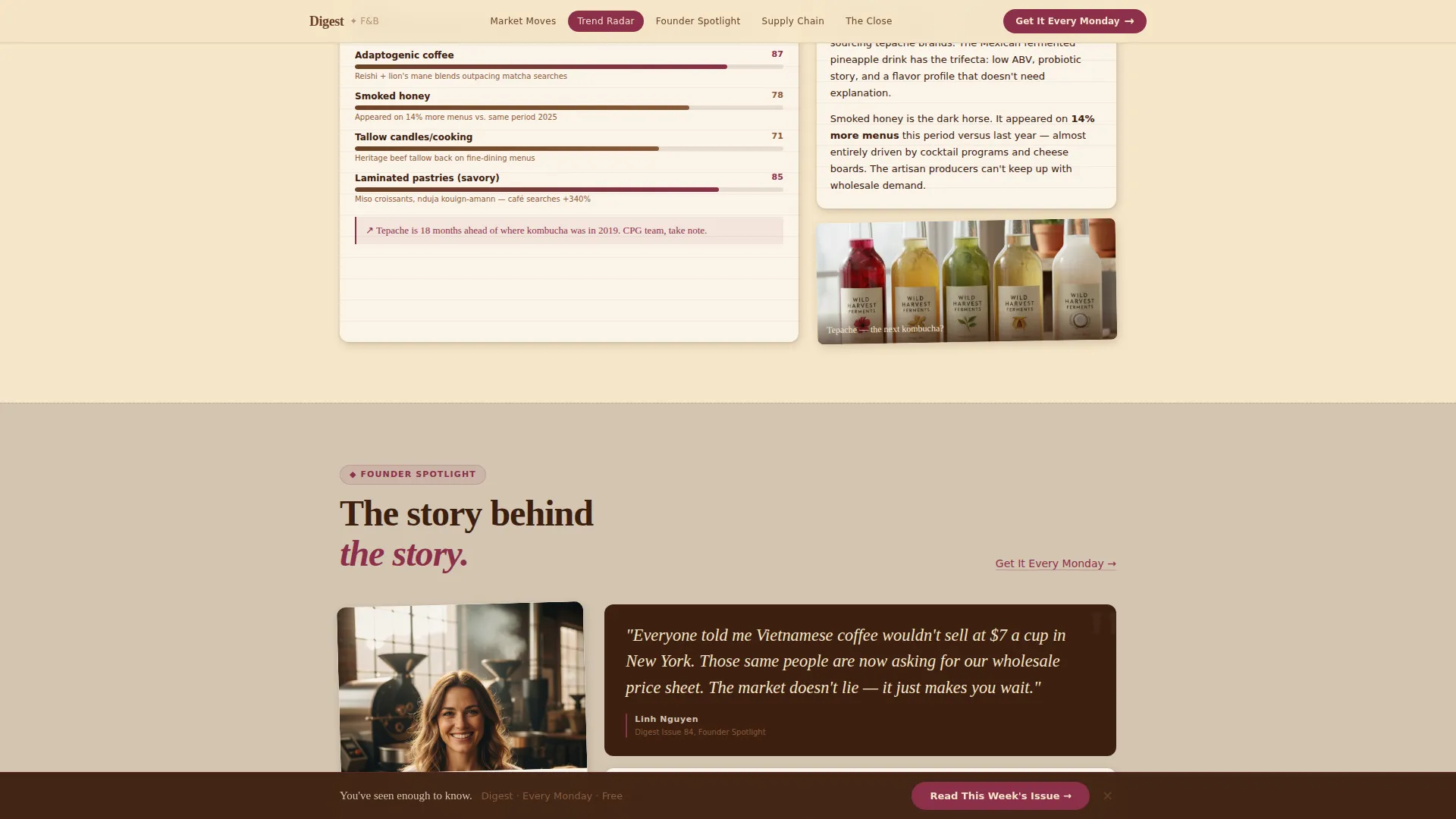
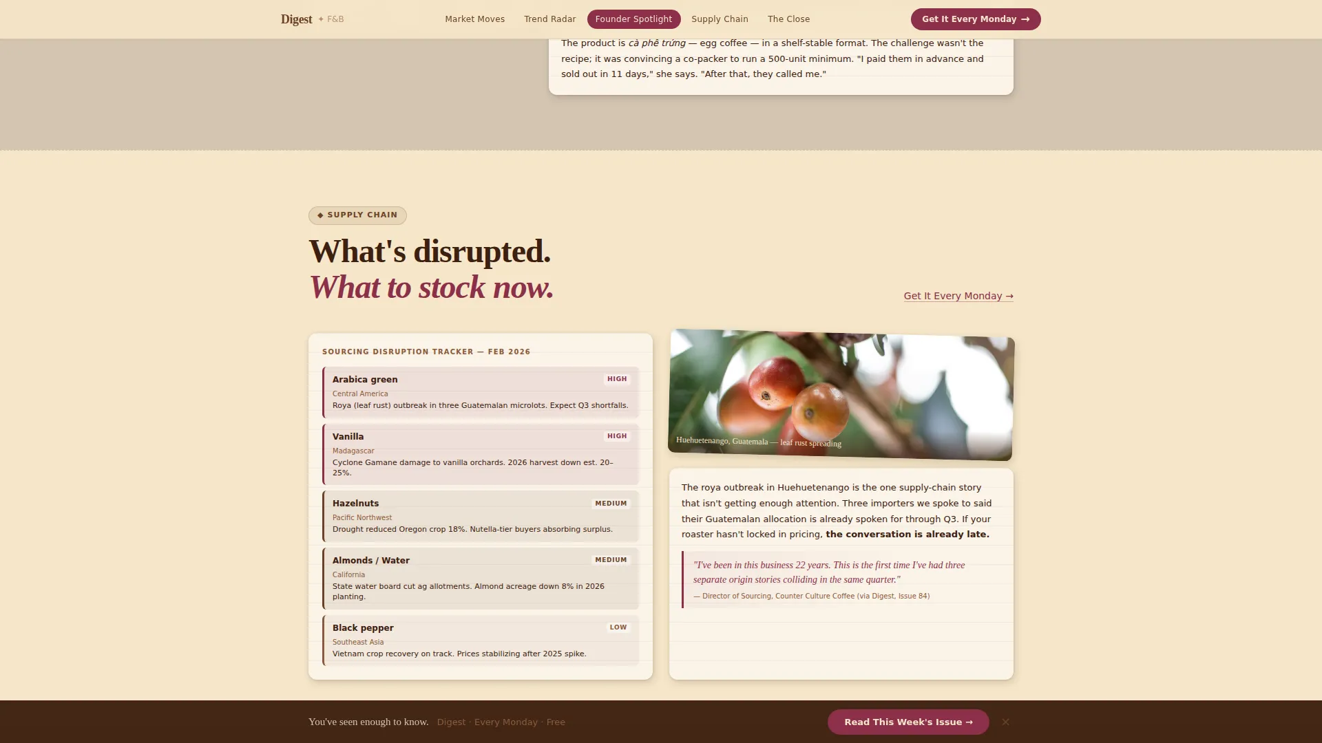
Each spoke section presents a curated sample of real newsletter content. Styles vary by section: a price shift table and annotated chart for Market Moves, flavor trend callouts for Trend Radar, a pull quote interview excerpt for Founder Spotlight, a sourcing disruption briefing for Supply Chain, and a sign-off note for The Close. Each section feels like a page torn from the actual newsletter.
Dual Call-to-Action System
The primary call to action, "Read This Week's Issue," appears first below the header collage and again as a persistent bottom bar that activates after the visitor scrolls past two spoke sections. A secondary call to action, "Get It Every Monday," floats as a text link inside each spoke. There are no form fields on this page, the click is the conversion.
Warm Artisan Visual System
Backgrounds alternate between cultured butter (#F5E6C8) and unglazed ceramic (#D4C5B2). Body text is set in burnt crust (#6B4226). The fermented berry accent (#8B2F4A) is reserved for links, buttons, and pull quotes. Typography pairs Fraunces display serif with DM Sans body text for a mix of editorial weight and clean readability.
Hover and Scroll Interactions
Paper rotation hover states give individual collage elements a tactile, corkboard feel. Scroll reveal animations bring spoke sections into view as the reader moves down the page. The persistent bottom call-to-action bar slides in after a defined scroll threshold, keeping the conversion prompt visible without interrupting the reading experience.
Page sections overview
| Section | Purpose |
|---|---|
| Hero Collage Header | Establishes editorial identity and presents the primary "Read This Week's Issue" call to action |
| Market Moves Spoke | Displays a price shift table and annotated chart excerpt to signal data depth |
| Trend Radar Spoke | Shows a flavor trend analysis excerpt with visual callouts for category managers |
| Founder Spotlight Spoke | Features a pull quote interview excerpt that demonstrates sourcing and founder intelligence |
| Supply Chain Spoke | Presents a sourcing disruption briefing excerpt relevant to operators and buyers |
| The Close Spoke | Delivers the newsletter's sign-off tone and triggers the persistent bottom call-to-action bar |
| Footer | Horizontal flow footer pattern wrapping navigation and publication links |
Design & branding system
The visual identity follows a Warm Artisan direction rooted in the Warm Stone color system. Every color and type choice is deliberate, the page should feel like a farmhouse table after a long dinner, not a polished media kit.
- Color system: cultured butter (#F5E6C8) and unglazed ceramic (#D4C5B2) alternate as section backgrounds; burnt crust (#6B4226) handles body text; fermented berry (#8B2F4A) appears sparingly on links, buttons, and pull quotes
- Typography: Fraunces serves as the display serif for headlines and stamped title treatment; DM Sans handles body copy for clean legibility across professional reading contexts
- Texture and ephemera: torn paper edges, drop shadows, slight rotation angles, and corkboard-style layering give the page a physical, handmade quality that reinforces the editorial voice
Mobile & speed optimization
This template is built desktop-first, matching the professional reading habits of its core audience. It also delivers a solid mobile experience so the page holds up when a reader taps through from a forwarded link or social share.
- Desktop layout is prioritized for the collage header and multi-column spoke sections, reflecting the primary laptop-based use case
- Static content is handled with server components to keep JavaScript minimal and page weight low
- Scroll-triggered interactions and the sticky navigation are designed to remain functional and unobtrusive at smaller viewport sizes
How this template helps you convert
This template is built around one conversion mechanic: let the content prove its value so the click feels earned. Every structural decision supports that sequence.
- The collage header and stamped title create immediate editorial credibility, so visitors stay on the page long enough to reach the content spokes that demonstrate real industry intelligence.
- Each spoke presents a real-feeling excerpt, a data table, a founder quote, a sourcing note, that builds a compounding case for the newsletter's value with every section the reader scrolls through.
- The dual call-to-action system meets readers wherever they convert: the persistent bottom bar catches high-intent visitors who have scrolled deep, while the inline text links inside each spoke capture those ready to commit without previewing further.
Other information about this template
A few additional details worth knowing before you build with or adapt this template for your newsletter project.
- The template is categorized under Blog and Editorial, specifically Food and Beverage Blog and Media, with a niche focus on food and beverage newsletter publishing
- The creative direction is Industry Report, meaning the layout is designed to feel like a curated professional dossier rather than a consumer lifestyle page
- The header concept is Collage and Scrapbook, a deliberate departure from clean hero photography common in food media templates
- The landing page direction is Click-Through, meaning the page routes visitors to a hosted issue on an external newsletter platform rather than collecting email addresses on-page
- The template style is Hub and Spoke with anchor navigation, making it straightforward to adapt spoke content for different newsletter categories or seasonal editorial focuses
- The footer follows a horizontal flow pattern suitable for publication-style link structures
Theme
Warm Artisan
Creative direction
Industry Report
Color system
Warm Stone
Style
Hub & Spoke (Anchor Nav)
Direction
Click-Through
Page Sections
Collage Scrapbook Header
Sticky Anchor Navigation
Hub and Spoke Content Layout
Dual Call-to-action System
Warm Artisan Color and Type System
Tactile Hover and Scroll Interactions
Related questions
Does this template include a subscription form or email capture?
Can I change the five spoke section topics to match my own newsletter categories?
Who is the primary audience for a page built with this template?
How does the persistent bottom call-to-action bar work?
Is the collage header easy to customize?



