Backend Engineering Newsletter Blog Website Template
Digest is an editorial landing page template built for backend engineering newsletters. It uses a broadsheet-inspired Gallery Walk layout to present past editions as framed exhibits, building reader trust before the subscription click. The Ink and Paper visual system, full-viewport hero, sticky call-to-action bar, and dedicated archive path make it a credible, conversion-ready single-page experience for technical publishers.
by Rocket studio
Quick summary
Digest is a single-page editorial landing page template designed for backend engineering daily briefings. It blends broadsheet print aesthetics with a Gallery Walk scroll structure to showcase past editions and earn the subscription click. Three curated exhibit sections, a sticky call-to-action bar, and a warm Ink and Paper visual identity give technically sophisticated readers a reason to trust the publication before committing their inbox.
Who this template is for
This template is built for publishers who write for engineers, not for a general audience. It suits newsletters, briefings, and digest products where depth and editorial credibility matter more than volume.
- Backend engineering newsletter authors targeting senior engineers and staff-plus architects
- Indie SaaS founders or team leads publishing infrastructure and systems content
- Technical publishers who want a landing page that reads like a publication, not a marketing funnel
What problem this template solves
Most newsletter landing pages feel transactional. They ask for an email before they prove any value. For a technical audience that has already read Hacker News before breakfast, a generic signup form does not build trust.
- A bare signup page cannot demonstrate editorial depth or writing quality before the ask
- Technical readers need to see the actual work before they commit to inbox access
- Standard templates lack the typographic weight and print editorial feel that signals a serious publication
What you get with this template
You get a complete, single-page landing page structured around editorial credibility. Every section is purposeful, and the conversion path is built to feel like a reading decision rather than a marketing interaction.
- A full-viewport hero with a 120-point serif headline set over a styled editorial photograph
- Three framed gallery exhibit sections showcasing past editions across observability, distributed systems, and database internals
- A sticky call-to-action bar, a full-width call-to-action section, and an archive browsing path for skeptical readers
Feature list
This section details the specific, built-in capabilities of the Digest template as described in the source brief.
Full-Viewport Editorial Hero
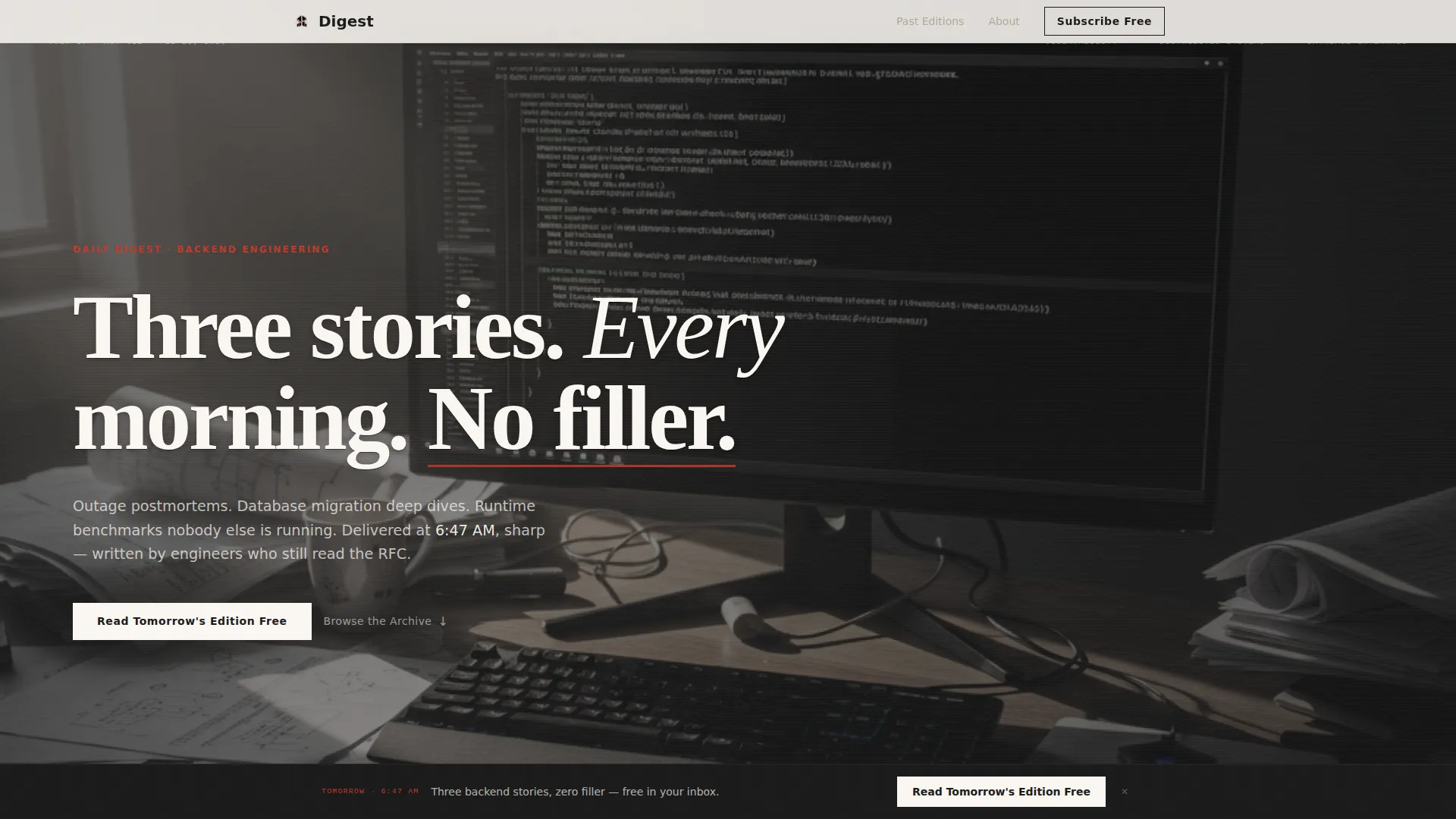
The header fills the entire screen with a softly desaturated photograph of a terminal screen reflecting in glasses resting on printed RFCs. A 120-point Fraunces serif headline reads "Three stories. Every morning. No filler." knocked out in newsprint white with a paper-texture letterpress overlay. Morning window light and a Dutch-angle composition give the image an immediate editorial authority.
Gallery Walk Scroll Structure
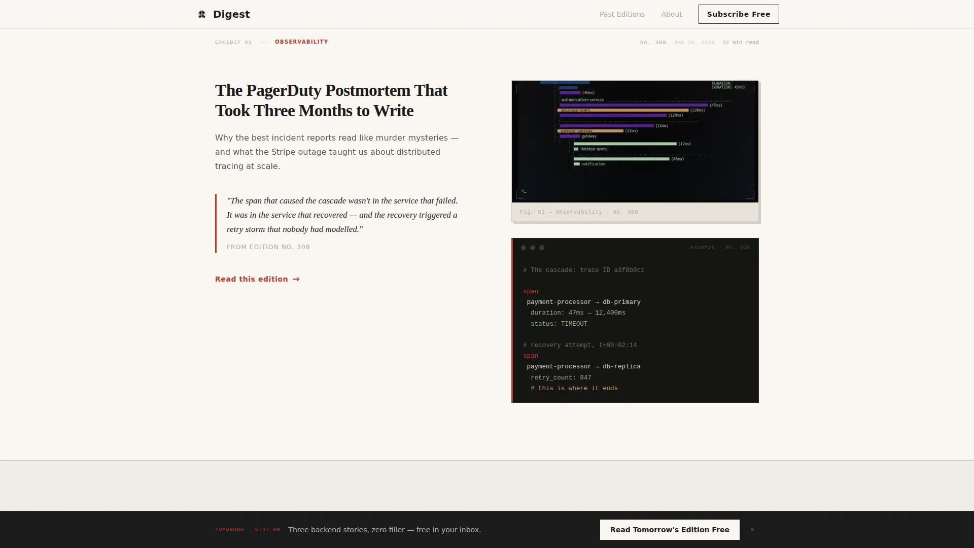
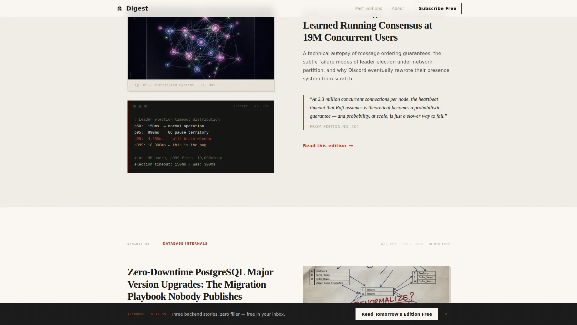
Scrolling past the hero reveals three framed exhibit sections, each presenting a single past edition. Every exhibit shows the edition headline, a pull quote from the analysis, and a cropped code snippet or architecture diagram displayed like a gallery print. The three exhibits span observability, distributed systems, and database internals, demonstrating editorial range across disciplines.
Scroll-Linked Sticky Call-to-Action Bar
After the visitor passes the second gallery exhibit, a sticky bottom bar slides into view with the primary call-to-action: "Read Tomorrow's Edition Free." The bar remains visible as the reader continues scrolling and is reinforced by a full-width call-to-action section after the final exhibit.
Two-Path Conversion Flow
The template offers two routes forward. The primary path routes the click to a dedicated single-field email capture page, keeping the landing page itself form-free. A secondary "Browse the Archive" path links to three fully readable past editions, letting skeptical readers verify quality before subscribing.
Ink and Paper Visual System
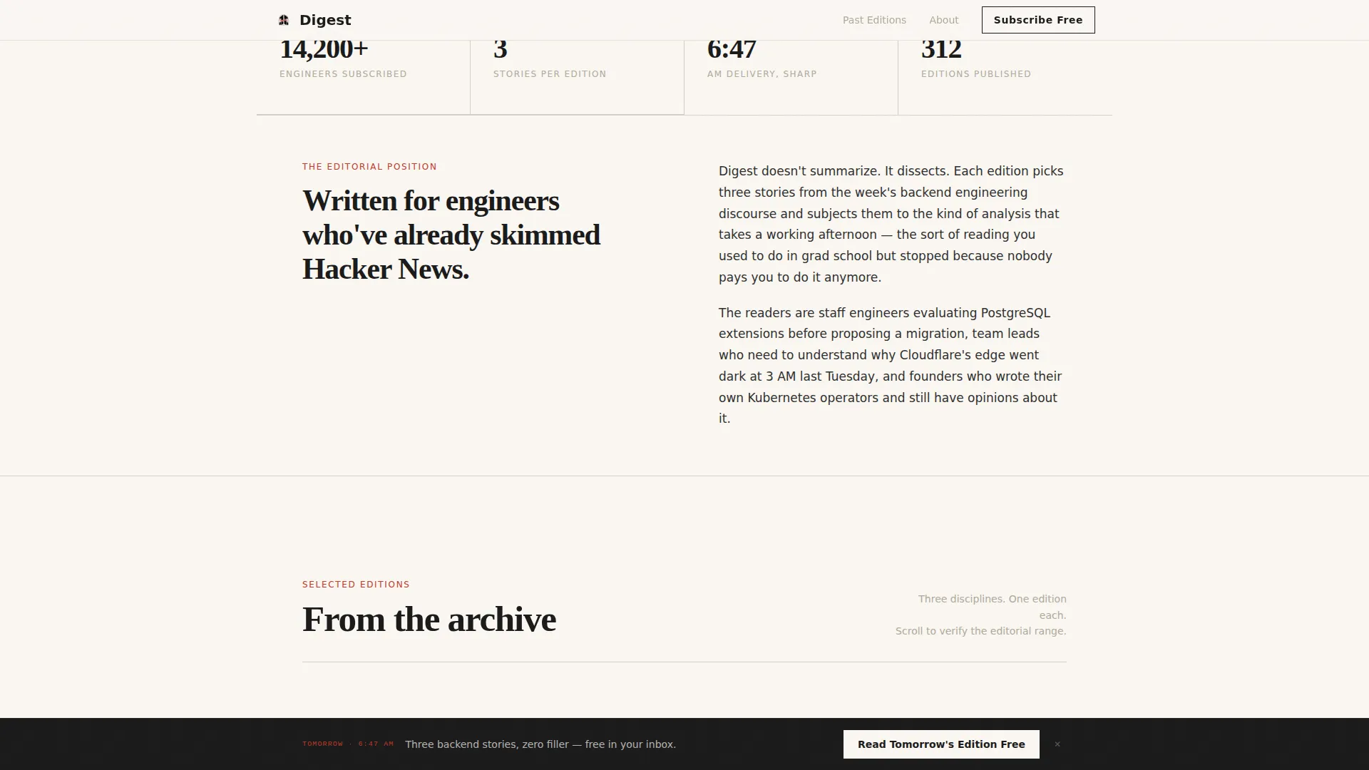
The template uses a warm newsprint background (#FAF7F2), heavy ink-black body text (#1A1A1A), pencil-margin gray section dividers (#B0A999), and annotation red (#C0392B) reserved for links, hover states, and highlights. The palette is deliberately restrained so that every red instance feels like a hand-drawn mark on a printed page.
Editorial Typography Pairing
Display headings use Fraunces, a high-contrast serif that carries the weight of a printed broadsheet. Body copy and interface elements use DM Sans for clean legibility. Together, the pairing signals a publication that takes both writing and design seriously.
Page sections overview
| Section | Purpose |
|---|---|
| Hero Header | Full-viewport editorial photograph with 120pt serif headline and paper-texture overlay |
| Gallery Exhibit One | Framed observability postmortem with pull quote and code snippet preview |
| Gallery Exhibit Two | Framed distributed systems deep dive with pull quote and architecture diagram |
| Sticky Call-to-Action Bar | Slides in after Exhibit Two with primary subscription click-through prompt |
| Gallery Exhibit Three | Framed database internals piece completing the editorial range demonstration |
| Full-Width Call to Action | Reinforces primary subscription path after the final gallery exhibit |
| Footer | Linear single-row footer with archive and supporting links |
Design & branding system
The visual identity is rooted in the feel of a technical notebook left open on a desk. Warmth comes from the newsprint background, weight from ink-black type, and restraint from the sparing use of annotation red.
- Color palette: newsprint warm (#FAF7F2), ink black (#1A1A1A), pencil-margin gray (#B0A999), and annotation red (#C0392B) for links and interactive states
- Typography: Fraunces serif for display headlines, DM Sans for body text and interface labels
- Animation: scroll-linked section reveals, a subtle parallax effect on the hero, and red annotation hover states on gallery cards
Mobile & speed optimization
The template is built desktop-first, reflecting the primary reading context of senior engineers at their desks before standup. The architecture prioritizes minimal JavaScript and static-first rendering.
- Desktop-first layout optimized for the pre-standup reading session context of the target audience
- Static-first build with server components and minimal JavaScript to support fast initial load
- Scroll-linked animations and sticky bar entrance are implemented with performance in mind, keeping interactivity lightweight
How this template helps you convert
The conversion strategy is editorial. Every design and structural decision is made to build enough reading confidence that the subscription click feels like a personal choice.
- The Gallery Walk lets visitors experience three real past editions before any call to action appears, proving quality through actual content rather than claims.
- The sticky call-to-action bar appears after the second exhibit, when the reader has already absorbed two editorial samples, making the prompt feel timely rather than premature.
- The archive path gives skeptics a low-friction alternative that keeps them engaged with the publication rather than bouncing, increasing the chance of a deferred subscription.
Other information about this template
The Digest template is part of the Blog and Editorial category, with a specific fit for the Backend Engineering Newsletter subcategory and the Backend Engineering Daily Digest niche. A few additional details worth knowing before you start customizing:
- The template style is Editorial and Magazine, following a broadsheet and letterpress print creative direction
- The header concept is Type Over Image, and the landing page direction is Click-Through, routing to an off-page email capture
- The Cloud Canvas color system underlies the full palette, and the Ink and Paper theme governs all visual decisions
- The footer follows a linear single-row pattern, keeping the page exit clean and uncluttered
- Social proof elements in the brief include past edition headlines, pull quotes, code snippet previews, and subscriber count display
Theme
Ink & Paper
Creative direction
Gallery Walk
Color system
Cloud Canvas
Style
Editorial/Magazine
Direction
Click-Through
Page Sections
Full-viewport Editorial Hero
Gallery Walk Scroll Structure
Scroll-linked Sticky Call-to-action Bar
Two-path Conversion Flow
Ink and Paper Visual System
Editorial Typography Pairing
Related questions
Does this template include an email signup form on the landing page itself?
Can I replace the gallery exhibits with my own past editions?
Is this template suitable for newsletters outside backend engineering?
What is the primary call-to-action wording built into this template?
Does the sticky bar appear immediately on page load?



