Breaking Restaurant News Blog Landing Page Template
The Digest Breaking Restaurant News Blog Landing Page Template is a horizontal-scroll broadsheet built for food industry insiders. It pairs an Ink & Paper visual identity with a five-section editorial newsroom, a "Find Your Reader Type" quiz, and a personalized email signup flow. No coding knowledge required to launch a fully responsive, visually compelling restaurant landing page.
by Rocket studio
Quick summary
Digest is a bold, broadsheet-style restaurant landing page built for one purpose: turning curious industry readers into newsletter subscribers. The page flows horizontally through five editorial panels, from Breaking news to Industry Moves, before landing on a five-question reader archetype quiz that earns the email signup. The result is a high converting restaurant landing page that feels like a publication, not a form.
Who this template is for
This website template is built for editorial teams, independent food journalists, and newsletter operators covering the restaurant industry. It fits any digital presence that treats restaurant news as a daily beat rather than an occasional post.
- Line cooks, food public-relations professionals, and real estate brokers scouting dining corridors who want a focused daily briefing
- Food media startups building a restaurant website with subscriber acquisition as the primary goal
- Independent editors who want a professional looking landing page without hiring a web designer or spending weeks on custom code
What problem this template solves
Most restaurant landing page designs force editorial publications into formats built for menus or reservation forms. A news-first audience has completely different expectations. They want immediacy, dense editorial rhythm, and a clear reason to subscribe, not a reservation form or a seasonal menu carousel.
- Readers leave generic blog landing pages because nothing signals urgency or editorial authority
- Potential customers of a newsletter need to feel the publication's voice before handing over an email address
- A static, one-size restaurant website template fails to communicate the fast pace of breaking industry coverage
What you get with this template
This restaurant landing page template is a pre-designed, single-page layout built around horizontal scroll and editorial card stacks. Every section serves a specific conversion role without overwhelming visitors with competing calls to action.
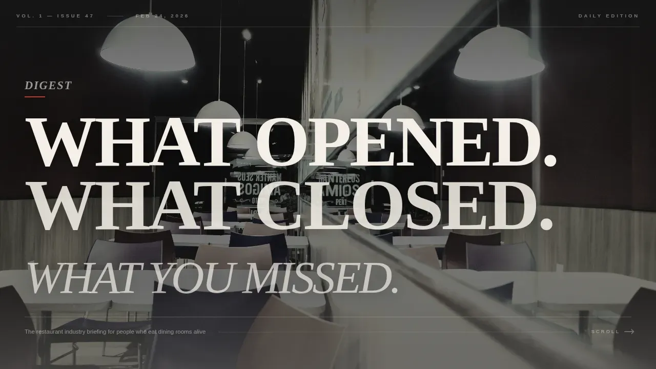
- A massive Type Over Image hero section with a bold serif main headline layered over a desaturated restaurant interior photograph
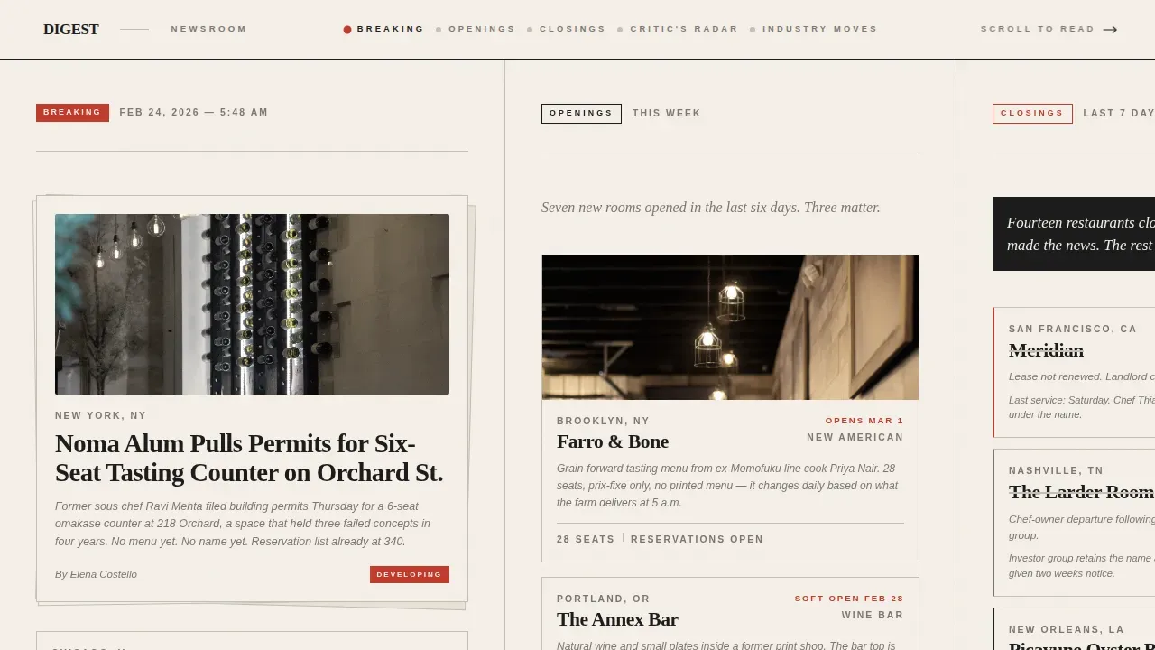
- Five horizontal editorial panels styled as broadsheet departments, flowing from Breaking through Openings, Closings, Critic's Radar, and Industry Moves
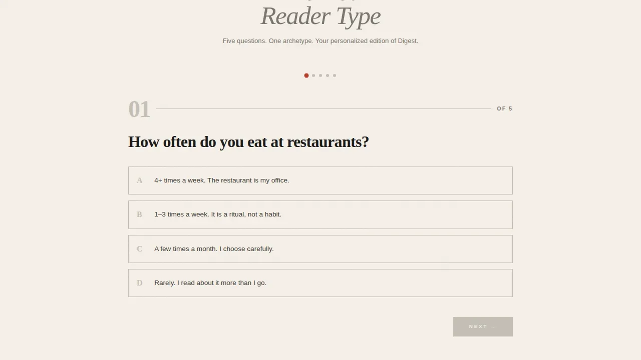
- A five-question "Find Your Reader Type" illustrated quiz with four reader archetypes and a personalized email signup field
Feature list
This template delivers a focused set of purpose-built components. Each one reflects the editorial priorities of a breaking restaurant news publication.
Type Over Image Hero Section
The hero section opens at full viewport width with a 120-point-plus serif headline reading "WHAT OPENED. WHAT CLOSED. WHAT YOU MISSED." set over a desaturated, grain-heavy photograph of an empty restaurant interior mid-setup. The main headline crops at the viewport edge, inviting the visitor to scroll further. There is no navigation bar and no call to action cluttering the hero image, allowing the visual and the headline to breathe together like a magazine cover.
Horizontal Scroll Editorial Newsroom
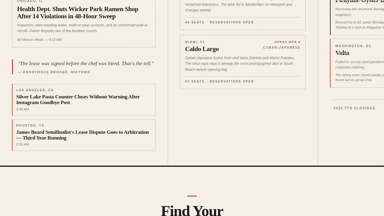
Five editorial panels move the reader through broadsheet-style departments using GSAP ScrollTrigger-powered horizontal scroll. Each panel is a card stack built from real headline styles, datelines, and byline fragments. The density increases as the scroll progresses, mimicking a newsroom priority board and keeping visitors engaged through natural curiosity. This approach gives readers a restaurant's story told in the rhythm of a daily publication rather than a static list of posts.
Five-Question Reader Archetype Quiz
The quiz call-to-action section presents five illustrated questions covering dining frequency, chef versus restaurant loyalty, opening versus closing interest, neighborhood versus cuisine preference, and insider versus civilian perspective. Answers sort the reader into one of four archetypes: The Scout, The Regular, The Insider, or The Critic. Each archetype receives a personalized newsletter cadence recommendation and a single email field reading "Get your edition." The quiz earns the signup by making the reader feel understood before asking for anything.
Ink and Paper Visual Identity
The visual design follows an Ink and Paper theme using a Cloud Canvas color system. Newsprint cream (#F5F0E8) backgrounds, smudged headline black (#1A1A1A) type, column-rule gray (#C4BFB6) dividers, and editor's red (#C0392B) reserved for links, alerts, and interactive highlights create a palette that feels like a broadsheet left on a café table. Fraunces serif handles all display headlines while DM Sans covers body copy and bylines.
GSAP-Animated Card Reveals
Staggered card reveal animations trigger as the horizontal scroll progresses, giving each editorial panel a print-run feel. The animation system uses GSAP ScrollTrigger to sequence card entrances, quiz transitions, and section shifts. This keeps the landing page visually alive without relying on auto-play video or overwhelming visitors with simultaneous motion.
Minimal Footer with Horizontal Flow
The footer follows a horizontal flow pattern that stays consistent with the broadsheet layout direction. It carries only the essential contact details and social media links needed to close the page cleanly. No sidebars, no external link clusters, and no pop ups competing for attention in the final panel.
Page sections overview
| Section | Purpose |
|---|---|
| Hero: Type Over Image | Sets editorial tone with bold headline over restaurant interior photo |
| Breaking News Panel | Opens the horizontal newsroom with high-urgency headline cards |
| Openings Panel | Showcases new restaurant opening stories with datelines and bylines |
| Closings Panel | Covers restaurant closures with the same editorial card-stack format |
| Critic's Radar Panel | Features opinion-led and review-adjacent industry commentary |
| Industry Moves Panel | Covers chef shuffles, lease disputes, and behind-the-scenes business stories |
| Quiz Call to Action | Presents the five-question reader archetype quiz with illustrated prompts |
| Archetype Results | Displays personalized cadence recommendation and email signup field |
| Minimal Footer | Provides contact details and social media links in horizontal flow layout |
Design & branding system
The design language of this restaurant landing page draws entirely from print editorial tradition. Every choice, from the color palette to the type scale, references the physical experience of unfolding a broadsheet at a diner counter at six in the morning.
- Color system: newsprint cream (#F5F0E8) for all backgrounds, headline black (#1A1A1A) for primary type, column-rule gray (#C4BFB6) for dividers and structural lines, and editor's red (#C0392B) for all links, alerts, and interactive highlights
- Typography: Fraunces at 120-point-plus for hero display headlines and editorial panel headers, DM Sans for all body copy, byline fragments, and datelines
- Texture and spacing: grain-heavy photography, ample white space within panels, and subtle ink-feathered visual effects that make every surface feel printed and handled
Mobile & speed optimization
Mobile optimization is essential for this restaurant landing page because a large share of restaurant industry readers check news on mobile phones during off-hours, breaks, and commutes. The horizontal scroll experience is desktop-first, but the template includes a mobile fallback to vertical scroll that preserves full editorial readability on all mobile devices.
- The vertical mobile fallback stacks the five editorial panels in reading order, with thumb-friendly card layouts and readable type scales that display well across screen sizes
- High quality images in the hero section and editorial panels are handled with a static hero approach, reducing initial load pressure and supporting good page speed across devices
- The quiz component and horizontal scroll system load as client-side components, allowing the static hero and above-the-fold content to render site quickly without blocking the interactive elements
How this template helps you convert
A high converting restaurant landing page for an editorial publication needs to earn trust before asking for anything. This template is designed around a single conversion goal, the email signup, and every section moves the reader toward that goal without distraction.
- The benefit-first hero section immediately signals editorial authority by placing the most compelling copy in the top half of the viewport, giving visitors a reason to scroll before they see any call to action
- The horizontal newsroom builds social proof through volume and variety, with dense headline card stacks and datelines that show potential customers the publication's scope and consistent output
- The "Find Your Reader Type" quiz acts as the primary call to action by personalizing the signup, making readers feel seen as an individual archetype rather than just an email address, which increases the likelihood that visitors convert and stay subscribed
Other information about this template
This template is built for publishers who want to jump straight into content without building from scratch. It provides a fully responsive, production-ready restaurant landing page that a non-technical editor can customize in just a few clicks using a drag and drop landing page builder interface. No deep coding knowledge is required to update headlines, swap high quality images, or adjust the quiz questions and archetype labels.
The website template is structured so that new pages or additional editorial sections can be added by duplicating panels within the horizontal scroll layout. A landing page builder with drag and drop functionality makes it straightforward to extend the template into a broader restaurant website if the publication grows beyond a single landing page. Some landing page builder tools also support a wordpress block editor workflow, giving editorial teams familiar with that environment a way to manage content updates without touching code.
This template also applies well beyond pure news blogs. Restaurant owners launching a dedicated landing page for a special event, a new seasonal menu announcement, or a signature dishes campaign can adapt the card-stack panel format for promotional use. The reservation form and contact forms typical of a restaurant website are not included by default, keeping the page focused on newsletter acquisition, but a web designer or developer can add a reservation form, contact forms, or an online store link into the footer or a new panel with minimal effort.
Because the page is designed as a dedicated landing page rather than an entire website, it avoids the risk of overwhelming visitors with too many navigation options. Each landing page should serve one clear purpose, and this template is disciplined about that principle. The editor's red accent color draws the eye to every interactive element, from quiz answer options to the email field, making the call to action impossible to miss without relying on pop ups or aggressive interstitial overlays.
From a marketing strategy perspective, the reader archetype quiz is a particularly effective tool. It makes the subscription feel like a personalized service rather than a generic newsletter blast, which supports long-term audience retention as part of a broader content marketing strategy. For publications using social media platforms to drive traffic, the archetype result cards are designed to be shareable, giving visitors a reason to post their result and bring new customers into the funnel organically.
The template's social proof layer is built into the editorial panels themselves. Dense headline stacks, realistic datelines, and byline fragments encourage visitors to infer the publication's volume and authority without requiring explicit testimonials. For teams that want to add more explicit social proof, the footer horizontal flow area can accommodate press mention logos or award badges from major publications, following best practices for effective landing pages in competitive editorial niches.
Designers using professionally designed templates as a starting point will find the Ink and Paper system easy to extend. The column-rule gray dividers, ample white space between card stacks, and modular panel structure mean that visual customization stays clean even after significant content changes. Real photos of restaurant interiors work especially well in the editorial panels, but illustrated or typographic placeholder cards also fit the broadsheet aesthetic.
For teams running a digital presence across multiple channels, this restaurant landing page connects naturally to social media platforms and email platforms. The archetype-based signup flow is designed to tag subscribers by reader type, supporting segmented email sends as part of a broader marketing strategy without requiring any additional configuration at the template level.
- The template supports header styles at two weights: 120-point-plus display for hero panels and a smaller editorial weight for card headlines inside the newsroom
- Compress images before uploading to maintain good page speed, especially for the grain-heavy hero photography
- Search engines index the static hero content immediately, while the interactive quiz and scroll components load client-side, keeping the page structure clean for search engines
Theme
Ink & Paper
Creative direction
Curated Collection
Color system
Cloud Canvas
Style
Horizontal Scroll
Direction
Quiz/Assessment
Page Sections
Type Over Image Hero Section
Horizontal Scroll Editorial Newsroom
Reader Archetype Quiz and Email Signup
Ink and Paper Visual Identity
Staggered GSAP Card Reveal Animations
Minimal Horizontal Flow Footer
Related questions
Does this template require coding knowledge to customize?
Is this template only useful for restaurant news publications?
How does the mobile experience work on this landing page?
Can I expand this into a full restaurant website later?
What makes this different from a standard restaurant website template?



