Artisan Developer Newsletter Landing Page Template
Dispatch is a horizontal scroll landing page template built for mobile development newsletters with a literary editorial identity. It pairs a manifesto-style hero header with five self-contained story panels, a persistent subscribe button, and a click-through strategy that lets visitors read before they commit. The warm artisan design feels analog, unhurried, and built for readers who think carefully before subscribing.
by Rocket studio
Quick summary
Dispatch is a single-page landing page template designed for mobile development newsletters with a strong editorial voice. It uses a horizontal scroll layout, a quote-driven hero section, and a click-through call to action that sends visitors directly to the latest issue. The visual identity draws from a Japanese Zen color palette to create a tactile, magazine-like reading experience.
Who this template is for
This template suits newsletter creators who write for technically sophisticated audiences and want their landing page to reflect the quality of their content. It is especially well matched for editorial voices that value depth over volume.
- Mobile development writers publishing long-form interviews, code teardowns, or developer profiles
- Independent newsletter operators running on subscription platforms who want a landing page that earns trust through content previews
- Engineering-adjacent writers covering topics like iOS development, Android engineering, or indie app development
What problem this template solves
Most newsletter landing pages ask for an email address before proving they are worth reading. This creates friction for skeptical, high-context readers who want evidence first. The Dispatch template inverts that pattern entirely.
- It removes the email capture field and replaces it with a direct link to the latest issue, letting the content do the persuading
- It presents engagement metrics, testimonials, and content previews as editorial panels rather than marketing copy
- It builds a coherent visual argument for subscription quality without relying on generic promotional language
What you get with this template
The template delivers a complete, single-page layout with every section pre-structured for a newsletter click-through experience. You get a production-ready design system and a clear content hierarchy from hero to call to action.
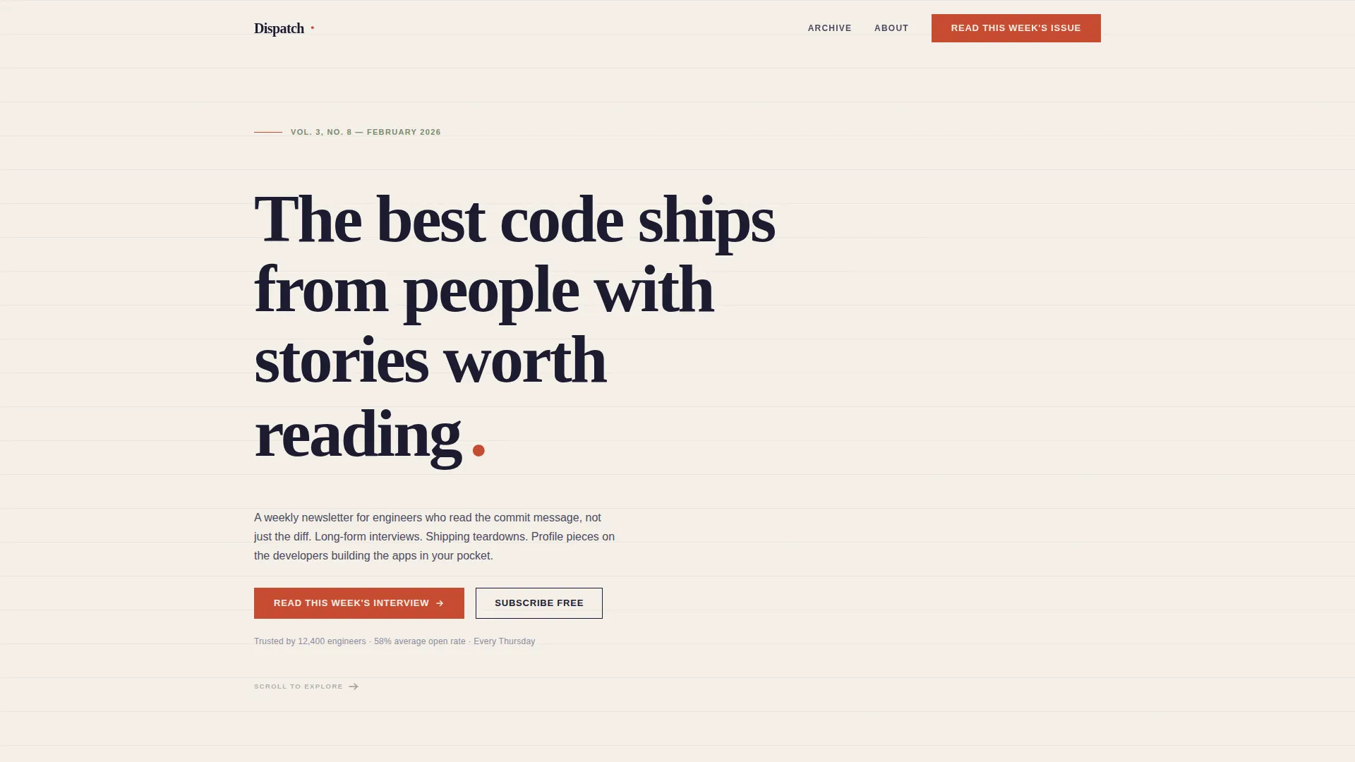
- A manifesto-style hero section with oversized Fraunces serif type, left-of-center placement, and a vermillion period styled as a hanko accent
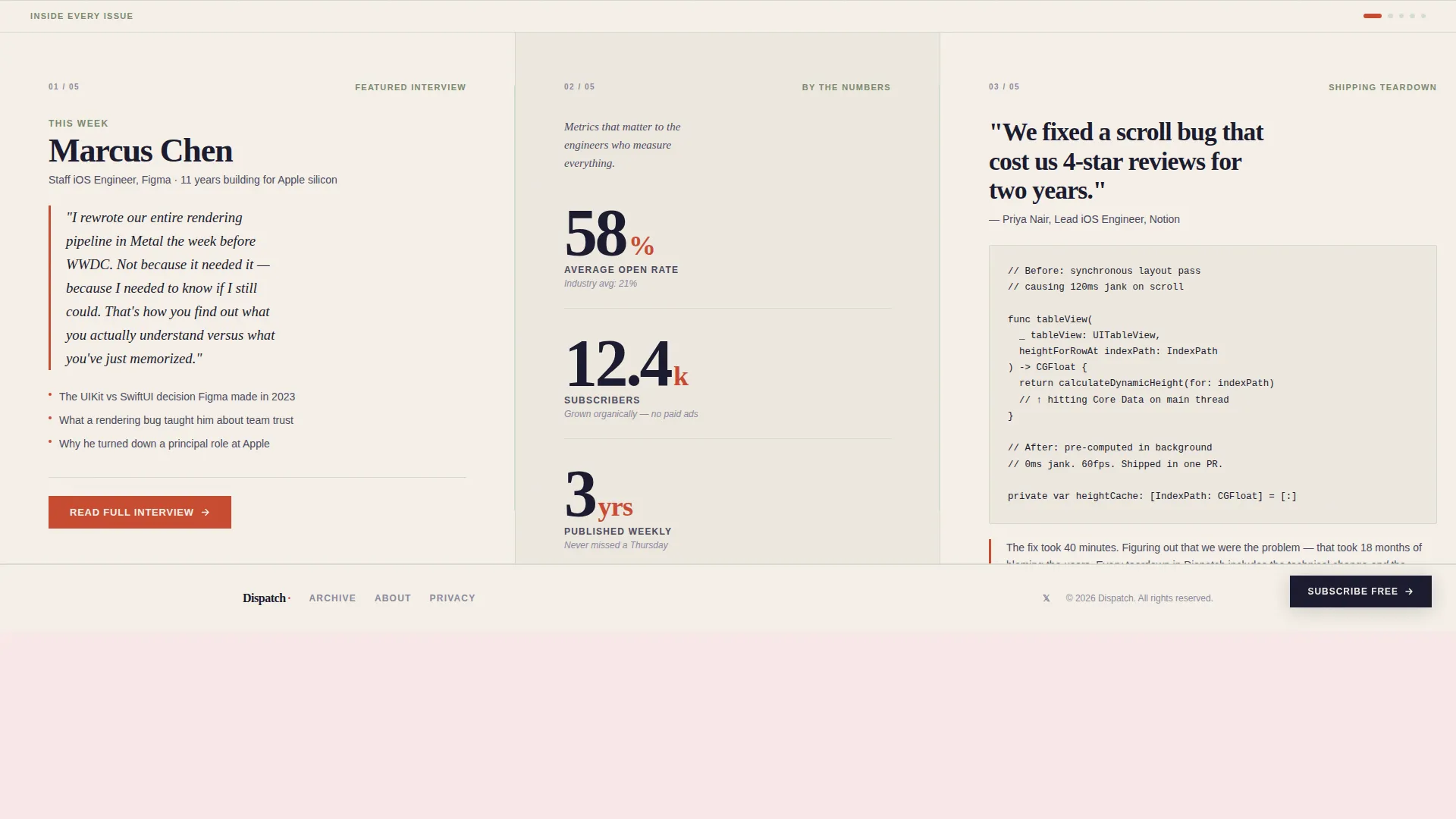
- A five-panel horizontal scroll section featuring a featured interview card, editorial engagement metrics, a code teardown preview, reader marginalia testimonials, and a final action panel
- A persistent secondary subscribe button that follows the horizontal scroll, plus a footer using a minimal single-row pattern
Feature list
This section covers the core capabilities built into the Dispatch template as described in the source brief.
Manifesto Hero Header
The hero section displays a single editorial sentence in oversized Fraunces serif type set against the full cream viewport. The sentence sits slightly left of center, as if typeset by hand. No imagery and no animation are used. Whitespace carries the full visual weight, and a vermillion period closes the statement with the presence of a red seal stamp.
Horizontal Scroll Panel Layout
Five self-contained story panels unfold across a horizontal scroll container. Each panel functions independently, revealing a different layer of newsletter content. The scroll rewards curiosity progressively, building the subscription case through evidence rather than assertion.
Editorial Metrics Panel
One dedicated panel presents a real engagement figure, such as the newsletter open rate, rendered in large editorial numerals. The treatment makes the metric feel like a data point in a report rather than a promotional claim, which suits the analytical mindset of a developer audience.
Code Teardown Preview Panel
A panel pairs a code snippet with the human reasoning behind the technical decision. This gives visitors a direct sample of the newsletter's editorial format, demonstrating depth without requiring a full issue read before the click.
Persistent Subscribe Button
A secondary call-to-action button reading "Subscribe Free" follows the horizontal scroll at all times. It stays accessible without interrupting the reading experience, so the option to subscribe is always one tap away.
Click-Through Call-to-Action Strategy
The primary call to action links directly to the latest issue rather than collecting an email on the page. This approach gives first and asks second. The final panel narrows to a single choice between reading the current issue or subscribing.
Page sections overview
| Section | Purpose |
|---|---|
| Manifesto Hero Header | Opens with a single editorial sentence to anchor brand voice |
| Featured Interview Panel | Previews a developer profile to demonstrate content quality |
| Engagement Metrics Panel | Displays open rate data in large editorial numerals |
| Code Teardown Panel | Shows a code snippet beside its human reasoning context |
| Reader Marginalia Panel | Presents testimonials formatted as handwritten margin notes |
| Final Action Panel | Narrows visitor choice to read the issue or subscribe free |
| Minimal Footer Row | Closes the page with a single-row GitHub-minimal footer pattern |
Design & branding system
The design system follows a Warm Artisan editorial identity inspired by Japanese Zen visual principles. Every color and type choice reinforces the feeling of a handbound magazine rather than a software product page.
- Color palette: washi paper cream (#F5F0E8) as the dominant background, sumi ink (#1A1A2E) for all body text, torii gate vermillion (#C84B31) for interactive elements and pull quote accents, and moss stone (#7A8B6F) for dividers and metadata
- Typography: Fraunces serif for all display headings and the hero manifesto sentence, paired with DM Sans for body copy and panel text
- Visual tone: analog, tactile, and deliberately unhurried, with whitespace treated as an active design element rather than empty space
Mobile & speed optimization
The layout is designed desktop-first, with the horizontal scroll experience as the primary interaction. A graceful fallback presents the same five panels in a vertical stack on smaller screens, preserving content hierarchy without requiring horizontal swipe behavior.
- Animations are kept intentionally low: a text reveal on load and a subtle scroll hint are the only motion elements
- The template uses server components for static content and minimal JavaScript to keep the page light and responsive
- No email capture form or third-party embed is placed on the page, which reduces external load dependencies
How this template helps you convert
The conversion strategy in Dispatch is built on giving value before making any request. Every section of the page serves as a trust-building layer before the visitor reaches a subscription decision.
- The manifesto hero establishes editorial voice immediately, signaling to the right reader that this newsletter thinks differently than a typical developer digest
- The horizontal scroll panels each present a distinct proof point, from real engagement metrics to actual code context, making the subscription case through content evidence rather than feature lists
- The final panel and the persistent subscribe button create two clear paths without pressure, letting a confident reader subscribe and a curious reader click through to the latest issue first
Other information about this template
This template is well suited for newsletter operators who already publish on platforms that host subscription pages separately from their landing presence. It is built to act as the editorial front door, not the subscription mechanism itself.
- The click-through model is compatible with external subscription platforms such as Substack or Buttondown, where the actual subscriber capture happens after the handoff
- Template style is Horizontal Scroll with Warm Artisan theme and Japanese Zen color system, making it visually distinct from standard developer tool landing pages
- Creative direction follows an Industry Report editorial treatment, and the header concept is a Quote or Manifesto, both noted in the intersection match context
- The intersection match score of 13 reflects a well-aligned pairing of Blog and Editorial category with the Mobile Development Newsletter subcategory


Theme
Warm Artisan
Creative direction
Industry Report
Color system
Japanese Zen
Style
Horizontal Scroll
Direction
Click-Through
Page Sections
Manifesto Hero with Oversized Serif Type
Five-panel Horizontal Scroll Layout
Editorial Engagement Metrics Display
Code Teardown Preview Panel
Persistent Click-through Subscribe Button
Warm Artisan Japanese Zen Design System
Related questions
Does this template collect email addresses directly on the page?
Can I use this template for a newsletter outside of mobile development?
What does the horizontal scroll layout look like on a phone?
Do I need to configure the colors and fonts before publishing?
How many panels are included in the horizontal scroll section?



