DTC Brand Newsletter Landing Page Template
Dispatch is a hub-and-spoke landing page template built for direct-to-consumer brand newsletters. It combines a collage-style header, an anchor navigation bar, and themed spoke sections, Founders, Packaging, Growth Playbooks, and Brand Teardowns, to guide readers from first impression to email sign-up through an editorial, studio-wall aesthetic.
by Rocket studio
Quick summary
Dispatch is a single-page newsletter template designed for weekly direct-to-consumer brand publications. It uses a collage-and-scrapbook header, a sticky anchor nav, and four themed content spokes to turn curious brand operators into subscribers. The layout feels like a curated editor's table, tactile, intentional, and easy to browse from top to bottom.
Who this template is for
This template is built for editorial newsletter publishers who cover direct-to-consumer brands, founder stories, and industry strategy. It speaks directly to people whose readers treat each issue like a research resource.
- Brand operators and DTC founders launching or relaunching a newsletter presence
- Agency strategists and marketing leads who publish brand intelligence content
- Editorial teams running interview-led, culture-driven newsletters for the DTC industry
What problem this template solves
Most newsletter landing pages look like sign-up forms with a tagline slapped above them. That approach fails for editorial brands that earn trust through depth, not brevity. Readers who study brands need proof of quality before they hand over an email address.
- Generic landing pages cannot carry the weight of a conversation-first editorial brand
- Flat, form-only layouts bury the editorial identity that makes a newsletter worth subscribing to
- Without a browsable structure, readers cannot sample the content before committing
What you get with this template
You get a fully structured, single-page layout that does the work of a media kit and a subscription funnel at the same time. Every section is designed to demonstrate editorial credibility while moving visitors toward a clear action.
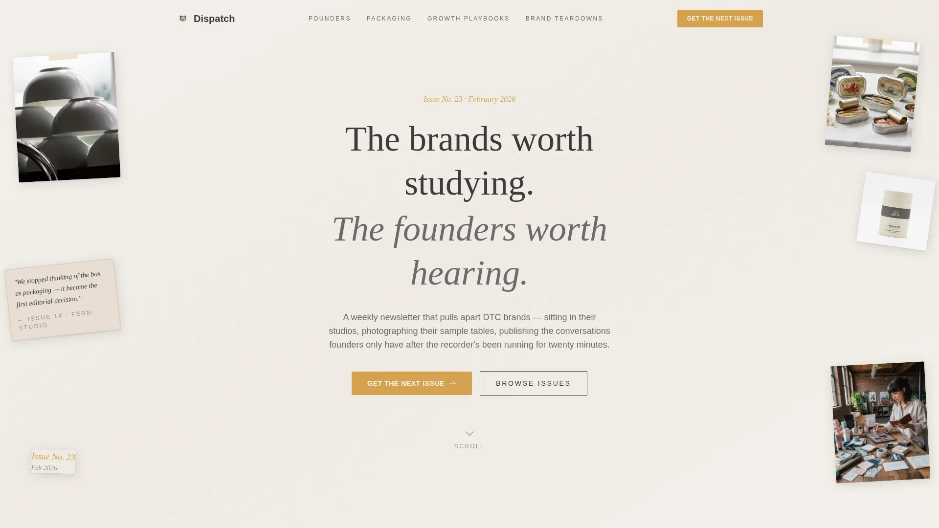
- A collage-style hero section with a bold headline, rotated brand photography, torn-edge pull quotes, and a primary call-to-action button
- Four themed content spokes with interview card grids, full-width editorial moments, and a gated PDF download section
- A sticky email capture bar, an anchor navigation menu, and a segmentation toggle built into the sign-up form
Feature list
This template ships with a set of purpose-built layout features grounded in the editorial and lead-generation goals of the brief.
Collage Hero with Animated Scroll Cue
The header is a scrapbook-style composition of overlapping brand photography, slightly rotated product shots, and torn-edge interview excerpts. A handwritten-style dateline marks the current issue number. A single animated arrow invites the visitor to scroll, keeping the entry experience active rather than static.
Anchor Navigation Bar
A top-level nav labels each content spoke by theme: Founders, Packaging, Growth Playbooks, and Brand Teardowns. Clicking any label glides the visitor directly to the matching section. This gives brand operators and strategists a way to jump to the content most relevant to them without scrolling past unrelated material.
Interview Card Grids with Pull Quotes
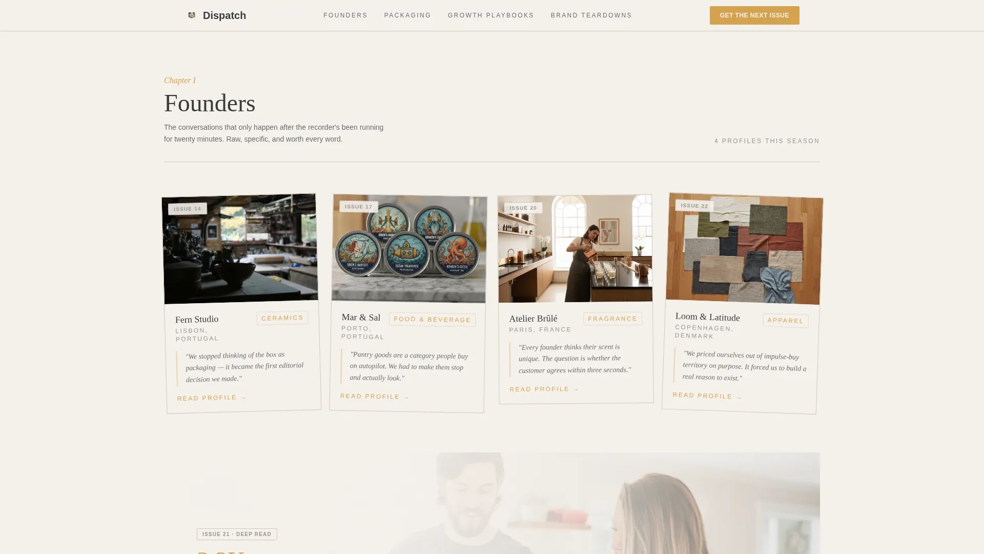
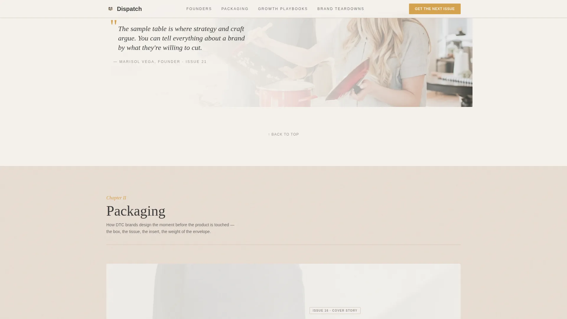
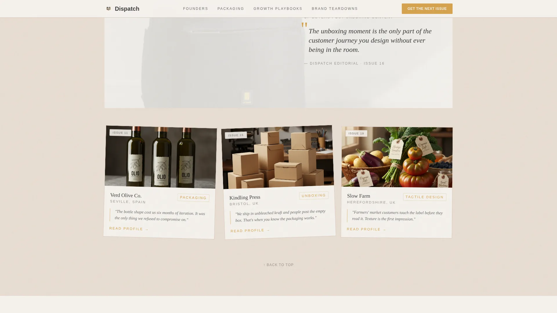
Each spoke contains a grid of interview cards. Every card shows a brand photograph, a one-line pull quote, and an issue number. The rhythm alternates between dense card grids and single full-width editorial moments, so the page breathes like a magazine layout rather than a social feed.
Sticky Email Capture Bar
After the visitor passes the second spoke, a sticky bar appears at the bottom of the viewport. It carries the primary call-to-action, "Get the Next Issue", and keeps the sign-up prompt visible without interrupting the browsing experience.
Segmented Sign-Up Form
The email form asks for one field: an email address. A single optional toggle lets readers self-identify as "I run a brand" or "I study brands." This gives the newsletter publisher light segmentation data without adding friction to the sign-up flow.
Gated Brand Teardown PDF
The Brand Teardowns spoke includes a secondary conversion path. Visitors who are not ready to subscribe can instead download a "Brand Teardown PDF" of the most-read profile. The download is gated behind the same email field, so every path through the page exchanges value for access.
Page sections overview
| Section | Purpose |
|---|---|
| Hero Collage | Headline, rotated brand photos, torn-edge pull quotes, primary call-to-action |
| Founders Spoke | Interview card grid with hover previews, pull quotes, and issue numbers |
| Packaging Spoke | Full-width editorial moment paired with a dense card grid |
| Growth Playbooks Spoke | Metrics and stats cards with a supporting excerpt |
| Brand Teardowns Spoke | Featured teardown profile and gated PDF download |
| Footer | Horizontal flow layout closing the page |
Design & branding system
The visual identity follows an Atelier Studio direction. Every color, typeface, and layout choice is meant to feel tactile and deliberately analog, as if the page itself were printed on unbleached cotton paper.
- Color palette: warm linen (#F4F1EC) as the base, pencil graphite (#3B3B3B) for body text, tracing-paper blush (#E8DDD3) for secondary surfaces, and studio-lamp amber (#D4A24E) reserved for links, buttons, and pull-quote marks
- Typography pairing: Fraunces as the serifed display typeface for headlines and pull quotes, DM Sans as the clean body and interface typeface for cards and navigation
- Animation and interactivity: collage rotations on load, scroll-reveal transitions, cursor hover previews on interview cards, and word-level animations on key headline text
Mobile & speed optimization
The template is built desktop-first, reflecting how its core audience, brand operators reading at a desk, will encounter the page. Mobile responsiveness is included to serve visitors on other devices.
- Desktop-first layout with responsive breakpoints for mobile and tablet viewports
- Static server components handle the content-heavy sections; client components manage animations and interactive elements separately
How this template helps you convert
The page is structured as a lead-generation funnel that never feels like one. Every design choice supports a clear conversion goal while keeping the editorial identity intact.
- The hero section places the primary "Get the Next Issue" call-to-action inside the collage itself, so the first thing a visitor sees is both an editorial statement and an invitation to subscribe
- The anchor nav and spoke structure reward curiosity, visitors who browse multiple sections build trust with the content before the sticky bar resurfaces the sign-up prompt
- The gated PDF download creates a second entry point for visitors who need more proof before subscribing, ensuring that even hesitant visitors exchange value for access
Other information about this template
This template is part of a broader set of editorial and newsletter landing page designs. A few additional details are worth noting for buyers evaluating fit.
- The template is categorized under Blog and Editorial, with a specific focus on the direct-to-consumer brand newsletter niche
- The Soft Mist color system and Curated Collection creative direction are foundational to the visual language and should be preserved for brand coherence
- The Hub and Spoke with anchor navigation structure can support newsletter publishers who want readers to self-sort by interest area before encountering the sign-up prompt
- European brand references and an English-language, USD-context localization are baked into the sample content direction
Theme
Atelier Studio
Creative direction
Curated Collection
Color system
Soft Mist
Style
Hub & Spoke (Anchor Nav)
Direction
Lead Generation
Page Sections
Collage Hero with Animated Scroll Cue
Anchor Navigation Bar
Interview Card Grids with Pull Quotes
Sticky Email Capture Bar
Segmented Sign-up Form with Toggle
Gated Brand Teardown PDF Download
Related questions
Who is this landing page template designed for?
Can I change the spoke themes to match my newsletter's sections?
How does the segmentation toggle work in the sign-up form?
Does the template include the PDF download gate?
Is the layout desktop-first or mobile-first?



