Backend Engineering Newsletter Booking Website Template
Dispatch is a Heritage & Story editorial landing page for a curated backend engineering jobs newsletter. Built in a masonry layout with broadsheet typography, it moves senior engineers and staff engineers from first impression to waitlist signup through real job clippings, a first-person curator narrative, subscriber pull quotes, and a live "Reserve Your Seat" counter.
by Rocket studio
Quick summary
Dispatch is an editorial landing page template for a weekly backend engineering jobs newsletter. It uses a masonry grid, broadsheet-scale typography, and an Ink & Paper color system to build authority fast. Real job clipping cards, a curator spotlight, and a live waitlist counter work together to earn the signup before a visitor ever feels persuaded.
Who this template is for
This template is built for newsletter creators launching in the backend engineering and technical jobs space. It suits anyone who curates high-signal opportunities for a senior technical audience and needs a page that earns trust on first scroll.
- Backend engineers or engineering managers launching a niche job curation newsletter
- Technical content creators who need a credibility-first landing page without a polished marketing team
- Founders building early waitlist momentum for a subscription newsletter in the engineering vertical
What problem this template solves
Most newsletter landing pages rely on generic hero copy and vague promise lists. That approach falls flat with senior engineers, who distrust marketing language and leave quickly when a page feels hollow.
- Senior readers need to see demonstrated editorial quality, not promises, before giving an email address
- Buried backend roles with no compensation context are frustrating to find across scattered career pages
- Newsletter operators lack a page layout that communicates craft, curation process, and real sample content up front
What you get with this template
You get a fully structured single-page editorial layout that guides a senior technical audience from curiosity to conversion. Every section is purpose-built around the Dispatch newsletter concept and its curation-first value proposition.
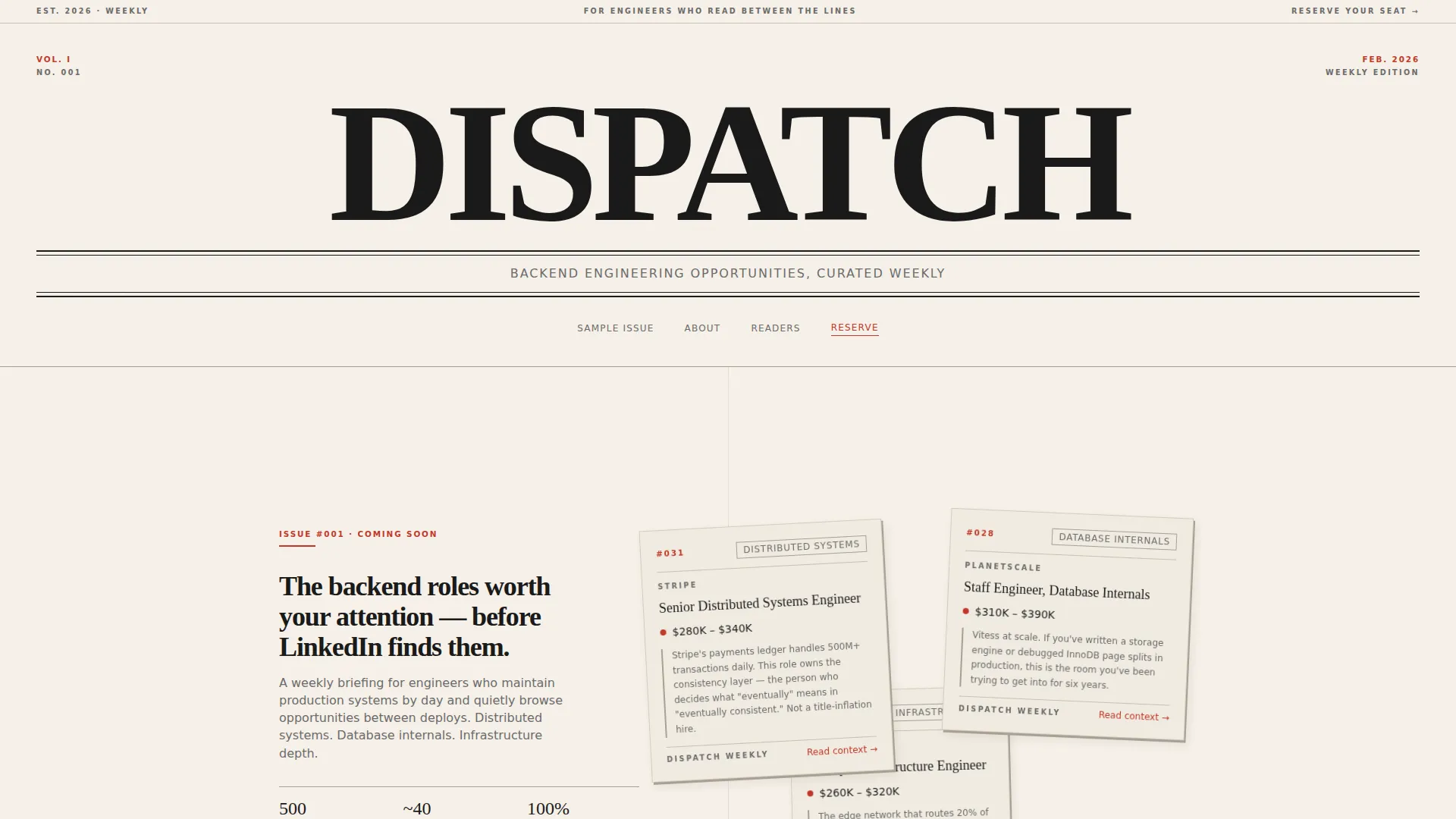
- A broadsheet masthead section with rotated job clipping cards showing real titles, salary bands, and editorial notes
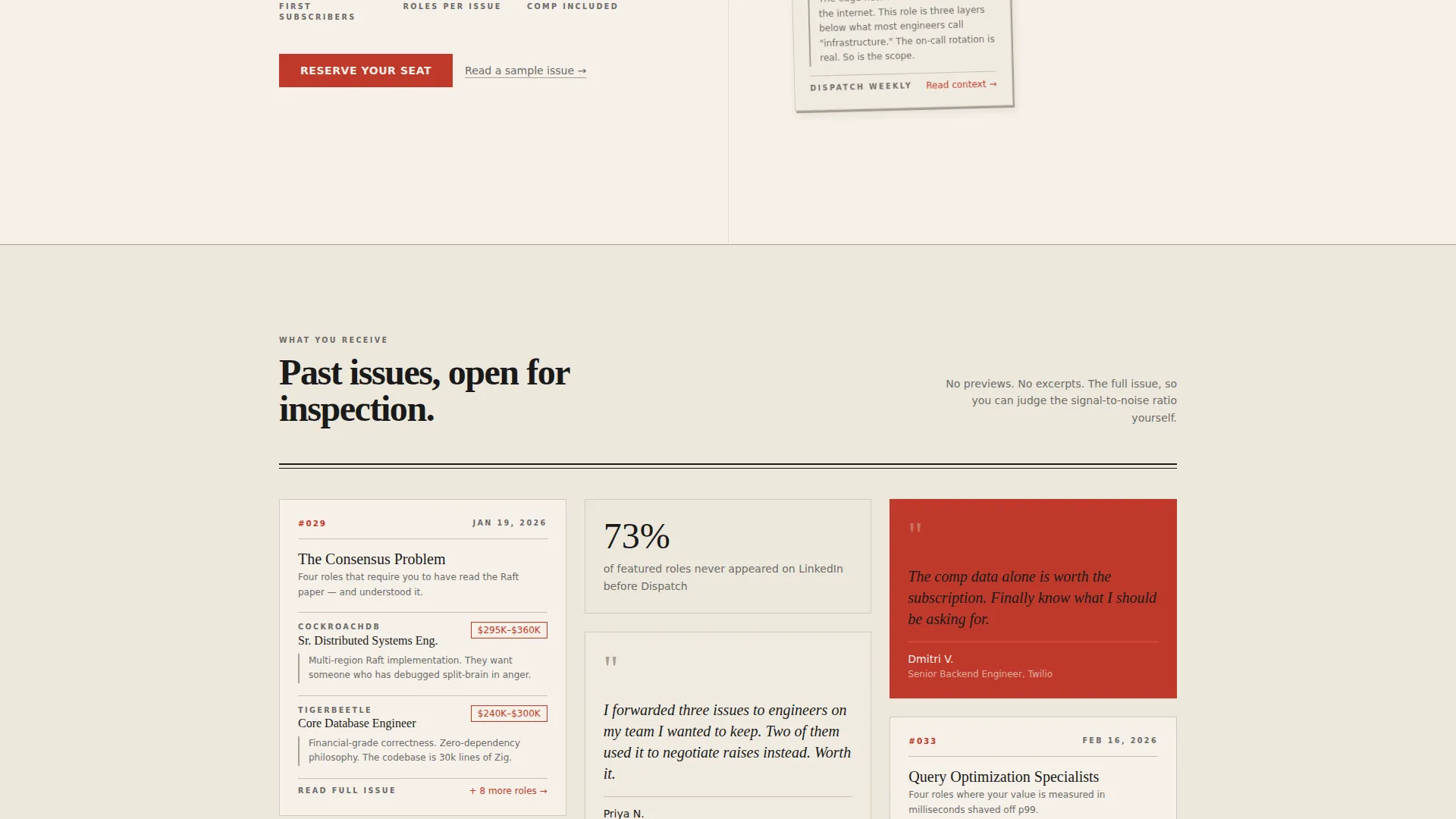
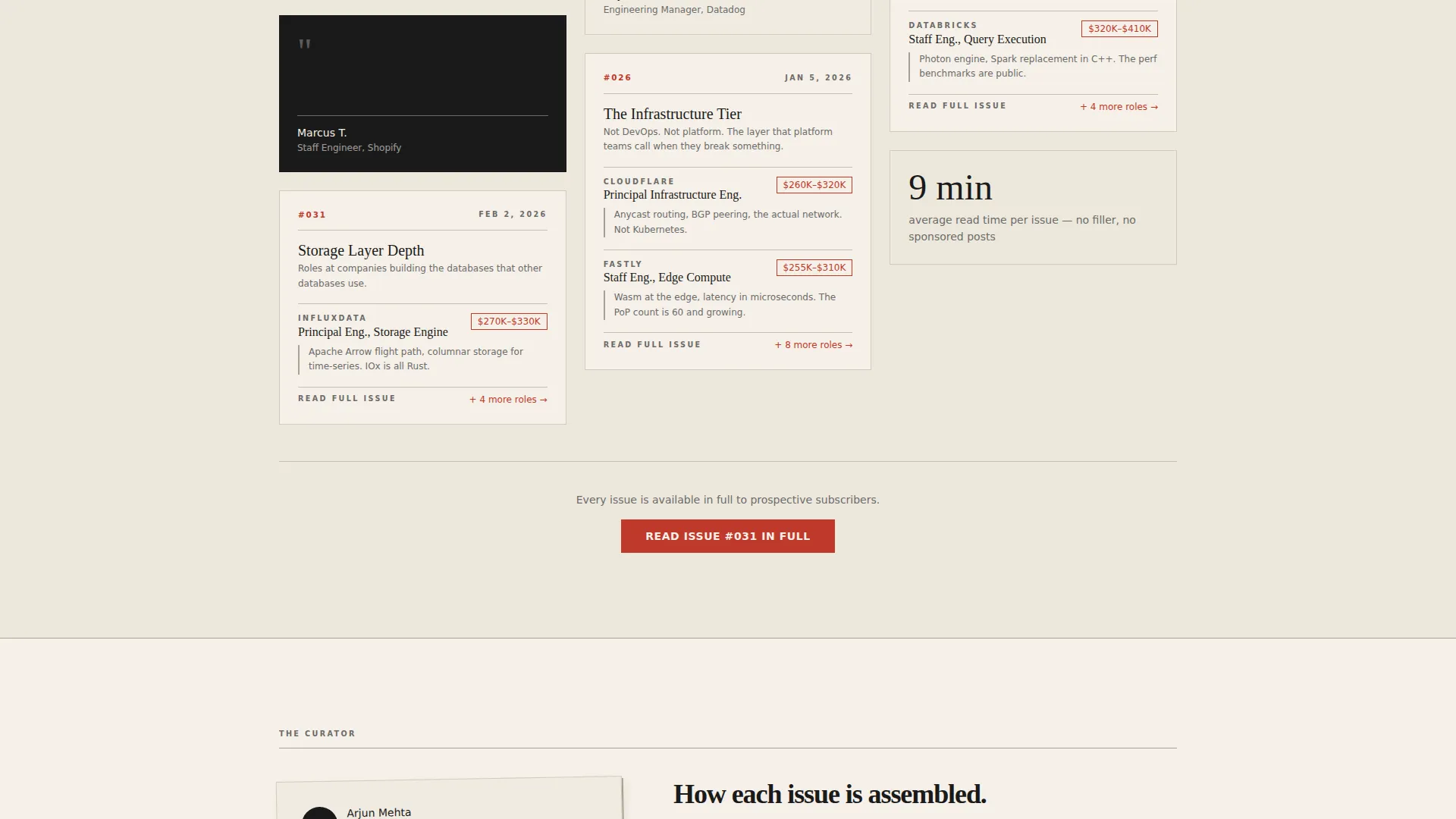
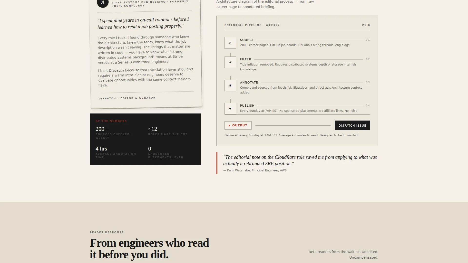
- A masonry grid of sample issue previews, subscriber pull quotes, and architecture-style assembly diagrams
- A waitlist conversion section with a single email field, live signup counter, and a secondary path to a full sample issue
Feature list
A brief look at how Dispatch is constructed, one purpose-built component at a time.
Broadsheet Masthead Header
The header spans full width and sets the editorial tone immediately. "DISPATCH" renders in a heavy Fraunces serif at broadsheet scale, flanked by a volume number, issue date, and a one-line subhead. This section anchors the visual identity before a visitor scrolls a single pixel.
Masonry Job Clipping Grid
Past issue cards are arranged like newspaper clippings pinned to a corkboard. Each card shows a real job title, a salary band, and a two-sentence editorial note. The rotated card layout gives the grid a tactile, handcrafted quality that reinforces the curation premise.
Curator Spotlight Narrative
A first-person narrative card introduces the newsletter's author as a practicing backend engineer, not a content marketer. The section pairs personal voice with an architecture-style diagram showing how each issue is sourced, filtered, annotated, and published. This combination builds the kind of trust that generic testimonial sections cannot replicate.
Subscriber Pull Quotes
Pull quotes from real readers appear in varied masonry tile sizes, breaking the grid rhythm and adding social proof without a dedicated testimonial section. Short, direct quotes like "First newsletter I actually open" carry more weight in this format than star ratings.
Waitlist Conversion Block
The call to action reads "Reserve Your Seat" with a single email input field. A live counter below the field displays current signups in marginalia red, creating quiet urgency without aggressive sales copy. A secondary link lets visitors read a full sample issue in-browser before deciding.
Scroll Reveal and Hover Interactions
Cards animate in with staggered scroll reveals as the visitor moves down the page. Clipping cards lift slightly on hover, and the live waitlist counter animates as new signups register. These interactions reinforce the editorial quality signal without overpowering the typographic foundation.
Page sections overview
| Section | Purpose |
|---|---|
| Hero Masthead | Set editorial tone, display broadsheet identity, show floating job clipping cards |
| Sample Issue Grid | Surface curated job titles and comp bands in a masonry layout |
| Curator Spotlight | Build personal trust through first-person narrative and issue assembly diagram |
| Subscriber Proof | Reinforce credibility with varied pull quote tiles |
| Waitlist Call to Action | Convert visitors with email field, live counter, and sample issue link |
| Ultra-Minimal Footer | Close the page cleanly with horizontal flow and minimal distraction |
Design & branding system
The visual language is modeled on a well-thumbed technical journal from a university press. Typography does the authority work. Whitespace is treated as a luxury, not a gap.
- Color system: deep editorial black (#1A1A1A) for body type, warm parchment (#F5F0E8) as the page background, faded pencil gray (#6B6B6B) for secondary labels, and marginalia red (#C0392B) reserved for links, issue numbers, and the subscribe button
- Typography: Fraunces serif for the masthead and all headings; DM Sans for body text, form labels, and user interface elements
- No stock photography and no gradients anywhere on the page; authority comes entirely from typographic composition and editorial structure
Mobile & speed optimization
The template is built desktop-first, reflecting where the target audience actually browses. Senior backend engineers typically scroll on a laptop between deploys, and the broadsheet layout is designed to reward a wide viewport.
- Desktop-first layout with a masonry grid that adapts for smaller viewports without losing the editorial grid logic
- Static server components handle all fixed content; client components are scoped only to the live waitlist counter and the email submission form
- Medium animation weight: scroll-reveal staggers and hover lifts are present but kept light enough to avoid layout jank on standard hardware
How this template helps you convert
The page is engineered to earn the signup through demonstrated value, moving visitors through a logical trust sequence before the call to action appears.
- The masthead and job clipping cards establish editorial credibility in the first viewport, giving senior readers a reason to keep scrolling without a single marketing claim
- The curator spotlight and architecture diagram reveal the craft behind each issue, replacing vague promise copy with transparent process that resonates with technical audiences
- The live waitlist counter and sample issue path create two parallel conversion routes: one for visitors ready to sign up and one for visitors who need to read the product first
Other information about this template
This template sits inside the Blog & Editorial category and is purpose-matched to the Backend Engineering Newsletter subcategory. It is a clean fit for anyone building a niche job curation product in the technical or engineering vertical.
- The Heritage & Story theme and Ink & Paper color system are applied consistently across every section, including the footer, creating a cohesive editorial publication feel from top to bottom
- The Waitlist and Coming Soon landing page direction means the template is structured for pre-launch momentum, not post-launch subscription management
- The Creator Spotlight creative direction and Newspaper or Publication header concept are both built into the layout as named structural components, not visual afterthoughts
- The masonry and Pinterest-style grid layout is the organizational backbone of the middle sections, giving the page visual rhythm without relying on image-heavy design
- The template uses the Fraunces and DM Sans typeface pairing, which are freely available via Google Fonts and easy to configure or replace
Theme
Heritage & Story
Creative direction
Creator Spotlight
Color system
Ink & Paper
Style
Masonry/Pinterest
Direction
Waitlist/Coming Soon
Page Sections
Broadsheet Masthead with Job Clippings
Masonry Issue Preview Grid
First-person Curator Spotlight
Live Waitlist Counter and Call to Action
In-browser Sample Issue Path
Staggered Scroll and Hover Animations
Related questions
Who is this landing page template designed for?
Does this template include a working waitlist form and live counter?
Can visitors read a sample issue before signing up?
Is this template desktop-first or mobile-first?
Can I customize the job clipping cards with my own content?



