Creator Economy Newsletter Complete Blog Website Template
Dispatch is an editorial landing page template built for a creator economy data and trends newsletter. It combines a broadsheet-inspired Ink and Paper visual identity with a dual conversion path: a five-question Creator Archetype quiz and a direct email capture option. The result is a single-page experience that turns serious industry data into a compelling subscriber journey.
by Rocket studio
Quick summary
Dispatch is a landing page template designed for a creator economy newsletter that reads like a financial analyst wrote it for a cultural critic. The page pairs a woodcut-style illustrated header with scroll-triggered chapter sections, an interactive archetype quiz, and a secondary direct sign-up path, all wrapped in a warm Parchment and Rust editorial design system.
Who this template is for
This template is built for publishers and newsletter operators who serve a professional, data-hungry audience. If your newsletter covers sponsorship rates, platform economics, or brand deal benchmarks, this page is designed to match that level of seriousness.
- Mid-career independent creators earning between $50,000 and $500,000 annually who need real benchmarking data
- Talent managers overseeing rosters of YouTubers and podcasters who want industry-grade reporting
- Brand partnership leads at direct-to-consumer companies trying to evaluate fair market rates
What problem this template solves
Most newsletter landing pages choose between "pretty" and "credible." They either lean into lifestyle visuals or dump raw statistics with no editorial frame. Neither approach earns the trust of a professional audience that has already read every generic "state of the creator economy" take.
- Readers with domain expertise skip pages that feel lightweight or over-designed without substance
- A quiz-only opt-in can alienate visitors who just want the data without a personality layer
- Generic email capture forms fail to communicate the specific, tier-based value the newsletter delivers
What you get with this template
You get a fully structured single-page editorial experience with two distinct conversion paths built in. Every section is designed as a chapter in a longer story, moving from macro industry data down to personal benchmarking and sign-up.
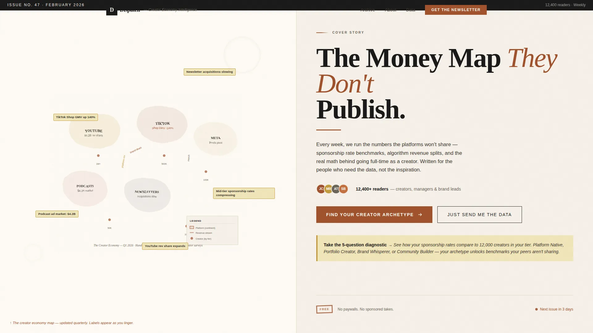
- A hero section featuring a hand-inked illustrated map with animated fade-in data labels and a dual call-to-action layout
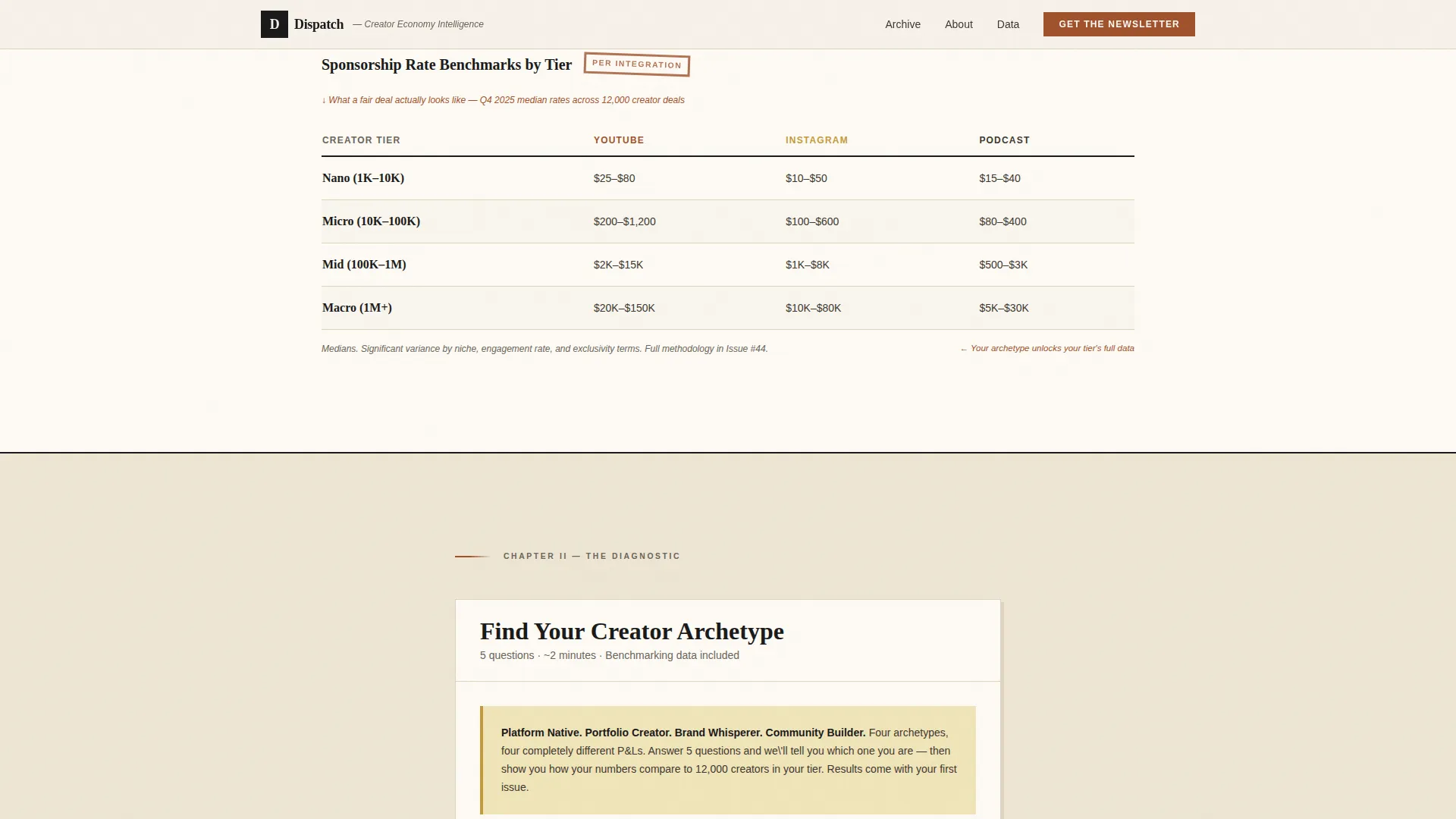
- A five-question Creator Archetype quiz with animated step transitions and archetype-specific benchmarking teasers delivered by email
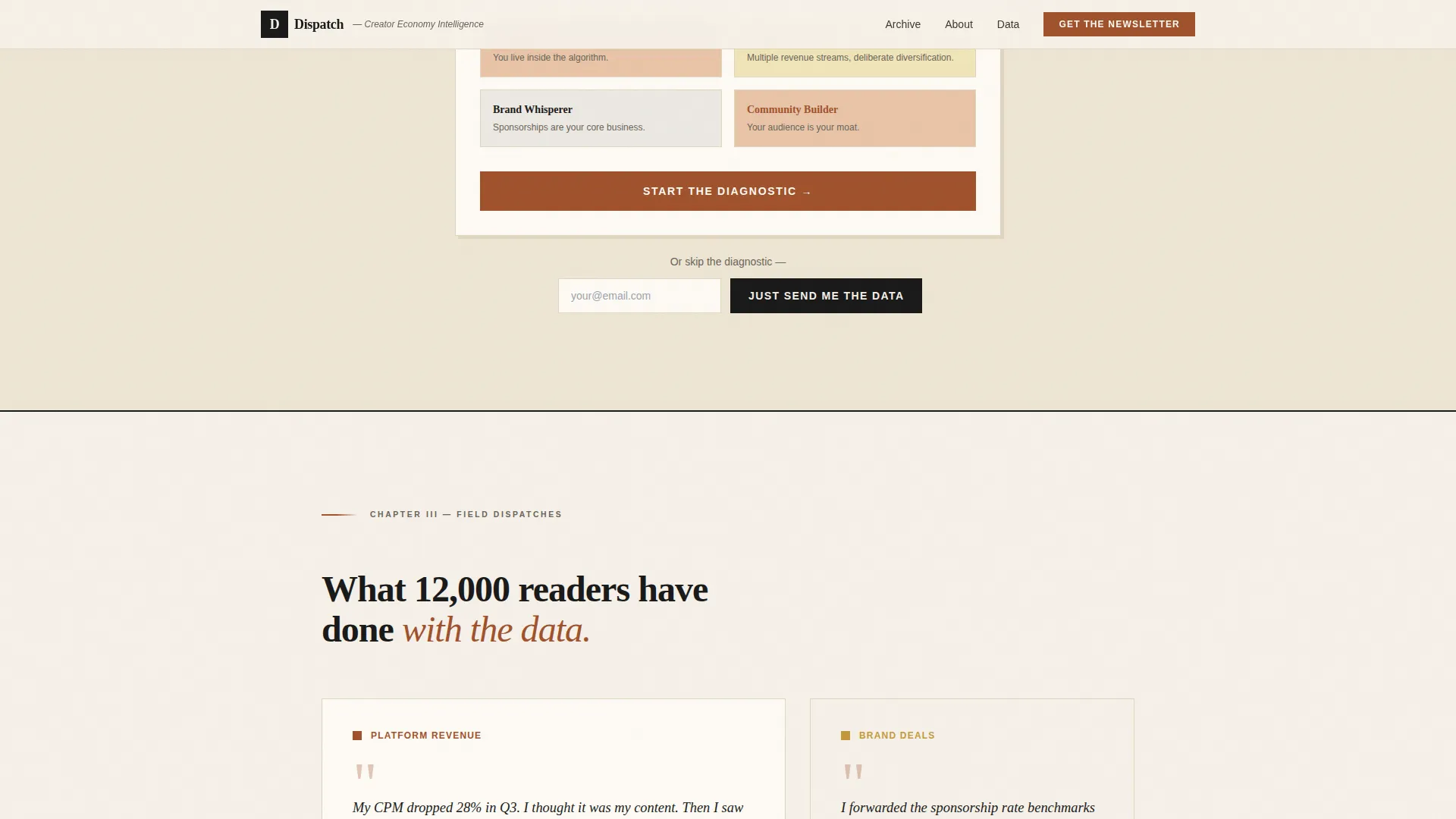
- A secondary "Just Send Me the Data" direct email capture path that bypasses the quiz entirely
Feature list
This section breaks down the distinct functional and design capabilities built into the Dispatch template.
Animated Editorial Hero Map
The header is a custom woodcut-meets-infographic illustration rendered as a sprawling map of the creator economy ecosystem. As visitors linger, animated labels fade in naming real trends. A large serif headline sits beneath, anchoring the editorial tone immediately.
Five-Step Creator Archetype Quiz
The primary call to action leads into a five-question diagnostic. It identifies whether the reader is a Platform Native, Portfolio Creator, Brand Whisperer, or Community Builder based on revenue mix, audience size, and content cadence. Results are delivered by email alongside the first newsletter issue.
Dual Conversion Path Architecture
Two opt-in paths run in parallel. Visitors who engage with the quiz flow through the full diagnostic. Visitors who prefer a direct sign-up use the "Just Send Me the Data" single-field email capture. Neither path blocks the other.
Scroll-Triggered Chapter Sections
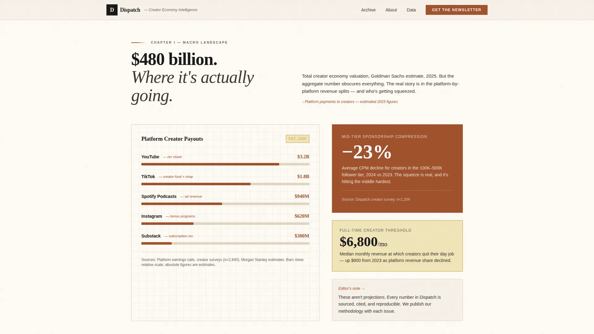
Each page scroll section functions as a named chapter with its own data story. Chapters move from macro creator economy trends down to micro-level sponsorship benchmarks. Scroll-triggered reveals keep the reading rhythm close to a long-form magazine feature.
Hand-Plotted Chart Aesthetic
The data preview sections use a graph-paper visual style that makes charts look hand-drawn rather than dashboard-generated. Pull quotes from anonymous creators appear as field dispatches, alternating dense data blocks with editorial breathing room.
Ink and Paper Design System
The full page is built on a warm, fibrous editorial palette. Serif display typography sits heavy against aged parchment backgrounds. Rust-red and ochre accents appear selectively, reserved for callouts, pull quotes, and interactive highlights where the data demands attention.
Page sections overview
| Section | Purpose |
|---|---|
| Hero Illustrated Map | Introduce editorial identity and present dual call-to-action paths |
| Data Preview Charts | Display macro creator economy trends with hand-plotted chart aesthetic |
| Creator Archetype Quiz | Guide visitors through five-question diagnostic and tease benchmarking data |
| Field Dispatches | Surface anonymous creator pull quotes alongside micro data callouts |
| What's Inside Preview | Show chapter-style issue layout to communicate newsletter depth |
| Footer Flow | Close the page with horizontal navigation and secondary sign-up access |
Design & branding system
The visual identity follows an Ink and Paper editorial theme built around the Parchment and Rust color system. Every design decision reinforces the feeling of reading a researcher's annotated industry report.
- Color palette: aged parchment (#F5F0E8) for backgrounds, dried ink black (#1A1A1A) for body text, rust-red (#A0522D) for annotations and accents, and margin-note ochre (#C49A3C) reserved for callouts and interactive highlights
- Typography pairing: Fraunces serif for display headings and editorial headlines, DM Sans for body copy and interface elements
- Grain texture overlay, woodcut illustration style, and hand-inked visual motifs throughout reinforce the broadsheet reading metaphor
Mobile & speed optimization
The template is designed desktop-first to honor the broadsheet metaphor, with responsive behavior that carries the editorial identity down to smaller screens. Interactive components are structured to keep static sections lightweight while keeping quiz interactivity smooth.
- Server components handle static editorial sections to reduce unnecessary client-side load
- Client-side rendering is scoped specifically to the five-step quiz for state management and step transitions
- Scroll-triggered animations and grain texture overlays are layered in a way that preserves the visual system at every viewport size
How this template helps you convert
The page is built around two intentional conversion strategies that serve different visitor mindsets. Neither path is an afterthought.
- The Creator Archetype quiz earns the click by promising personalized, tier-specific benchmarking data. The teaser copy ("See how your sponsorship rates compare to 12,000 creators in your tier") gives the visitor a concrete reason to complete all five steps before sharing their email.
- The direct "Just Send Me the Data" path removes friction for analytically minded visitors who distrust quiz formats. A single email field and a clear value promise capture this segment without forcing them through a flow they would abandon.
Other information about this template
This template sits in the Blog and Editorial category under the Creator Economy Newsletter subcategory. It is purpose-built for the creator economy data and trends niche and is classified as an Editorial and Magazine template style.
- The landing page direction is Quiz and Assessment, making it well suited for any newsletter that benefits from audience segmentation at the point of sign-up
- The header concept is a Custom Illustration, which means the hero visual is a bespoke asset rather than a stock image or pattern background
- The creative direction follows an Industry Report cadence, structuring the page as a sequence of named chapters rather than a conventional features-and-benefits layout
- Animation complexity is high: fade-in map labels, scroll-triggered chapter reveals, quiz step transitions, and a grain texture overlay are all part of the delivered design
- The footer uses a Horizontal Flow layout pattern that keeps navigation clean and surfaces a final email capture opportunity without visual clutter
Theme
Ink & Paper
Creative direction
Industry Report
Color system
Parchment & Rust
Style
Editorial/Magazine
Direction
Quiz/Assessment
Page Sections
Animated Woodcut Hero Illustration
Five-step Creator Archetype Quiz
Dual Conversion Path Design
Scroll-triggered Chapter Sections
Hand-plotted Chart Aesthetic
Ink and Paper Editorial Design System
Related questions
Who is the intended audience for this template?
How does the Creator Archetype quiz work?
Can visitors skip the quiz and still subscribe?
Is this template designed for desktop or mobile use?
What makes this different from a standard newsletter sign-up page?



