Editorial E-Commerce Industry Report Landing Page
Dispatch is a bold editorial landing page built for e-commerce industry report publishers. It combines broadsheet-weight typography, a warm parchment and rust color system, and a structured lead generation flow. The template turns a single scroll into a persuasive read, converting operators, founders, and supply chain leaders into qualified subscribers.
by Rocket studio
Quick summary
Dispatch is a single-page editorial template designed for e-commerce intelligence publishers who need to convert serious operators into subscribers. It leads with a giant serif headline, unfolds a conviction-building manifesto, and gates both a free report and a sample PDF behind lightweight email forms. Every section earns the next click before asking for it.
Who this template is for
This template is built for publishers and teams producing high-signal e-commerce intelligence. It suits anyone whose content speaks to operators rather than casual browsers.
- E-commerce directors, supply chain VPs, and brand founders publishing weekly industry reports
- Direct-to-consumer (DTC) media brands, 3PL intelligence desks, and marketplace research teams
- Independent analysts or editorial studios monetizing operator-level insights through email subscriptions
What problem this template solves
Most newsletter or blog landing pages feel generic. They borrow layouts built for software products or consumer apps. That mismatch erodes trust before a visitor even reads a headline. Dispatch solves the credibility gap.
- Operators arrive and immediately read copy written at their level, not pitched down to them
- The manifesto and methodology sections replace empty claims with reasoned conviction
- The redacted table of contents creates genuine curiosity without overpromising the content inside
What you get with this template
You get a fully structured single-page lead generation layout built around editorial authority and qualified conversion. Every section serves a specific job in the reader's trust journey.
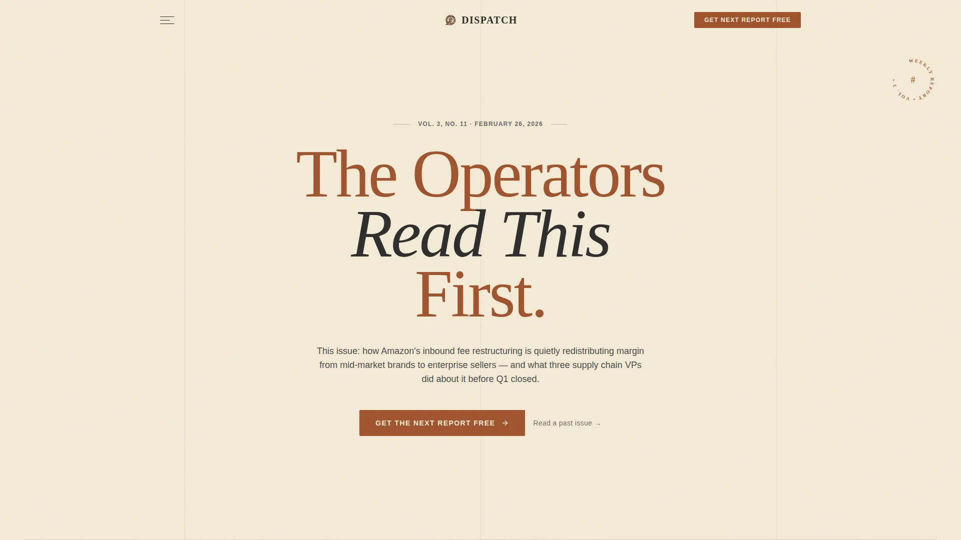
- A giant broadsheet masthead hero with dateline subhead and dual call-to-action placement
- A manifesto block, methodology cards, and reader social proof section with headshots and roles
- A redacted current-issue table of contents, a two-gate conversion flow, and a persistent call-to-action bar
Feature list
This template ships with a focused set of purpose-built features. Each one is grounded in the needs of a serious editorial lead generation page.
Giant Broadsheet Masthead Hero
The hero section uses enormous centered serif type set directly against bare parchment. No imagery, no illustration. A single dateline-style subhead carries the current issue number and a one-sentence thesis. Two call-to-action placements sit below it: the primary "Get the Next Report Free" form and a link to the sample PDF gate.
Conviction-Building Manifesto Block
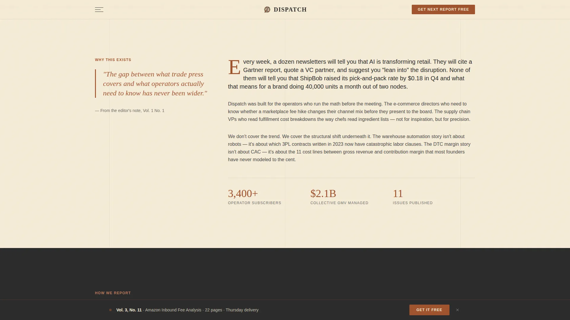
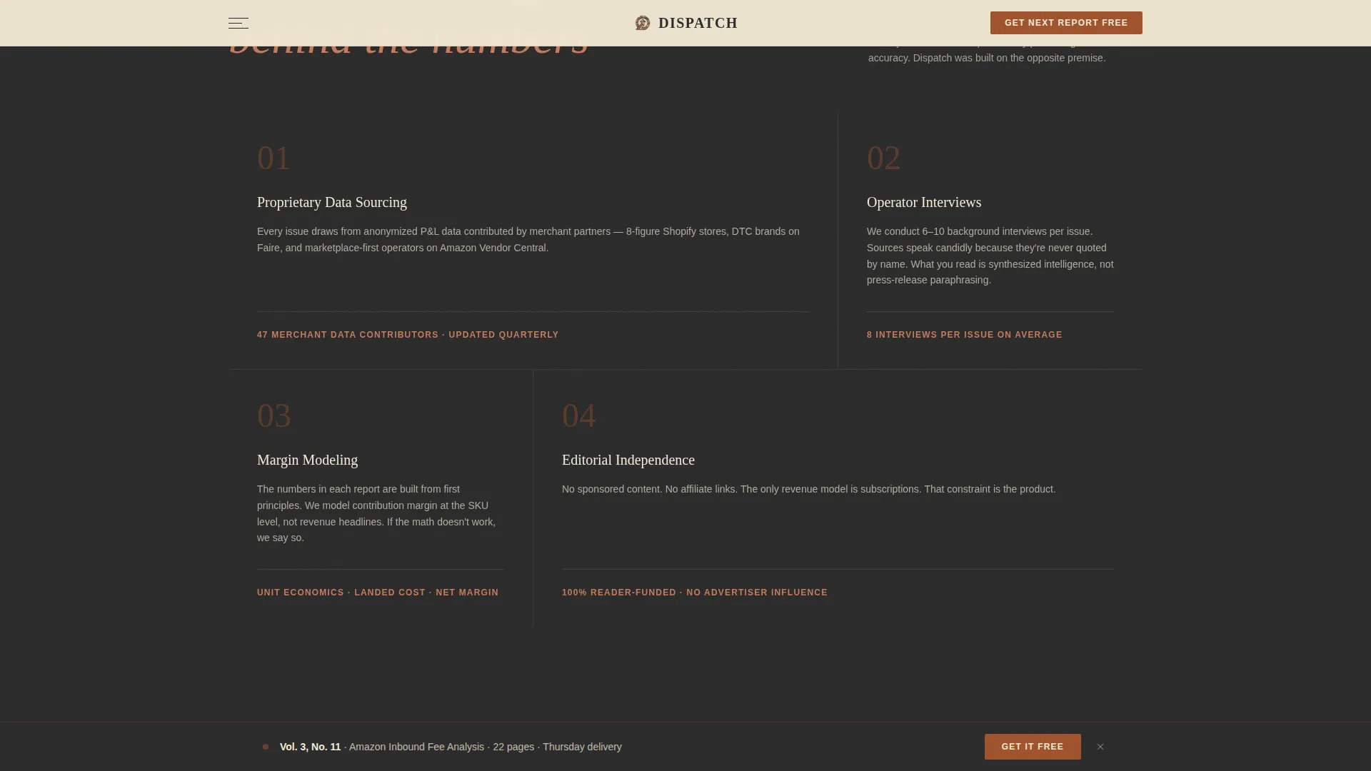
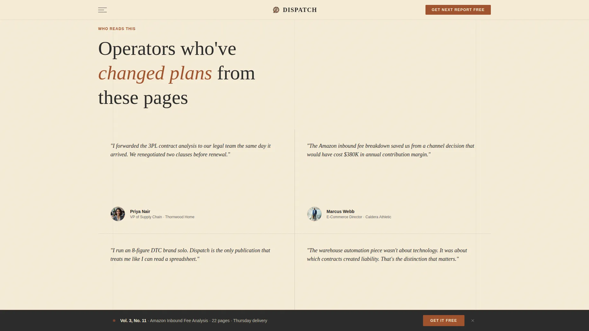
The manifesto section is a structured three-movement scroll. The first movement states why the reports exist. The second reveals how the data is sourced through proprietary methodology cards. The third shows who reads and acts on the content through headshots and single-line reader roles. Each movement deepens trust rather than repeating the same claim.
Redacted Table of Contents Teaser
The current issue is previewed as a partially blacked-out table of contents. Enough structure is visible to prove the report's depth. Enough is obscured to create real curiosity. This section sits directly above the sample PDF gate, so the impulse to read more is immediately actionable.
Two-Path Lead Generation Flow
The primary conversion form collects work email, company name, and a role dropdown with five options: Founder, Director, VP/C-Suite, Analyst, and Other. A secondary path offers a past report sample behind a single email field. Both gates are positioned at natural scroll-pause points in the page.
Persistent Call-to-Action Bar
After the visitor scrolls past the hero, a fixed bottom bar appears carrying the primary call to action. It stays visible without interrupting the reading experience. This ensures the conversion option is always one step away, regardless of where the reader is in the page.
Scroll-Reveal Animations and Hover States
Sections enter with scroll-triggered reveal animations. Methodology cards respond to hover. The subscription button uses the muted terracotta accent on hover states. A rotating badge adds editorial texture. These interactions are kept at a medium intensity, enough to feel alive without distracting from the content.
Page sections overview
| Section | Purpose |
|---|---|
| Hero Masthead | Establishes authority with giant headline, dateline, and dual call to action |
| Manifesto Block | Delivers the editorial "why" in an opinionated essay-style movement |
| Methodology Cards | Shows how data is sourced through proprietary non-uniform bento layout |
| Reader Social Proof | Builds trust with reader headshots and single-line role descriptions |
| Redacted TOC Teaser | Creates curiosity with a partially blacked-out current issue preview |
| Sample PDF Gate | Offers a past report behind a single-field email form |
| Persistent call to action Bar | Keeps the primary subscription action visible after first scroll |
| Footer | Horizontal flow layout closing the page cleanly |
Design & branding system
The visual identity is built around a Warm Artisan editorial theme. It evokes the physical weight of a leather-bound trade journal without sacrificing digital clarity.
- Color system: aged parchment cream (#F5ECD7) as the dominant background, deep editorial rust (#A0522D) for headlines and pull quotes, charcoal typeset black (#2B2B2B) for body text, and muted terracotta (#C67B5C) on hover states and subscription buttons
- Typography pairing: Fraunces serif for all headlines and pull quotes to carry ink-weight authority, DM Sans for body text to keep dense information readable at any size
- Motion and texture: scroll reveals, a marquee element, hover states on interactive cards, and a rotating badge add editorial texture at medium animation intensity
Mobile & speed optimization
The template is designed desktop-first, reflecting the reading habits of the senior operators it targets. A solid mobile layout is included so the page works across all devices without degradation.
- Desktop-first layout prioritizes the broadsheet reading experience on larger screens where operators typically consume long-form reports
- Mobile breakpoints preserve the typographic hierarchy and form usability without collapsing key trust elements
- The build uses server components for static content sections and keeps JavaScript minimal to support a responsive, fast-loading experience
How this template helps you convert
Every design and copy decision in Dispatch is arranged to move a skeptical operator from cold arrival to qualified subscription. The conversion logic is sequential and intentional.
- The hero section earns attention immediately with confident broadsheet typography and a thesis-led subhead, so the visitor understands the value proposition before scrolling a single pixel
- The manifesto, methodology, and social proof sequence builds layered conviction, replacing vague newsletter promises with demonstrated rigor before any form appears
- The redacted table of contents creates a specific, content-grounded reason to subscribe, making the "Get the Next Report Free" call to action feel earned rather than demanded
Other information about this template
Dispatch is part of a broader template library built around intersection-matched creative systems. A few additional details are worth noting for anyone evaluating this template.
- The footer uses a horizontal flow pattern suited to editorial publications with minimal navigational needs
- The role dropdown in the primary form captures five audience segments, making the subscriber data immediately useful for segmentation
- The template style is classified as Editorial/Magazine under the Blog and Editorial category, with a specific focus on the e-commerce industry report niche
- The color system, typography pairing, and animation approach are all specified at the component level, so customization does not require rebuilding the visual identity from scratch
- This template is a strong fit for operators building an e-commerce blog, industry media brand, or subscription intelligence desk targeting B2B decision-makers
Theme
Warm Artisan
Creative direction
Vision & Mission
Color system
Parchment & Rust
Style
Editorial/Magazine
Direction
Lead Generation
Page Sections
Giant Broadsheet Masthead Hero
Three-movement Manifesto Scroll
Redacted Table of Contents Teaser
Two-path Lead Generation Forms
Persistent Bottom Call-to-action Bar
Scroll-reveal Animations and Hover States
Related questions
Who is this landing page template designed for?
Does this template support two different conversion paths?
Can I use this template if my publication is just launching?
What makes this different from a standard newsletter sign-up page?
Is this template suitable for a desktop-heavy audience?



