Startup Fundraising Newsletter Specialist Blog Website Template
Dispatch is a masonry-style landing page template built for a weekly startup fundraising interview newsletter. It features a broadsheet masthead, a scroll-reveal editorial manifesto, a past issues grid, a sample Q&A section, and a five-question fundraising blind spot quiz that gates a personalized reading list behind email capture. The design channels an atelier editorial studio with an ink-on-paper aesthetic.
by Rocket studio
Quick summary
Dispatch is a single-page editorial landing page template for a weekly founder interview newsletter. It captures the seventy-two-hour post-close window in startup fundraising. The layout pairs a broadsheet masthead and masonry card grid with a scroll-reveal manifesto and an interactive five-step blind spot quiz that earns subscriber emails by delivering value first.
Who this template is for
This template is built for newsletter founders and editorial creators who serve the startup fundraising intelligence space. It speaks directly to audiences who value editorial authority over hype.
- Pre-seed founders who want raw, unfiltered deal intelligence before investor calls
- Solo general partners and angel syndicates sourcing signal from founder interviews
- Newsletter builders and media operators launching a startup fundraising interview publication
What problem this template solves
Most fundraising content arrives after the public narrative has already been polished and packaged for LinkedIn. Readers who need actual deal intelligence get there too late. This template helps a newsletter creator build instant editorial credibility and capture subscribers at exactly the right moment of intent.
- Generic newsletter pages fail to communicate the editorial depth that sophisticated investors and founders expect
- Standard email capture forms do not earn trust before asking for a commitment
- Masonry grids and quiz flows are hard to assemble without a purpose-built editorial structure
What you get with this template
You get a fully structured single-page layout that combines editorial design with a conversion-led quiz flow. Every section is intentional and built around the Dispatch content model.
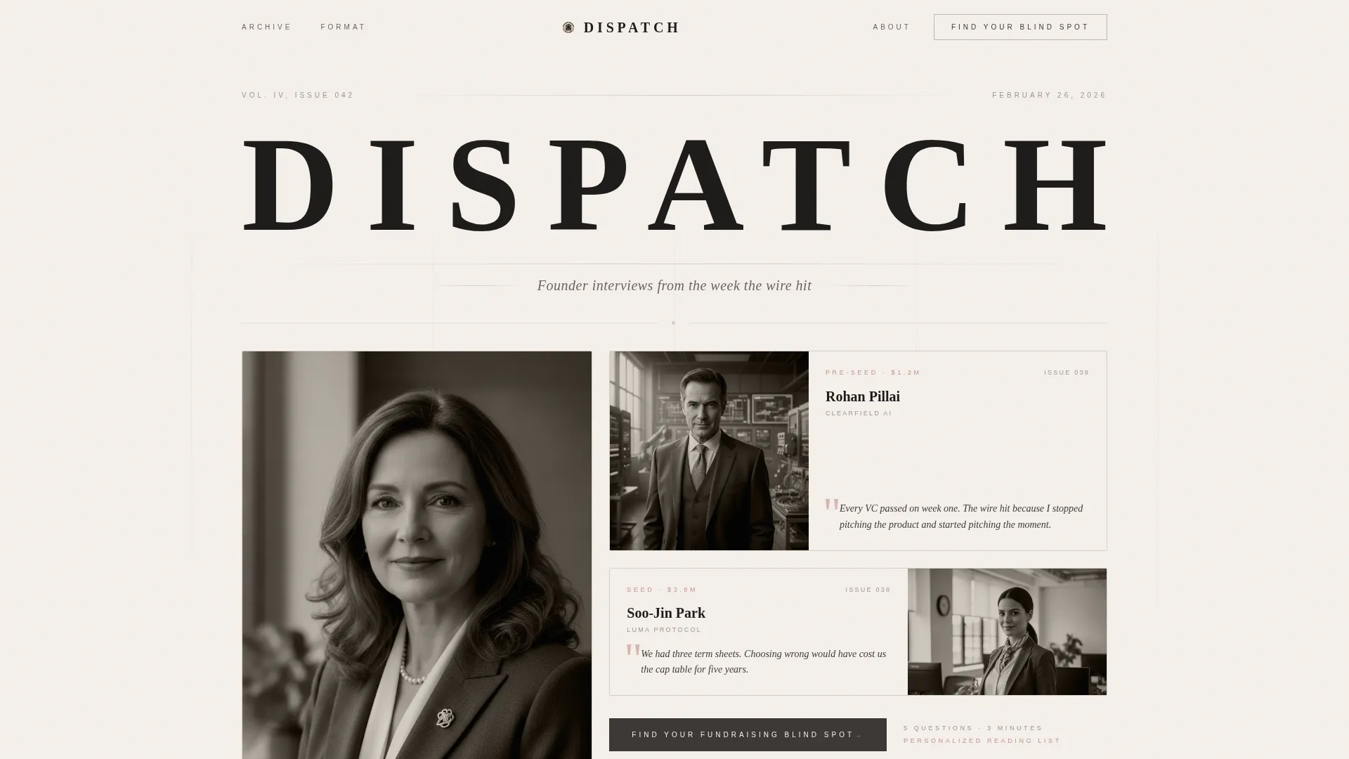
- A broadsheet hero masthead with three duotone founder preview masonry cards and pull quotes
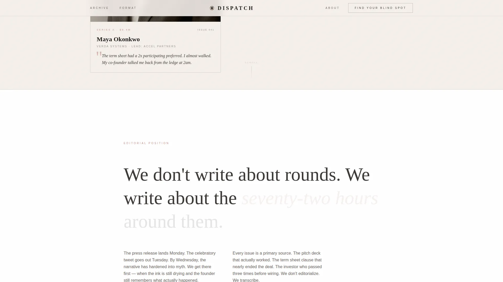
- A scroll-reveal editorial manifesto with four distinct content acts and alternating typography
- A five-question fundraising blind spot diagnostic with a personalized reading list and gated email capture
Feature list
Broadsheet Masthead with Masonry Preview Cards
The hero section presents "DISPATCH" in a high-contrast serif at newspaper scale, flanked by a dateline and issue number. Below it, three masonry cards preview recent founder profiles with tightly cropped duotone portraits, round size in small caps, and one pull quote per card.
Scroll-Reveal Manifesto with Four Editorial Acts
The manifesto unfolds through four scroll-driven sections. It opens with an editorial declaration, expands into a masonry past-issues grid, introduces the interview format through a sample Q&A with alternating type weights, and narrows to a single-column direct address before the quiz.
Five-Step Fundraising Blind Spot Quiz
The primary call to action launches a five-question scenario-based diagnostic. Questions use real fundraising situations rather than self-assessments. Results match readers to a personalized list of three back-issues based on their identified gap, whether that is narrative positioning, valuation framing, investor targeting, deck structure, or term sheet literacy.
Value-First Email Capture Flow
The email capture field appears only after the final quiz question and the result is revealed. This sequence earns the subscriber address by proving value before asking for it. A secondary subscribe field sits below the quiz for readers who already know they want in.
GSAP-Powered Animation and Grain Overlay
The template uses scroll-reveal word animations, masonry stagger transitions, and magnetic button effects built with GSAP. A grain overlay adds tactile depth to the parchment background, reinforcing the ink-on-paper editorial aesthetic throughout the page.
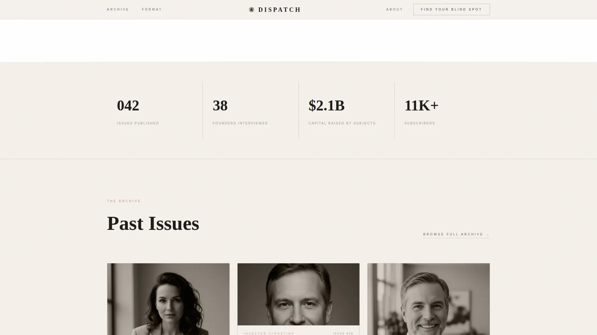
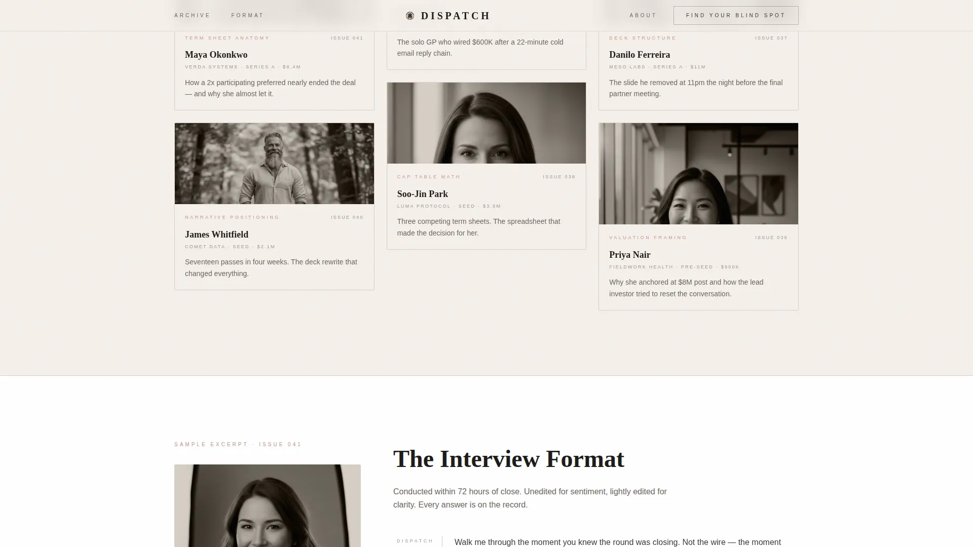
Past Issues Masonry Bento Grid
A dedicated section fans out a masonry bento grid of archived issues. Each card signals the publication's depth and consistency, building visual proof of editorial history before the quiz ask.
Page sections overview
| Section | Purpose |
|---|---|
| Hero Masthead | Establishes broadsheet authority and previews three founder profiles |
| Manifesto Declaration | Declares editorial values with a scroll-reveal statement |
| Past Issues Grid | Shows archived issue depth through a masonry bento layout |
| Sample Q&A Excerpt | Demonstrates interview format with alternating typography |
| Blind Spot Quiz | Runs a five-question diagnostic and delivers a personalized reading list |
| Subscribe Field | Offers a direct email capture path for ready subscribers |
| Footer | Presents publication identity in a horizontal flow layout |
Design & branding system
The visual identity follows an atelier editorial studio direction built on the Soft Mist color system. Every color and typeface choice reinforces the feeling of a print publication that has existed for decades.
- Warm parchment (#F5F0EB) dominates the background, studio fog (#D6CFC7) separates card clusters, graphite pencil (#3B3735) carries all body text, and dried rose (#C4918A) appears only on interactive states and pull-quote marks
- Cormorant Garamond handles all display and serif headings; DM Sans handles body text and labels
- No stock imagery and no gradients; duotone founder portraits and broadsheet typography signal editorial restraint and taste
Mobile & speed optimization
The template is designed desktop-first to match an editorial reading context, with a fully responsive layout that adapts cleanly to smaller screens. Server Components handle static sections while Client Components manage the interactive quiz flow.
- Static editorial sections render as Server Components to keep initial load light
- The five-step quiz runs as a Client Component with its own state machine and animated transitions
- Masonry stagger and scroll-reveal animations are structured to complement the reading flow on both desktop and mobile viewports
How this template helps you convert
The conversion architecture is built around earning trust before making an ask. Every section moves the reader closer to subscribing without feeling like a traditional email capture page.
- The masonry preview cards and editorial manifesto establish credibility before any call to action appears, so readers arrive at the quiz already invested in the content.
- The five-question blind spot diagnostic delivers a personalized reading list, making the email capture feel like an unlock rather than a gate, which increases the quality and intent of each subscriber captured.
Other information about this template
This template is categorized under Blog and Editorial with a focus on the startup fundraising interview and profile newsletter niche. It is built as a single landing page with a masonry and Pinterest-style visual layout, making it well suited for editorial newsletters that need to convey depth at a glance.
- The creative direction follows a Manifesto approach, meaning the page builds a point of view before it makes any conversion ask
- The header concept is modeled on a Newspaper and Publication broadsheet format, which sets an authoritative first impression for a B2B media product
- The template style is Masonry and Pinterest, suited to a content-rich publication with multiple archived issues to surface
- The landing page direction is Quiz and Assessment, a conversion pattern that works especially well for high-intent readers who need proof of value before subscribing
Theme
Atelier Studio
Creative direction
Manifesto
Color system
Soft Mist
Style
Masonry/Pinterest
Direction
Quiz/Assessment
Page Sections
Broadsheet Masthead with Masonry Cards
Scroll-reveal Editorial Manifesto
Five-step Blind Spot Diagnostic Quiz
Value-first Gated Email Capture
GSAP Animations and Grain Overlay
Past Issues Masonry Bento Grid
Related questions
Can I use this template for a newsletter that covers topics beyond startup fundraising?
Does the quiz send personalized results automatically, or do I configure that separately?
Is this template suitable for a new newsletter with no archived issues yet?
What makes the email capture in this template different from a standard subscribe form?
What page layout style does this template use?



