Healthtech Newsletter Landing Page Template
Dispatch is a healthtech newsletter landing page template built around a masonry edition wall, a looping video header, and a waitlist email capture flow. It serves editorial brands in the digital health space that want to convert professional readers into subscribers. The design follows a warm Ink and Paper theme using linen, sandstone, and ink-black tones for a broadsheet feel.
by Rocket studio
Quick summary
Dispatch is a single-page landing page template designed for a healthtech weekly newsletter. It pairs a Short-Form Reel header with a masonry archive wall, a live subscriber counter, and a low-friction email capture form. The tone is editorially confident, the palette is warm and analog, and every section is built to move a scanning professional toward hitting "Hold My Seat."
Who this template is for
This template is built for editorial brands, independent journalists, and newsletter operators working inside the digital health and healthtech space. It suits anyone launching or growing a weekly briefing aimed at time-pressed professionals who need curated signal rather than raw noise.
- Hospital innovation officers, health-tech founders, and venture associates who publish for their peers
- Independent editors running a healthtech weekly newsletter who need a credible first impression
- Digital health consultants or communications professionals building an audience around curated industry intelligence
What problem this template solves
Healthtech professionals are drowning in sources. A newsletter that replaces forty open tabs still has to earn attention before the first issue is even sent. Most newsletter landing pages either look like generic SaaS sign-up forms or cluttered blogs. Neither builds the editorial trust that converts a skeptical professional reader.
- Visitors leave before subscribing because the page fails to demonstrate the quality of the writing
- A long-form sign-up flow with multiple fields kills momentum for busy B2B readers
- Without a visible proof layer, first-time visitors have no reason to hand over their inbox address
What you get with this template
You get a complete single-page layout that covers every stage of the subscriber journey, from first impression to email capture. All sections are structured, designed, and wired for a healthtech newsletter context out of the box.
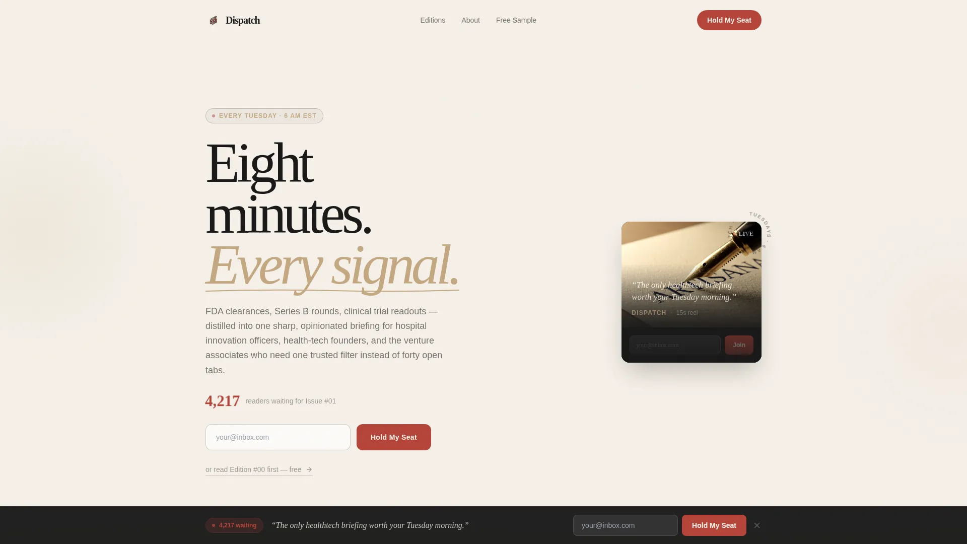
- A looping video header with an overlay email form and live signup counter
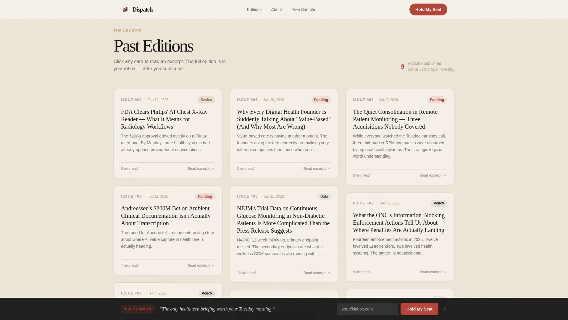
- A masonry edition wall with expand-on-click cards, pull-quote rows, and a free sample download path
- A sticky bottom subscribe bar that activates after two scroll depths, plus an editor spotlight section for credibility
Feature list
This template ships with six purpose-built features grounded in the source brief. Each one serves a specific conversion or credibility function.
Looping Video Header with Inline Email Capture
The header plays a fifteen-second macro-lens reel showing a fountain pen writing on textured stock, cutting to the newsletter on a phone screen. A serif headline fades over the final frame. The subscriber counter and email field sit inside the reel frame so the call to action is immediate.
Masonry Edition Wall with Expand-on-Click Cards
Past edition cards are arranged in a Pinterest-style masonry grid. Each card displays an edition date, a bold headline, a one-line teaser, and a category tag such as Policy, Funding, Device, or Data. Clicking a card expands an excerpt rather than the full piece, building curiosity rather than giving everything away.
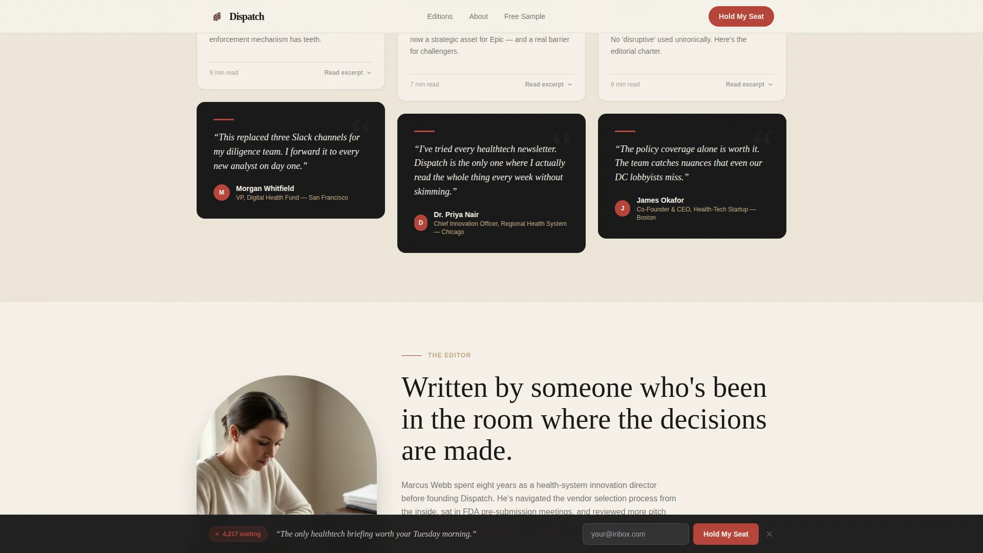
Pull-Quote Rows Between Grid Sections
Every third row of the masonry grid breaks to display a named reader pull-quote. These quotes are attributed with a reader title, such as VP at a Digital Health Fund, and they interrupt the browse rhythm with social proof before the visitor returns to the archive wall.
Live Subscriber Counter
A prominent counter displays the current waitlist number in marginal-note red above the email field. The count reinforces demand and creates soft urgency without relying on countdown timers or artificial pressure tactics.
Sticky Subscribe Bar
After two scroll depths, a sticky bar appears at the bottom of the viewport. It carries the same single-field email form and the "Hold My Seat" call to action, ensuring the conversion path is always visible without interrupting the reading experience above.
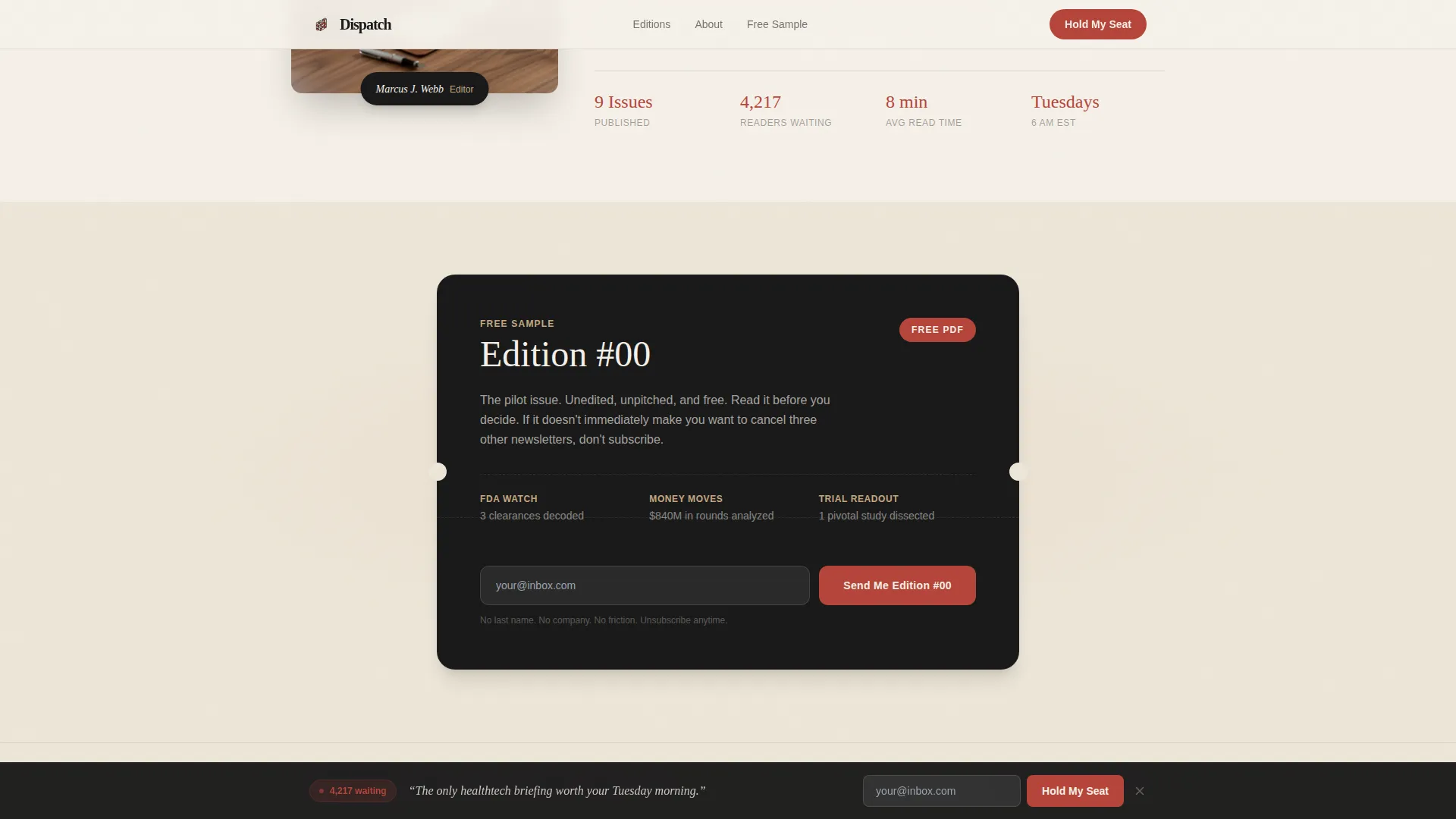
Free Sample Download Path
A dedicated call-to-action section offers "Read Edition #00" as a downloadable sample. Hesitant visitors can request proof of editorial quality through the same email field, capturing their address while giving them a reason to trust the newsletter before committing to the waitlist.
Page sections overview
| Section | Purpose |
|---|---|
| Hero Reel Header | Introduces the newsletter, shows the video loop, and presents the primary email capture with the live subscriber counter |
| Edition Masonry Wall | Displays past edition cards in a masonry grid with expand-on-click excerpts and pull-quote rows every three rows |
| Editor Spotlight | Anchors credibility with the editor's photo, name, and a two-sentence bio |
| Free Sample Call to Action | Offers Edition #00 as a downloadable proof piece, capturing email from visitors who want to read before subscribing |
| Footer | Closes the page with horizontal layout branding and supporting links |
Design & branding system
The visual identity follows an Ink and Paper theme built on a Warm Stone color system. The palette is deliberately quiet and analog, modeled after a well-loved notebook rather than a neon software product. Typography pairs DM Serif Display for headlines with Manrope for body text and interface elements.
- Colors: unbleached linen (#F5F0E8) and deeper parchment (#EDE6D8) for backgrounds, dried ink black (#1A1A1A) for body text, sandstone tan (#C4A882) for bylines and metadata, and marginal-note red (#B5453A) reserved for links, counters, and the subscribe button
- Typography: DM Serif Display brings broadsheet weight to headlines; Manrope keeps body copy and user interface elements clean and readable
- Animation style: medium-weight stagger reveals, noise texture overlay, and masonry layout transitions create tactile warmth without heavy visual distraction
Mobile & speed optimization
The template is designed desktop-first to match the morning routine scanning habits of its target audience, but it maintains full mobile parity so subscribers can arrive from any device. The build approach favors static-first rendering with no heavy JavaScript dependencies.
- Desktop-first layout reflects how hospital innovation officers and venture associates scan during their morning routine
- Mobile parity ensures the masonry wall, sticky bar, and card expand-on-click behavior work cleanly on smaller screens
- Static-first construction avoids heavy JavaScript dependencies, keeping load behavior lean and predictable
How this template helps you convert
The page is structured as a layered persuasion sequence. Each section adds a reason to trust the newsletter before asking for an email address again.
- The video header and live counter create immediate credibility and signal demand, prompting the first conversion attempt before the visitor even scrolls
- The masonry edition wall lets visitors sample the editorial voice across multiple past issues, building trust through evidence rather than claims
- The sticky subscribe bar and free sample download path give two additional conversion moments for visitors who needed more proof before committing
Other information about this template
This template is categorized under Blog and Editorial with a HealthTech Newsletter subcategory. It is built for the specific intersection of editorial credibility and professional audience conversion in the digital health space.
- Template style: Masonry and Pinterest grid layout
- Header concept: Short-Form Reel with a fifteen-second looping macro-lens video
- Creative direction: Creator Spotlight anchoring the editor identity section
- Landing page direction: Waitlist and Coming Soon, optimized for pre-launch subscriber capture
- The email capture form intentionally asks for no last name, no company field, and no extra friction, only an inbox address
Theme
Ink & Paper
Creative direction
Creator Spotlight
Color system
Warm Stone
Style
Masonry/Pinterest
Direction
Waitlist/Coming Soon
Page Sections
Looping Video Header with Email Capture
Masonry Edition Wall
Pull-quote Social Proof Rows
Live Subscriber Counter
Sticky Subscribe Bar
Free Sample Download Path
Related questions
How many times does the email form appear on the page?
Can I edit the edition cards and pull-quote blocks?
Is this template suited for a newsletter that has not launched yet?
What information does the email form ask for?
What does the sticky subscribe bar look like and when does it appear?



