Investigative Logistics Blog Landing Page Template
Dispatch is a hub-and-spoke anchor-nav landing page template built for investigative logistics publications. It combines a broadsheet-style masthead, beat-driven editorial sections, and persistent navigation to deliver credible freight analysis to operations managers, procurement leads, and logistics consultants. The design pairs aged newsprint aesthetics with sharp click-through mechanics and a frictionless newsletter signup.
by Rocket studio
Quick summary
Dispatch is an editorial landing page template designed for a logistics review publication. It presents a full-viewport newspaper masthead, five coverage beat sections, a founder's letter, and a sticky newsletter banner. The layout guides readers from first impression through deep editorial content, building trust and driving article click-throughs at every scroll step.
Who this template is for
This template suits anyone building a serious logistics media brand or trade publication. It is made for publishers who want their content to feel authoritative, not generic.
- Operations managers and procurement leads who need sharp, current freight intelligence
- Logistics consultants who share credible analysis with clients
- Editorial teams launching a logistics blog or trade review with a distinct voice
What problem this template solves
Most logistics content online reads like repurposed press releases. There is no structure that signals depth, credibility, or beat-level expertise at a glance. Readers with professional stakes leave immediately when a page feels thin.
- Generic blog layouts fail to communicate editorial authority to freight industry readers
- Scattered content with no clear navigation makes it hard for busy ops professionals to find relevant coverage
- Weak calls to action mean newsletter signups and article click-throughs stay low despite good writing
What you get with this template
You get a fully structured, single-page editorial hub that organizes logistics content into five named coverage beats. Every section is built to accumulate reader trust and move them toward a click or a signup.
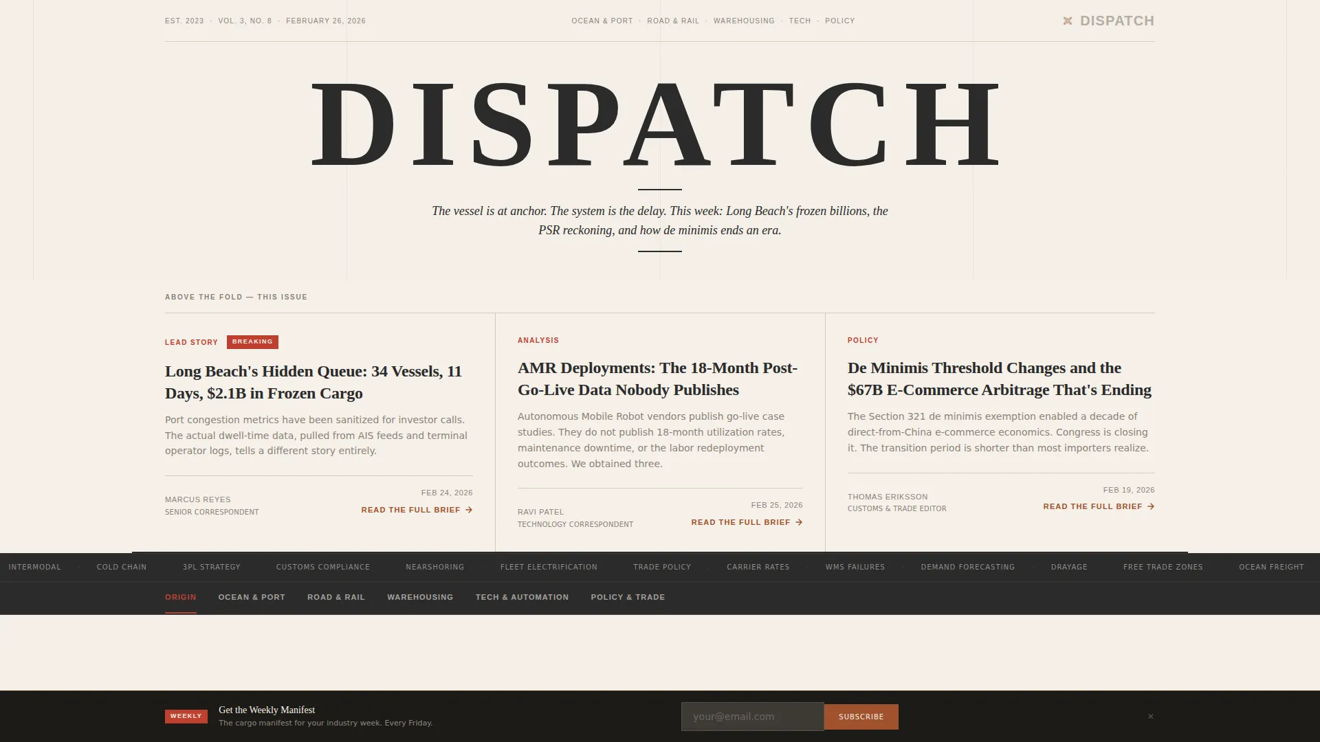
- A broadsheet-style hero masthead with three above-the-fold article preview cards and a persistent anchor navigation bar
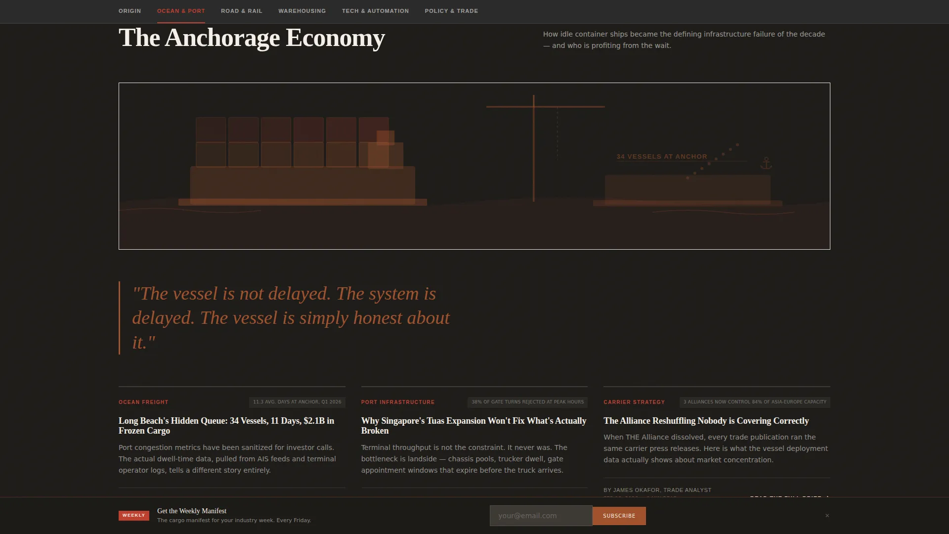
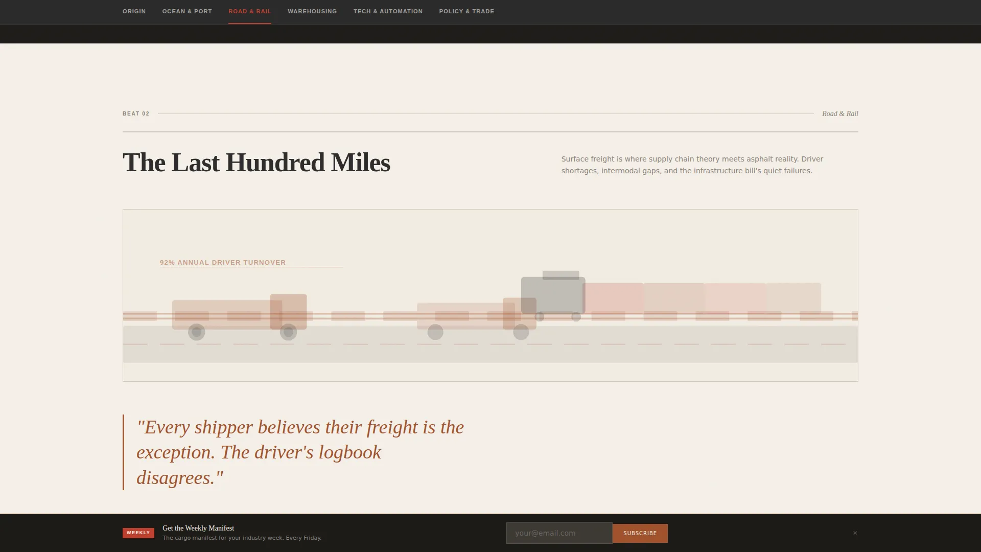
- Five beat sections (Ocean & Port, Road & Rail, Warehousing, Tech & Automation, Policy & Trade), each opening with an editorial illustration and presenting three article preview cards
- A founder's letter section for origin story credibility, plus a sticky newsletter signup banner with a single email field
Feature list
This template is built around a clear editorial logic. Every component serves either trust-building or conversion.
Broadsheet Masthead with Article Previews
The hero section renders "DISPATCH" in a full-viewport heavyweight serif nameplate, wide-kerned like a classic broadsheet. A dateline and italic deck headline sit below it. Three column-width article preview cards appear above the fold, each carrying a stamp-red category slug, a bold headline, a two-line opening paragraph, and a byline.
Persistent Anchor Navigation
A sticky navigation bar anchors readers to each coverage beat throughout the scroll. Readers can jump directly to Ocean & Port, Road & Rail, Warehousing, Tech & Automation, or Policy & Trade without losing context. Anchor highlights use the faded stamp red from the color system for instant visual orientation.
Beat-Driven Editorial Sections
Each of the five beat sections opens with a full-width editorial illustration rendered in muted rust tones. Three article preview cards follow, each with a category label, headline, opening paragraph, data point, and a "Read the Full Brief" call-to-action link. The layout mimics turning through newspaper sections.
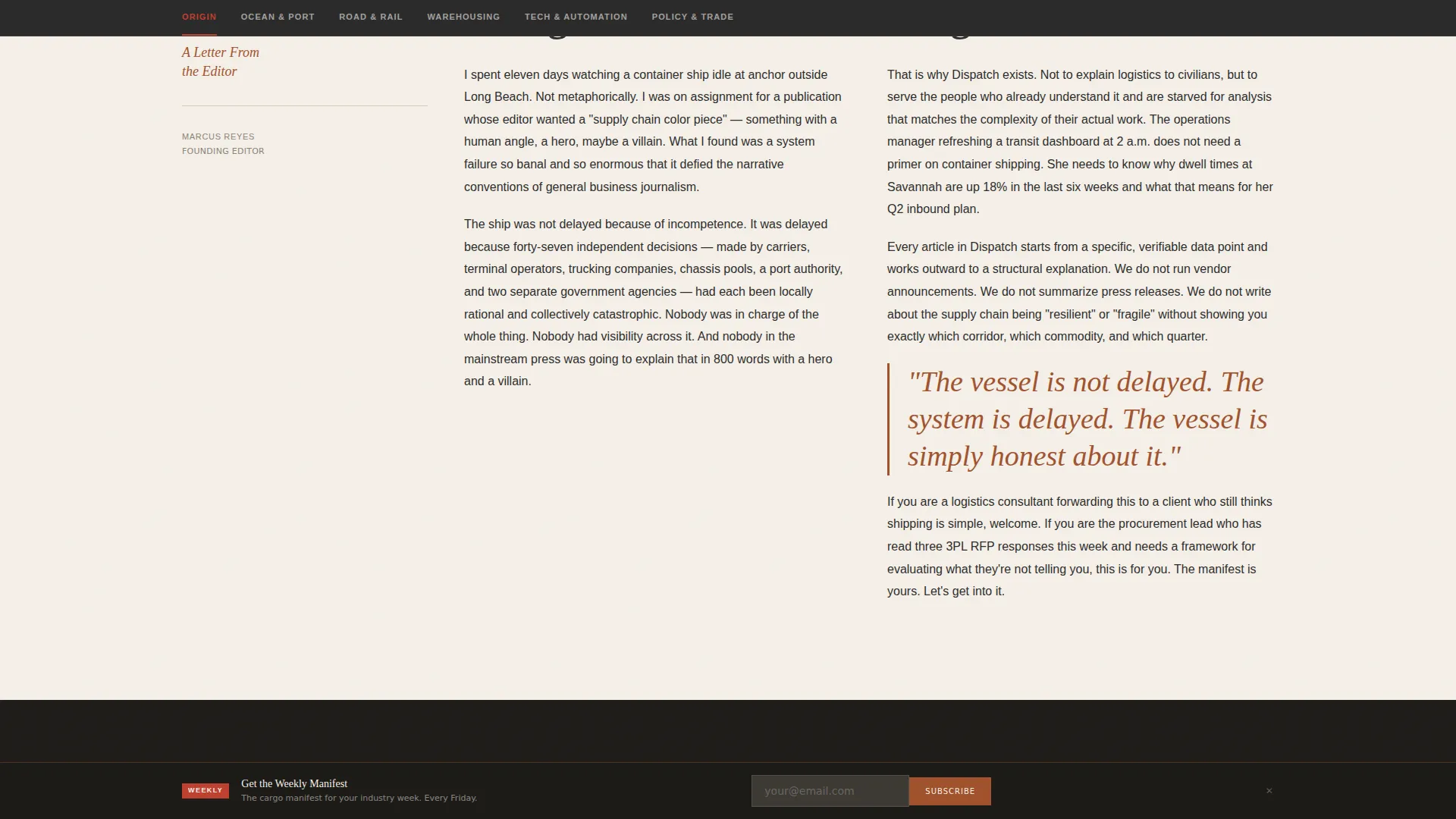
Founder's Letter Column
The section directly below the hero presents a first-person founder's letter. It explains the publication's editorial mission in the voice of a column, establishing credibility before the reader reaches any beat content. The cadence is intentionally unhurried and direct.
Sticky Newsletter Banner
A persistent banner sits at the bottom of the viewport throughout the scroll. It presents a single email input field and the label "Get the Weekly Manifest." No secondary fields, no extra friction. It stays visible without interrupting reading.
Scroll-Triggered Transitions and Hover Effects
The template includes medium-weight animation: marquee scrolling elements, hover reveals on article cards, and scroll-triggered section transitions between beats. These details reinforce the editorial newspaper feel without slowing the page experience.
Page sections overview
| Section | Purpose |
|---|---|
| Hero Masthead | Display nameplate, deck headline, and three above-the-fold article previews |
| Anchor Navigation Bar | Provide persistent jump links to all five coverage beats |
| Founder's Letter | Establish origin story and editorial credibility in first person |
| Ocean & Port Beat | Present three article cards covering ocean freight and port analysis |
| Road & Rail Beat | Present three article cards covering trucking and rail freight topics |
| Warehousing Beat | Present three article cards covering warehouse operations coverage |
| Tech & Automation Beat | Present three article cards covering logistics technology topics |
| Policy & Trade Beat | Present three article cards covering freight regulation and trade policy |
| Footer | Minimal horizontal flow layout with publication links |
Design & branding system
The visual identity is built on an Editorial Magazine theme using a Parchment & Rust color system. The palette evokes aged trade documents: yellowed paper, iron-oxide stains, and typewriter carbon.
- Core colors: aged newsprint cream (#F5F0E8), oxidized container rust (#A0522D), freight-bill charcoal (#2B2B2B), and faded stamp red (#C04030) reserved for nav highlights, pull quotes, and breaking tags
- Typography pairs Fraunces (a heavyweight serif for display headings and the masthead) with DM Sans (a clean sans-serif for body text and interface elements)
- Backgrounds alternate between deep charcoal for featured longform beat sections and warm parchment for article index areas, with rust functioning as the editorial accent that draws the eye
Mobile & speed optimization
The template is built desktop-first to match the working environment of its primary audience: operations managers on logistics dashboards. Full mobile support is included so the reading experience holds on any device.
- Server Components handle static editorial content to keep JavaScript minimal and page load lean
- Sticky components (anchor nav and newsletter banner) are optimized to remain functional on smaller viewports without overlapping critical reading areas
- Marquee scrolling, hover reveals, and scroll-triggered transitions are set to medium intensity, preserving visual polish without heavy resource demands
How this template helps you convert
Every design and content decision in this template is oriented toward two outcomes: article reads and newsletter signups. The structure earns both without resorting to aggressive interruption.
- Article preview cards give away sharp headlines, opening paragraphs, and specific data points, making the "Read the Full Brief" call to action feel like a natural next step rather than a forced gate
- The sticky newsletter banner remains visible throughout the entire scroll journey, offering "Get the Weekly Manifest" at exactly the moment a reader has consumed enough content to see the value
Other information about this template
This template is part of the Blog & Editorial category, specifically designed for the Logistics Blog & Media subcategory and the Logistics Review Blog niche. It uses the Hub & Spoke (Anchor Nav) template style, which means the entire reading experience lives on one scrollable page organized around named beats.
- The creative direction follows an Origin Story approach, making the founder's letter a structural anchor for trust, not an afterthought
- The header concept is Newspaper/Publication, a deliberate choice to signal editorial seriousness through typography alone, with no imagery in the hero
- The landing page direction is Click-Through, meaning every section is designed to move readers deeper into content rather than toward a traditional lead-capture form
- The footer uses a minimal horizontal flow pattern, keeping the closing section clean and on-brand without adding visual noise
Theme
Editorial Magazine
Creative direction
Origin Story
Color system
Parchment & Rust
Style
Hub & Spoke (Anchor Nav)
Direction
Click-Through
Page Sections
Broadsheet Masthead with Article Previews
Persistent Anchor Navigation Bar
Five Beat-driven Editorial Sections
Founder's Letter Column
Sticky Newsletter Signup Banner
Scroll-triggered Animation and Hover Effects
Related questions
Can I use this template for any logistics content, or is it specific to one niche?
Do I need to supply my own article content and illustrations?
How does the anchor navigation work?
Is the newsletter signup connected to an email platform?
Can I add or remove beat sections?



