Mobile Dev Newsletter Landing Page Template
Dispatch is a single-page editorial landing page template built for a weekly mobile development jobs newsletter. It uses an asymmetric 60/40 grid, a Heritage editorial visual identity, and a single-field email capture flow. The design earns subscriber trust by showing real market insight before asking for anything in return.
by Rocket studio
Quick summary
Dispatch is a lead generation landing page template for a weekly mobile development jobs and opportunities newsletter. It pairs a cinematic 60/40 asymmetric grid layout with a warm editorial design system. The page walks visitors through a market snapshot, featured roles, and a curated industry essay before presenting the subscribe call to action.
Who this template is for
This template is built for newsletter operators serving the mobile development industry. It suits creators who want a polished, publication-grade page without starting from scratch.
- Mobile development newsletter publishers targeting mid-senior iOS and Android engineers
- Independent developers or engineering managers building a subscriber base in the tech hiring space
- Content-led newsletter operators who want to demonstrate value before asking for an email address
What problem this template solves
Most newsletter landing pages lead with a pitch. Dispatch leads with proof. Engineers are skeptical readers. They need to see real signal before they share their inbox.
- Generic landing pages fail to reflect the editorial quality of a well-researched newsletter
- Job-board-style layouts feel transactional and do not build the trust that mid-senior engineers expect
- Single-column designs waste the opportunity to show content depth and visual authority side by side
What you get with this template
You get a complete, ready-to-adapt single-page layout structured around editorial storytelling and a focused conversion goal. Every section is designed to deepen credibility as the visitor scrolls.
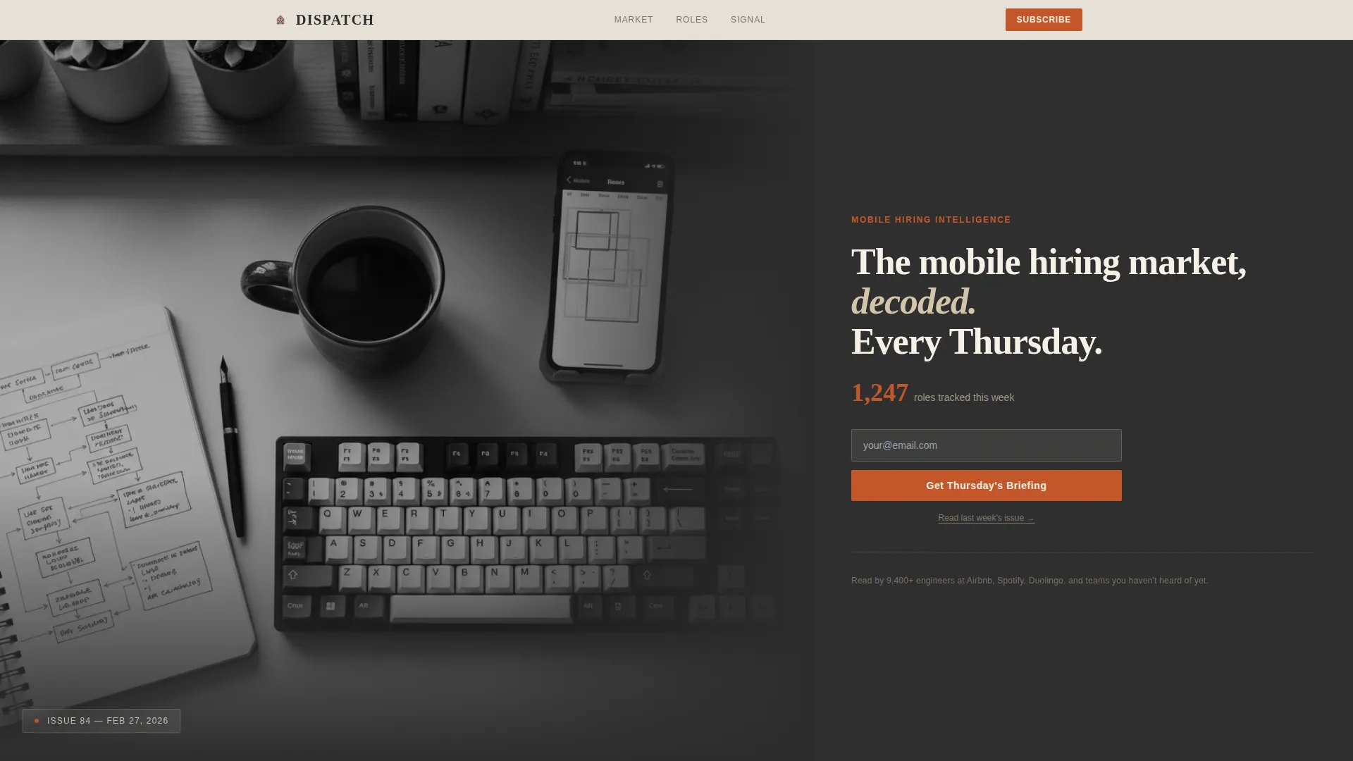
- A 60/40 asymmetric grid hero section with a large-format photograph and above-the-fold subscribe form
- Three content sections covering a market snapshot chart, editorial role cards, and a curated industry signal essay
- A floating sticky bottom bar and a final subscribe section, both using the same single-field email capture
Feature list
The template is built around a set of purposeful, prompt-backed layout and interaction features. Each one serves the goal of converting a skeptical engineer into a subscriber.
Asymmetric 60/40 Editorial Grid
The page uses a consistent 60/40 column split throughout. The wider column carries visual and data content; the narrower column holds annotation, copy, and calls to action. This creates a newspaper-like reading rhythm that feels authoritative and familiar.
Half-Page Photo and Text Hero
The header places a large-format black-and-white developer desk photograph in the left 60% column. The right 40% carries an editorial serif headline, a terracotta-accented role count stat, and the primary subscribe field. Everything a visitor needs to decide is visible before they scroll.
Market Snapshot Section with Annotation Layout
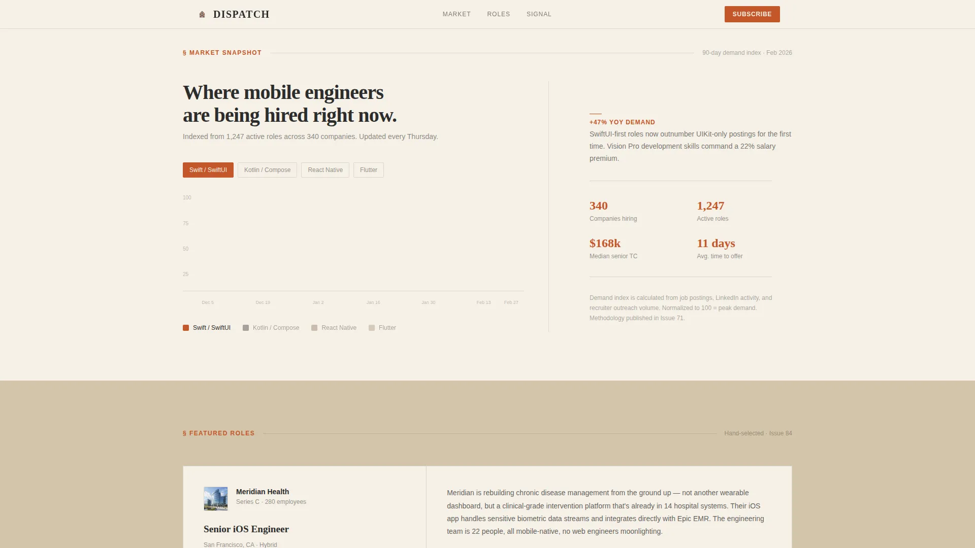
The market snapshot section uses the asymmetric grid to display a hand-drawn-style demand chart for Swift, Kotlin, React Native, and Flutter roles over 90 days. Annotation callouts sit in the 40% column beside the chart, guiding the reader through the data without overwhelming them.
Editorial Role Cards
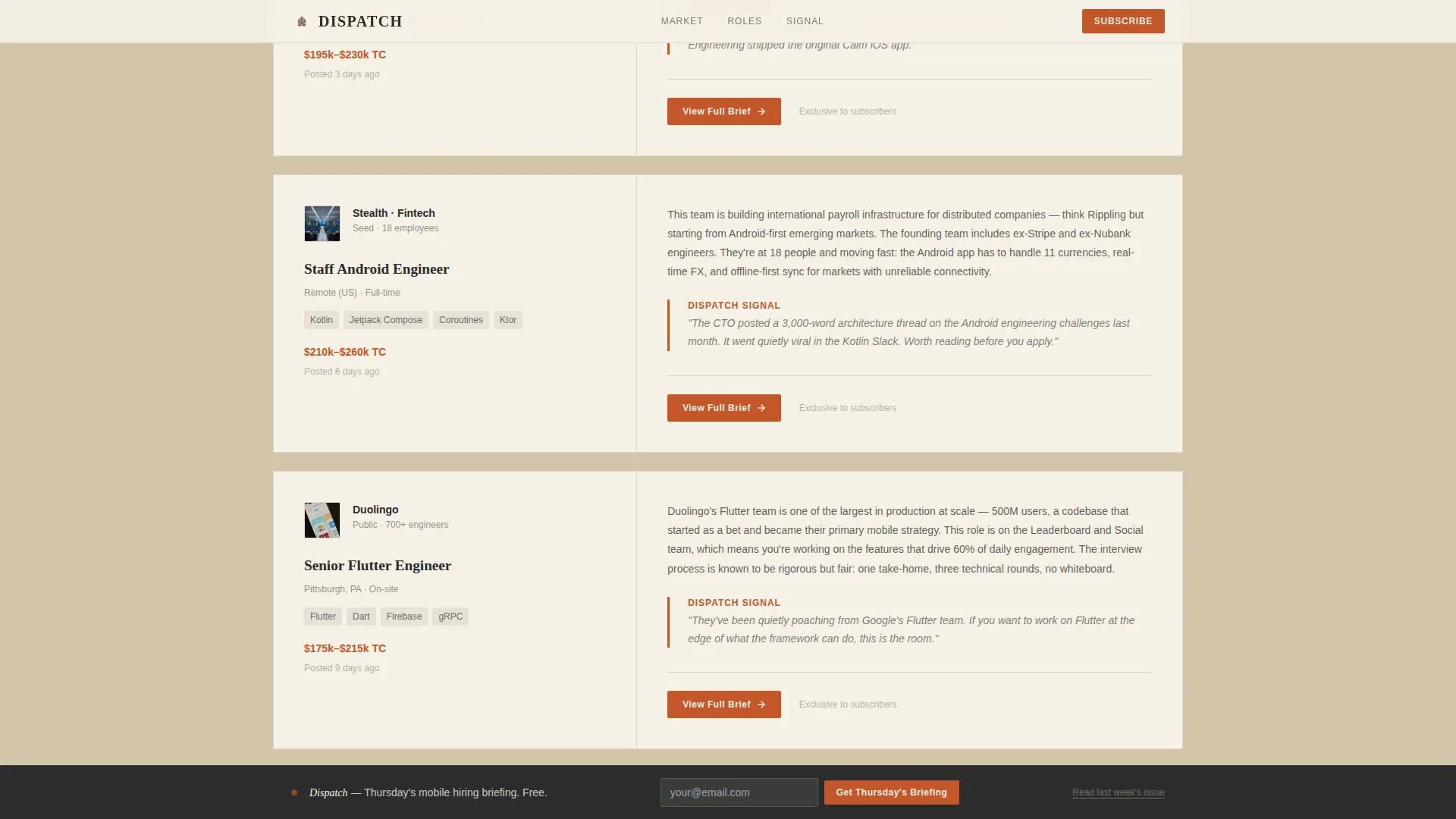
Three featured roles are presented as editorial cards with company context paragraphs rather than job-board listings. Each card communicates who the team is, what they are building, and why the opportunity is worth noticing right now.
Floating Sticky Subscribe Bar
After the visitor scrolls past the market snapshot, a bottom bar floats into view with the primary call to action. It stays accessible throughout the rest of the page without interrupting the reading experience. A secondary text link beneath each call to action offers access to a previous issue.
Signal Essay Section
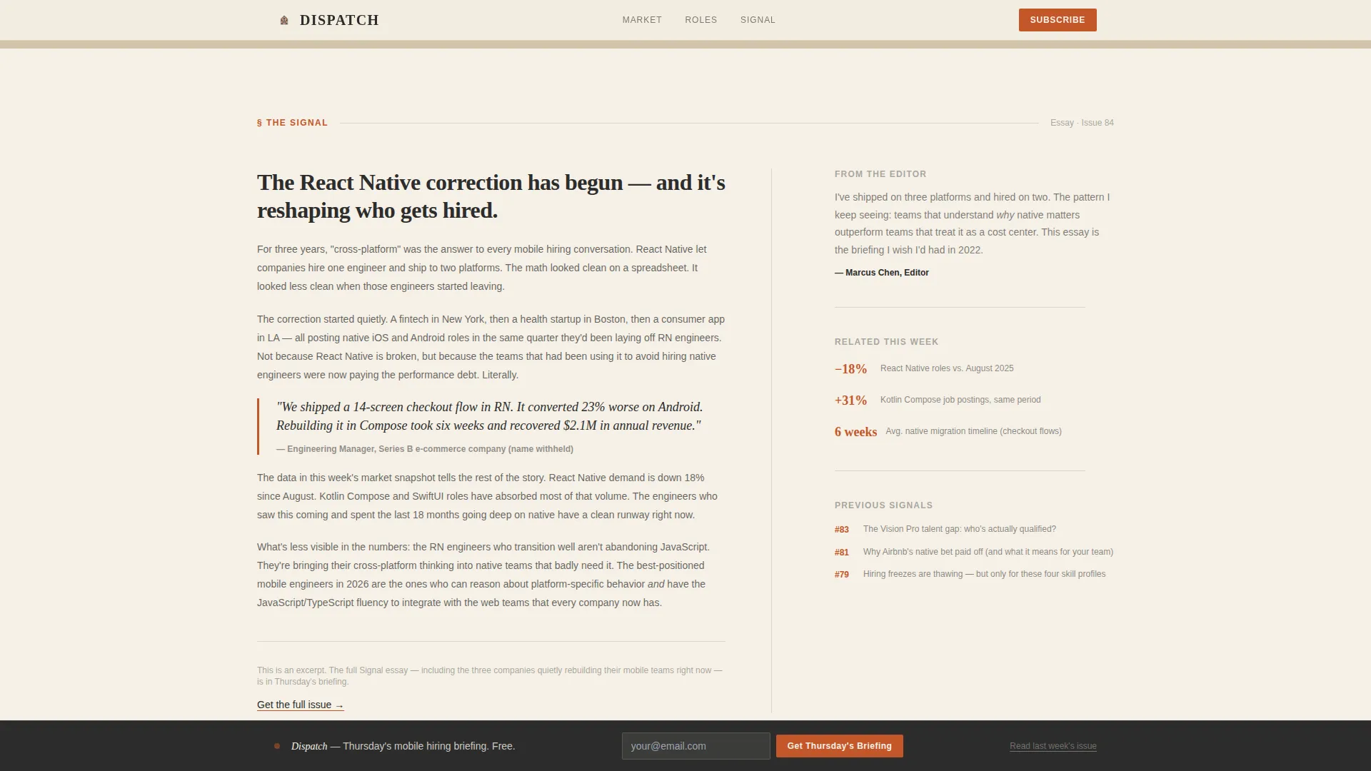
A curated industry essay excerpt occupies its own dedicated section. Written in the voice of someone who ships mobile code, it covers a meaningful shift such as a framework change, an acquisition, or a hiring trend. This section demonstrates editorial depth before the final conversion ask.
Page sections overview
| Section | Purpose |
|---|---|
| Hero Header | Photograph, headline, stat, and above-the-fold subscribe form |
| Market Snapshot | Demand chart for mobile frameworks with annotation callouts |
| Featured Role Cards | Three editorial role cards with team and context paragraphs |
| Signal Essay | Curated industry insight excerpt demonstrating editorial voice |
| Subscribe Call to Action | Final email capture section with floating sticky bottom bar |
| Footer | Horizontal flow footer with supporting links and attribution |
Design & branding system
The visual identity follows a Heritage and Story theme. Every color and typeface choice reinforces the feeling of a trusted, long-running publication rather than a generic software product.
- Color palette: aged parchment (#F5F0E6) and quarry sandstone (#D4C5A9) alternate as section backgrounds; deep editorial charcoal (#2C2C2C) anchors all body text; kiln-fired terracotta (#C4572A) is reserved for links, buttons, and data callouts only
- Typography pairing: Fraunces serif is used for display headlines to create editorial weight; DM Sans handles body text and interface elements for clean readability
- Visual style: alternating parchment and sandstone backgrounds, generous line spacing on charcoal body text, and sparing use of terracotta ensure the eye lands exactly where it should
Mobile & speed optimization
The template is designed desktop-first to match the primary audience of engineers reading between standups. It includes a solid mobile fallback so the page works across devices.
- Static-first build approach with optimized images and no heavy JavaScript dependencies keeps the page light
- Scroll reveal animations, floating call to action bar, and hover card effects are implemented at a medium intensity so they enhance without slowing the experience
- The asymmetric grid collapses gracefully for smaller screens, preserving readability of the hero, role cards, and subscribe sections
How this template helps you convert
The page is structured so that trust is built before the subscribe prompt is ever repeated. By the time a visitor reaches the bottom, they have consumed content comparable to half a newsletter issue.
- The hero section places the subscribe form above the fold alongside a concrete role count stat, giving engineers an immediate reason to engage before reading further.
- The market snapshot and editorial role cards demonstrate real industry knowledge, turning a landing page visit into a content preview that proves the newsletter's value.
- The floating sticky bar and final subscribe section keep the call to action accessible at every stage of the scroll without interrupting the editorial reading flow.
Other information about this template
This template is a strong fit for newsletter operators who want their landing page to feel like an extension of the publication itself rather than a separate marketing artifact.
- The "Read Last Week's Issue" secondary link beneath each call to action gives skeptical readers a no-commitment path to sample the product before subscribing
- Social proof elements including a tracked role count stat, issue number, and reader count are built into the layout to reinforce credibility at the point of first impression
- The template style and editorial direction make it well suited for use alongside tools like Framer, where the Heritage visual system and asymmetric grid can be adapted and extended without rebuilding from scratch
Theme
Heritage & Story
Creative direction
Industry Report
Color system
Warm Stone
Style
Asymmetric Grid (60/40)
Direction
Lead Generation
Page Sections
Asymmetric 60/40 Editorial Grid
Half-page Photo and Text Hero
Market Snapshot with Annotation Callouts
Editorial Featured Role Cards
Floating Sticky Subscribe Bar
Curated Signal Essay Section
Related questions
What kind of newsletter is this template designed for?
Does the email capture require multiple form fields?
How does the floating bottom bar work?
Can visitors read a past issue directly from this page?
Is this template suited for a desktop-first audience?



