Agency & Freelance Newsletter Blog Website Template
Dispatch is a hub and spoke landing page template built for curated newsletter creators in the agency and freelance space. It leads with a bold typographic manifesto, walks visitors through editorial philosophy, and delivers a real inline sample issue mid-scroll. By the time readers reach the subscribe form, they have already experienced the product firsthand.
by Rocket studio
Quick summary
Dispatch is a single-page newsletter landing page template built for creative professionals who publish curated link digests. It opens with a serifed manifesto header, moves through a structured editorial argument, and closes with a focused email capture. The design follows a Heritage and Story theme using warm, editorial tones that feel serious without being cold.
Who this template is for
This template suits newsletter creators who serve a creative professional audience and need to convert skeptical, time-short readers into subscribers. It works best when the product is opinionated, editorial, and worth defending in copy.
- Solo designers and freelancers who want to position their newsletter as a credible industry resource
- Agency founders and creative directors publishing a curated links digest for peers
- Burnt-out strategists launching a focused, low-volume newsletter that earns attention by being selective
What problem this template solves
Most newsletter landing pages ask for an email before giving the visitor any reason to trust the sender. The result is low conversion and high unsubscribe rates. Dispatch solves this by making the editorial voice visible before the ask.
- Visitors can read a real inline sample issue mid-scroll, so the product sells itself
- Pull-stat sections communicate the content overwhelm problem in the reader's own language
- The anchor navigation guides readers through a structured argument instead of a cluttered scroll
What you get with this template
You get a complete, ready-to-adapt landing page that builds a case for your newsletter the way a good essay does: premise, evidence, proof, then invitation. Every section is purposeful and sequenced.
- A full six-section page layout covering manifesto, problem, method, sample issue, testimonials, and subscription
- A sticky anchor navigation bar linking to named chapters: The Problem, The Method, A Sample Issue, What Readers Say, and Subscribe
- A single-field email capture with supporting copy designed to reduce friction at the final conversion step
Feature list
This section covers the core built-in capabilities that make Dispatch work for agency and freelance newsletter creators.
Typographic Manifesto Header
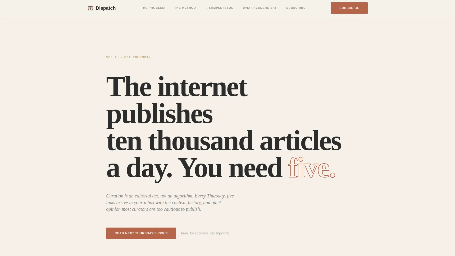
The hero section uses a large serifed display typeface set against full-bleed parchment cream. No image, no animation. The headline and a single italic attribution line do all the work, creating immediate typographic confidence.
Sticky Anchor Navigation
The anchor nav pins to the top of the page and links to five named chapter sections. Each chapter label doubles as a structural cue, helping visitors understand the page has a deliberate argument to follow rather than a list of features to skim.
Pull-Stat Content Overwhelm Section
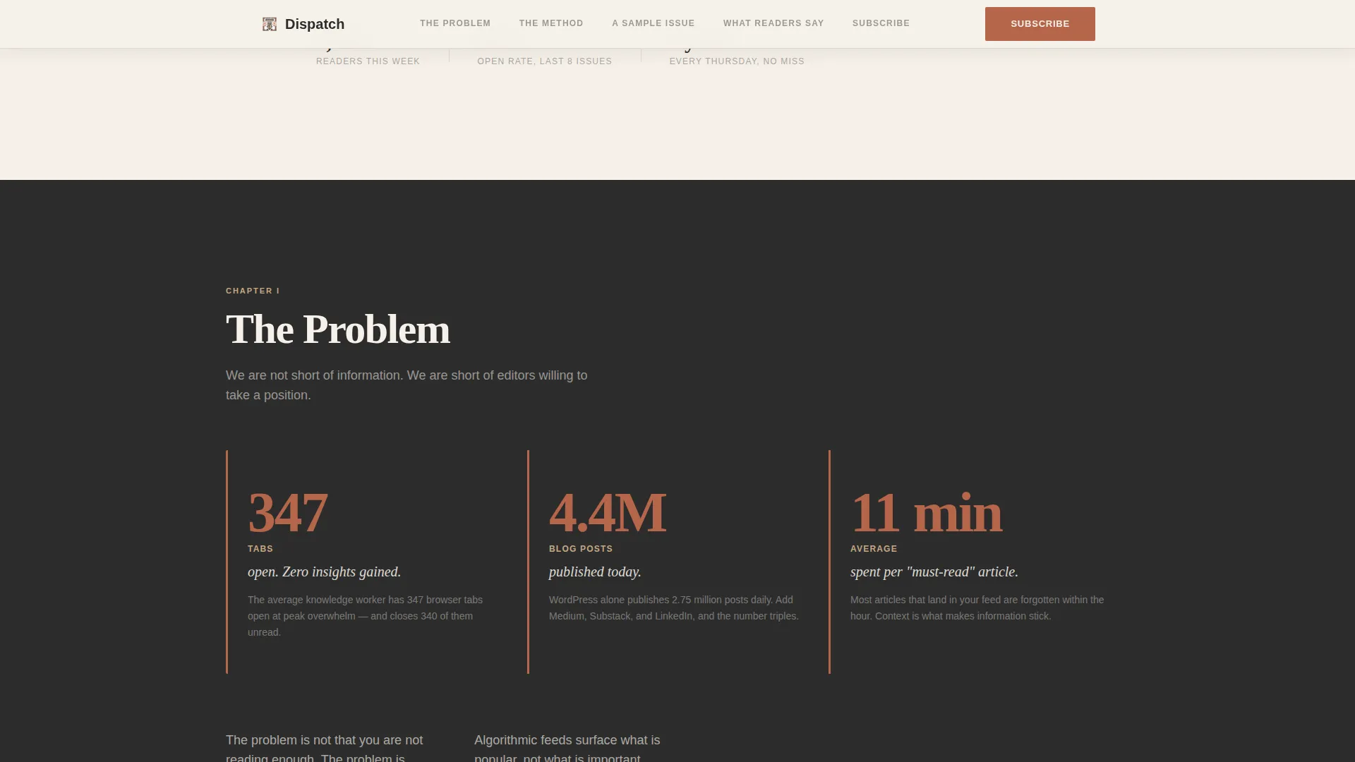
The Problem section presents content overload data as large terracotta-colored pull statistics against a deep charcoal background. The contrast is intentional: it makes the numbers feel urgent and impossible to scroll past without reading.
Three-Step Editorial Process Diagram
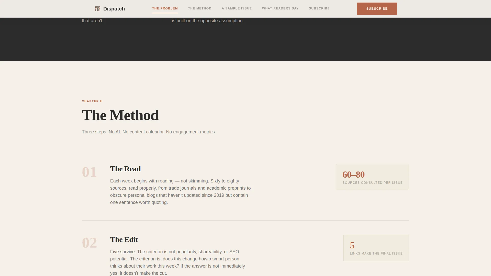
The Method section lays out the curation process as a simple three-step flow on a parchment background. It demystifies how the newsletter is made and builds trust in the editor's judgment before the sample issue arrives.
Inline Sample Issue Block
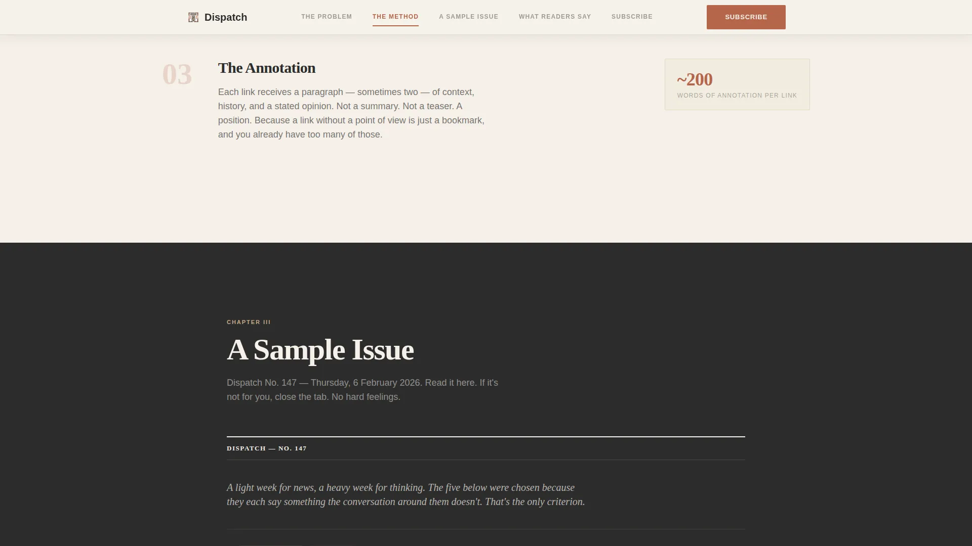
A real past issue is rendered directly on the page with annotations visible. Visitors read the actual product before committing. This is the most powerful conversion element in the layout and it sits roughly mid-scroll, not behind a gate.
Handwritten-Style Testimonials
Reader quotes are formatted to resemble handwritten attributions, each paired with a named role and city. There are no logos or company names, which keeps the tone personal and the social proof credible to a creative professional audience.
Page sections overview
| Section | Purpose |
|---|---|
| Hero Manifesto | Opens with a bold typographic statement and the primary call to action |
| The Problem | Presents content overwhelm data as large pull statistics in terracotta |
| The Method | Diagrams the three-step editorial curation process |
| A Sample Issue | Renders a real past issue inline so visitors experience the product |
| What Readers Say | Displays handwritten-style testimonials with role and city attribution |
| Subscribe | Delivers the final single-field email capture and closing call to action |
Design & branding system
The visual identity follows a Heritage and Story theme. The palette references the feel of a letterpress broadsheet: warm without nostalgia, authoritative without coldness. Backgrounds alternate between parchment cream and deep editorial charcoal to create a page rhythm that feels like turning pages.
- Color system uses four values: parchment cream (#F5F0E8), sandstone tan (#C4A882), editorial charcoal (#2C2C2C), and muted terracotta (#B5654A) reserved for links, anchor nav highlights, and the subscribe button
- Typography pairs Fraunces as the serifed display face with DM Sans for body copy, creating a clear hierarchy between editorial statement and readable prose
- Negative space is generous throughout, especially in the hero, supporting the reading posture the template is designed to encourage
Mobile & speed optimization
The template is built desktop-first to match the long-form reading habits of its target audience. Mobile layouts are fully supported and maintain the editorial hierarchy of the desktop experience.
- Server Components handle the primary page rendering; only the sticky navigation and email capture form use client-side behavior
- Animation is intentionally minimal: no animations appear in the hero section, and subtle scroll reveals are used sparingly in later sections
- The single-column mobile layout preserves the pull-stat contrast and inline sample issue legibility without requiring layout changes
How this template helps you convert
The page is structured as a click-through landing page optimized to move visitors into the email subscription flow. Every section earns the next.
- The primary call to action, "Read Next Thursday's Issue," appears first beneath the manifesto header, again directly after the inline sample issue, and finally at the page bottom, giving visitors three natural decision points without feeling pressured
- The inline sample issue removes the biggest objection before the ask: visitors already know what they are signing up for, so the only remaining friction is entering an email address
- The single-field email capture is supported by a secondary trust line confirming no spam, no sponsors, just five links and the thinking behind them, which directly addresses the hesitation of a burnt-out reader who has unsubscribed from too many newsletters already
Other information about this template
This template is categorized under Blog and Editorial, specifically within the Agency and Freelance Newsletter subcategory. It is built for the Agency and Freelance Curated Links Newsletter niche and carries a high intersection match for that use case.
- The template style is Hub and Spoke with anchor navigation, meaning the page functions as a single scrollable document with clearly defined, linked chapters
- The creative direction follows an Industry Report format: data-led, argument-driven, and structured to build credibility before the conversion moment
- The header concept is a Quote and Manifesto, making it well-suited to newsletter brands that lead with a clear editorial point of view
- The landing page direction is Click-Through, optimized for a single subscription action rather than a multi-step funnel
- Footer follows a horizontal flow pattern consistent with a clean editorial publication layout
Theme
Heritage & Story
Creative direction
Industry Report
Color system
Warm Stone
Style
Hub & Spoke (Anchor Nav)
Direction
Click-Through
Page Sections
Typographic Manifesto Hero
Sticky Anchor Navigation
Pull-stat Problem Section
Inline Sample Issue Block
Handwritten-style Testimonials
Single-field Email Capture
Related questions
Can I use this template for a newsletter that covers topics outside design and strategy?
Does the inline sample issue section require any special setup?
How does the email capture work?
Is this template suitable for a desktop-first audience?
Can I change the colors and typefaces to match my newsletter branding?



