Nonprofit Industry Report Landing Page Template
Dispatch is a horizontal-scroll nonprofit landing page template built for editorial authority. It presents deep-cut industry reports through a cinematic broadsheet layout, moving readers panel by panel from crisis to evidence to call to action. Designed for grant writers, executive directors, and policy researchers who need long-form analysis that holds up under scrutiny.
by Rocket studio
Quick summary
Dispatch is a single-page horizontal-scroll template for nonprofit research publications. It uses a Luxe Minimal, Cinematic Dark design system to guide readers through a five-panel editorial argument. Each panel builds rhetorical momentum, from naming the crisis to issuing the call, earning the final click before the reader ever reaches the archive.
Who this template is for
This template is built for organizations that publish serious, sourced analysis for the nonprofit sector. It suits publications where the written argument is the product and the design must match that editorial ambition.
- Grant writers who need a credible source to cite in funding proposals
- Executive directors and program officers preparing board-level presentations
- Policy researchers and nonprofit consultants who rely on rigorous, data-backed reporting
What problem this template solves
Most editorial templates are built for consumer blogs. They prioritize imagery, listicles, and fast skimming. That format fails the nonprofit professional who needs to trust a source before citing it.
- There is no standard template that presents long-form nonprofit research with the visual weight it deserves
- Generic blog layouts dilute editorial authority and make rigorous analysis look like opinion content
- Nonprofit decision-makers require a reading experience that signals depth, not just speed
What you get with this template
You get a complete horizontal-scroll landing page structured as a five-panel editorial argument. The layout is desktop-first, with a mobile fallback to vertical scroll. Every design decision, from typography scale to color rationing, reinforces editorial credibility.
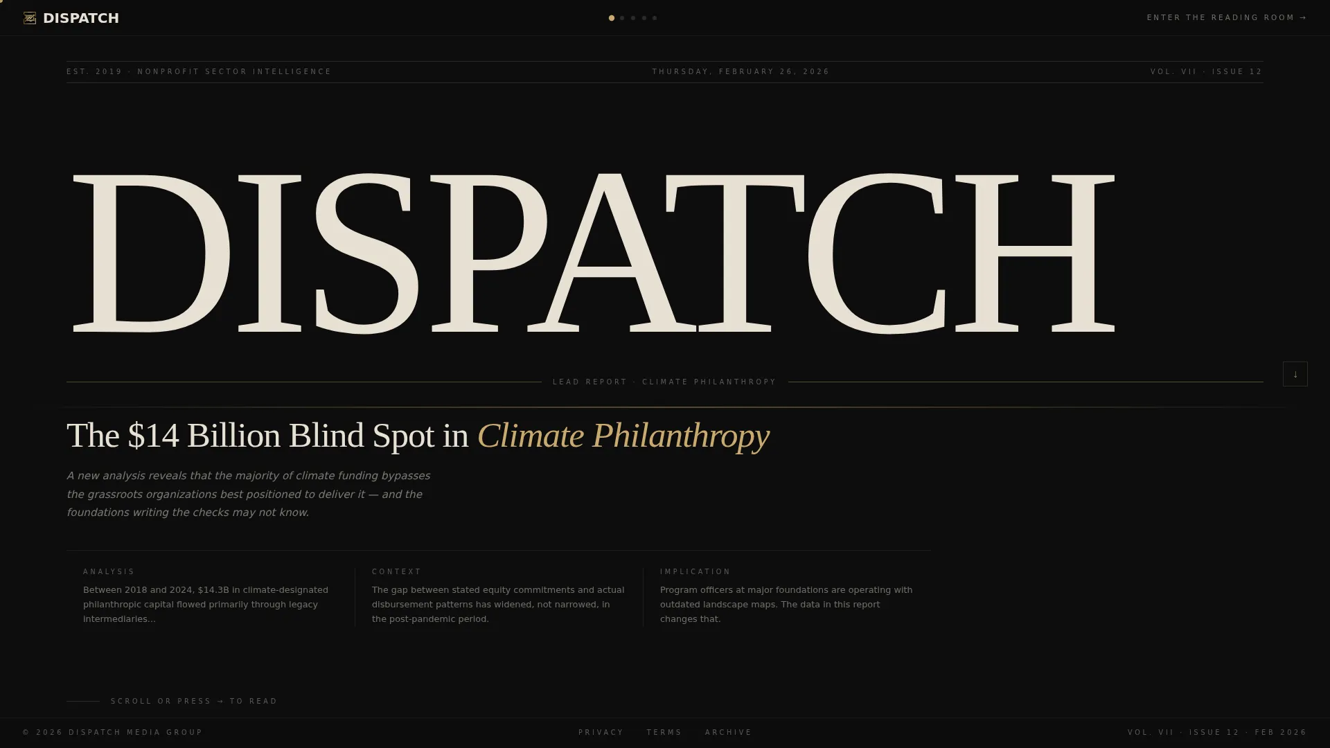
- A newspaper masthead hero panel with massive serif display type, a dateline, and a lead headline
- Four content panels covering the crisis, the evidence, the voices, and the call to action
- A minimal single-row footer and a dual conversion path combining a primary click-through and an email capture field
Feature list
Each feature below is built directly into the Dispatch template and serves a specific purpose in the editorial experience.
Horizontal Scroll Panel Architecture
The template uses CSS scroll-snap to move readers left to right across five full-viewport panels. Each panel functions as a chapter in a continuous editorial argument, so the reading experience feels like turning through a broadsheet spread rather than scrolling a feed.
Newspaper Masthead Hero
The opening panel presents "DISPATCH" in ultra-thin Fraunces serif type at display scale. It includes a dateline, a lead headline, an italicized subhead in parchment, and a visible opening column of text. Typography carries the entire visual weight with no image dependency.
Gold-on-Black Data Visualization Panel
The evidence panel renders a bar chart visualization in muted gold on deep editorial black. This approach keeps data presentation on-brand while giving sourced statistics a visual hierarchy that commands attention without breaking the color system.
Named Pull Quote System
Pull quotes from named executive directors appear in muted gold type at designated intervals across the panels. Each quote is attributed, which reinforces the sourced, accountable editorial standard the publication projects.
Dual Conversion Path
The final panel offers two routes. The primary call to action, "Enter the Reading Room," leads to the full report archive. The secondary path, "Get the Brief," presents a single-field email capture for a weekly executive summary. Both paths are set in the same display serif as the masthead.
Scroll-Linked Animation and Interactivity
The template includes a scan-line effect on the masthead, scroll-linked parallax reveal animations across panels, horizontal scroll momentum, and a gold cursor trail. On mobile, the accordion interaction replaces horizontal scroll for content navigation.
Page sections overview
| Section | Purpose |
|---|---|
| Masthead Hero Panel | Establishes publication identity with display typography, dateline, and lead headline |
| Crisis Argument Panel | Names the central problem and opens the editorial argument with a pull quote |
| Evidence Data Panel | Presents gold bar chart visualization and sourced statistics against dark background |
| Voices Human Panel | Profiles named executive directors and illustrates who is being failed |
| Call to Action Panel | Delivers "Enter the Reading Room" call to action and "Get the Brief" email capture |
| Minimal Footer Row | Single-row linear footer with minimal publication links |
Design & branding system
The design system is built on a Cinematic Dark palette where black dominates every panel and accent color is strictly rationed. The result feels like a limited-edition journal: serious, considered, and deliberately unhurried.
- Colors: deep editorial black (#0D0D0D) as the dominant ground, charcoal newsprint (#1E1E1E) for panel variation, warm parchment (#E8E0D4) for all body typography, and muted gold (#C9A96E) reserved for pull quotes, bylines, and hover states
- Typography: Fraunces serif for all display headlines and the masthead logotype, DM Sans for body text, creating a clear editorial hierarchy between argument and exposition
- Visual tone: Luxe Minimal throughout, with no decorative imagery, deliberate whitespace, and every element earning its position on the page
Mobile & speed optimization
The template is built desktop-first, with horizontal scroll as the primary reading experience. On smaller screens, the layout falls back to a vertical scroll structure so the editorial argument remains intact and readable.
- Mobile uses an FAQ-style accordion interaction to replace horizontal panel navigation, preserving the chapter-by-chapter reading rhythm
- Animations use CSS scroll-snap and IntersectionObserver so the page does not depend on heavy external libraries for its interactive behavior
How this template helps you convert
Dispatch converts by proving editorial authority before it asks for anything. The layout is structured so that by the time a reader reaches the final panel, the depth of the publication has already been demonstrated.
- Each panel withholds the complete analysis while giving away enough insight to establish credibility, so the "Enter the Reading Room" click feels like a natural next step rather than a cold ask
- The secondary "Get the Brief" email capture offers a lower-commitment entry point, allowing readers who are not ready for the full archive to stay connected through a weekly executive summary
Other information about this template
Dispatch is a strong fit for nonprofit communications professionals who want their research publication to look as rigorous as the work it contains. The template is designed around the reading habits of a specific professional audience, not a general content consumer.
- The template is categorized under Blog and Editorial, Nonprofit Blog and Media, with a niche focus on nonprofit industry report publishing
- It is built as a single landing page with a click-through conversion direction, not a multi-page site
- The Manifesto creative direction structures the horizontal scroll as a single unbroken argument, a format particularly suited to sector reports, policy briefs, and foundation-facing research publications
- The Cinematic Dark color system and Luxe Minimal theme make this template well suited for organizations that want to signal seriousness and editorial independence



Theme
Luxe Minimal
Creative direction
Manifesto
Color system
Cinematic Dark
Style
Horizontal Scroll
Direction
Click-Through
Page Sections
Horizontal Scroll Panel Architecture
Newspaper Masthead Hero Panel
Gold-on-black Data Visualization
Named Executive Pull Quotes
Dual Conversion Path
Scroll-linked Animation System
Related questions
Is this template designed for a single page or a full website?
Can I use this template if my organization publishes more than one report?
Does this template require a developer to customize?
Who is the intended reader for a page built on this template?
Can the colors and fonts be changed to match a different brand identity?



