Private Equity Newsletter Landing Page Template
Dispatch is a single-page landing page template built for a weekly private equity curated links newsletter. It pairs a warm editorial visual identity with a horizontal scroll carousel of past issues, two clear conversion paths, and a desk-photograph hero. The result is a focused, credibility-first page that earns reader trust before asking for a subscription.
by Rocket studio
Quick summary
Dispatch is a landing page template for a weekly private equity newsletter. It combines a Type Over Image hero, a horizontal scroll carousel of past issue cards, and a dual call-to-action layout. The design follows a Warm Artisan editorial style, built to attract time-poor professionals who need signal, not more noise.
Who this template is for
This template is built for independent newsletter publishers and content practitioners serving the private equity space. The design and layout reflect the expectations of a sophisticated, laptop-first readership.
- Mid-career associates, operating partners, and independent sponsors who publish curated industry content
- Fund-focused writers or analysts launching a weekly curated links newsletter
- Solo publishers looking to establish editorial credibility before asking for a subscription
What problem this template solves
Most newsletter landing pages either oversell or underprepare. They rely on generic sign-up forms with no proof of editorial quality. Professionals in private equity are skeptical readers. They will not commit their inbox to something that cannot demonstrate taste and judgment upfront.
- Visitors have no way to evaluate editorial quality before subscribing
- Generic layouts fail to signal the depth and effort behind a curated links format
- Single-path conversion pages miss readers who prefer to sample content before committing
What you get with this template
The template ships as a complete, single-page layout with four distinct sections and a footer. Every design detail is sourced from the brief and nothing is left as a placeholder.
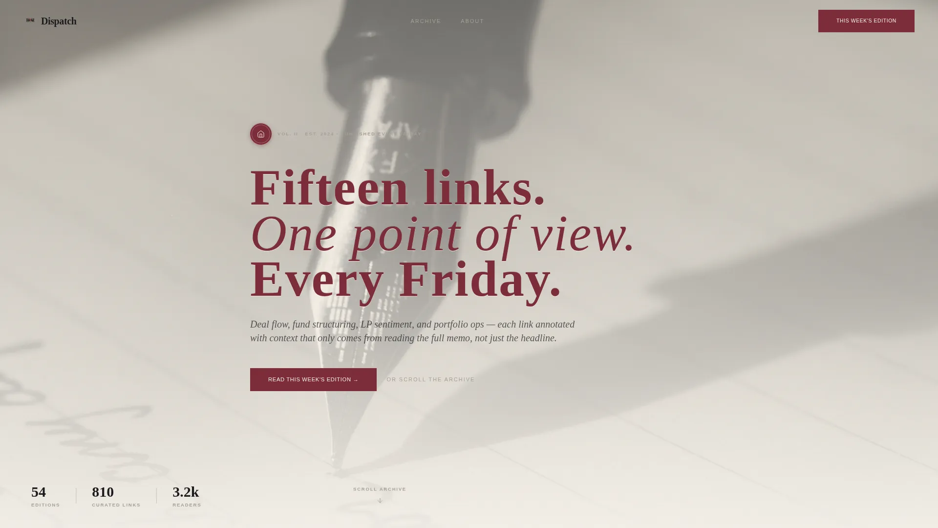
- A Type Over Image hero with a serif headline and two conversion entry points
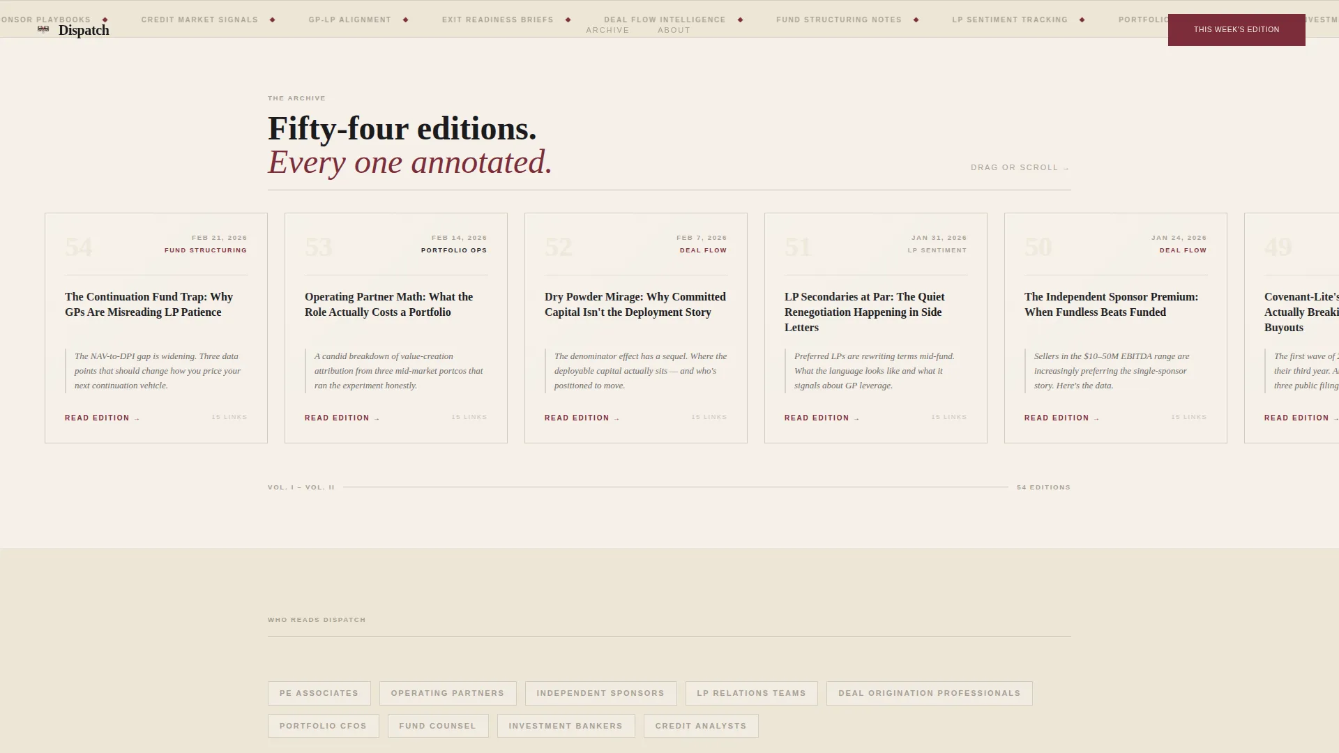
- A horizontal scroll carousel displaying past issue cards with edition numbers, dates, headlines, and editorial annotations
- A social proof strip, an email capture field, and a primary call-to-action button routing to the latest edition
Feature list
This section describes the core built-in capabilities that define the Dispatch template.
Type Over Image Hero Section
The header places a softly desaturated, overhead desk photograph behind a large serif headline. The headline is set in burgundy, letterspaced for a letterpress feel, and accompanied by a primary call-to-action button. A parallax scroll effect adds depth as the visitor begins reading downward.
Horizontal Scroll Issue Carousel
Past issues are displayed as individual cards in a draggable, wheel-scrollable carousel. Each card shows the edition number, publication date, a standout headline, and a one-line editorial note in italics. Cards use a parchment background with an ink border, and hovering triggers a subtle lift with a paper-shadow effect.
Dual Conversion Layout
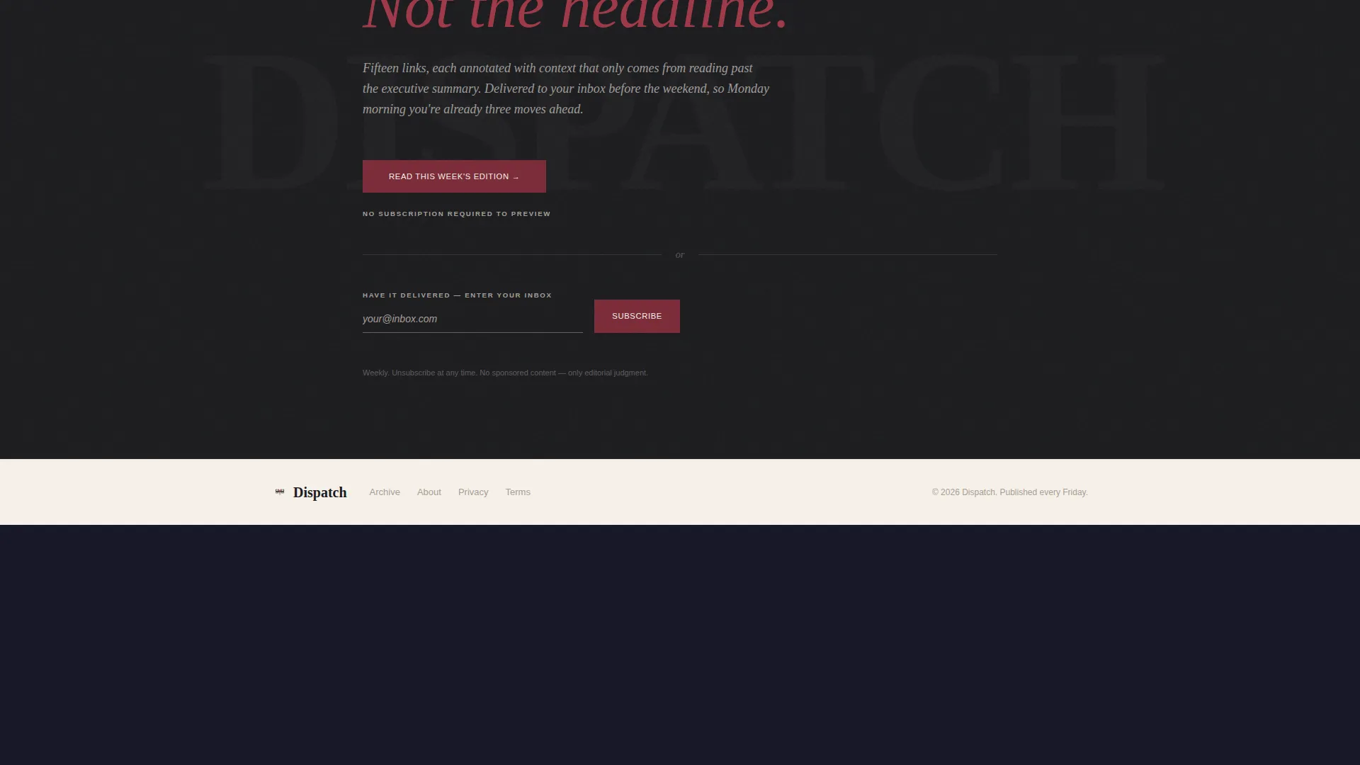
The template supports two conversion paths side by side. A burgundy call-to-action button routes visitors to the latest edition hosted on the newsletter platform. A slim email input field with the prompt "Or have it delivered" offers a direct subscription path for readers ready to commit.
Social Proof Strip
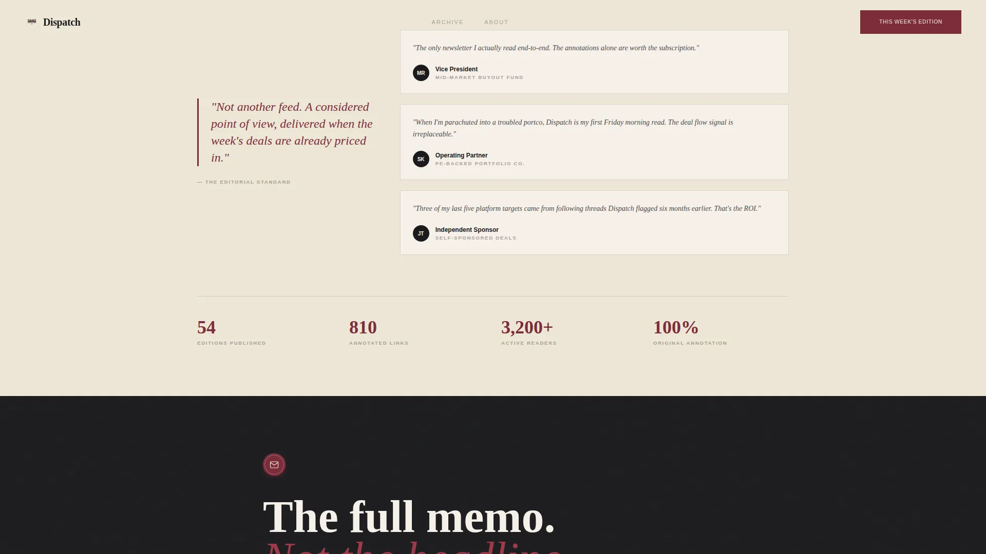
A dedicated strip displays reader role labels and edition volume proof. The strip communicates the newsletter's longevity and the professional profile of its audience without relying on vague testimonials.
Editorial Card Design System
Each past issue card is built as a self-contained design unit: parchment fill, ink border, italic annotation line, and a hover lift animation. The card system is consistent across the carousel and reinforces the newsletter's identity as a craft publication, not a bulk send.
Page sections overview
| Section | Purpose |
|---|---|
| Hero header | Introduce the newsletter with a desk photograph, serif headline, and primary call-to-action button |
| Horizontal scroll carousel | Display past issues as swipeable cards to build credibility through editorial volume |
| Call-to-action and email capture | Offer a direct read path via button and a subscription path via email field |
| Social proof strip | Show reader roles and edition count to reinforce authority |
| Footer | Close the page with horizontal flow navigation and supporting links |
Design & branding system
The visual identity is built around a four-color Ink and Paper palette that feels like a marked-up first edition from a partner's bookshelf. Typography is handled by two typefaces working in clear contrast.
- Deep editorial ink (#1B1B1E) for all body text, unbleached parchment (#F5F0E8) as the dominant canvas, marginal pencil gray (#A69F95) for secondary labels and dividers, and wax-seal burgundy (#7C2D3A) reserved for links, buttons, and accent elements
- Fraunces serif is used for display headlines; DM Sans handles body copy and interface labels, keeping the editorial warmth grounded in functional clarity
- Burgundy appears sparingly so that every instance reads as intentional, like a collector's annotation rather than a brand color applied by default
Mobile & speed optimization
The template is designed desktop-first, reflecting the laptop-centered habits of its target readership. A mobile fallback layout is included so the page remains functional and readable on smaller screens.
- The horizontal carousel supports both drag interaction on touch screens and scroll-wheel interaction on desktop, giving each device the most natural input method
- Server Components handle static layout rendering, while the carousel interaction is scoped to a Client Component to keep the interactive footprint focused
- The parallax header and card lift animations use medium-intensity motion, keeping the experience engaging without overloading the viewport
How this template helps you convert
The page is structured as a Click-Through landing page, meaning its primary job is to move a curious visitor toward the latest edition before asking for a long-term commitment.
- The hero section delivers the value proposition immediately with a clear headline and a primary call-to-action button, so high-intent visitors can act in the first scroll position without reading further
- The carousel builds editorial proof by stacking real issue cards in sequence, letting the volume and quality of past editions do the persuading before the second call-to-action appears
- The dual conversion section captures two distinct visitor types: those ready to subscribe and those who want to read first, reducing abandonment by never forcing a single path
Other information about this template
The Dispatch template is part of the Blog and Editorial category, listed under the Private Equity Newsletter subcategory. It is purpose-built for the private equity curated links newsletter niche.
- The template style is Horizontal Scroll, which is an uncommon layout choice that directly reinforces the index-card browsing metaphor described in the brief
- The creative direction is Curated Collection, meaning the carousel is the centerpiece of the page rather than a supplementary section
- The landing page direction is Click-Through, prioritizing the read-first path over immediate sign-up friction
- The color system is Ink and Paper, and the theme is Warm Artisan, both of which are reflected consistently across every section of the layout
Theme
Warm Artisan
Creative direction
Curated Collection
Color system
Ink & Paper
Style
Horizontal Scroll
Direction
Click-Through
Page Sections
Type Over Image Hero with Parallax
Horizontal Scroll Issue Carousel
Dual Conversion Call-to-action Layout
Social Proof Reader Strip
Editorial Ink and Paper Design System
Related questions
What kind of newsletter is this template designed for?
Can visitors browse past issues before subscribing?
Does the template offer more than one way to convert?
Is this template optimized for desktop or mobile?
How does the carousel build credibility for the newsletter?



