Venture Capital Newsletter Landing Page Template
Dispatch is an editorial landing page template built for a weekly venture capital curated links newsletter. It combines a cinematic split-header, a five-question reading profile quiz, a past-issues bento grid, and a testimonials carousel into one persuasive, single-page flow. The warm parchment and deep editorial black palette gives it the weight of a broadsheet and the warmth of a letterpress pamphlet.
by Rocket studio
Quick summary
Dispatch is a single-page editorial template designed for a weekly venture capital newsletter that delivers exactly seven curated links per issue. It pairs broadsheet-style typography with a personalized quiz conversion path, giving emerging fund managers and their peers a reason to subscribe before they even reach the email field.
Who this template is for
This template is built for newsletter creators in the venture capital and emerging manager space. It speaks directly to the people who both write and read this kind of content.
- Solo general partners raising a first fund who want a credible, low-friction subscriber page
- Principal-track associates and limited partner relations leads who need a sharp editorial presence
- Curated content publishers in the venture capital and broader private markets niche who want a landing page that earns trust before asking for an email
What problem this template solves
Most newsletter landing pages ask for an email before proving they are worth the inbox slot. Dispatch flips that order. It leads with editorial credibility, lets content do the persuading, and only asks for a commitment once the visitor already feels the voice.
- Generic subscribe pages offer no taste of the editorial voice, so visitors bounce without converting
- Fund managers and their colleagues are time-poor and skeptical, meaning a bland sign-up form destroys trust instantly
- A one-size-fits-all pitch ignores the real range of readers, from a solo general partner reading at a kitchen table to a limited partner relations lead prepping for Monday morning
What you get with this template
You get a complete, section-led single-page layout built around editorial credibility and a quiz-driven conversion path. Every section has a clear job to do.
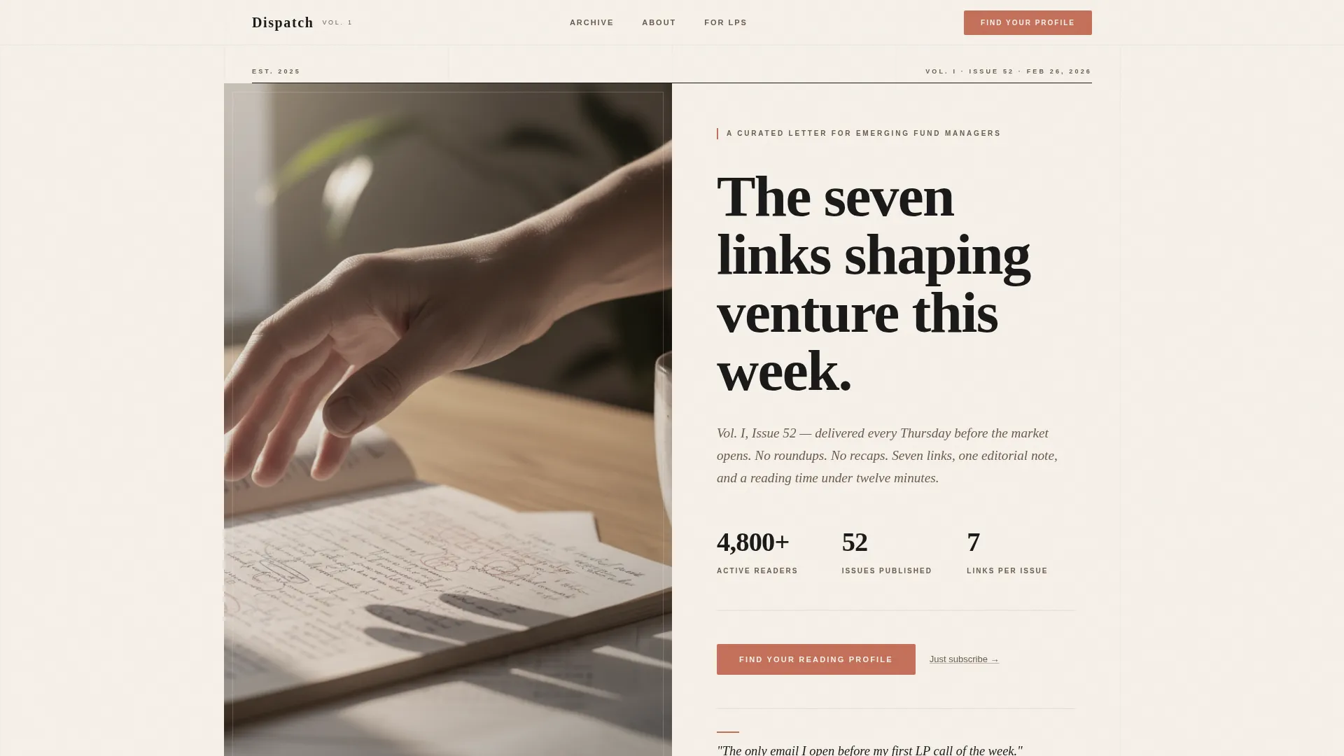
- A cinematic split-header hero with a monumental serif masthead and warm editorial photography
- A five-step inline reading profile quiz that delivers a personalized issue preview before asking for an email
- A past-issues bento grid, a testimonials carousel, and a featured sample issue section that together build the case for subscribing
Feature list
This template ships with six purpose-built sections and a cohesive design system. Each component earns its place on the page.
Cinematic Split-Header Hero
The hero places a warm-toned, tightly cropped photograph on the left and a monumental serif headline on the right. The date and issue number are styled like a journal volume, grounding the page in editorial ritual from the very first second.
Past Issues Bento Grid
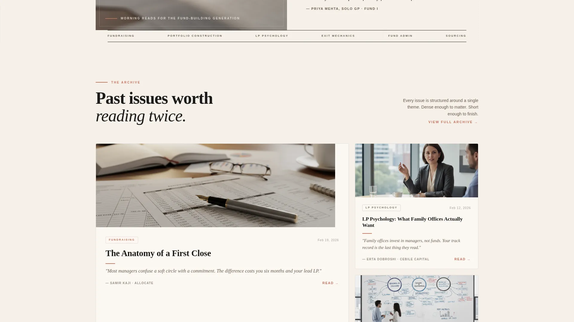
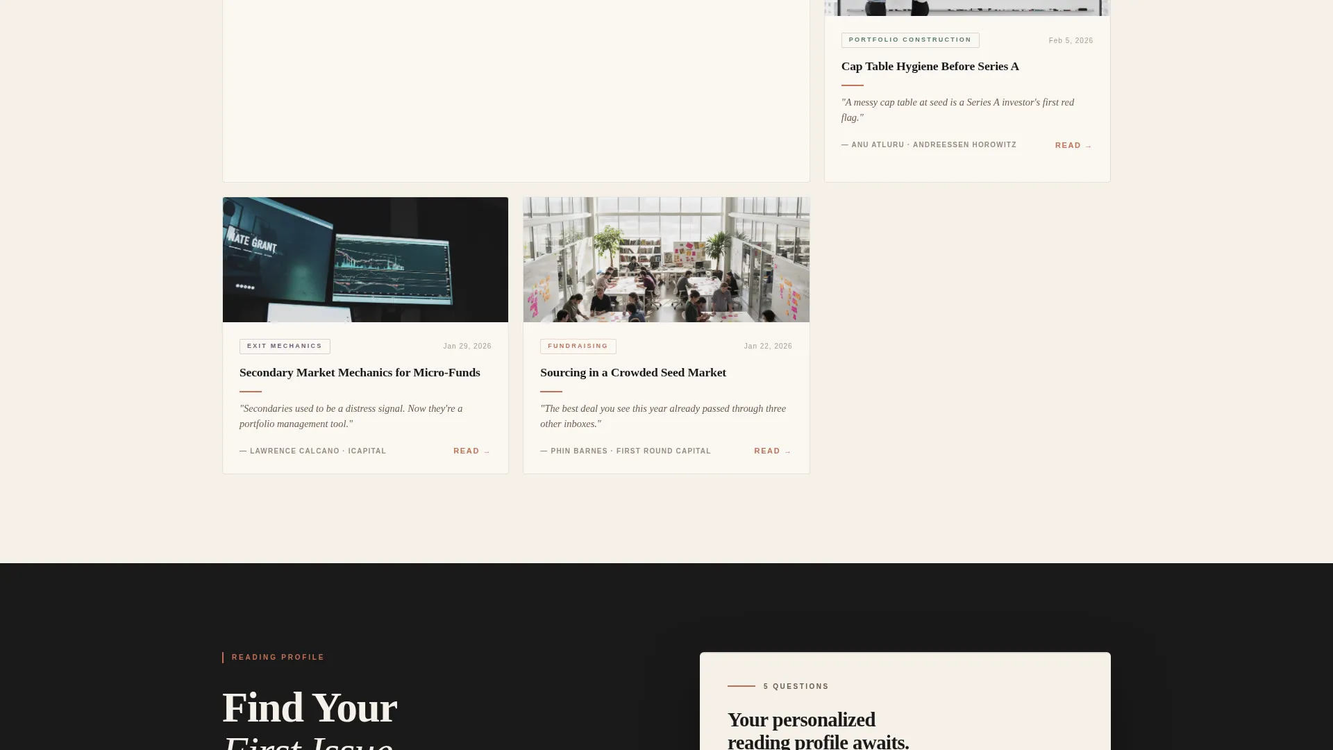
An asymmetric bento grid showcases previous issue themes as cards. Each card surfaces a pull quote, a source name, and a category tag such as Fundraising, Portfolio Construction, LP Psychology, or Exit Mechanics. The grid teaches the visitor what the editorial voice sounds like before any ask is made.
Five-Step Reading Profile Quiz
The primary conversion path is a five-question inline assessment. Visitors answer questions about investment stage focus, weekly reading time, biggest knowledge gap, preferred content format, and reading time of day. Results generate a personalized "Your First Issue" preview matched to their answers.
Personalized Issue Preview
After the quiz, a tailored preview of the first issue appears alongside a single email input and a terracotta subscribe button. A quiet secondary text link offers a direct subscribe path for visitors who want to skip the quiz entirely.
Testimonials Carousel
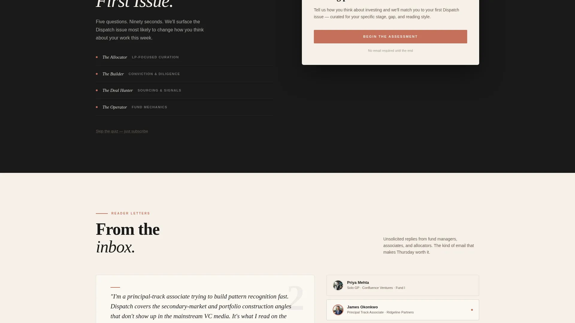
A swiper-style carousel presents reader testimonials written in a natural editorial voice. Each testimonial is attributed to a role and firm, and the section includes issue count and reader count metrics to anchor social proof in real numbers.
Sample Issue Showcase
A dedicated section features one curated link with full editorial commentary. It demonstrates the curatorial judgment and voice that defines every issue, giving fence-sitters one final, concrete reason to subscribe.
Page sections overview
| Section | Purpose |
|---|---|
| Hero Split Header | Establish editorial identity and set the tone with a monumental serif masthead |
| Past Issues Bento | Show curated issue themes as pull-quote cards with category tags |
| Reading Profile Quiz | Guide visitors through a five-step assessment toward a personalized preview |
| Personalized Issue Preview | Deliver a tailored first-issue sample tied to quiz results and capture the email |
| Testimonials Carousel | Build social proof with role-attributed reader quotes and subscriber metrics |
| Sample Issue Showcase | Feature one curated link with editorial commentary as a final conversion nudge |
| Page Footer | Close with a clean horizontal footer layout |
Design & branding system
The visual identity follows a Warm Artisan editorial direction. Every design choice reinforces the feeling of a carefully typeset first-edition essay collection.
- Color system: warm parchment (#F5F0E8) covers roughly eighty percent of the canvas, deep editorial black (#1A1A1A) anchors headlines and the masthead, aged manuscript brown (#6B5B4E) handles body text and secondary elements, and muted terracotta (#C4705A) appears only on links, buttons, and pull-quote rules
- Typography: Fraunces is used as the serif display face for headlines and the masthead; DM Sans handles body copy and interface elements, keeping long editorial reads comfortable at any viewport
- Visual style: the overall feeling is broadsheet gravitas with letterpress warmth, generous margins, and restrained use of terracotta so that every instance feels deliberate and editorial
Mobile & speed optimization
The template is built desktop-first to match how the target audience reads, typically on a laptop at a desk or in a café. Full mobile support is included so the experience holds at every screen size.
- Scroll reveal animations, card hover states, and quiz transition effects use medium-weight animation, keeping motion purposeful without adding unnecessary visual noise
- Images are lazy-loaded and the build avoids heavy third-party libraries, keeping the static-first page lean on resources
- The five-step quiz manages state inline without requiring a page reload, so the personalized preview appears smoothly within the same scroll context
How this template helps you convert
The entire page is structured as a progressive free sample. Visitors receive value at every scroll depth before they are ever asked for an email address.
- The editorial bento grid and hero copy demonstrate curatorial voice upfront, so skeptical readers understand the quality of the newsletter before any commitment is requested
- The five-question reading profile quiz creates a personalized stake in the result, meaning the visitor is invested in seeing their tailored first issue before the email field even appears
- The secondary "Just Subscribe" text link beneath the quiz removes friction for readers who are already convinced, ensuring no willing subscriber is lost to quiz fatigue
Other information about this template
This template is a strong fit for the venture capital newsletter space and the broader emerging manager content ecosystem. A few additional details worth knowing before you build with it.
- The template style is Editorial/Magazine, categorized under Blog & Editorial with a Venture Capital Newsletter subcategory
- The page uses the Curated Collection creative direction, meaning the scroll rhythm is designed to feel like flipping through a beautifully typeset table of contents
- The header concept is Half-Page Photo and Text, pairing editorial photography with a serif masthead in a split-screen composition
- The conversion path follows a Quiz and Assessment landing-page direction, with a personalized result state driving the email capture moment
- The footer uses a clean horizontal layout that closes the page without visual clutter
Theme
Warm Artisan
Creative direction
Curated Collection
Color system
Ink & Paper
Style
Editorial/Magazine
Direction
Quiz/Assessment
Page Sections
Cinematic Split-header Hero
Past Issues Bento Grid
Five-step Reading Profile Quiz
Personalized Issue Preview
Testimonials Carousel
Sample Issue Showcase
Related questions
Who is the Dispatch template designed for?
How does the reading profile quiz work?
Can visitors subscribe without completing the quiz?
What visual style does this template use?
What sections come included in this template?



