SEO & Content Newsletter Reviews Website Template
Dispatch is a hub-and-spoke newsletter landing page built for SEO intelligence publications. It pairs a Heritage editorial visual identity with a structured anchor-nav layout to convert visiting professionals into subscribers. The "Claim Your First Issue" form, chapter-preview spokes, and back-cover closing section work together to earn sign-ups through demonstrated depth.
by Rocket studio
Quick summary
Dispatch is a single-page template designed for authoritative SEO and content newsletters. It opens like a first-edition reference book, guides readers through four chapter-preview spokes, and closes with a friction-light subscription form. The Ink and Paper color system and serif typography reinforce the sense that what follows has been researched and edited with care.
Who this template is for
This template suits publishers and professionals who need a landing page that signals authority before asking for an email address. It works best when the newsletter itself carries genuine editorial depth.
- In-house SEO leads and content managers who want a credible home for a recurring intelligence report
- Agency strategists launching a canonical monthly briefing for clients or prospects
- B2B newsletter creators who need a structured, conversion-focused page without starting from scratch
What problem this template solves
Most newsletter landing pages look like generic sign-up forms. They fail to communicate why this particular publication is worth a reader's inbox. Dispatch solves the trust gap by showing depth before asking for commitment.
- Visitors arrive skeptical and leave without subscribing because the page never proves its value
- No clear information architecture means readers cannot quickly find the section most relevant to them
- A single inline form buried at the bottom misses readers who are ready to subscribe earlier in the page flow
What you get with this template
Dispatch delivers a fully structured, single-page layout with every section a newsletter publisher needs to convert cold traffic into subscribers. The design, copy structure, and interactive components are all included.
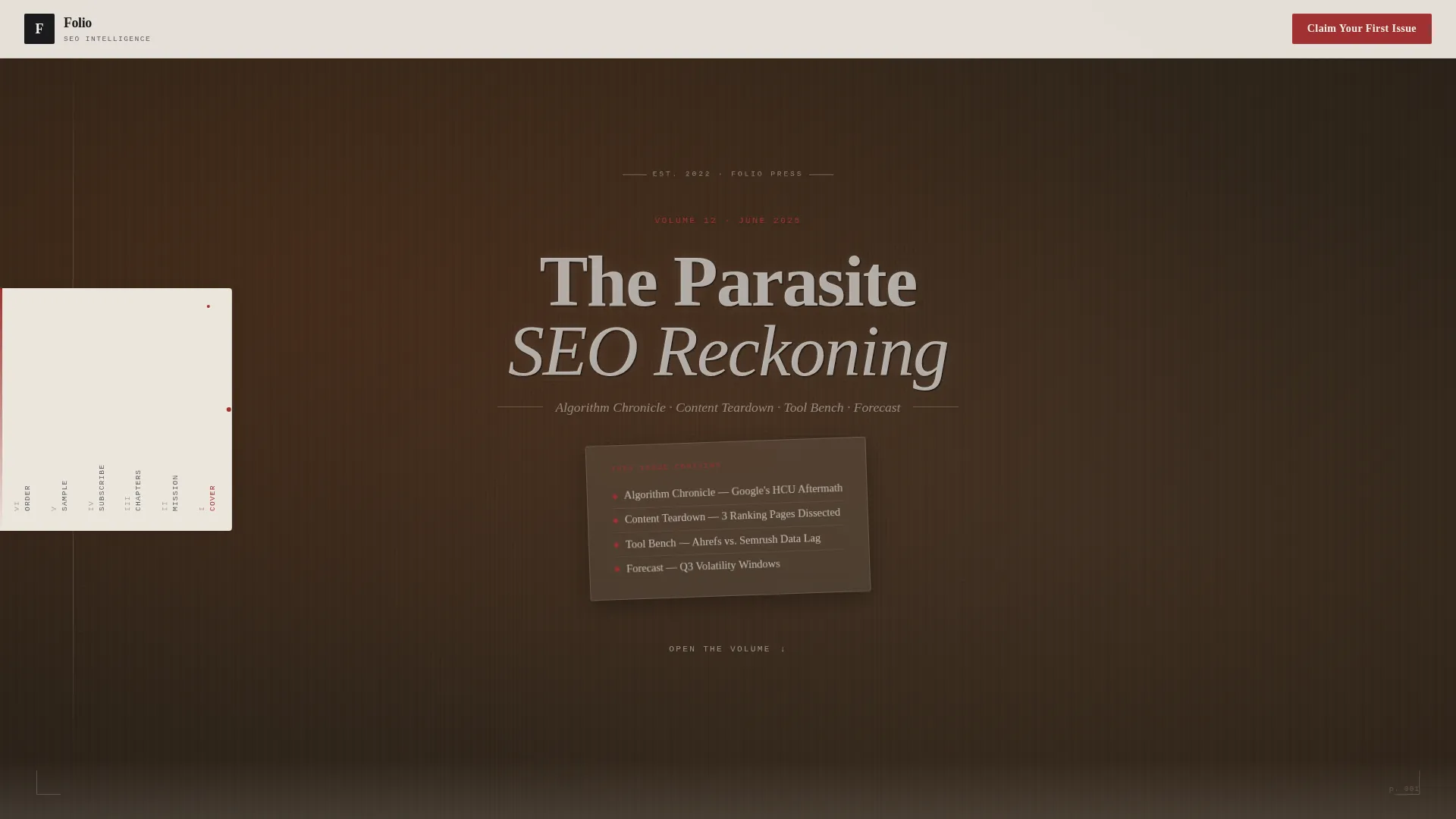
- A leather-textured book-cover hero with a debossed volume title and a page-turn animation revealing the table of contents
- Four chapter-spoke sections previewing recurring newsletter themes, each built to deepen trust through sample depth and pull-quotes
- Two subscription form placements: a mid-page stitched card and a full-bleed back-cover order form, both using an email field and an SEO stack dropdown
Feature list
A summary paragraph before the features: each component in Dispatch was chosen to support a specific trust-building or conversion goal. Nothing is decorative without purpose.
Anchor Navigation Ribbon
A bookmark-style ribbon runs along the left edge of the page. It highlights the active chapter as the visitor scrolls, letting readers jump directly to the section most relevant to them without losing their place.
Book-Cover Hero Section
The page opens on a leather-textured viewport with a debossed title reading the current volume and issue theme. A page-turn CSS animation reveals the table of contents beneath, immediately framing the publication as a curated editorial object rather than a generic web page.
Chapter Spoke Grid
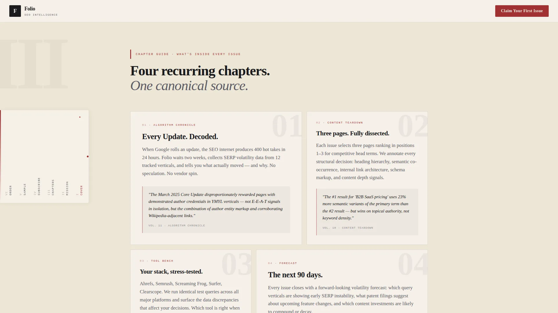
Four recurring sections, Algorithm Chronicle, Content Teardown, Tool Bench, and Forecast, are laid out in a bento grid. Each spoke includes sample content, pull-quotes from past issues, and brief methodology notes to demonstrate that the newsletter is scholarship, not content marketing.
Dual Subscription Form Placement
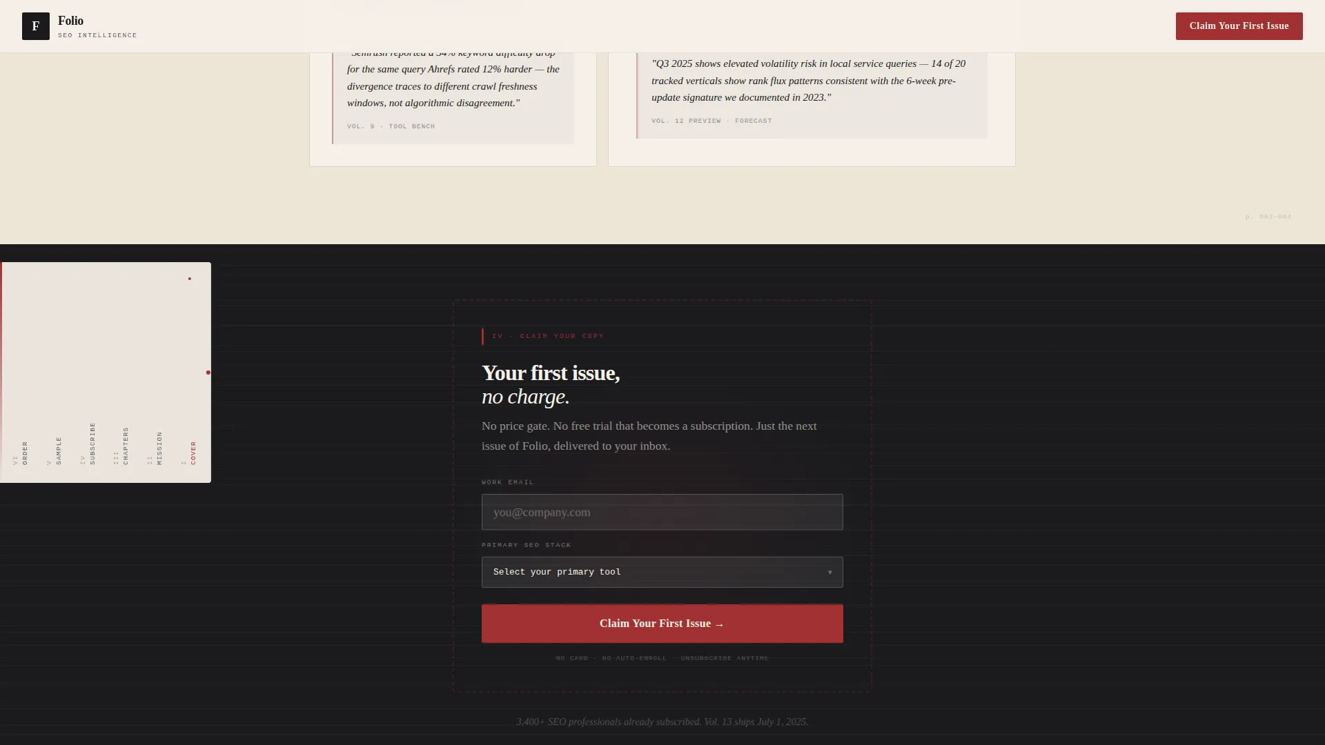
The "Claim Your First Issue" form appears twice: once as a stitched-in subscription card after the second spoke, and again as a full-bleed closing section styled like a back-cover order form. Both instances include an email field and a single dropdown asking for the subscriber's SEO stack.
Founding Story Section
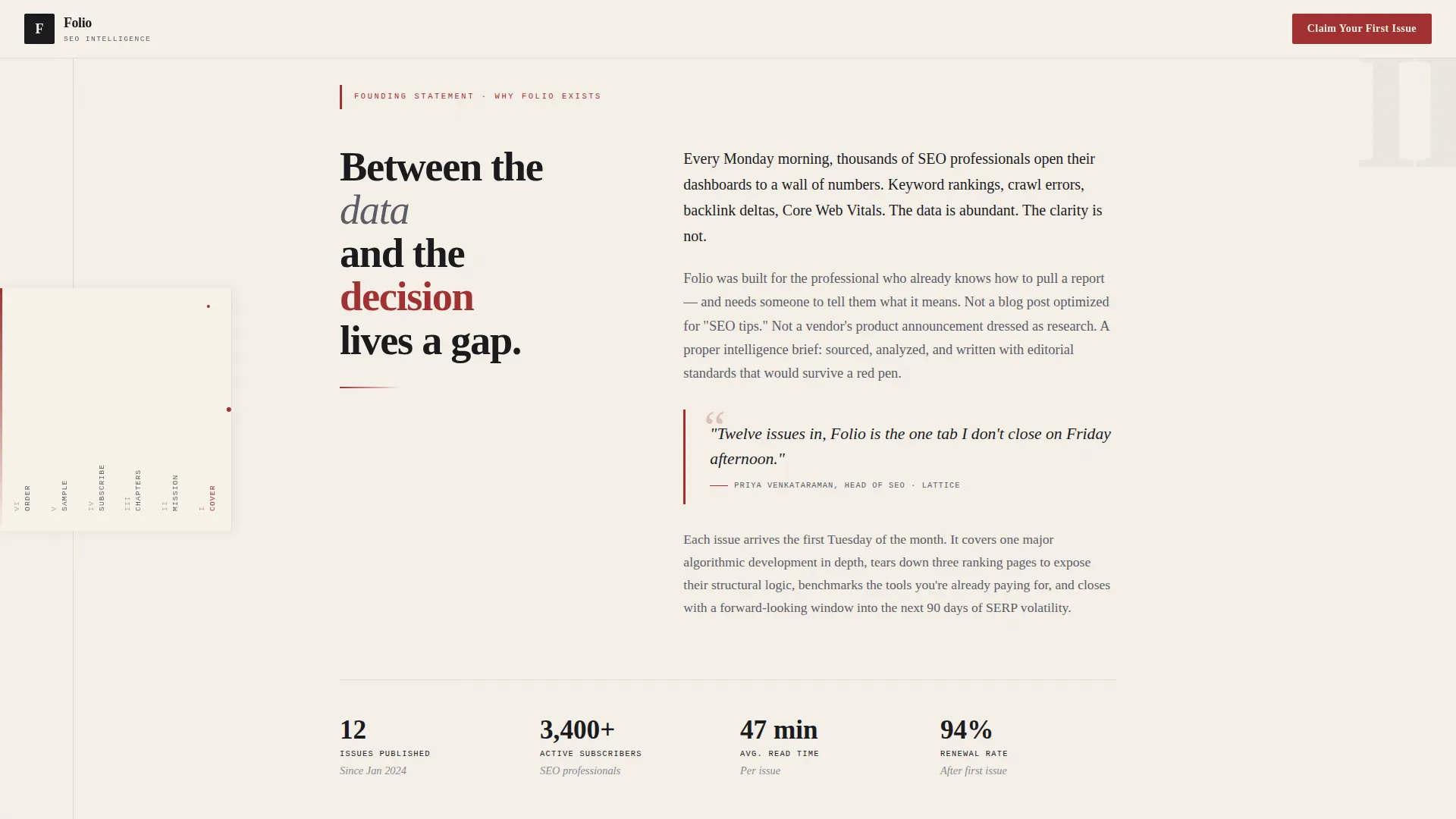
An asymmetric manifesto layout communicates why the publication exists. It articulates the gap between raw data and strategic clarity, giving potential subscribers a reason to care before they have read a single issue.
Heritage Typography System
Display headings use Fraunces, a high-contrast serif that reads like letterpressed chapter heads. Body copy uses Crimson Text for long-form legibility. Labels and monospaced callouts use IBM Plex Mono, keeping the editorial hierarchy clear at every scroll depth.
Page sections overview
| Section | Purpose |
|---|---|
| Book Cover Hero | Opens the page with editorial authority and volume identity |
| Page-Turn Reveal | Animates to table of contents, building anticipation |
| Founding Story | Explains the publication's purpose and editorial mission |
| Algorithm Chronicle Spoke | Previews the search algorithm tracking chapter |
| Content Teardown Spoke | Showcases the content analysis recurring section |
| Tool Bench Spoke | Highlights the practical tools review chapter |
| Forecast Spoke | Previews forward-looking strategic commentary |
| Mid-Page Subscription Card | Captures ready subscribers with low-friction form |
| Sample Depth Section | Displays pull-quotes, sample pages, and methodology notes |
| Back-Cover Order Form | Full-bleed closing call to action with email and dropdown |
| Footer | Horizontal pattern with dot separators |
Design & branding system
The visual identity follows a Heritage and Story theme built on an Ink and Paper color system. Every design decision reinforces the feel of a well-made printed journal pulled from a shelf.
- Colors: warm parchment (#F5F0E8) dominates the background; manuscript black (#1B1B1E) handles all headings and body type; marginalia red (#A03232) marks anchor-nav highlights and interactive states; annotation graphite (#5C5C66) handles secondary text and rule lines
- Typography: Fraunces for display headings, Crimson Text for body paragraphs, and IBM Plex Mono for labels and monospaced callouts
- No stock photography or dashboard screenshots; the visual language relies on texture, typography, and letterpressed-style composition
Mobile & speed optimization
The template is designed desktop-first to serve marketing directors reading at their desks, with a solid responsive layout for mobile readers. Performance decisions reflect the nature of a static editorial page.
- Server Components handle all static sections for fast initial load; Client Components are scoped to the anchor navigation ribbon and subscription form
- Staggered fade-up animations and scroll-linked anchor-nav highlights are implemented at medium intensity to add polish without harming page responsiveness
- The mobile layout preserves the editorial hierarchy, keeping the anchor nav and subscription form accessible on smaller screens
How this template helps you convert
Dispatch earns the subscription rather than demanding it. The page is structured so that a visitor who reads even a few sections already feels the value before encountering a form.
- The founding story section establishes editorial credibility early, giving the visitor a reason to keep reading before any call to action appears
- The chapter spoke grid shows real newsletter depth through pull-quotes, sample pages, and methodology notes, so the subscription decision feels informed rather than speculative
- Two strategically placed subscription forms capture both early-ready visitors and those who needed the full page to be convinced, with near-zero friction on the first issue
Other information about this template
Dispatch is built for the SEO and content marketing professional who has seen too many thin newsletters and wants to publish something genuinely useful. The template supports that positioning at every scroll depth.
- The SEO stack dropdown in the subscription form qualifies subscriber sophistication without adding friction, signaling to readers that this publication understands their world
- The hub-and-spoke anchor navigation structure makes the page readable as a long-form document, not just a scroll-to-bottom funnel
- The back-cover order form section is styled to feel like a printed journal's subscription page, reinforcing the editorial brand identity right at the point of conversion
- This template is suited to newsletter creators who want their landing page to feel as considered as the publication itself
Theme
Heritage & Story
Creative direction
Vision & Mission
Color system
Ink & Paper
Style
Hub & Spoke (Anchor Nav)
Direction
Lead Generation
Page Sections
Anchor Navigation Ribbon
Book-cover Hero with Page-turn Animation
Four-chapter Spoke Grid
Dual Subscription Form Placement
Founding Story Section
Heritage Typography System
Related questions
Can I change the volume title and chapter names in the hero section?
Does the template include both subscription form placements by default?
Is the anchor navigation ribbon accessible on mobile devices?
What fonts does this template use, and do they require paid licenses?
Can this template work for newsletters outside of SEO and content marketing?



