Startup Fundraising Newsletter Complete Blog Website Template
Dispatch is a bold editorial landing page template built for a weekly startup fundraising newsletter. It guides visitors through a manifesto-style scroll, a five-question subscriber diagnostic, and redacted proof cards before routing them into a curated newsletter track. The ink-and-paper visual identity and broadsheet typography make every section feel like a Thursday morning desk read.
by Rocket studio
Quick summary
Dispatch is a single-page editorial template designed for a weekly fundraising newsletter. It combines a cinematic hero reel, a manifesto scroll, and a five-step quiz that segments subscribers into one of three focused tracks. The design channels the feel of a broadsheet newspaper, with aged parchment tones, serif headlines, and rust-red editorial details that signal credibility before a word is read.
Who this template is for
This template suits anyone launching or relaunching a curated newsletter in the fundraising and startup capital space. The page is built for professionals who already know their audience and want a conversion-first home that looks as authoritative as the content inside.
- Former venture capitalists building independent consulting or advisory practices
- Freelance and fractional chief financial officers sourcing Series A and growth-stage engagements
- Grant writers and nonprofit fundraising professionals pivoting into the tech startup ecosystem
What problem this template solves
The best fundraising roles and grant opportunities rarely appear on public job boards. They circulate in quiet channels, move fast, and expire before most professionals find them. A generic newsletter sign-up page cannot communicate that urgency or sort visitors by what they actually need.
- Generic subscription forms attract unqualified readers and produce unfocused lists
- A flat sign-up page does not communicate the editorial depth or insider access that justifies a regular read
- Visitors who see undifferentiated content have no reason to choose one track over another
What you get with this template
This template delivers a fully structured, section-led landing page built around editorial storytelling and quiz-driven conversion. Every section is purposeful, sequenced to escalate stakes and earn the subscription before the call to action appears.
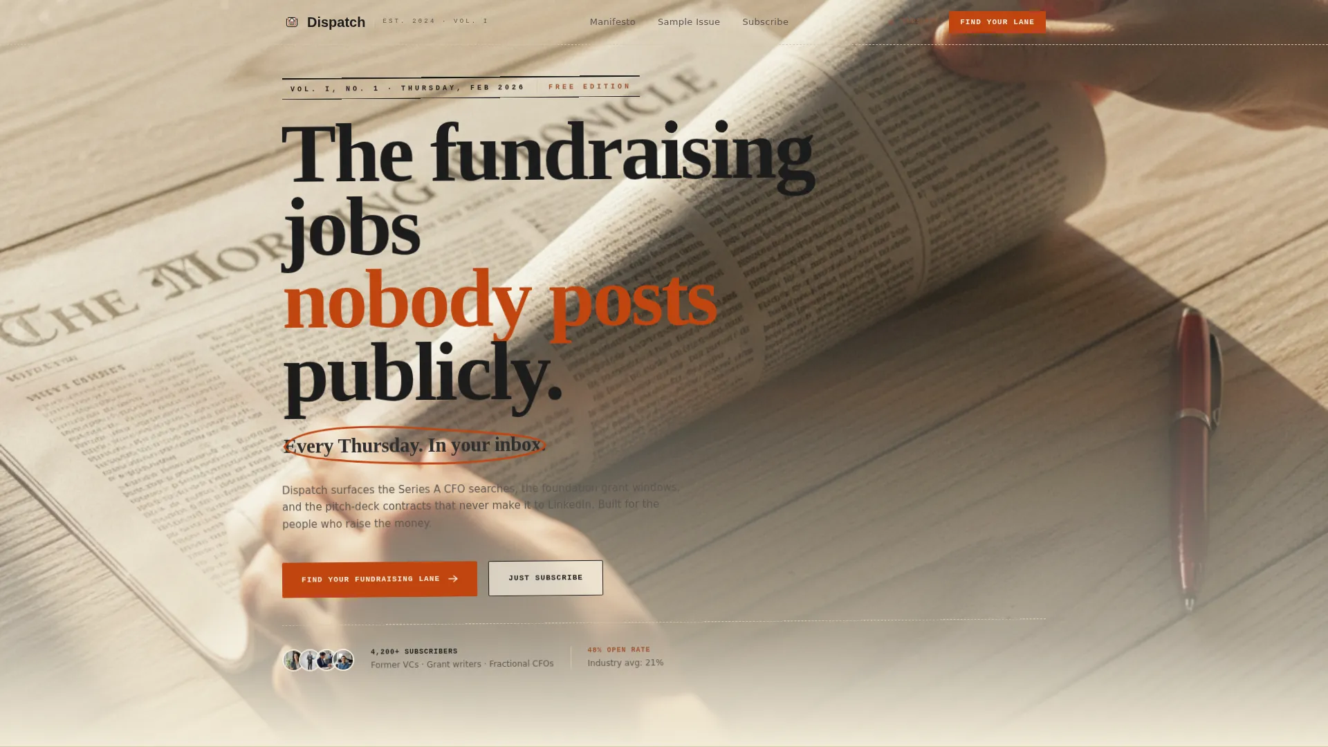
- A looping short-form hero video section with a dateline stamp headline and scan-line animation treatment
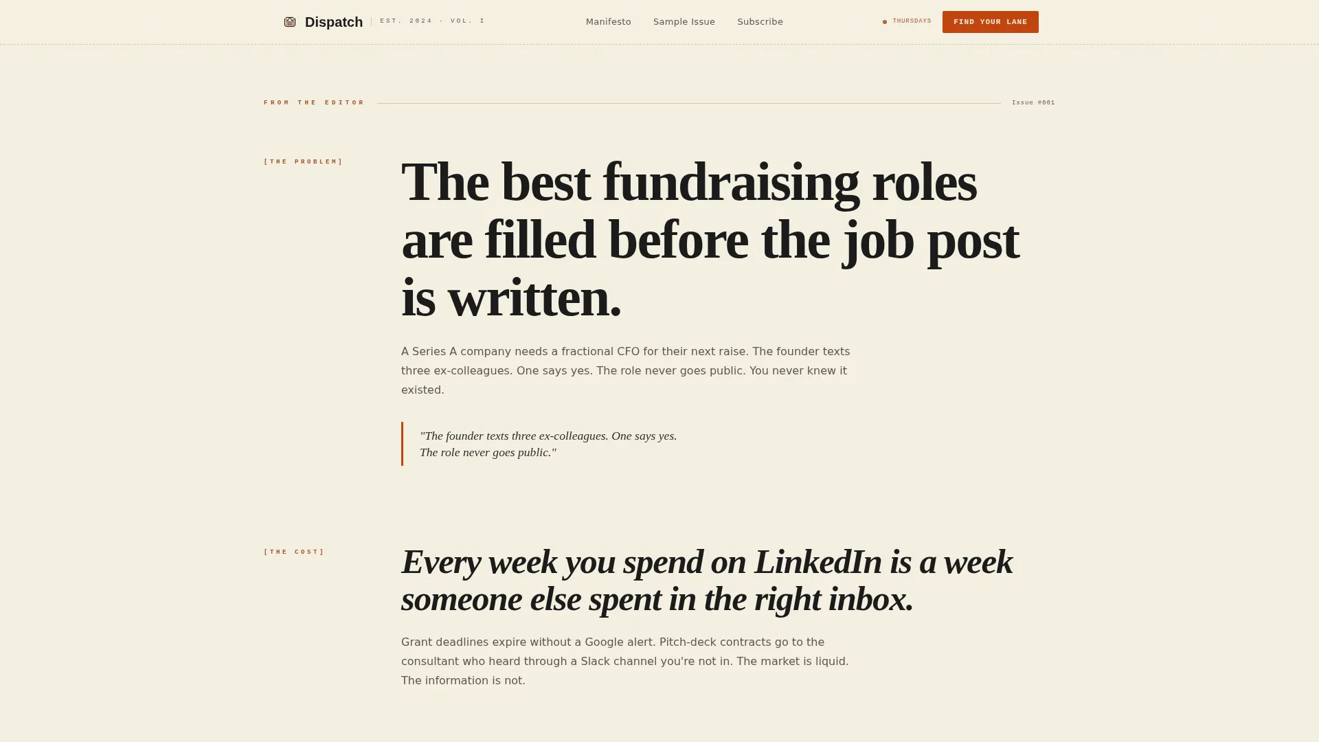
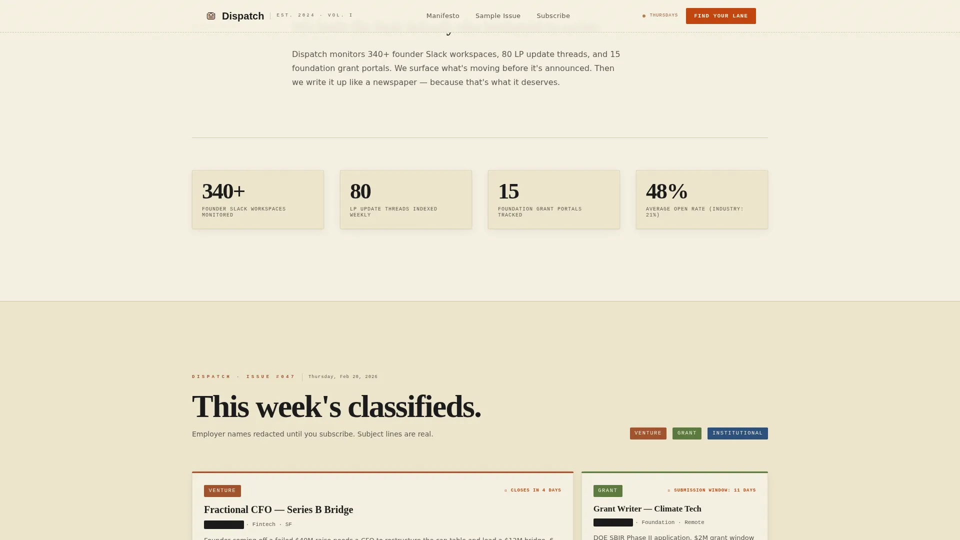
- A manifesto editorial scroll that moves from problem to cost to redacted proof artifacts in a broadsheet bento layout
- A five-question subscriber diagnostic that routes visitors into Institutional, Venture, or Grant newsletter tracks
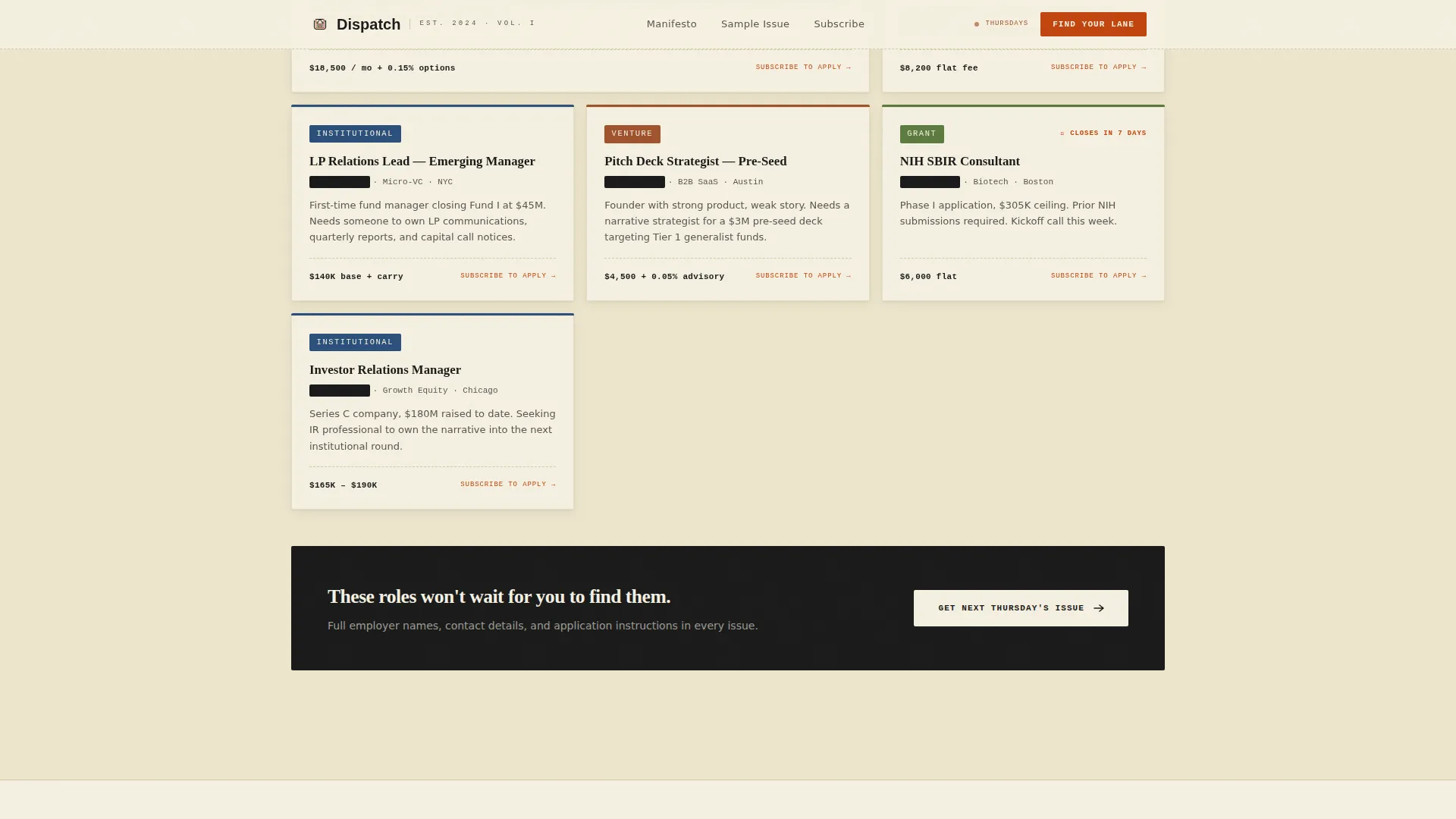
- Role-specific testimonial pull quotes and a past issues proof section with redacted employer subject line cards
- A clean footer following a horizontal flow pattern, set in mono serif for a classified-listing finish
Feature list
Five-Step Subscriber Diagnostic
The "Find Your Fundraising Lane" quiz walks visitors through five questions: current role, preferred funding stage, sector focus, availability type, and salary floor. On completion, results route each subscriber into one of three tracks: Institutional, Venture, or Grant. A secondary "Just Subscribe" path sits below for visitors who prefer the full unfiltered feed.
Manifesto Editorial Scroll
The body of the page reads like an editor's letter, not a marketing pitch. Each section makes one bold declaration. Stakes climb from the problem to the cost of missing out to redacted real subject lines from past issues. The scroll uses staggered reveal animations to give each statement room to land.
Short-Form Reel Hero Section
The hero is built around a fifteen-second looping top-down desk video. Hands tear open an envelope, unfold a broadsheet, and circle a listing with a red pen. A dateline stamp headline overlays the footage. The scan-line animation reinforces the editorial aesthetic without obscuring the copy.
Redacted Proof Card Layout
Past issue subject lines appear as physical proof artifacts in a broadsheet bento grid. Employer names are redacted using monospace type, which mirrors the classified-ad reference feel and signals that insider access is real without revealing confidential details.
Broadsheet Typography System
Headlines are set in Fraunces, an editorial serif that carries visible weight at large sizes. Body copy uses DM Sans for clean readability across column widths. Classified listings and redacted text render in JetBrains Mono, creating a visual hierarchy that shifts register the way a real newspaper does from front page to classifieds.
Role-Specific Testimonial Section
Three reader archetype testimonials appear in pull-quote treatment. Each quote maps to a primary audience segment: the former venture capitalist, the freelance chief financial officer, and the grant writer in transition. The pull-quote styling keeps the social proof visible without breaking the editorial tone.
Page sections overview
| Section | Purpose |
|---|---|
| Hero Reel | Opens with looping desk video and dateline headline to set editorial tone immediately |
| Manifesto Scroll | Escalates from problem to proof using editorial letter format with staggered reveals |
| Quiz Diagnostic | Routes visitors through five questions to assign a personalized newsletter track |
| Past Issues Proof | Shows redacted subject line cards as broadsheet-style proof of insider content |
| Testimonials | Presents three archetype pull quotes to build role-specific trust |
| Minimal Footer | Closes with horizontal flow pattern and mono serif classified-style finish |
Design & branding system
The visual identity follows an Ink and Paper theme built on a Parchment and Rust color system. Every color choice has a specific editorial role: backgrounds feel like aged reference books, body text reads like printed ink, and accent colors appear sparingly as annotations.
- Parchment cream (#F5F0E1) backgrounds, dried ink black (#1A1A1A) body text, and rusted orange (#A0522D) accents for editorial structure
- Margin-note red (#C1440E) reserved for links, buttons, and pull quote highlights to direct attention without overuse
- Fraunces serif for headlines, DM Sans for interface and body copy, and JetBrains Mono for classified and redacted text
Mobile & speed optimization
The template is built desktop-first, reflecting that the core reader is a professional at a desk on Thursday morning. Mobile layout is included as a functional fallback so the page remains usable across all devices.
- Static-first architecture means interactive elements like the quiz use client components only where necessary
- Scan-line animations, quiz state transitions, and manifesto reveal effects are scoped to medium complexity so the page stays responsive
- Desktop column widths and broadsheet grid proportions are preserved at large viewports, with graceful reflow for smaller screens
How this template helps you convert
The page is built around a conversion sequence that earns trust before asking for a commitment. Each section reduces friction and increases specificity so the visitor arrives at the call to action already convinced.
- The manifesto scroll elevates the perceived value of the newsletter before any form appears, making the subscription feel like access rather than sign-up.
- The five-step quiz filters intent and delivers a personalized track result, which makes the subscriber feel that the content was chosen for them rather than broadcast at them.
- The "Just Subscribe" fallback below the quiz captures visitors who are sold on the newsletter but unwilling to complete the diagnostic, so no motivated reader is left behind.
Other information about this template
This template was designed specifically for the startup fundraising ecosystem, where professional trust and editorial credibility directly affect conversion. A few additional details worth knowing before you build with it.
- The template supports a subscriber count display for social proof, visible near the hero or manifesto section
- The accordion FAQ component is included as an interactive element for handling common reader questions without leaving the page
- The footer follows a horizontal flow pattern set in mono serif type, consistent with the classified-listing design language
- The page is built for an English (US) audience using United States dollar formatting and MM/DD/YYYY date conventions
- The quiz track labels (Institutional, Venture, Grant) are editable, so you can rename them to fit your own newsletter segmentation model
- The template is categorized under Blog and Editorial with a startup fundraising newsletter subcategory, making it appropriate for any curated capital-markets content product
Theme
Ink & Paper
Creative direction
Manifesto
Color system
Parchment & Rust
Style
Editorial/Magazine
Direction
Quiz/Assessment
Page Sections
Five-step Subscriber Diagnostic Quiz
Manifesto Editorial Scroll
Short-form Reel Hero Section
Redacted Proof Card Layout
Broadsheet Typography Hierarchy
Role-specific Testimonial Pull Quotes
Related questions
Can I use this template without running the quiz?
How many newsletter tracks does the quiz support?
What does the hero section require to function?
Is this template suitable for a newsletter outside fundraising?
Can the redacted proof cards show real employer names?



