Cinematic Dark Venture Capital Newsletter Landing Page
Dispatch is a cinematic dark venture capital newsletter landing page built for editorial publishers who want to convert readers through atmosphere and craft. The horizontal scroll design guides visitors across five immersive panels, from an ink-wash illustration header to an unfinished excerpt that demands a click. No email field on the landing page itself keeps the experience frictionless and the subscribe gate intentional.
by Rocket studio
Quick summary
Dispatch is a horizontal scroll newsletter landing page designed for venture capital editorial publishers. Each panel draws visitors deeper into an insider VC world before delivering a single, deliberate call-to-action. The design earns the click through atmosphere, raw dialogue, and craft, not through noise.
Who this template is for
This newsletter landing page template works for publishers, writers, and editorial teams who create high-conviction content for a sophisticated audience. It suits anyone building a newsletter that needs to feel like a private document rather than a marketing page.
- Aspiring venture capitalists and junior associates who want a newsletter that mirrors their world
- Founders and operators building a media presence inside the venture ecosystem
- Independent writers and editorial designers launching a premium newsletter landing page with minimal setup
What problem this template solves
Most newsletter landing pages ask for an email address before earning the reader's trust. Dispatch solves that by letting the page itself do the persuasion work. The design is the pitch. Visitors read their way into subscribing rather than being nudged by generic copy.
- Readers leave unfocused newsletter landing pages before they sign up, because the page never makes them feel anything
- A good landing page must grab attention with a catchy headline and carry that momentum all the way to the sign-up moment
- The above-the-fold value proposition must immediately address the reader's interest and clarify what the newsletter offers, which most generic newsletter templates fail to do
What you get with this template
This template gives you a complete, ready-to-launch newsletter landing page with every panel pre-built and every design decision resolved. Using a template like this can save significant time compared to building a custom page from scratch, allowing you to focus on your content and campaigns.
- Five horizontal scroll panels, each representing a different hour in a venture capitalist's day
- An ink-wash SVG illustration header, two typographic content panels, a secondary illustration panel, and a click-through call-to-action panel
- A minimal footer following the Superhuman Extreme Minimal pattern, with no distractions before the subscribe gate
Feature list
This newsletter landing page template includes several carefully considered features. Each one serves the core goal: move visitors from curious to committed through editorial quality and restraint.
Horizontal Scroll Panel Layout
Each panel in the page design scrolls right like a page turn. The five-panel flow takes visitors from the illustration header through a morning memo, a raw interview dialogue, an LP dinner scene, and a final unfinished excerpt that demands a click to continue.
Ink-Wash SVG Illustration Header
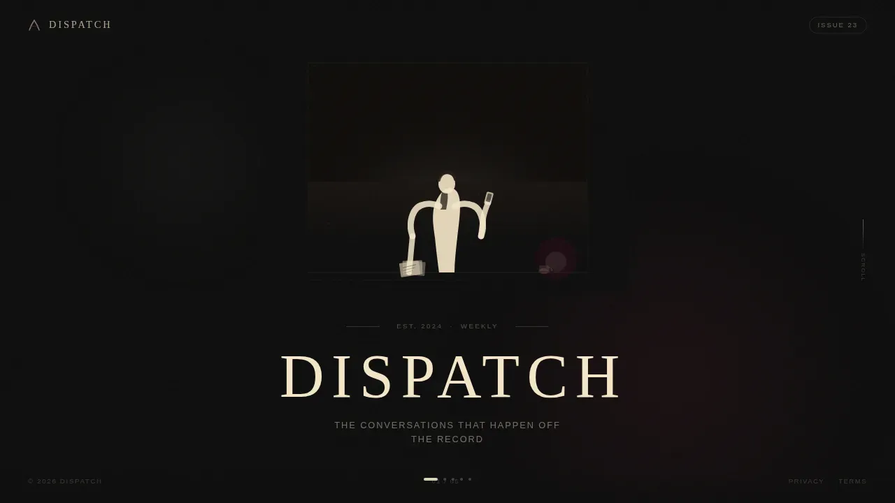
The header image features a loose, gestural silhouette at a floor-to-ceiling window, rendered in cream and burgundy on deep black. The newsletter title sits below it like a gallery placard. No animation, no motion. The stillness is the design statement.
Click-Through Call-to-Action Panel
The final panel places an unfinished excerpt mid-sentence, followed by a "Read the Full Interview" button in aged ink burgundy on cream. A secondary "Browse the Archive" text link gives skeptical visitors another path forward. No email field appears on this landing page.
Cinematic Dark Color System
The page design uses deep editorial black, warm lamplight cream, muted graphite, and aged ink burgundy. Burgundy appears only on pull-quotes, hover states, and the subscribe button, making every instance feel deliberate. High-contrast typography keeps body content and headlines easy to read.
Day-in-the-Life Creative Direction
Each scroll panel represents a different hour in a venture capitalist's working day. This structure gives the page a narrative arc rather than a static description, allowing visitors to experience the newsletter's editorial texture before they sign up.
Typographic Pull-Quote System
Key dialogue and thesis excerpts appear as highlighted block quotes in aged ink burgundy. This design pattern emphasizes the most compelling insights in the newsletter, giving visitors a clear sense of editorial voice and making the landing page feel more like a premium report than a sign-up form.
Page sections overview
| Section | Purpose |
|---|---|
| Hero Illustration Panel | Opens with ink-wash SVG art, newsletter title, and tagline |
| Morning Memo Panel | Typographic thesis excerpt with burgundy pull-quote |
| Interview Dialogue Panel | Raw two-person dialogue set on graphite background |
| LP Dinner Panel | Editorial paragraph with secondary ink-wash illustration |
| Call-to-Action Panel | Unfinished excerpt plus click-through subscribe button |
| Minimal Footer | Closes the page with no competing distractions |
Design & branding system
The page design follows an Atelier Studio editorial theme built around the Cinematic Dark color palette. Every color has a defined role, and no element competes for attention with the subscribe button or the body content.
- Deep editorial black (#0D0D0D) dominates every panel background; warm lamplight cream (#F5E6C8) carries all body type and headline work; muted graphite (#3A3A3C) separates horizontal sections like soft chapter breaks
- Aged ink burgundy (#6B1D2A) appears only on pull-quotes, hover states, and the call-to-action button, keeping every use deliberate and visually significant
- Typography pairs Fraunces serif headlines with DM Sans body text, creating an editorial contrast that feels like a printed magazine built for a dark screen
Mobile & speed optimization
The primary experience is a desktop-first horizontal scroll, navigated by mouse wheel or drag. On smaller screens, the page falls back to a clean vertical layout so the newsletter landing page remains fully readable on any device.
- Static panels and SVG illustrations keep the page light and fast-loading, which is important for maintaining a great experience across connection speeds
- Subtle scroll-linked opacity is the only animation present; stillness and restraint define the page's performance character
- Responsive layout adjustments require only minor tweaks from users who want to personalize the mobile reading experience for their specific audience
How this template helps you convert
A newsletter landing page should guide visitors toward one specific action. Dispatch earns that action by building editorial intimacy across each scroll panel before the call-to-action appears.
- The above-the-fold illustration and tagline immediately signal editorial quality, giving visitors a reason to keep scrolling before they ever see a sign-up prompt
- Each subsequent panel deepens trust by showing raw, specific content examples that demonstrate the newsletter's voice and insider access
- The final panel leaves an excerpt unfinished mid-sentence, creating a pull that makes clicking "Read the Full Interview" feel like a natural next step rather than a conversion event
Other information about this template
This template is built for editorial publishers who want great results without needing to hire designers or developers. Newsletter templates like this one work best when paired with clear, regularly published content that keeps subscriber interest high. The following details can help you decide if this template fits your workflow.
- You can customize colors, typography, and panel copy through a text editor or your preferred page builder, allowing changes without touching the underlying layout structure
- Landing page templates like this store your visual identity in one place, making it easy to personalize future campaigns without rebuilding from scratch
- Platforms such as Canva offer free newsletter templates for simpler use cases, while tools like Digioh provide lots of landing page template options to help you launch campaigns quickly; this Dispatch template is purpose-built for editorial newsletter publishers who need cinematic design depth
- A minimalist subscribe gate that asks only for an email address is included as the destination after the click, keeping friction low and sign conversions high
- Embedding the landing page on a custom domain with HTTPS is supported, giving your newsletter site a credible, professional web address
- Using quantitative social proof such as a subscriber count or recognizable firm logos on the subscribe gate page can further build trust with potential readers once they click through
- Regularly brainstorming content ideas that readers find genuinely interesting is just as important as the page design itself for long-term newsletter growth
- The footer follows a Superhuman Extreme Minimal pattern, keeping the page free of services or navigation links that could pull visitors away before they sign up



Theme
Atelier Studio
Creative direction
Day-in-the-Life
Color system
Cinematic Dark
Style
Horizontal Scroll
Direction
Click-Through
Page Sections
Horizontal Scroll Panel Layout
Ink-wash SVG Illustration Header
Click-through Call-to-action Panel
Cinematic Dark Color System
Typographic Pull-quote System
Day-in-the-life Creative Direction
Related questions
Does this landing page include the email subscribe form?
Can I edit the panel copy and images without a developer?
Will this landing page work on mobile devices?
How do I personalize this template for my newsletter brand?
Is this template suitable for a newsletter with no existing subscriber count?



