SaaS & Cloud Newsletter Blog Website Template
Dispatch is a cinematic landing page template built for a weekly cloud infrastructure interview newsletter. It combines a half-page editorial portrait hero, a masonry archive grid, pull-quote triptych, and a subscribe section into one scroll-driven, click-through page. Designed for B2B media, it earns trust before asking for anything.
by Rocket studio
Quick summary
Dispatch is a single-page landing page template for a weekly newsletter profiling the engineers and founders behind cloud infrastructure. It uses a heritage editorial aesthetic, a masonry grid archive, and a cinematic dark color system to draw senior technical readers in and move them toward reading the latest issue or subscribing for free.
Who this template is for
This template is built for publishers and creators running a serious B2B editorial newsletter in the infrastructure, DevOps, or cloud technology space. It fits anyone who needs a landing page that reads like a trade journal, not a startup pitch deck.
- Senior DevOps engineers and platform engineers who want a page that speaks their language directly
- Chief Technology Officers and vendor evaluators who discover newsletters through the people profiled in them
- Ambitious mid-career engineers and independent tech media publishers who want an editorial presence that signals depth and seriousness
What problem this template solves
Most newsletter landing pages look identical. They lead with a benefit headline, a single email field, and a promise of value. For a technical audience that prizes signal over noise, that approach gets ignored fast.
- The template solves the credibility gap by showing the archive before asking for a subscription, proving the newsletter has been doing this longer and more seriously than the visitor expected
- It removes the blank-slate problem for editorial newsletters by providing a full cinematic layout with a portrait hero, pull-quote triptych, and masonry grid already composed and ready to populate
- It gives click-through clarity by making the primary call to action read the latest issue, not subscribe, so first-time visitors can sample before committing
What you get with this template
You get a fully structured, single-page landing page with five distinct content sections, a floating call-to-action bar, and a subscribe form with a frequency toggle. Every section is composed and ordered to build trust gradually as the visitor scrolls.
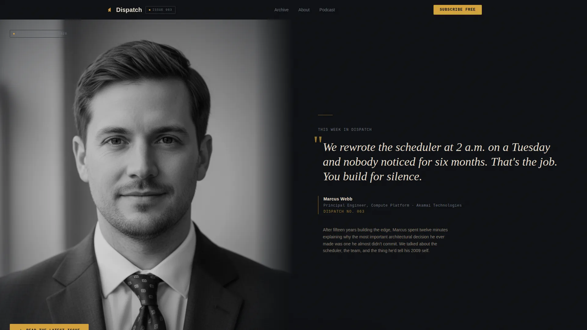
- Hero section with half-page editorial portrait and large serif pull quote, plus primary amber call-to-action button
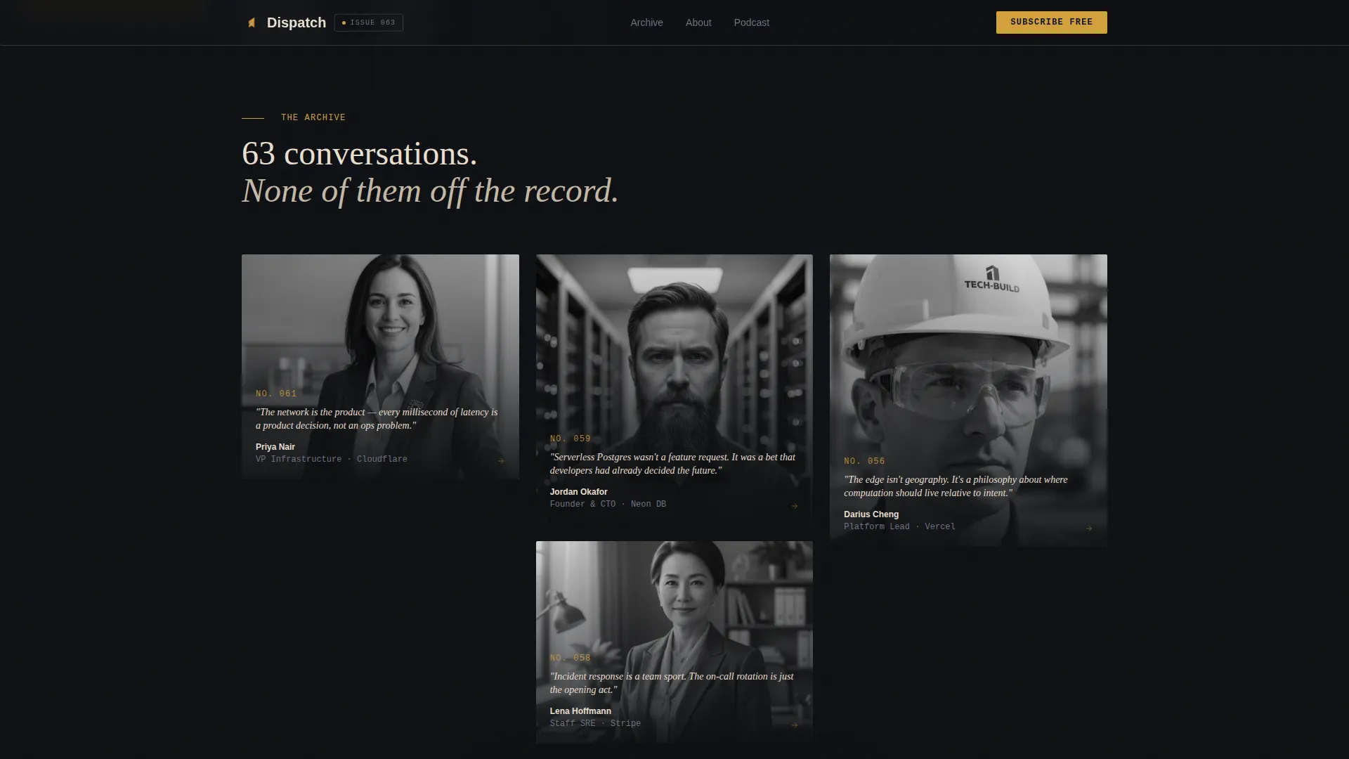
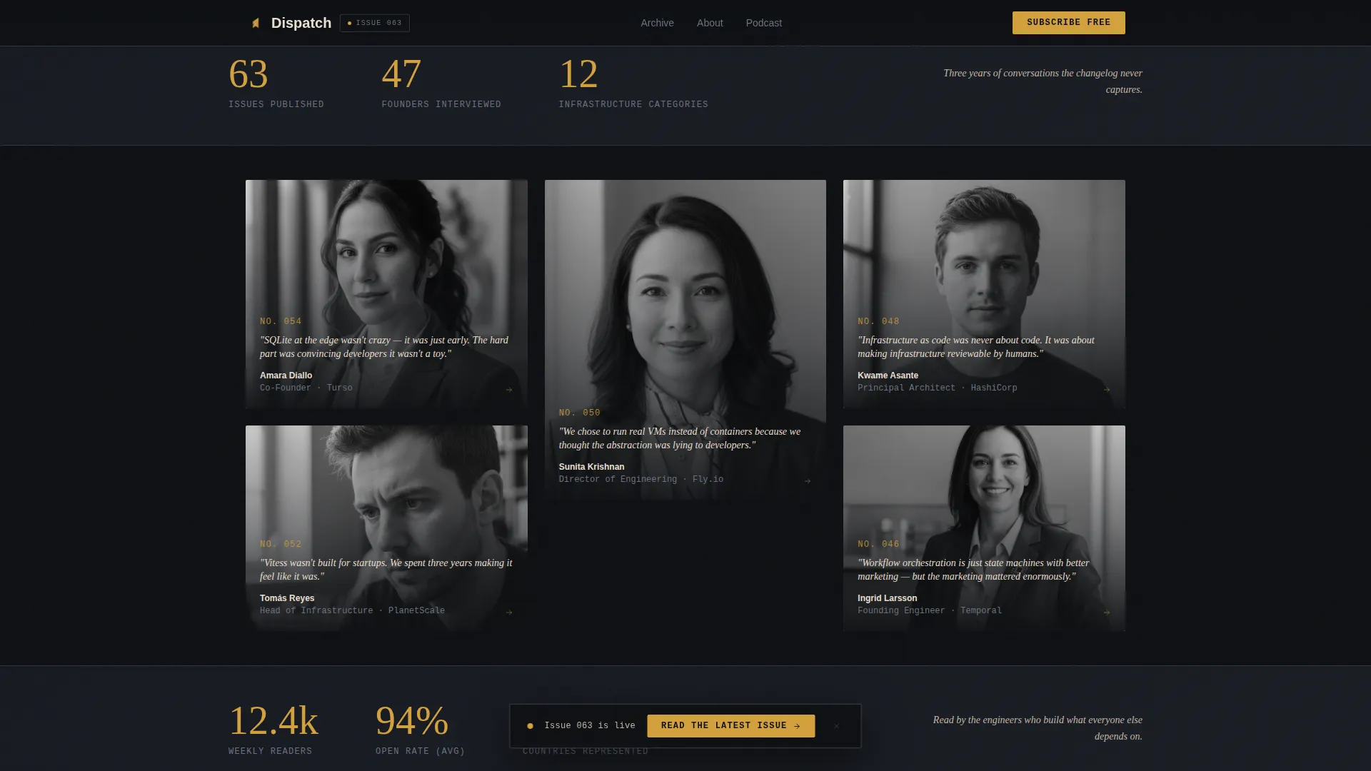
- Masonry archive grid of past interview portrait tiles, staggered like pinned clippings, with data callouts between rows to ground the archive in scale
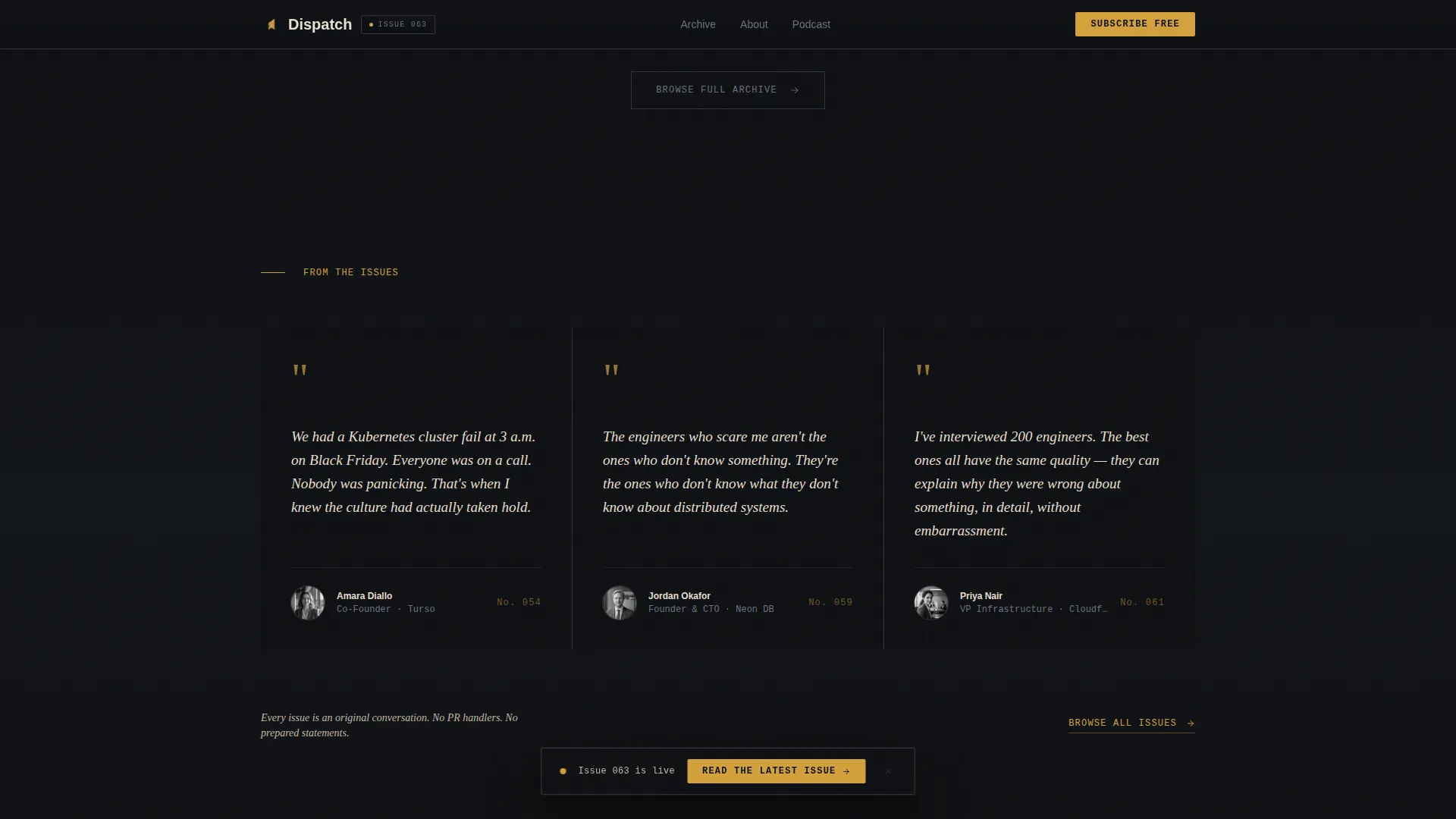
- Pull-quote triptych, subscribe section with email field and weekly or monthly digest toggle, and a Vercel Horizontal Flow footer pattern
Feature list
This template is built around a specific editorial and conversion logic. Each feature serves a defined purpose in the reader journey.
Cinematic Half-Page Hero
The hero splits the page into two panels. The left panel holds a high-contrast black-and-white portrait, cropped tight at the shoulders with direct eye contact. The right panel carries a large serif pull quote set on warm parchment, with the subject's name, title, company, and issue number rendered in small monospaced type below.
Masonry Archive Grid
Past interview cards are laid out in a Pinterest-style masonry grid, each tile pairing a portrait with a one-sentence thesis from that conversation. The tiles are staggered at different heights to feel like a living research wall, not a marketing carousel. Scroll-reveal animations bring each row into view progressively.
Pull-Quote Triptych
Three full pull quotes appear in large serif type on the deep editorial black background. This section does the trust-building work without adding a word of marketing copy, letting the subjects speak before the page asks for anything.
Issue Archive Data Callouts
Between every third row of the masonry grid, a data callout appears inline. These single-stat lines, such as number of founders interviewed or infrastructure categories covered, anchor the scroll experience in editorial scale and authority.
Subscribe Section with Frequency Toggle
A focused subscribe section presents a single email field alongside a frequency toggle that lets visitors choose between a weekly issue and a monthly digest. This reduces commitment friction by giving readers a choice before they sign up.
Floating Call-to-Action Bar
After two scroll depths, a floating bar appears at the edge of the viewport with the primary call to action. It stays accessible without interrupting the reading experience, capturing intent from visitors who scroll without clicking the hero button.
Page sections overview
| Section | Purpose |
|---|---|
| Hero Portrait Panel | Sets editorial tone; primary call to action |
| Masonry Archive Grid | Shows interview depth; builds credibility |
| Data Callout Rows | Anchors archive scale with specific numbers |
| Pull-Quote Triptych | Demonstrates content quality before conversion |
| Subscribe Form | Captures email with weekly or monthly toggle |
| Floating Action Bar | Persistent call to action on scroll |
| Footer | Horizontal flow navigation and links |
Design & branding system
The design follows a Heritage and Story theme expressed through a Cinematic Dark color system. Every visual choice references documentary film and trade journal editorial rather than conventional SaaS marketing.
- Color palette: deep editorial black (#0D0F12) as the base, warm parchment (#E8DFD0) for text panels, muted silver infrastructure gray (#6B7280) for metadata and labels, and archival amber (#D4A03C) reserved exclusively for links, pull-quote marks, and subscribe buttons
- Typography: Fraunces serif for display headings and pull quotes, DM Sans for body text and paragraph copy, and JetBrains Mono for meta labels such as issue numbers, subject titles, and data callouts
- Visual texture: a grain texture overlay runs across the page surface, and the masonry grid uses hover states on portrait tiles to reinforce the editorial feel without breaking the cinematic atmosphere
Mobile & speed optimization
The template is built desktop-first, prioritizing the experience for senior engineers and technical leaders who read at a desk. A strong mobile fallback is included so the layout holds at smaller viewport sizes.
- Static sections use server-rendered components to keep the initial page load clean and predictable
- Scroll-dependent behaviors, including the staggered masonry reveal and the floating call-to-action bar, are handled by client components so they do not block the static content from loading first
- The masonry grid reflows gracefully on smaller screens, maintaining portrait and thesis pairing without breaking the archive layout
How this template helps you convert
The conversion logic of this template is built on showing before asking. Every section earns the next click by demonstrating the newsletter's depth and seriousness before presenting a form or a button.
- The hero leads with a real portrait and a specific human quote, signaling immediately that this is journalism with a point of view, not a generic content product
- The masonry archive and data callouts prove scale and consistency before any subscribe prompt appears, so visitors arrive at the form already convinced the newsletter is worth their inbox
- The frequency toggle on the subscribe form reduces the barrier to entry by letting readers opt for a monthly digest instead of a weekly commitment, lowering the perceived cost of signing up
Other information about this template
This template is designed for a specific publishing context. A few additional details help clarify its full scope and intended use.
- The template style is Masonry and Pinterest-layout, making it well suited for newsletters with an existing archive of interview subjects and portrait photography
- Animation intensity is set to medium, with scroll-reveal staggering on the masonry grid and a grain texture overlay that adds atmosphere without slowing the browsing experience
- The footer uses a horizontal flow pattern suited to editorial publication layouts, keeping navigation minimal and the brand footprint clean
- The intersection of the Blog and Editorial category with a SaaS and Cloud Newsletter subcategory means this template is positioned for B2B media publishers who want their landing page to carry the editorial weight of the content itself
Theme
Heritage & Story
Creative direction
Industry Report
Color system
Cinematic Dark
Style
Masonry/Pinterest
Direction
Click-Through
Page Sections
Cinematic Half-page Hero Section
Masonry Interview Archive Grid
Inline Archive Data Callouts
Pull-quote Triptych Block
Subscribe Form with Frequency Toggle
Floating Call-to-action Bar
Related questions
Does this template include a working email subscribe form?
Can I use this template if my newsletter is new and has a small archive?
What does the frequency toggle in the subscribe section do?
Is the floating call-to-action bar always visible while scrolling?
Is this template only for cloud infrastructure newsletters?



