Climate & Sustainability Newsletter Specialist Blog Website Template
Dispatch is a climate and sustainability weekly newsletter landing page built on an asymmetric 60/40 grid. It pairs a hand-drawn SVG illustration header with editorial broadsheet typography to earn reader trust before asking for a click. The page guides sustainability professionals, climate journalists, and researchers toward a single clear action: reading the latest free edition.
by Rocket studio
Quick summary
Dispatch is a single-page landing page for a weekly climate and sustainability newsletter. It uses an asymmetric 60/40 grid, an ink-and-paper visual identity, and a Creator Spotlight structure to demonstrate editorial depth. The goal is simple: give readers enough to trust the writing, then earn the click to the full edition.
Who this template is for
This template is built for independent newsletter writers, climate journalists, and sustainability media teams who need a landing page that earns trust before asking for a subscription. It suits anyone whose audience values depth over aggregation.
- Sustainability officers and ESG (Environmental, Social, and Governance) professionals who read critically and commit slowly
- Climate-beat journalists and graduate researchers who need original reporting, not curated headlines
- Newsletter creators in climate, policy, or environmental advocacy who lead with their writing as their main credential
What problem this template solves
Most newsletter landing pages ask for an email before they offer anything in return. That approach fails readers who arrive skeptical and need to see the quality of the work first. This template flips the structure.
- It leads with a generous content preview, not a sign-up form, so readers can assess the writing before committing
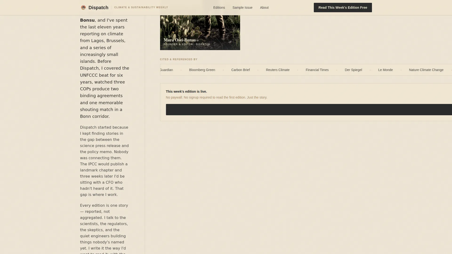
- It builds author credibility through a halftone portrait, a first-person bio, and a ticker of outlets that have cited the newsletter
- It removes friction from the primary conversion path by sending visitors directly to the latest hosted edition, where the native subscribe prompt lives
What you get with this template
The template delivers a fully structured, single-page editorial landing page with five distinct content sections and a footer. Every element is designed to reflect the weight and warmth of print journalism.
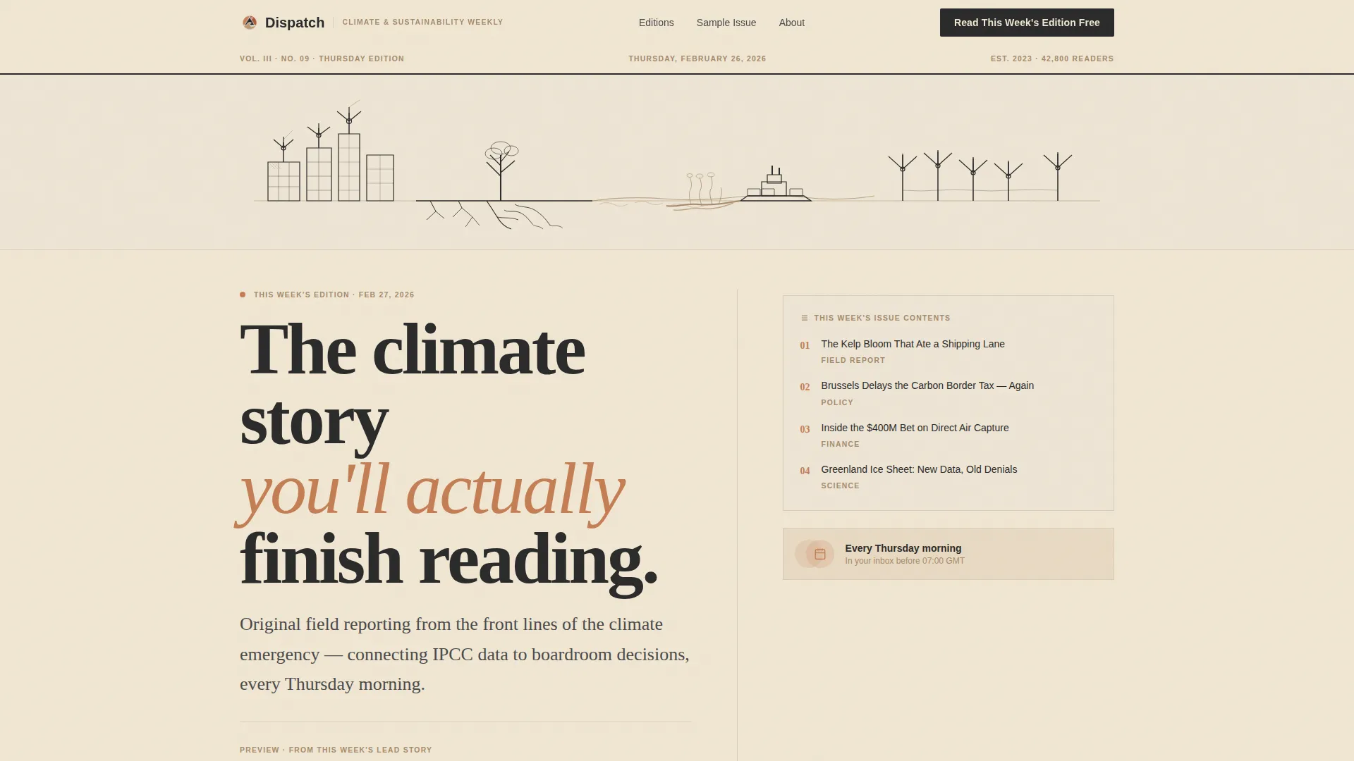
- A hero section with an SVG draw-on illustration, a heavy serif headline, a two-paragraph excerpt preview, and a visible table of contents for the current issue
- A 60/40 asymmetric Creator Spotlight section with a long-form typeset excerpt on the wide column and the author profile, halftone portrait, and citations ticker on the narrow column
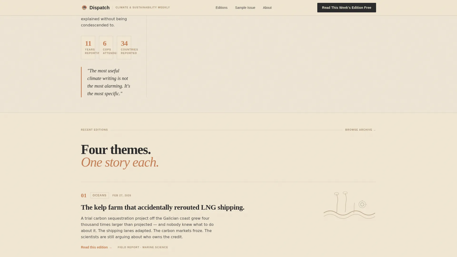
- Scroll-revealed edition theme cards covering Oceans, Policy, Tech, and Justice, each with a spot illustration and a single compelling paragraph
Feature list
This section describes the key built-in capabilities of the Dispatch landing page template.
SVG Draw-On Illustration Header
A custom hand-drawn, single-line ink illustration stretches edge to edge across the top of the page. It animates with a slow draw-on effect using SVG path animation, as if an invisible nib is completing the scene in real time. The illustration depicts wind turbines on city rooftops, roots beneath pavement, and a cargo ship trailing a kelp bloom.
Asymmetric 60/40 Editorial Grid
The page uses a deliberate 60/40 column split throughout the Creator Spotlight section. The wider column carries the long-form typeset sample excerpt with pull quotes, inline illustrations, and marginal annotations. The narrower column holds the author bio, halftone portrait, and a rolling outlet citations ticker.
Scroll-Revealed Edition Theme Cards
Four thematic edition cards, covering Oceans, Policy, Tech, and Justice, are revealed progressively as the reader scrolls. Each card carries its own spot illustration and a short editorial paragraph. The reveal uses IntersectionObserver-triggered staggered fade animations.
Click-Through Primary Call to Action
The primary call-to-action button reads "Read This Week's Edition Free" and appears in three positions: below the hero excerpt, pinned to the 40-column rail midway down the page, and anchoring the footer. There is no sign-up form on this page. The button routes visitors to the latest full edition hosted on the newsletter platform.
Social Proof and Archive Path
A reader count line is displayed in sandstone type as quiet social proof beneath the final call to action. A secondary text link, "Browse the archive," provides an alternative path for skeptical visitors who want to read multiple editions before committing.
Warm Stone Typographic System
Headlines are set in Fraunces, a heavy display serif that carries the visual weight of editorial print. Body text uses DM Sans for clean, readable contrast. Terracotta is used sparingly for links, buttons, and pull quotes, functioning like a red drop cap in a magazine feature.
Page sections overview
| Section | Purpose |
|---|---|
| Hero illustration header | Animate the brand illustration and introduce the headline |
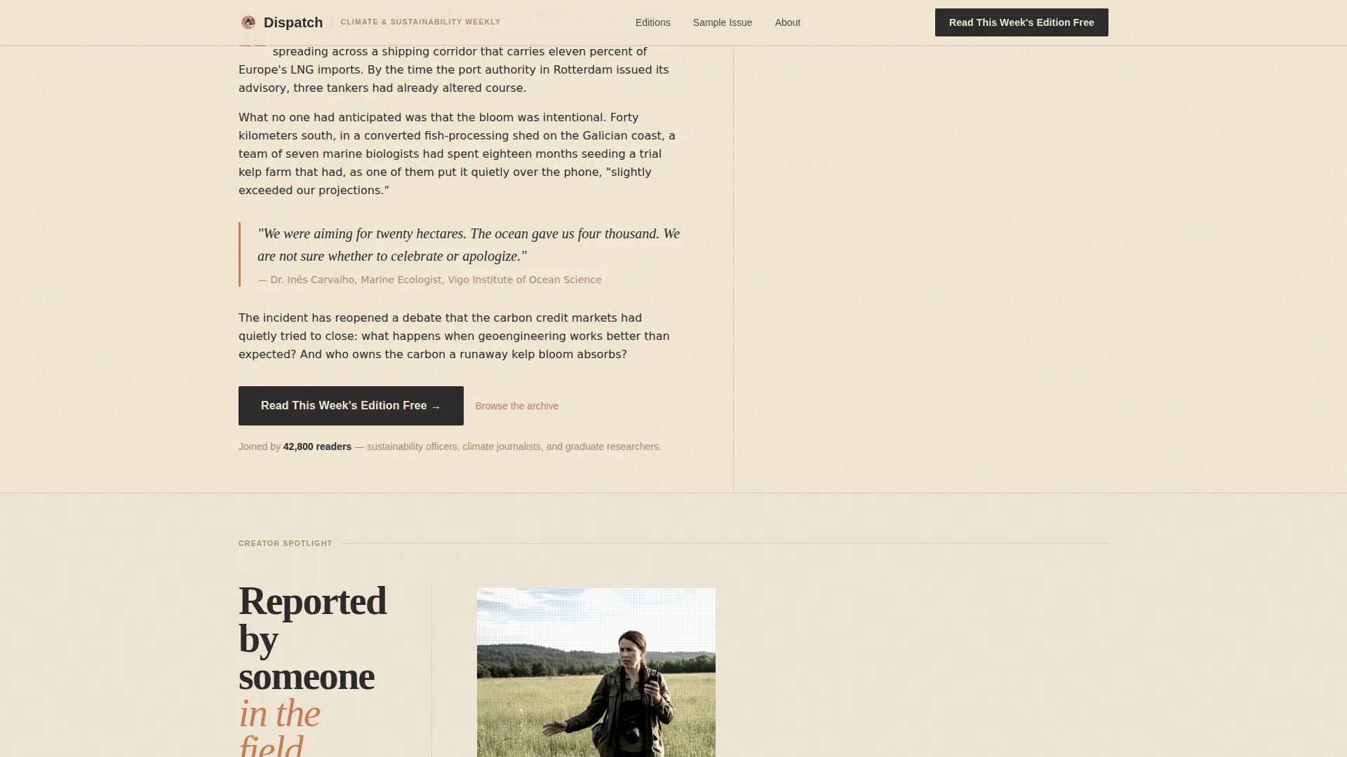
| Excerpt preview block | Show two paragraphs of real editorial content before any ask |
| Current issue contents | Display a visible table of contents for the latest edition |
| Creator Spotlight columns | Build author trust through bio, portrait, and citation ticker |
| Edition theme cards | Reveal four thematic editions with scroll-triggered animations |
| Long-form sample excerpt | Demonstrate writing depth with pull quotes and margin notes |
| Final call-to-action section | Deliver social proof, primary button, and archive text link |
| Footer pattern | Close the page with horizontal layout and navigation links |
Design & branding system
The visual identity follows an Ink and Paper theme built around the Warm Stone color system. Every color choice references the physical texture of letterpress printing on cotton stock, keeping the design grounded and editorially serious.
- Palette: unbleached parchment (#F0E6D3) and cooler ivory (#EDE4D4) alternate as section backgrounds; charcoal press ink (#2B2B2B) carries all body text; sandstone shelf (#A68B6B) appears in subtle supporting type; muted terracotta (#C47E54) is reserved for buttons, links, and pull quotes
- Typography: Fraunces serif for headlines at display weight, DM Sans for body text, with marginal annotations and pull quotes creating a layered editorial hierarchy
- Illustration style: architectural sketch meets botanical diagram, crosshatched and imperfect, consistent with the hand-drawn header aesthetic throughout all spot illustrations
Mobile & speed optimization
The template is designed desktop-first to honor the 60/40 asymmetric grid at full width. On smaller screens, the layout stacks gracefully so no content is lost.
- The asymmetric columns stack vertically on mobile, placing the excerpt above the author profile in a logical reading order
- CSS animations are GPU-accelerated to keep scroll reveals and the SVG draw-on effect smooth across devices
- Static content is prioritized structurally, with animations layered on top rather than blocking initial render
How this template helps you convert
The page is built around a give-first philosophy. It earns the click by delivering real editorial value before presenting any call to action.
- Two generous preview paragraphs and a visible table of contents let readers judge the writing on their own terms, raising confidence before the button appears
- The Creator Spotlight section builds personal trust through the author's halftone portrait, first-person bio, and a rolling ticker of outlets that have cited the newsletter, converting credibility into click intent
- The three-position call-to-action placement, combined with the quiet reader count social proof line and the secondary archive link, ensures both ready-to-click readers and cautious browsers have a clear next step
Other information about this template
This landing page template is a strong fit for climate and sustainability newsletter creators who publish on platforms that host full editions with native subscribe prompts. It is equally useful for environmental journalism projects, policy-focused editorial brands, and independent researchers building a public audience around their work.
- The template style is Asymmetric Grid (60/40), designed for editorial content where writing quality is the primary conversion argument
- The header concept is a Custom Illustration using SVG path animation, making the page visually distinctive without relying on photography
- The creative direction is Creator Spotlight, centering the writer's voice and credibility as the engine of reader trust
- The landing page direction is Click-Through, routing all conversion through a single button to an externally hosted edition rather than capturing data on the page itself
- The color system is Warm Stone, and the theme is Ink and Paper, both of which reinforce the broadsheet editorial tone throughout every section
Theme
Ink & Paper
Creative direction
Creator Spotlight
Color system
Warm Stone
Style
Asymmetric Grid (60/40)
Direction
Click-Through
Page Sections
SVG Draw-on Illustration Header
Asymmetric 60/40 Editorial Grid
Scroll-revealed Edition Theme Cards
Three-position Click-through Call to Action
Social Proof and Archive Navigation
Warm Stone Typographic System
Related questions
Does this template include a sign-up form?
Can I update the excerpt and edition theme cards with my own content?
Who is this template designed for?
How does the social proof element work?
Does the page display well on mobile devices?



