Agency & Freelance Newsletter Blog Website Template
Dispatch is a heritage-editorial landing page template built for a weekly freelance newsletter. A giant serif headline anchors the parchment background, while a masonry grid of past-issue cards carries pull-quotes, revenue figures, and tactical wins. The Click-Through flow routes curious visitors to real content before asking for anything, building trust one scroll at a time.
by Rocket studio
Quick summary
Dispatch is a single-page newsletter landing page template designed for the agency and freelance weekly newsletter space. It pairs an oversized Fraunces serif headline with a masonry pinboard of past-issue highlights, guiding visitors through real proof of value before surfacing a subscribe prompt. The result is a landing page that reads like a curated editorial archive, not a signup wall.
Who this template is for
This template was built for independent creative professionals who publish or plan to publish a weekly newsletter for peers in the freelance and agency world. It suits operators who want to lead with content credibility rather than a cold subscribe form.
- Solo copywriters publishing weekly freelance intelligence between client retainers
- Small design studios and two-person shops promoting their first six-figure project stories
- Agency founders who write the briefs themselves and want a landing page that reflects that voice
What problem this template solves
Most newsletter landing pages ask visitors to subscribe before they have read a single word. That cold ask creates friction and drives away the exact people who would become your most loyal readers. Dispatch solves this by putting proof first and the subscribe form second.
- Visitors see real past-issue cards with pull-quotes and revenue figures before any email input appears
- The sticky call-to-action bar and full-width break give returning visitors a direct path to the latest issue
- The archive-style masonry layout rewards scrolling, keeping attention long enough to build genuine trust
What you get with this template
You get a fully structured, single-page landing page with every section, animation, and interactive element described in the brief. Nothing requires you to stitch together separate components from scratch.
- A giant centered serif hero section with a pulsing rust-colored scroll arrow
- A two-row masonry grid of creator spotlight cards with varied heights, pull-quotes, and text-only variants
- A sticky bottom call-to-action bar, a full-width call-to-action break band, a minimal email capture section, and an ultra-minimal footer
Feature list
This template ships with the following built-in capabilities, all drawn directly from the design and interaction brief.
Giant Centered Hero Headline
An oversized Fraunces serif headline sits centered on the aged-linen background with no supporting imagery. The typeface carries the full editorial weight, and a rust-colored arrow pulses beneath the text to invite the first scroll.
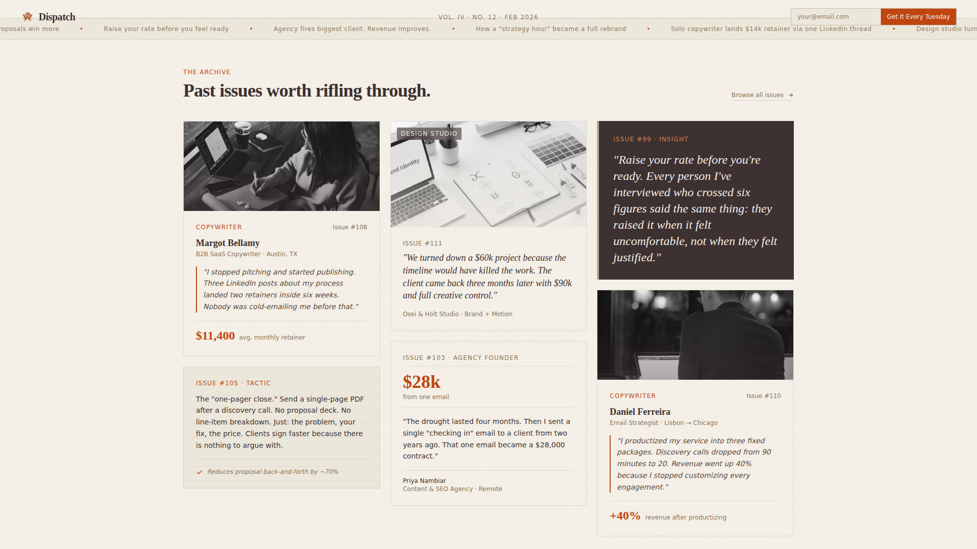
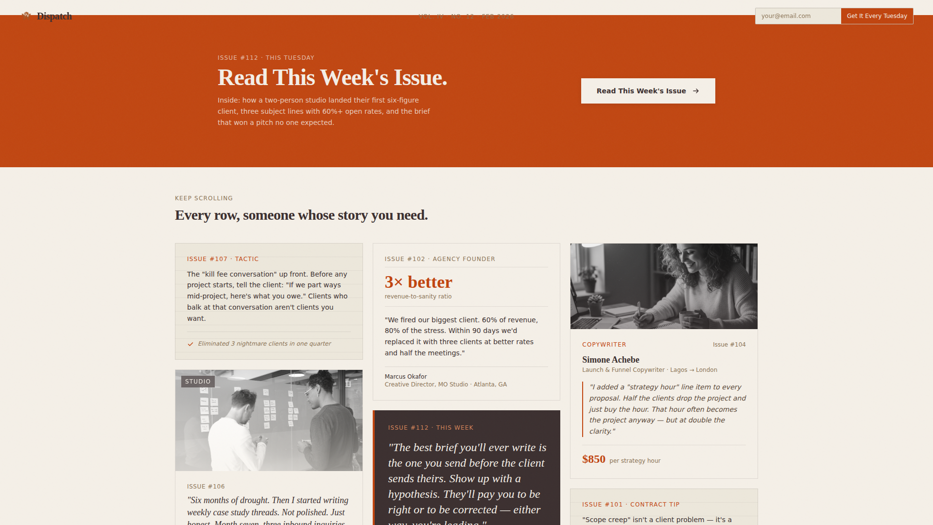
Two-Row Masonry Archive Grid
Two rows of Pinterest-style masonry cards recreate the feeling of a curated pinboard. Cards vary in height and density, mixing image-heavy layouts with text-only designs. Each card surfaces a freelancer profile, a pull-quote, a revenue figure, or a single tactical takeaway.
Proof-First Click-Through Flow
The primary call to action reads "Read This Week's Issue" and routes visitors directly to the latest newsletter issue. This proof-first approach lets visitors experience real content before they are ever asked to subscribe.
Sticky Call-to-Action Bar
After the third scroll depth, a sticky bar appears at the bottom of the viewport with the primary call-to-action link. It stays visible without obscuring the content, giving ready visitors a persistent path to act.
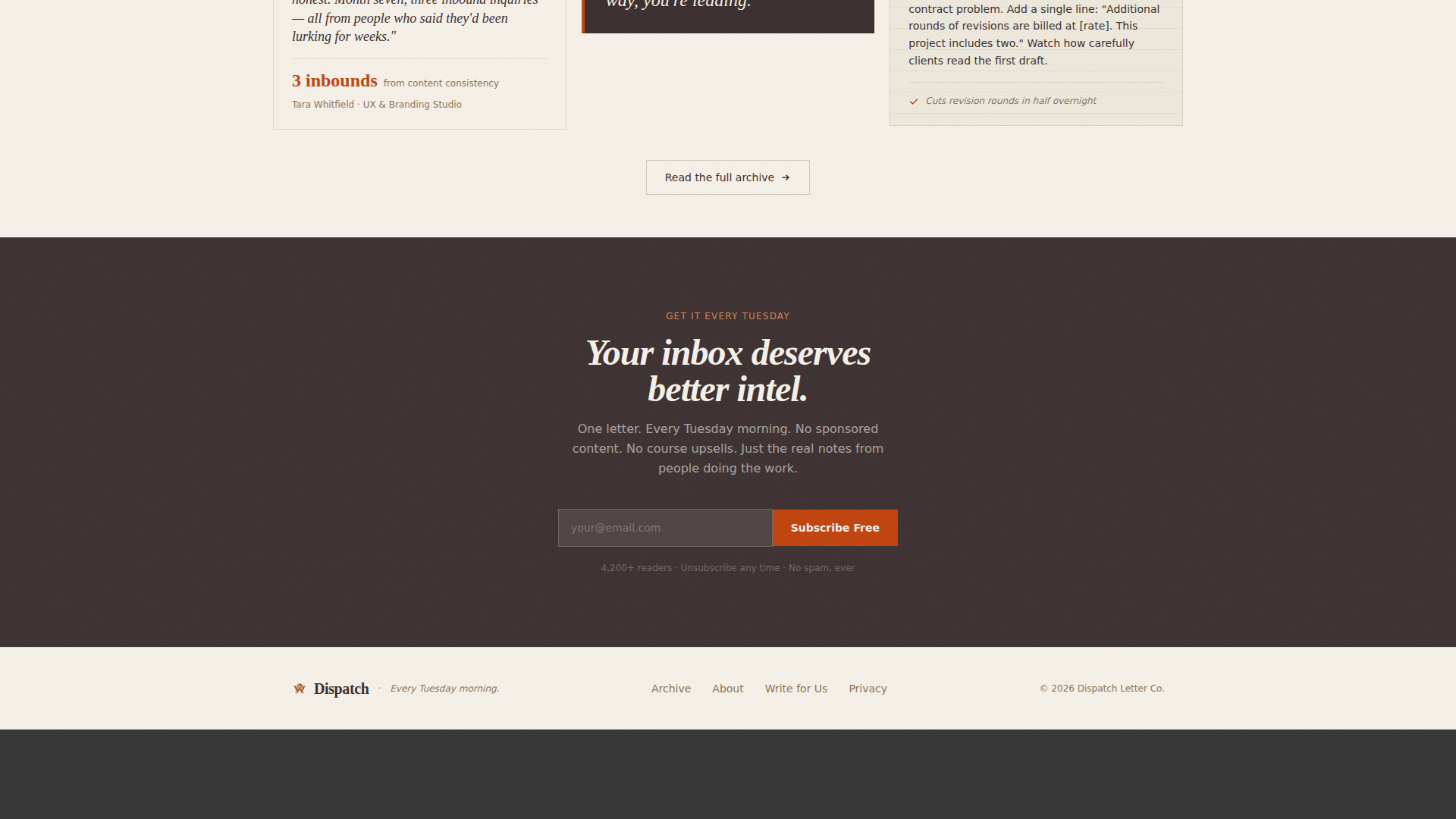
Floating Email Capture Input
A secondary email-only input field floats in the top-right corner for visitors who are already convinced. It asks only for an email address, creating a frictionless path for motivated subscribers.
Masked Text Reveals and Card Hover States
Scroll-triggered masked text reveals animate section headlines as they enter the viewport. Masonry cards lift slightly on hover, and parallax scroll adds subtle depth to the reading experience.
Page sections overview
| Section | Purpose |
|---|---|
| Hero Headline | Anchors editorial tone with oversized serif type and pulsing rust arrow |
| Masonry Grid Row 1 | Displays pinboard archive cards with freelancer profiles and pull-quotes |
| Call-to-Action Break | Full-width rust band directing visitors to read the latest issue |
| Masonry Grid Row 2 | Continues the archive with varied-height cards and tactical takeaways |
| Subscribe Section | Minimal email capture on a dark dried-ink background |
| Footer | Ultra-minimal horizontal footer pattern |
Design & branding system
The visual language is rooted in a Heritage and Story theme, drawing from letterpress broadsheet aesthetics and the tactile warmth of a worn Moleskine notebook. Every color and type choice reinforces the feeling that real notes from real people live inside this page.
- Color palette: aged linen (#F5F0E8) background, dried ink brown (#3B2F2F) for body text, oxidized iron (#A0522D) for mid-tone elements, and margin-note red (#C1440E) reserved for links and hover states
- Typography: Fraunces serif for all display and headline text, DM Sans for body copy and interface elements
- Visual texture feels deliberately imperfect, evoking a letterpress broadsheet pulled from a wooden drawer rather than a polished digital product page
Mobile & speed optimization
The template is designed desktop-first to match the behavior of newsletter readers opening their browser on a Tuesday morning, while maintaining full mobile support across all sections.
- Masonry grid reflows responsively for smaller viewports so cards remain readable without horizontal scrolling
- Scroll-depth logic for the sticky call-to-action bar and parallax effects uses client-side components, keeping static sections rendered server-side for faster initial loads
- The floating email input and sticky bar adapt to mobile layout without overlapping critical content
How this template helps you convert
Dispatch is structured around a proof-first conversion sequence. Every design and interaction decision moves visitors closer to clicking through to the newsletter before they are asked for anything.
- The hero headline and masonry archive build credibility by showing real freelance stories, revenue numbers, and tactical wins, establishing trust before any subscribe prompt appears.
- The sticky call-to-action bar and full-width break band give visitors two low-friction moments to click through to the latest issue, so the template earns the subscribe ask that follows.
- The floating top-right email input captures motivated visitors who arrive already ready to subscribe, converting them without interrupting the reading flow for everyone else.
Other information about this template
This section covers additional context about how the template was built and what environment it is suited for.
- The template is built with a mix of server-side static components and client-side interactive components for scroll tracking and sticky behavior
- Animation level is set to medium: masked text reveals on scroll entry, parallax depth on masonry rows, and card hover lifts
- The footer follows a Vercel Horizontal ultra-minimal pattern with no heavy navigation or dense link columns
- Localization defaults are set to English, United States dollar currency format, and United States date formatting
- The template sits within the Blog and Editorial category, specifically the Agency and Freelance Newsletter subcategory and niche
Theme
Heritage & Story
Creative direction
Creator Spotlight
Color system
Parchment & Rust
Style
Masonry/Pinterest
Direction
Click-Through
Page Sections
Giant Centered Serif Hero
Two-row Masonry Archive Grid
Proof-first Click-through Design
Sticky Call-to-action Bar
Floating Email Capture Field
Scroll Animations and Hover States
Related questions
What kind of newsletter does this template work best for?
Can I edit the headline and masonry card content?
Does the template include email subscribe functionality?
Is this template suitable for mobile visitors?