Logistics Podcast Landing Page Template
Dispatch is a logistics podcast landing page template built for audio journalism with real industry weight. It guides visitors through a chapter-by-chapter origin story, delivers three free episodes before any ask, and gates a curated resource archive behind a simple email field. The design follows an Ink and Paper editorial identity with broadsheet serif type and a Japanese Zen color palette.
by Rocket studio
Quick summary
Dispatch is a single-column flow landing page for a weekly logistics podcast. It blends documentary editorial design with a trust-first content strategy. Visitors move through a founder origin story, three free episodes, and a gated resource library. The page earns the email subscription by giving generously before asking for anything.
Who this template is for
This template suits creators and professionals who run a logistics podcast, audio journalism show, or industry media platform. It works especially well when the audience is already inside the industry and expects substance over sales pitch.
- Freight brokers, supply chain managers, and operations directors who produce or sponsor audio content
- Podcast creators covering trade, shipping, or industrial topics who need a professional landing page
- Logistics media brands building a subscriber list through curated, gated resources
What problem this template solves
Most podcast landing pages ask for an email before proving their value. That approach fails with experienced industry professionals who have little patience for vague promises. This template solves the trust gap by leading with storytelling and free content first.
- Visitors leave without subscribing because the page offers no preview of real depth or expertise
- Generic podcast templates do not reflect the credibility that freight and logistics professionals expect
- There is no clear narrative thread to hold a visitor's attention from arrival to conversion
What you get with this template
You get a complete single-page layout built around a serialized storytelling flow and a two-stage conversion path. Every section earns the next one, so visitors feel pulled forward rather than pushed toward a form.
- A documentary-style hero section with a broadsheet serif headline and a pulsing vermillion play button
- Three scroll-linked origin story chapters that unfold like a serialized newspaper feature
- A free episode showcase with waveform-style episode cards, followed by an email-gated resource archive
Feature list
The template includes a focused set of components, each matched to a specific moment in the visitor's journey.
Documentary Hero with Play Button
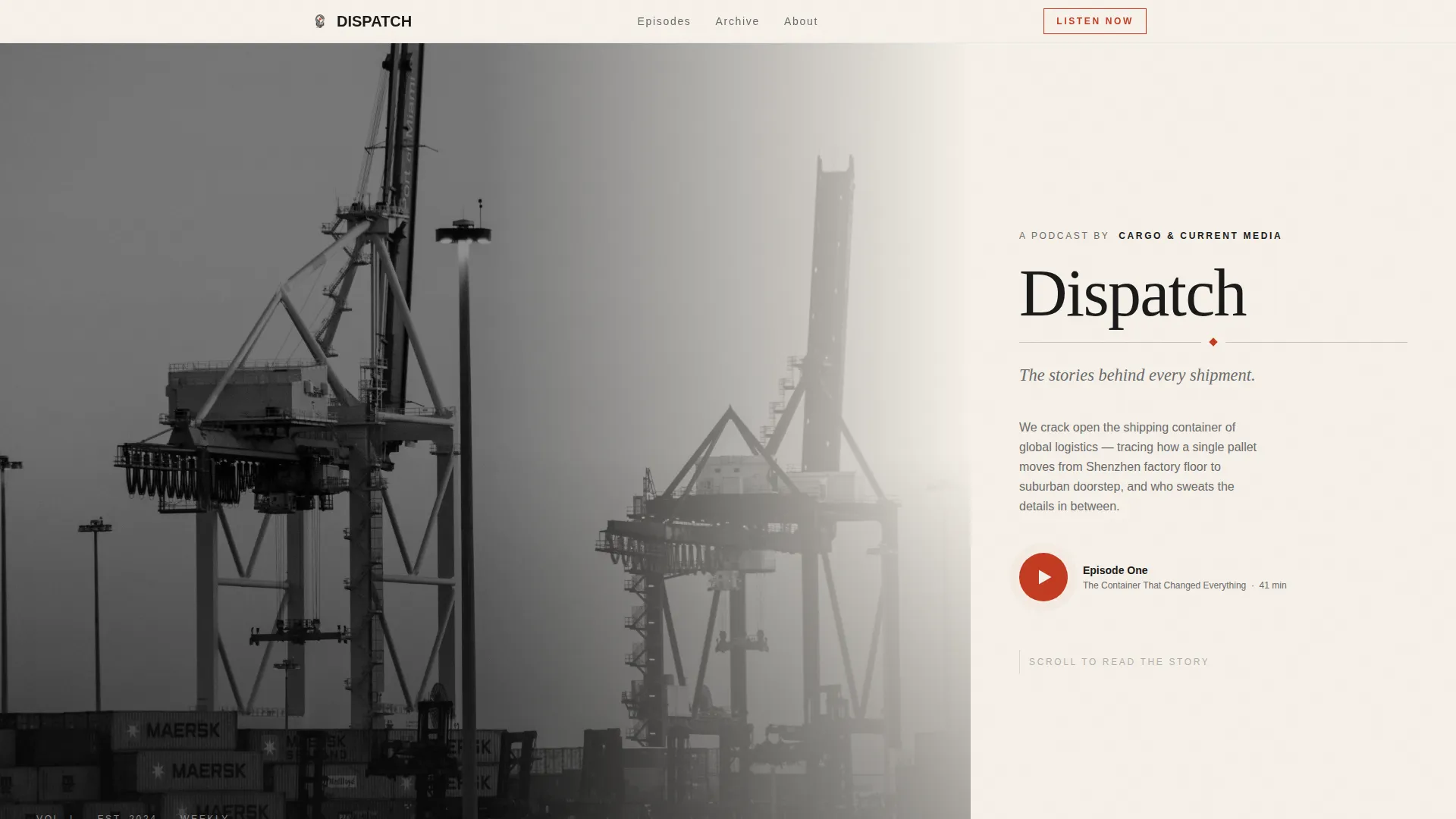
The hero uses a half-page black-and-white photograph of a container yard at dawn alongside a tall broadsheet serif headline. A single vermillion play button pulses gently below the tagline, inviting the visitor's first listen without pressure.
Chapter-by-Chapter Origin Story
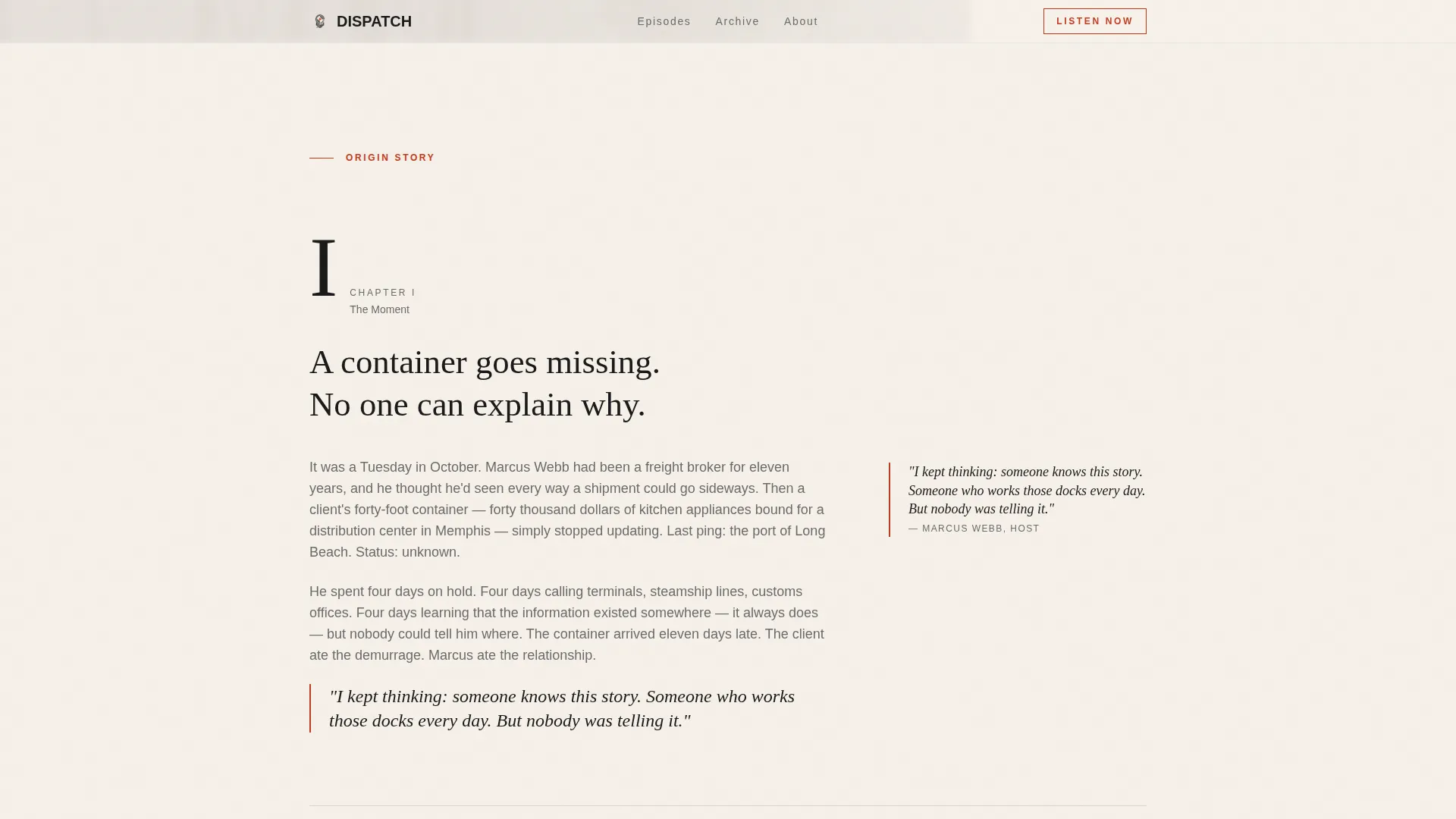
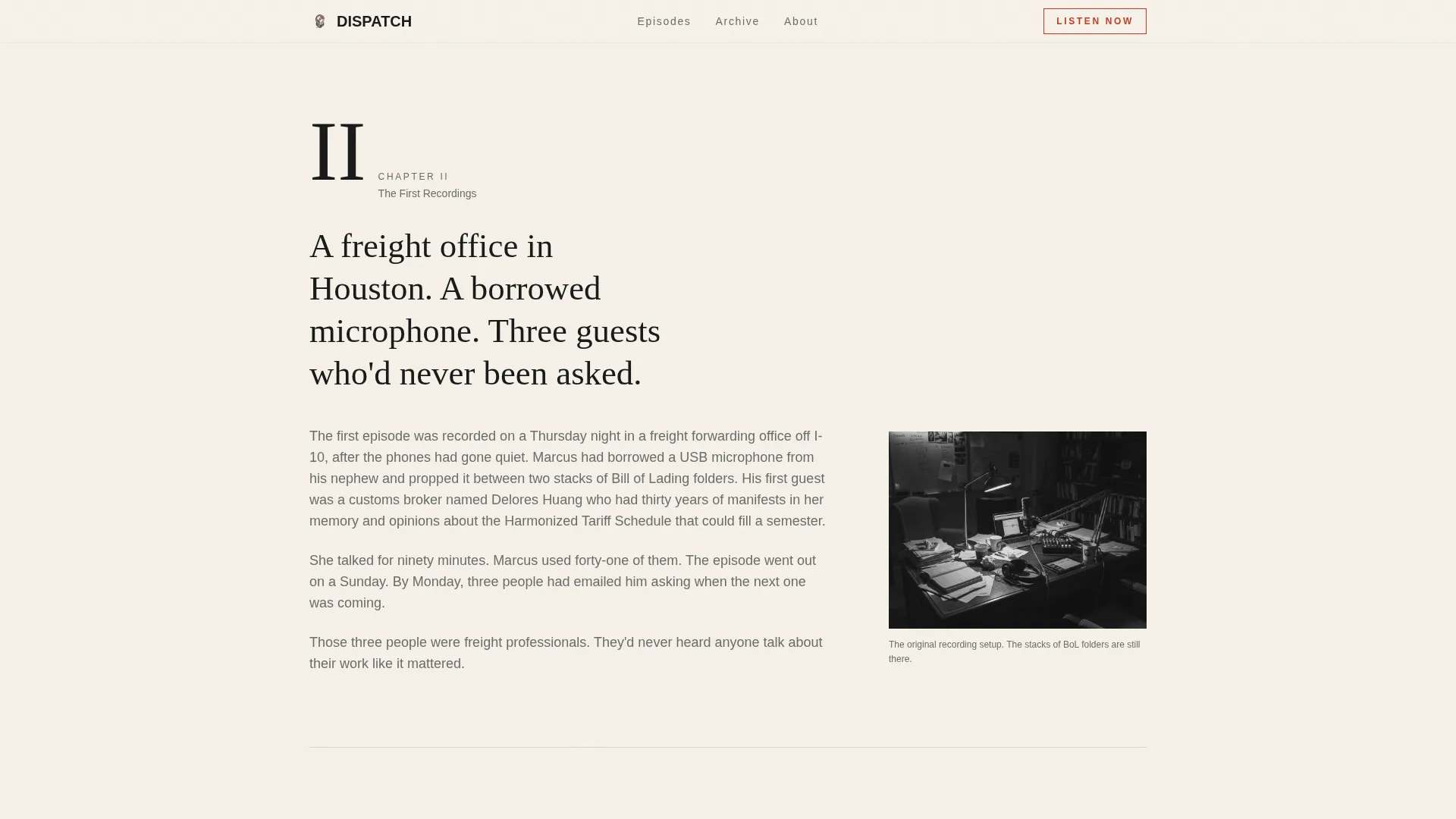
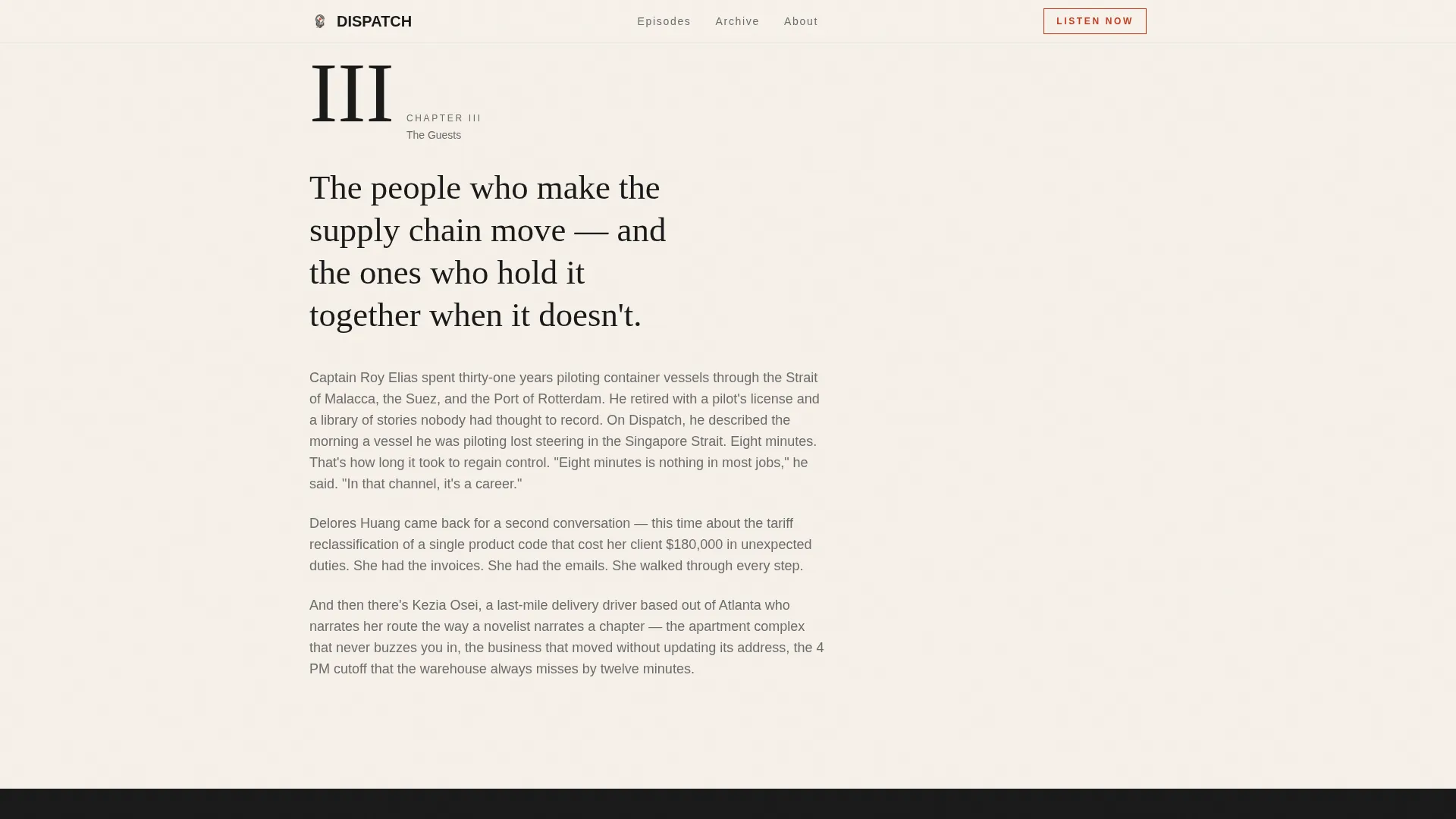
Three scroll-linked chapters reveal the founder's story in sequence. Each chapter fades in as the visitor scrolls, covering the founding moment, the early recordings, and the first notable guests. The pacing feels like reading a serialized feature, not clicking through slides.
Free Episode Cards
Three complete episodes are presented in waveform-style cards before any email ask. This section demonstrates the depth and tone of the show while removing any barrier to the first listen.
Gated Resource Archive
After the free episodes, a curated library of freight glossaries, route maps, and interview transcripts sits behind a simple email field. The prompt reads "Get the Full Archive," and the page has already earned that ask through generosity.
Editorial Ink and Paper Design System
The visual identity uses washi cream, sumi ink black, stone lantern gray, and a single vermillion accent. Typography pairs a tall Fraunces serif for headlines with DM Sans for body text. Backgrounds alternate between warm cream and deep ink, and whitespace is generous throughout.
Scroll-Linked Animations
Parallax scrolling on the hero image, chapter fade-ins on scroll, and staggered episode card reveals create a sense of turning pages. The animations are medium in intensity, adding rhythm without distracting from the content.
Page sections overview
| Section | Purpose |
|---|---|
| Hero Photo Header | Introduce the show with documentary credibility and a direct play prompt |
| Origin Chapter One | Share the founder's realization moment to build personal connection |
| Origin Chapter Two | Describe early recordings to establish authentic backstory |
| Origin Chapter Three | Introduce notable guests to signal expertise and depth |
| Episode One call to action | Place the primary conversion prompt at the emotional peak of the story |
| Free Episode Cards | Deliver three full episodes before any subscription ask |
| Resource Archive Gate | Capture email addresses with a curated, high-value content library |
| Footer Row | Provide basic navigation and closing context in a single linear row |
Design & branding system
The visual language draws from an Ink and Paper editorial tradition filtered through a Japanese Zen sensibility. Every color and type choice is deliberate, unhurried, and weighted with meaning.
- Color palette: washi cream (#F5F0E8) for backgrounds, sumi ink black (#1A1A1A) for primary text, stone lantern gray (#6B6B6B) for secondary text, and vermillion (#C23B22) reserved only for play buttons and active states
- Typography: Fraunces serif for all headlines to echo broadsheet mastheads, and DM Sans for body copy and interface elements
- Vermillion appears sparingly, so each instance reads like a stamped signature rather than a repeated brand color
Mobile & speed optimization
The template is designed desktop-first, reflecting the workstation habits of freight and logistics professionals. A clean mobile fallback ensures the layout holds together on smaller screens without losing its editorial character.
- Single-column flow adapts naturally to narrow viewports without requiring a separate mobile layout
- Scroll-linked animations are handled by client-side components, keeping static content lightweight and fast to load
How this template helps you convert
The conversion strategy is built on demonstrated generosity. The page gives before it asks, and the ask arrives only after the visitor has already received real value.
- The origin story builds trust across three chapters, so by the time the "Listen to Episode One" button appears, the visitor already feels invested in the show
- Three free episodes remove any hesitation about audio quality or content depth before the email gate appears
- The resource archive email prompt arrives after the visitor has consumed two forms of free content, making the exchange feel fair and low-stakes
Other information about this template
This template is part of a Blog and Editorial category, specifically designed for the Logistics Podcast and Media niche. It combines a Content and Resource landing page direction with an Origin Story creative direction.
- The template style is Single Column Flow, making it straightforward to customize section by section
- The header concept follows a Half-Page Photo and Text composition, a format common in documentary editorial design
- The Japanese Zen color system gives this template a distinct visual identity that stands apart from typical podcast page designs
- Social proof is built into the template through guest credential callouts, including a retired port captain, a customs broker with three decades of experience, and a last-mile driver narrator
- The footer follows a Pattern 1 Linear Single-Row layout, keeping the closing section clean and minimal
Theme
Ink & Paper
Creative direction
Origin Story
Color system
Japanese Zen
Style
Single Column Flow
Direction
Content/Resource
Page Sections
Documentary Hero with Pulse Play Button
Scroll-linked Origin Story Chapters
Free Episode Showcase Cards
Email-gated Resource Archive
Ink and Paper Editorial Design System
Staggered Scroll Animations
Related questions
Can I use this template for a podcast in a different industry?
Do I need audio hosting set up before using this template?
Can I adjust the color palette or font choices?
How does the email gate for the resource archive work?
Is this template a good fit for a podcast that is just starting out?



