Remote Work Newsletter Blog Website Template
Dispatch is a single-column newsletter landing page template built for remote work publications with a longform editorial voice. It uses a letterpress broadsheet aesthetic, a Parchment and Rust color system, and a Day-in-the-Life scroll structure to draw readers into the writing and convert them into subscribers through three strategically placed email capture prompts.
by Rocket studio
Quick summary
Dispatch is a newsletter landing page template designed for remote work deep-dive publications. It reads like a broadsheet, not a product page. The single-column layout guides visitors through a narrative scroll, from a full-width newspaper masthead to timestamp-marked story chapters, earning subscriber trust before asking for an email address.
Who this template is for
This template is built for editorial newsletter creators who lead with strong writing and need a landing page that matches the quality of their content. It suits publications covering distributed teams, async work, and the realities of managing people across time zones.
- Engineering managers publishing thought leadership for cross-continent teams
- Founders and operators running distributed-first companies since before remote work became mainstream
- Human resources directors and people leaders who communicate policy through editorial writing
What problem this template solves
Most newsletter landing pages feel like product signup flows. They lead with bullet points and benefits, not with the writing itself. For a publication whose main asset is voice and depth, that mismatch kills conversions before a reader ever decides to trust you.
- Readers have no way to sample the writing quality before committing their inbox
- Generic signup pages fail to communicate editorial tone, niche focus, or publication depth
- There is no natural moment in a standard template where curiosity peaks and a subscription prompt feels earned
What you get with this template
You get a complete, ready-to-customize newsletter landing page built around a single editorial flow. Every section serves a specific purpose in moving a first-time reader from curiosity to subscription, with three email capture opportunities placed at the moments of highest engagement.
- A full-width newspaper masthead section, a three-paragraph feature excerpt, timestamp-marked Day-in-the-Life scroll chapters, a data sidebar with tool recommendation, an archive email gate, and a minimal persistent footer
- Fraunces heavy serif headlines paired with DM Sans body text, set in a Parchment and Rust color system that reinforces the publication's analog warmth
- GSAP scroll reveal animations, a noise texture overlay, subtle parallax on masthead elements, and chapter timestamp reveals built in as interactive layers
Feature list
This template is built from several purposeful design and layout decisions. Each one serves the editorial reading experience and the lead generation goal at the same time.
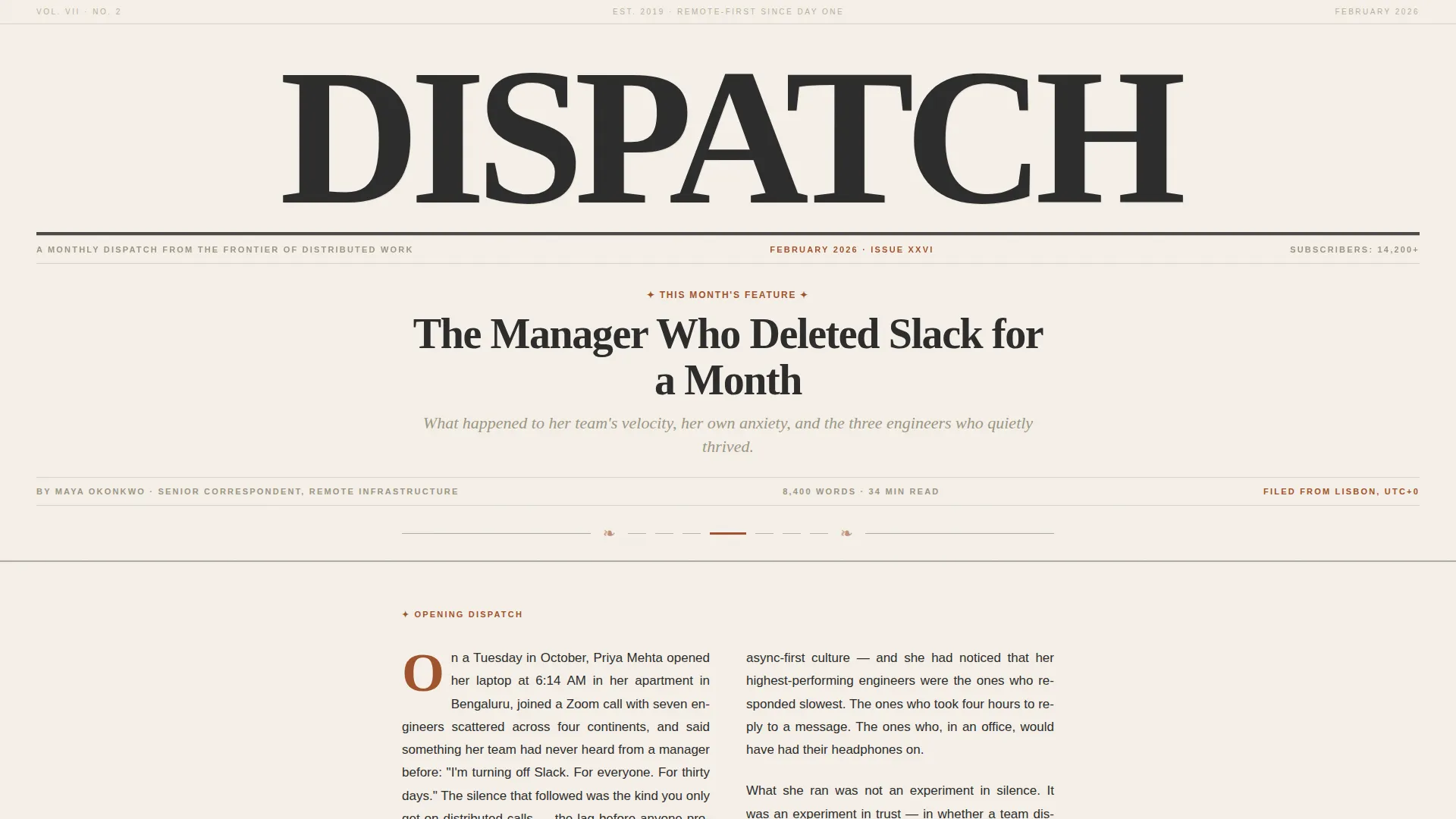
Newspaper Masthead Header
The header spans the full width of the page as a broadsheet masthead. "DISPATCH" is set in heavy serif type at the top, a dateline marks the current issue month, and a large editorial headline sits below the fold line. A woodcut-style illustration and the opening paragraph of the feature follow, typeset in two justified columns with no photography.
Day-in-the-Life Scroll Chapters
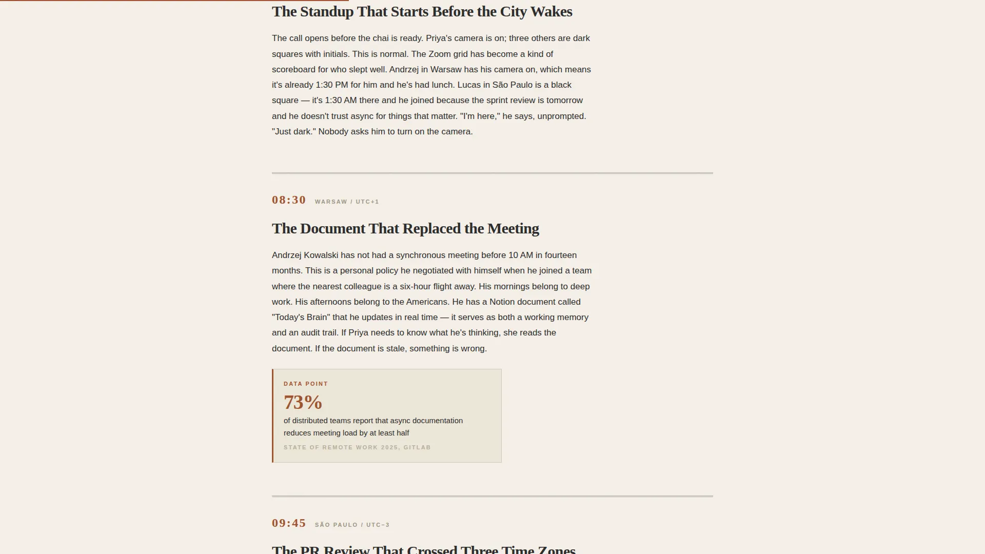
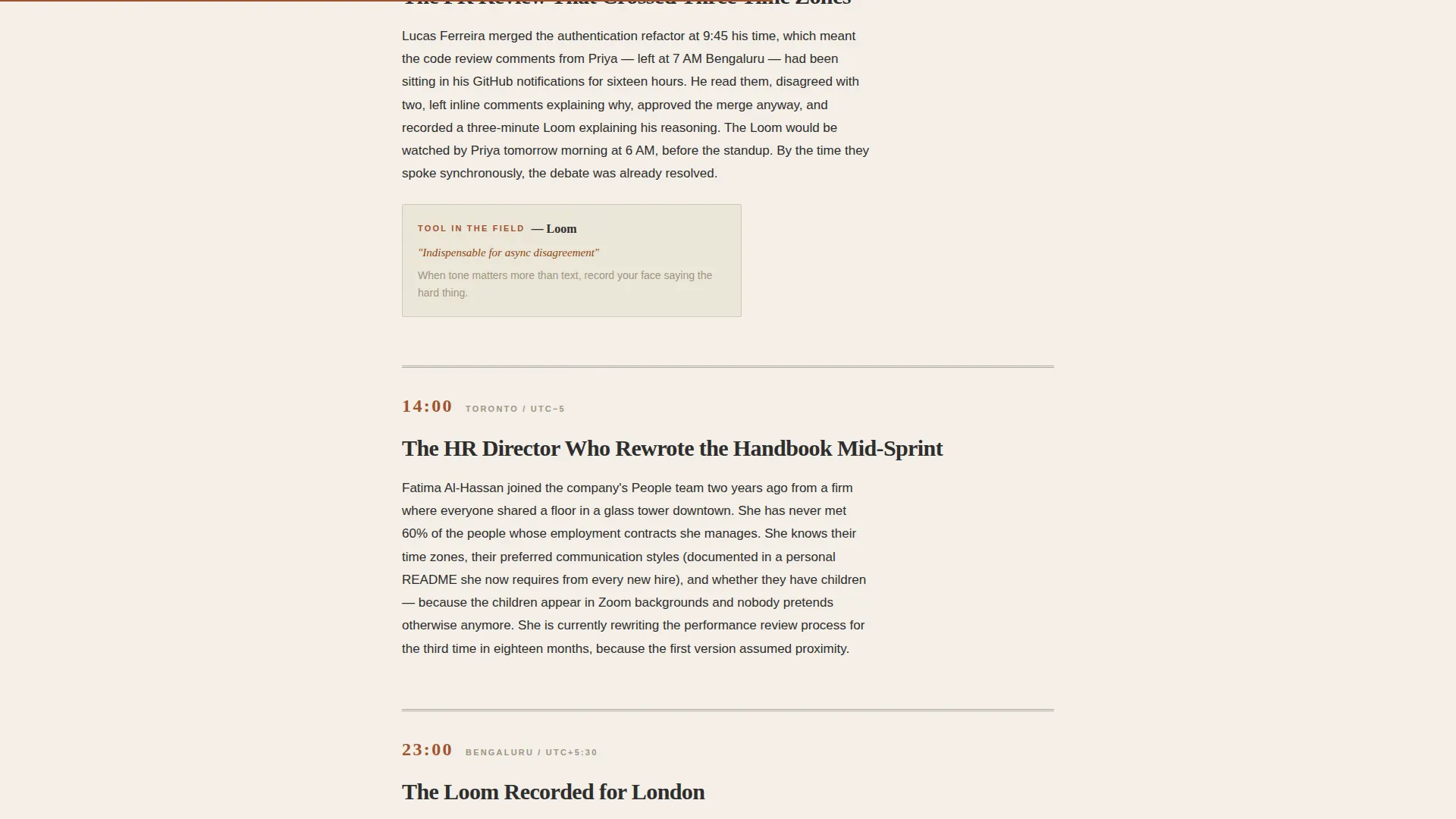
The page is structured as a narrative arc running from 6 AM to 11 PM. Each chapter is marked by a rust-colored timestamp and alternates between narrative excerpt, data sidebar, and tool recommendation. The scroll feels like reading a longform magazine piece rather than browsing a landing page.
Three-Point Email Capture Flow
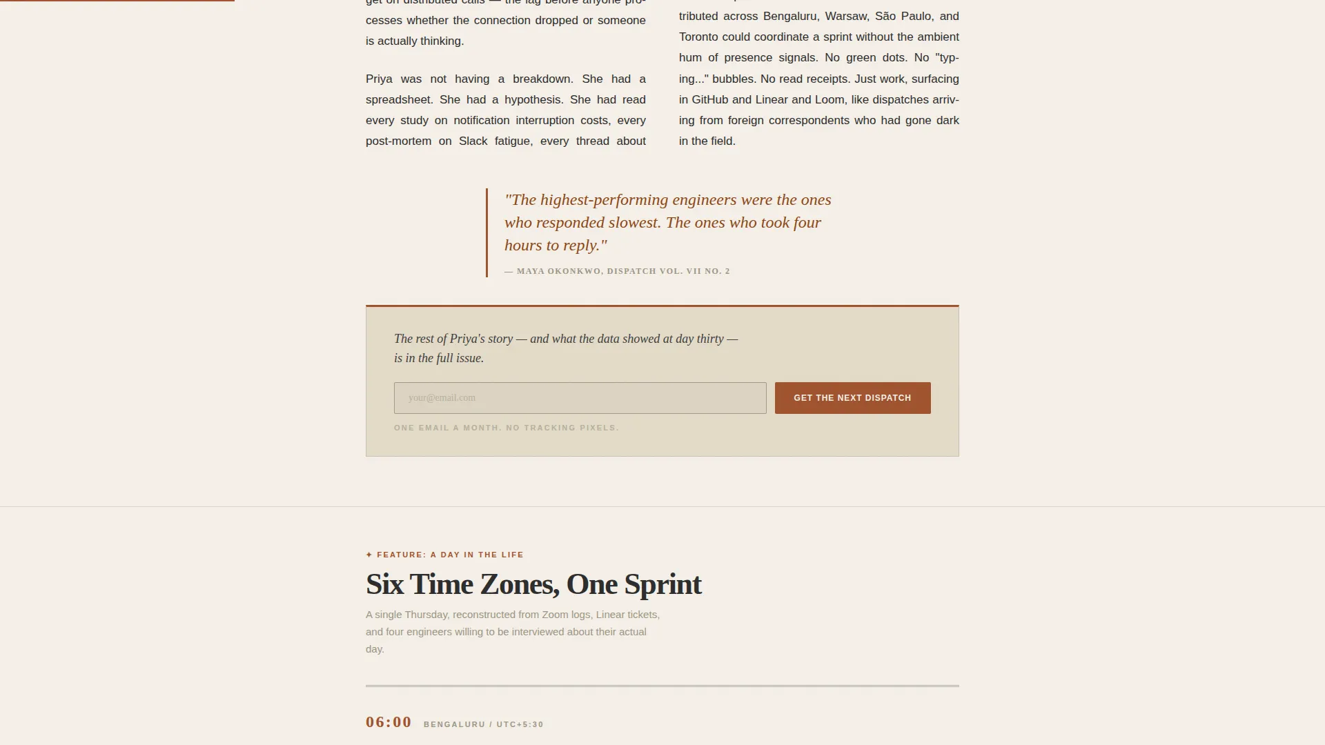
The primary call to action, "Get the Next Dispatch," appears with a single email field and a rust-colored submit button. It is placed after the opening excerpt, again after the sample data visualization, and finally as a persistent footer prompt. A secondary path offers archive access behind an email gate.
Pull Quotes and Social Proof Markers
Issue numbers, reader count annotations, and pull quotes from the current issue are woven into the layout. These elements build credibility without relying on external testimonials or third-party badges.
Editorial Typography System
Headlines use Fraunces, a high-contrast serif that reads like quality print. Body copy uses DM Sans for comfortable screen reading at editorial weight. The combination signals craft and intentionality before a reader processes a single word.
GSAP Scroll Animations and Texture
Medium-weight animations use GSAP scroll reveals, a noise texture overlay, and cursor-reactive masthead behavior. Chapter timestamps reveal as the reader scrolls, reinforcing the sense of progressing through a real publication.
Page sections overview
| Section | Purpose |
|---|---|
| Hero Masthead | Sets publication identity with full-width broadsheet type, dateline, and lead headline |
| Opening Feature Excerpt | Delivers first three paragraphs of current issue and presents the first email call to action |
| Day-in-the-Life Chapters | Guides reader through timestamp-marked narrative arc from 6 AM to 11 PM |
| Data Sidebar and Tool Rec | Provides sample data visualization and editorial tool recommendation with second call to action |
| Archive Email Gate | Offers full archive access behind an email capture prompt |
| Persistent Footer | Delivers copyright, social links, and a final subscription call to action in a minimal layout |
Design & branding system
The visual identity follows an Ink and Paper theme. The palette is drawn from the tactile world of letterpress printing, aged paper stock, and iron gall ink. Every color choice reinforces the idea that this publication takes its words seriously.
- Background uses aged cotton stock parchment (#F5F0E8) with generous whitespace; rust-red (#A0522D) pulls the eye to headlines, pull quotes, and buttons; iron gall ink (#2B2B2B) handles body text; and margin-note gray (#9B9683) marks datelines and metadata like pencil annotations
- Fraunces serves as the headline typeface for its heavy, high-contrast serif character; DM Sans handles body and interface text for clarity at reading weight
- A noise texture overlay and woodcut-style illustration reinforce the broadsheet aesthetic without relying on photography
Mobile & speed optimization
The template is built desktop-first to honor the broadsheet reading experience that defines the publication's identity. A responsive mobile fallback ensures the editorial layout holds together on smaller screens without losing its character.
- Static editorial content uses Server Components to keep the page load efficient; scroll animations and form interactions run as Client Components to avoid blocking the reading experience
- The single-column flow adapts cleanly to mobile viewports, preserving typographic hierarchy and call-to-action placement across device sizes
How this template helps you convert
The conversion strategy is editorial. The page earns the click by giving the writing away first, then asking for an email address at the moment curiosity naturally peaks.
- The opening feature excerpt delivers three full paragraphs of the current issue, enough to demonstrate writing quality and hook a reader before the first email prompt appears
- The Day-in-the-Life scroll structure creates forward momentum, with subscription prompts appearing after the data sidebar and at the footer when reader engagement is at its highest point
Other information about this template
This template is categorized under Blog and Editorial, with a specific fit for remote work newsletter publications. It is designed as a single-column flow landing page, which keeps the reading experience linear and distraction-free.
- The creative direction follows a Day-in-the-Life structure, a format well suited to content that covers the texture of distributed work across a full working day
- The header concept is modeled on a Newspaper and Publication layout, which immediately signals editorial seriousness to a first-time visitor
- The footer follows a minimal pattern with copyright and social links and no heavy column layout, keeping the exit experience as clean as the entry
- This template is a strong fit for publishing tools and platforms such as Beehiiv, Substack, or Ghost, where the landing page lives separately from the delivery platform and needs to represent the publication's voice independently
Theme
Ink & Paper
Creative direction
Day-in-the-Life
Color system
Parchment & Rust
Style
Single Column Flow
Direction
Lead Generation
Page Sections
Newspaper Masthead Header
Day-in-the-life Scroll Structure
Three-point Email Capture Flow
Editorial Typography System
Pull Quotes and Social Proof
GSAP Animations and Texture Layer
Related questions
Can I use this template if my newsletter covers a different topic?
Does the template include real email form functionality?
Is this template suitable for a new newsletter with no existing issues?
How many subscription prompts does the template include?
Can the Day-in-the-Life chapters be adapted to a different narrative structure?



